Image · GPT-Image
Japanese editorial coffee poster series
Create 9:16 coffee-themed editorial posters under a unified visual system, with different subjects and compositions, balancing realistic materials, negative space, and information hierarchy.
 蛋黄堡@Hamburgerai
Prompt
Create 4 independent “Japanese editorial coffee posters.” The four images belong to the same series, but each must have a different subject presentation, compositional path, and visual event; do not merely change the colors or brand name.

All four images share the visual language of modern Japanese museum publications, independent design-exhibition posters, and restrained editorial design. Use a uniform 9:16 vertical format, output each image independently, and do not make a collage. Use warm ivory paper throughout, with extremely subtle real paper fibers and low-intensity print grain. Use warm ivory, ink black, coffee brown, and a small amount of dark cinnabar red; neon, highly saturated gradients, and commercial gloss are prohibited.

All posters use a small number of circular visual anchors, fine measurement lines, arcs, locator points, and structural marks. Lines must serve the subject and reading path and must not become random decoration. Text may use only short, legible English labels; do not generate long pseudo-text, random logos, QR codes, or watermarks.

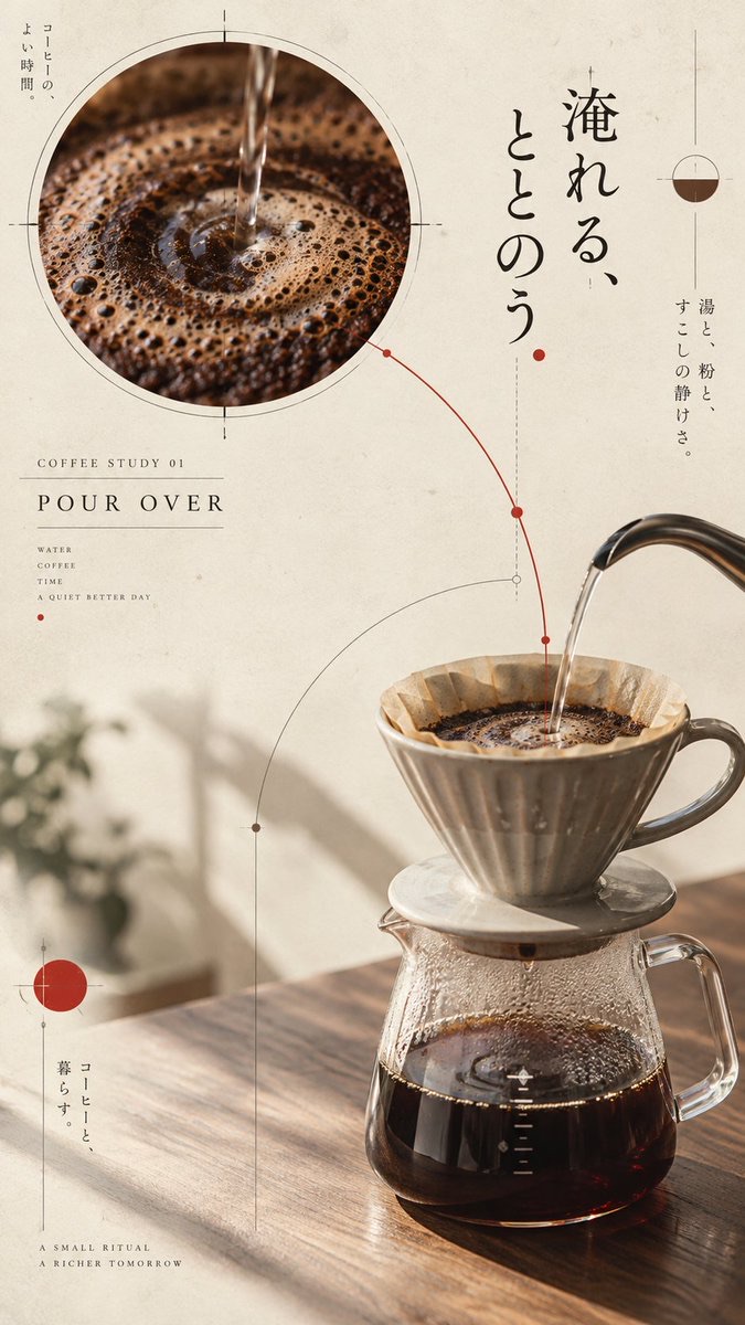
Image 1: Pour-over coffee. Show the ceramic dripper and glass server from a calm three-quarter tabletop view. Place a large circular detail slice in the upper left showing the coffee bloom and concentric ripples, with the realistic apparatus in the lower right; translate the water stream into a measuring arc. Add the short label “COFFEE STUDY 01 / POUR OVER”.

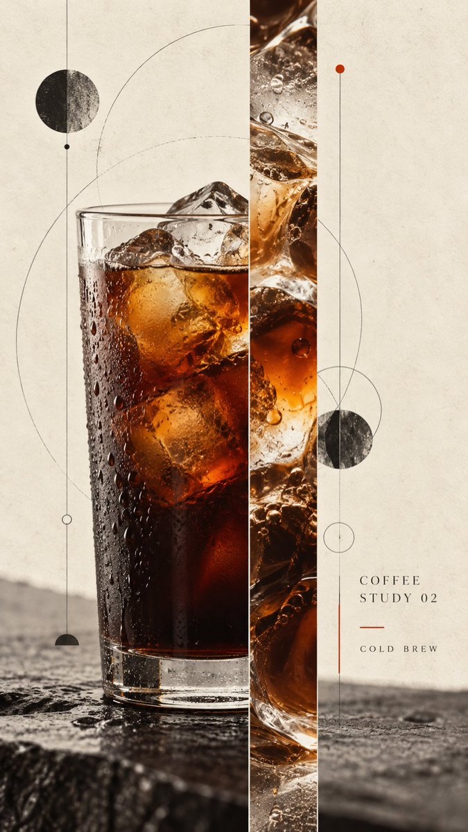
Image 2: Cold-drip coffee. Place a transparent tall glass of iced coffee on the left, and add a vertical slice showing the layers of coffee, ice cubes, and reflections; use fine vertical lines to establish a cool, calm rhythm. Add the short label “COFFEE STUDY 02 / COLD BREW”.

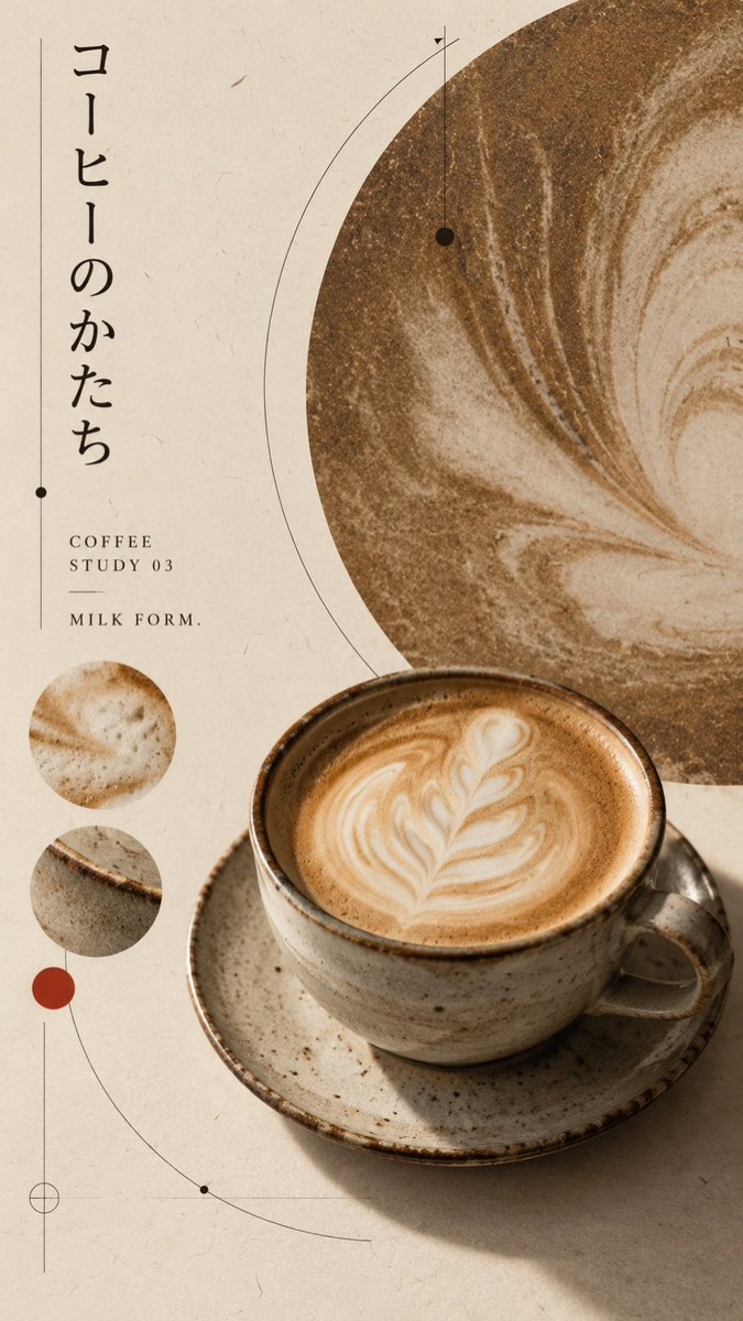
Image 3: Latte. Place a handmade ceramic cup in the lower right, with an offset disk cropped by the image edge behind it, echoing the swirl of the milk foam; add two small material-detail circles. Add the short label “COFFEE STUDY 03 / MILK FORM”.

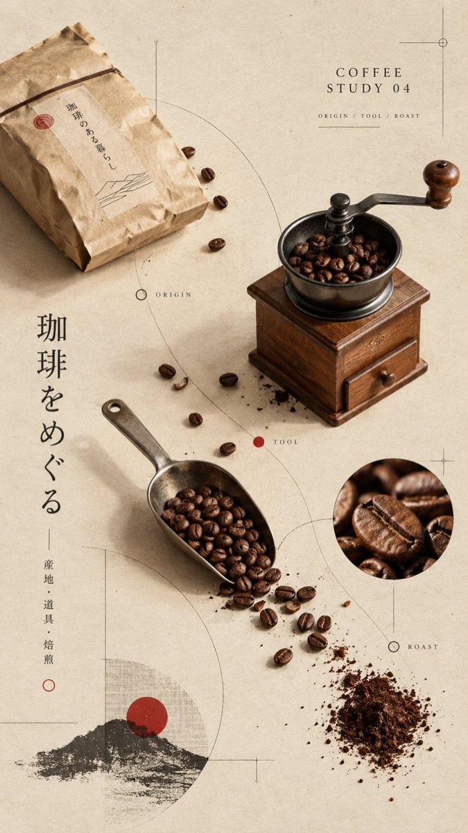
Image 4: Coffee beans and tools. Arrange roasted coffee beans, a hand grinder, a metal measuring spoon, and a folded paper bag as a diagonal map of objects in an isometric three-quarter view; connect the objects with fine contour lines and route nodes, preserving generous negative space. Add the short label “COFFEE STUDY 04 / ORIGIN / TOOL / ROAST”.

All four images must retain realistic coffee, glass, ceramic, metal, paper, and wood textures; the subjects must be clear, the lighting natural, and the editorial layout sophisticated. Prohibit ordinary coffee-shop menus, cluttered collages, fixed four-panel grids, evenly distributed layouts, cheap plastic 3D, complex UI, garbled text, excessive props, and watermarks.

The final output must consist of 4 independent 9:16 posters, maintaining series consistency while making the four images clearly different in subject, composition, visual focus, and interaction mechanism.
请创作 4 张相互独立的「日式编辑咖啡海报」,四张图属于同一个系列,但每张必须拥有不同的主体表现、构图路径和视觉事件,不得只更换颜色或品牌名。
四张图共同采用现代日本博物馆出版物、独立设计展览海报与克制编辑设计的视觉语言。画幅统一为 9:16 竖版,每张独立输出,不拼图。背景统一为暖象牙色纸张,带有非常细微的真实纸纤维和低强度印刷颗粒。统一使用暖象牙、墨黑、咖啡棕和少量暗朱红,禁止霓虹、高饱和渐变和商业化光泽。
所有海报都使用少量圆形视觉锚点、细测量线、弧线、定位点与结构标记。线条必须服务于主体和阅读路径,不得变成随机装饰。文字只使用短小、可读的英文标签,不生成长篇伪文字、随机 Logo、二维码或水印。
图 1:手冲咖啡。陶瓷滤杯与玻璃分享壶采用平静的三分之四桌面视角,左上放置一个展示咖啡绽放和同心涟漪的大圆形局部切片,右下为真实器具;水流被转译为一条测量弧线。加入短标签 “COFFEE STUDY 01 / POUR OVER”。
图 2:冰滴咖啡。透明高杯冰咖啡位于左侧,画面加入一条纵向切片,展示咖啡、冰块和反光的层次;使用细密的垂直线建立冷静节奏。加入短标签 “COFFEE STUDY 02 / COLD BREW”。
图 3:拿铁。手工陶瓷杯位于右下,背后放置被画面边缘裁切的偏置圆盘,圆盘呼应奶泡旋纹;加入两个小型材质细节圆。加入短标签 “COFFEE STUDY 03 / MILK FORM”。
图 4:咖啡豆与器具。烘焙咖啡豆、手摇磨豆机、金属量勺和折叠纸袋组成一组斜向物件地图,以等距三分之四视角排列;细轮廓线与路线节点连接对象,保留大面积留白。加入短标签 “COFFEE STUDY 04 / ORIGIN / TOOL / ROAST”。
四张图都必须保持真实咖啡、玻璃、陶瓷、金属、纸张和木质纹理;主体清晰、光线自然、编辑排版成熟。禁止普通咖啡店菜单、杂乱拼贴、固定四宫格、平均排布、廉价塑料 3D、复杂 UI、乱码、过多道具和水印。
最终输出 4 张独立的 9:16 海报,保持系列统一性,同时让四张图在主体、构图、视觉焦点和互动机制上明显不同。
How to use
Usage suggestion: Generate the four poster themes separately and check each one for subject completeness, English-label legibility, color consistency across the series, and sufficient negative space before correcting the layout details.
Details
More from 蛋黄堡
-

Travel Palette Watercolor Study Poster
-

Blue Halftone City Archive
-

Travel Photo to Glazed Mosaic Relief Poster
-

Clear White-Paper Travel Watercolor Editorial Poster
-

Vintage Matchbox Travel Label Poster
-

Travel Enamel Fridge Magnet Souvenir Poster
-

Two-Color Cultural Landmark Editorial Poster
-

Material Assemblage Contrast Poster from a Travel Photo