
Image
Vintage Matchbox Travel Label Poster
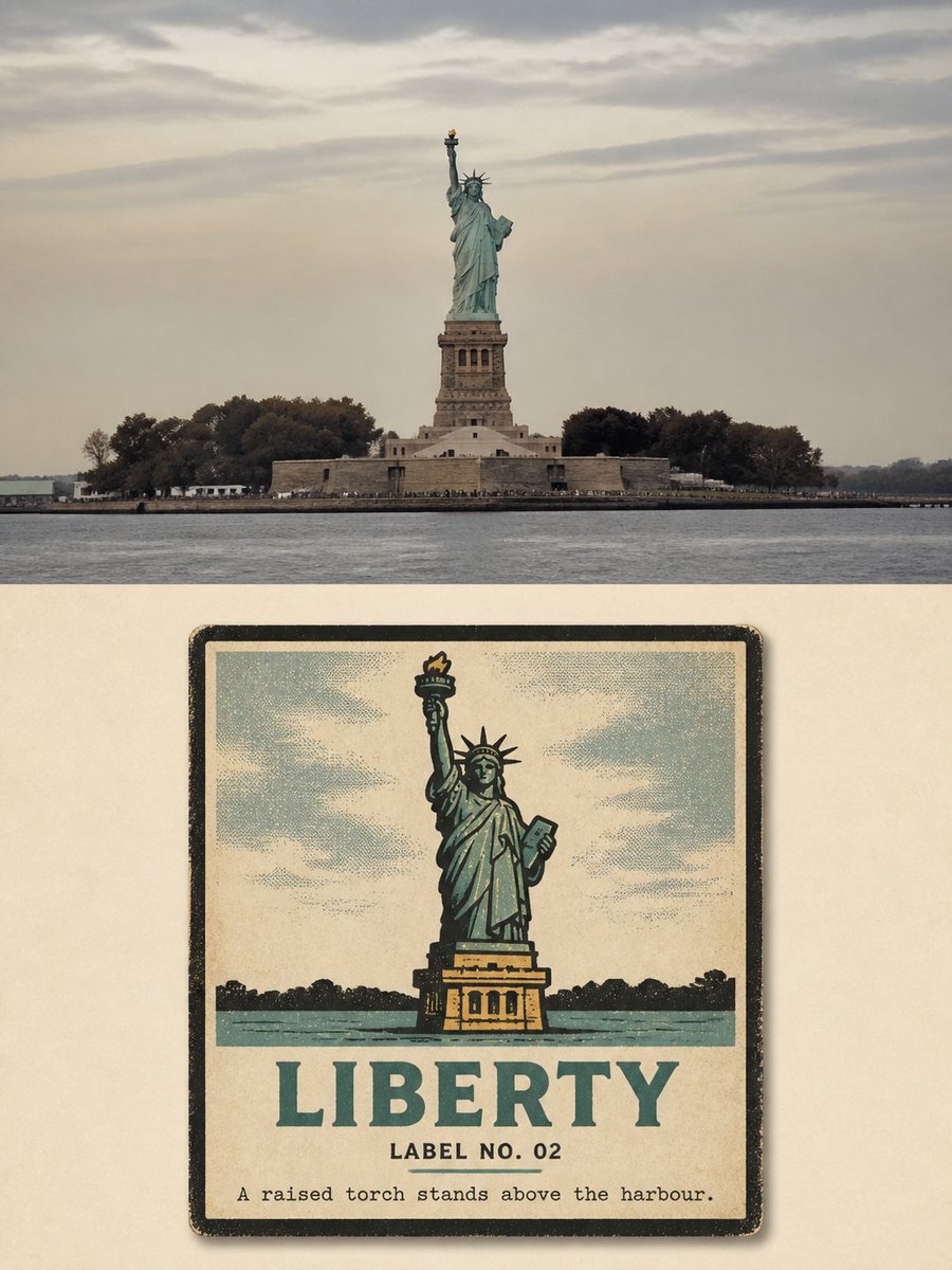
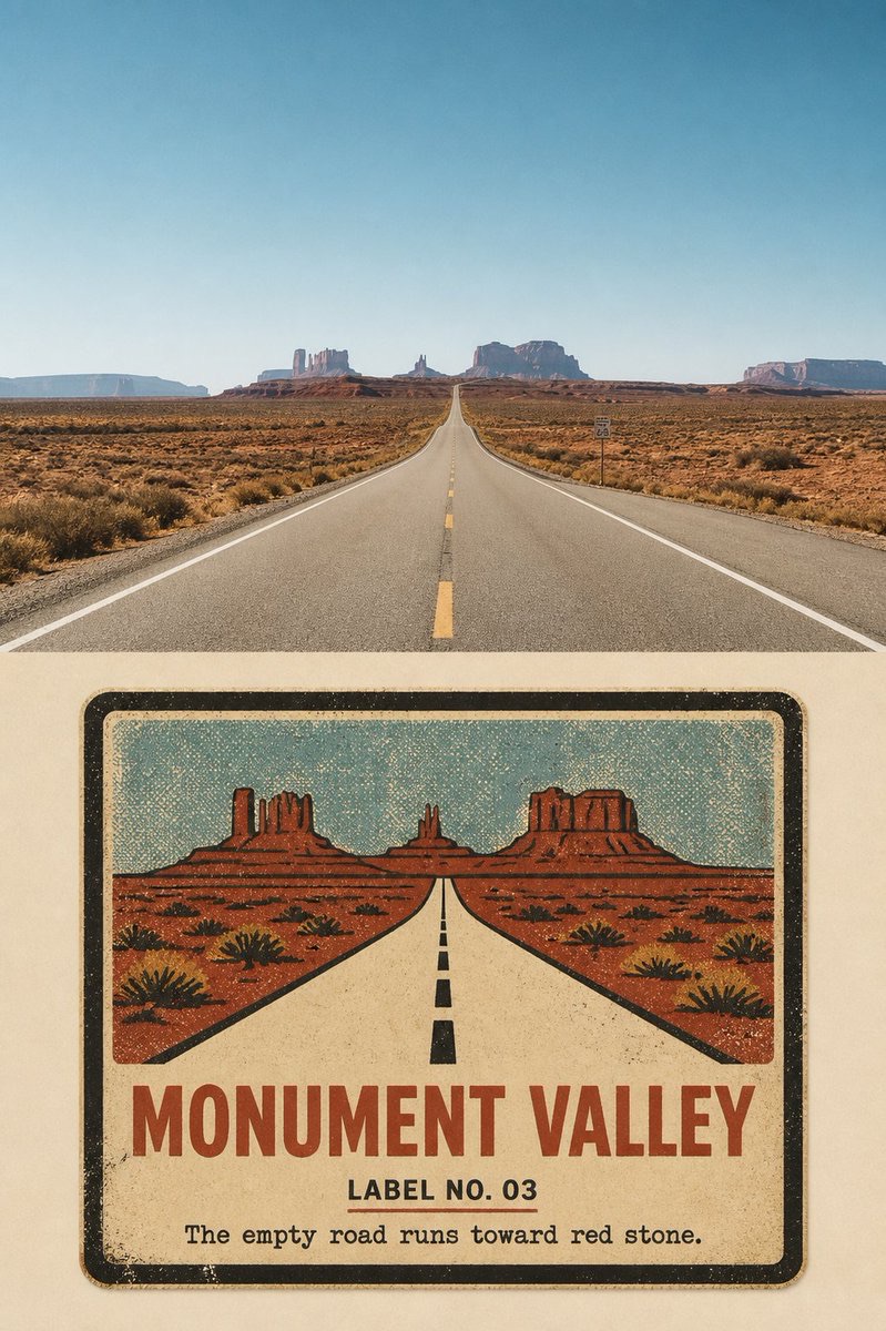
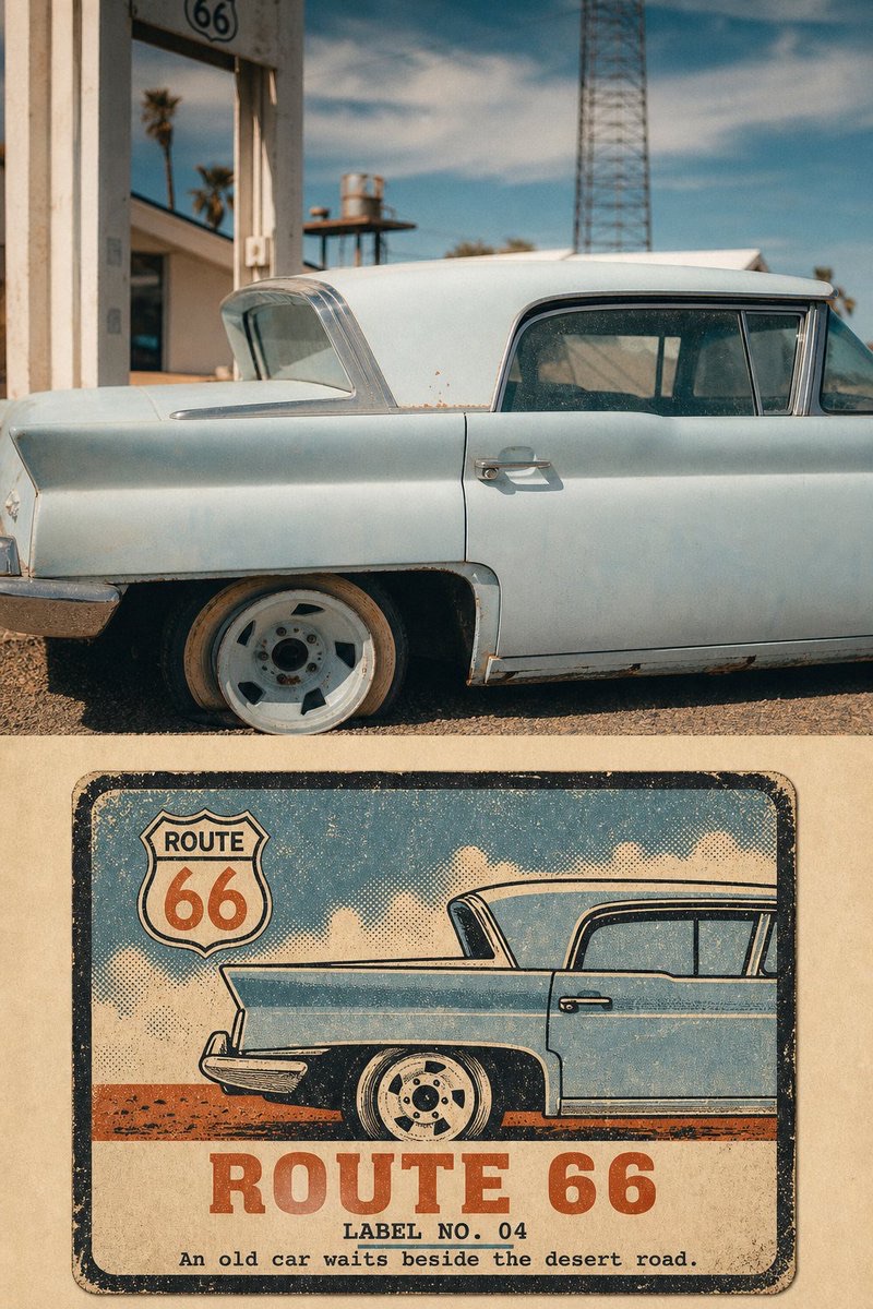
Turn each travel photo into a separate 3:4 travel poster with two sections: preserve the authentic photograph above and reconstruct the same scene as a vintage paper travel label below.
 蛋黄堡@Hamburgerai
Prompt
Please turn each travel photo I upload into its own high-end designed poster, with one finished piece per photo. Do not combine multiple photos into a collage or create a product-display mockup.

Use an overall vertical 3:4 composition. Divide the image into an authentic photographic area above and a vintage label illustration area below, with a clear, straight horizontal boundary between them.

The photographic area should take up about 45%–50% of the full image. Faithfully preserve the subject, buildings, vehicles, terrain, orientation, spatial relationships, viewpoint, natural light and shadows, authentic materials, and color atmosphere in the original photo. Apply only subtle high-end travel-photography color grading and a very fine film-grain effect. The upper area must remain clearly recognizable as a real photograph; do not redraw it, distort it, mirror it, replace the subject, or alter the architecture.

The lower area should take up about 50%–55%, and re-create the same scene as a “VINTAGE MATCHBOX TRAVEL LABEL|Vintage Matchbox Travel Label.”

In an open field of warm ivory or aged-paper color, place a flat rectangular vintage paper travel label. The label should take up about 48%–68% of the lower area's width, with approximately 32%–52% of continuous paper-colored margin around it.

Show only the front of the label. Do not show matchbox thickness, a drawer, sides, matches, packaging structure, a handheld scene, or a product display.

Extract the most recognizable subject silhouette, orientation, pose, key architectural structures, and signature color blocks from the original photo. Simplify the complex environment into one central stamp, badge, or bold color-block composition.

The subject must be immediately recognizable as deriving from the original photo, but do not use photo tracing or automatic vectorization. Reorganize the composition according to the subject's features, for example:

- Compress a landmark building into a bold-outline badge;
- Turn a bridge into a strong directional structure of towers and cables;
- Turn a road into an exaggerated perspective wedge;
- Turn a vehicle into a side-view badge made of its spoiler, body, and wheels;
- Turn mountains and terrain into a few hard-edged silhouettes.

Use thick near-black borders, bold black outlines, flat colors with hard edges, and 2–4 opaque spot colors. Extract the colors from the original photo, then simplify and purify them slightly, while adding warm paper color and near-black outlines.

Recreate the characteristics of old color-registration printing:

- coarse halftone;
- waxy ink grain;
- missing ink;
- rough printed edges;
- slight color misregistration;
- worn corners;
- aged paper fibers;
- uneven spot-color coverage.

Keep open paper-colored space inside the label. Do not fill its edges with decorations, halftone dots, or borders.

Add text as part of the label's printed design:

- A location or scene title of 1–3 English words;
- A number in the style of “LABEL NO. 01”;
- An observation sentence of 5–10 English words.

Set the main title in a heavy, slightly irregular vintage uppercase typeface. Set the supporting text in small old-style letterpress or typewriter type. Slightly uneven ink, wear, and color misregistration are allowed, but the main title must be clearly legible in the chat preview.

Do not copy logos, car-window stickers, organization names, author signatures, or unrelated text from the original photo. Do not imitate a real matchbox brand, specific vintage packaging, or an existing product label.

The overall result should look like a printed travel keepsake saved from an old suitcase, roadside shop, or local souvenir book: direct, rough, sun-worn, collectible, but not childish, cheap-looking, or like a generic nostalgia template.

Avoid: 3D matchboxes, packaging sides, matches, product-ad mockups, imitations of real brands, modern minimalist logos, smooth vector art, digital gradients, photographic filters, automatic photo tracing, too many colors, complex panoramas, children's cartoons, generic travel icons, redrawing the entire poster, omitting the original photo, shrinking the photo into a small decoration, using the same composition with a different material, blurred boundaries, author names, logos, watermarks, gibberish, fictional brands, or extra text.
请将我上传的每一张旅行照片分别制作成一张独立的高级设计海报,一张照片对应一张成品,不得多图拼贴,不得制作产品展示Mockup。
整体采用3:4竖版构图。画面由上方真实摄影区域和下方复古标签转绘区域组成,两个区域之间使用清楚、平直的水平边界。
上方摄影区域约占整张画面的45%—50%。忠实保留原照片中的主体、建筑、车辆、地形、方向、空间关系、观察角度、自然光影、真实材质和色彩氛围。只进行轻微的高级旅行摄影调色与极薄胶片颗粒处理。上方必须仍然是清楚可辨的真实照片,不得重绘、变形、镜像、替换主体或改造建筑。
下方约占50%—55%,将同一场景重新制作为“VINTAGE MATCHBOX TRAVEL LABEL|复古火柴盒旅行标签”。
在温暖的米白色或旧纸色空场中,放置一张平放的矩形旧纸旅行标签。标签约占下方区域宽度的48%—68%,周围保留约32%—52%的连续纸面留白。
只表现标签正面,不显示火柴盒厚度、抽屉、侧面、火柴、包装结构、手持场景或商品陈列。
从原照片中提取最具识别度的主体轮廓、朝向、姿态、关键建筑结构和标志性色块,将复杂环境压缩成一个中央图章、徽章或大色块构图。
主体必须一眼可追溯到原照片,但不能使用照片描边或自动矢量化。根据主体特征重新组织构图,例如:
- 地标建筑压缩成粗轮廓徽章;
- 桥梁转化成桥塔与缆索的强方向结构;
- 公路转化成夸张的透视楔形;
- 车辆转化成尾翼、车身和车轮组成的侧面图章;
- 山峰和地形转化成少量硬边剪影。
使用厚重近黑边框、粗黑轮廓、硬边平涂和2—4种不透明专色。色彩必须从原照片提取,再进行归纳和适度提纯,同时加入暖纸色和近黑轮廓色。
表现旧套色印刷特征:
- coarse halftone;
- waxy ink grain;
- missing ink;
- rough printed edges;
- slight color misregistration;
- worn corners;
- aged paper fibers;
- uneven spot-color coverage。
标签内部仍需保留可读的纸色空场,不要用装饰、网点或花边填满四周。
文字作为标签印刷的一部分加入:
- 一个1—3个英文单词的地点或场景标题;
- “LABEL NO. 01”式编号;
- 一行5—10个英文单词的观察句。
主标题使用粗重、略不规整的复古大写字体,辅助文字使用小号旧铅字或打字机字体。允许轻微缺墨、磨损和套色偏移,但主标题必须在聊天预览中清楚可读。
不得复制原照片中的商标、车窗贴纸、组织名称、作者签名或无关文字。不得模仿真实火柴品牌、具体旧包装或现有商品标签。
整体像一张从旧旅行箱、公路商店或地方纪念册里保存下来的旅行印刷物:直接、粗粝、晒旧、具有收藏感,但不能儿童化、廉价化或成为怀旧模板。
避免:3D火柴盒、包装盒侧面、火柴、商品广告Mockup、真实品牌仿制、现代极简Logo、平滑矢量、数字渐变、摄影滤镜、照片自动描边、过多颜色、复杂全景、儿童卡通、通用旅游图标、整张海报重绘、原照片缺失、照片缩成小装饰、相同取景换材质、模糊分界、作者名字、Logo、水印、乱码、虚构品牌和多余文字。
How to use
Usage tip: Upload one travel photo and generate a separate poster for each photo. You can change the location title, number, and observation sentence to match the scene. Remember to preserve any logos or personal information in the original image that should not be made public.
Details
More from 蛋黄堡
-

Travel Palette Watercolor Study Poster
-

Blue Halftone City Archive
-

Travel Photo to Glazed Mosaic Relief Poster
-

Clear White-Paper Travel Watercolor Editorial Poster
-

Travel Enamel Fridge Magnet Souvenir Poster
-

Two-Color Cultural Landmark Editorial Poster
-

Material Assemblage Contrast Poster from a Travel Photo
-
Fabric-Collage Travel Memory Poster