
Image
Blue Halftone City Archive
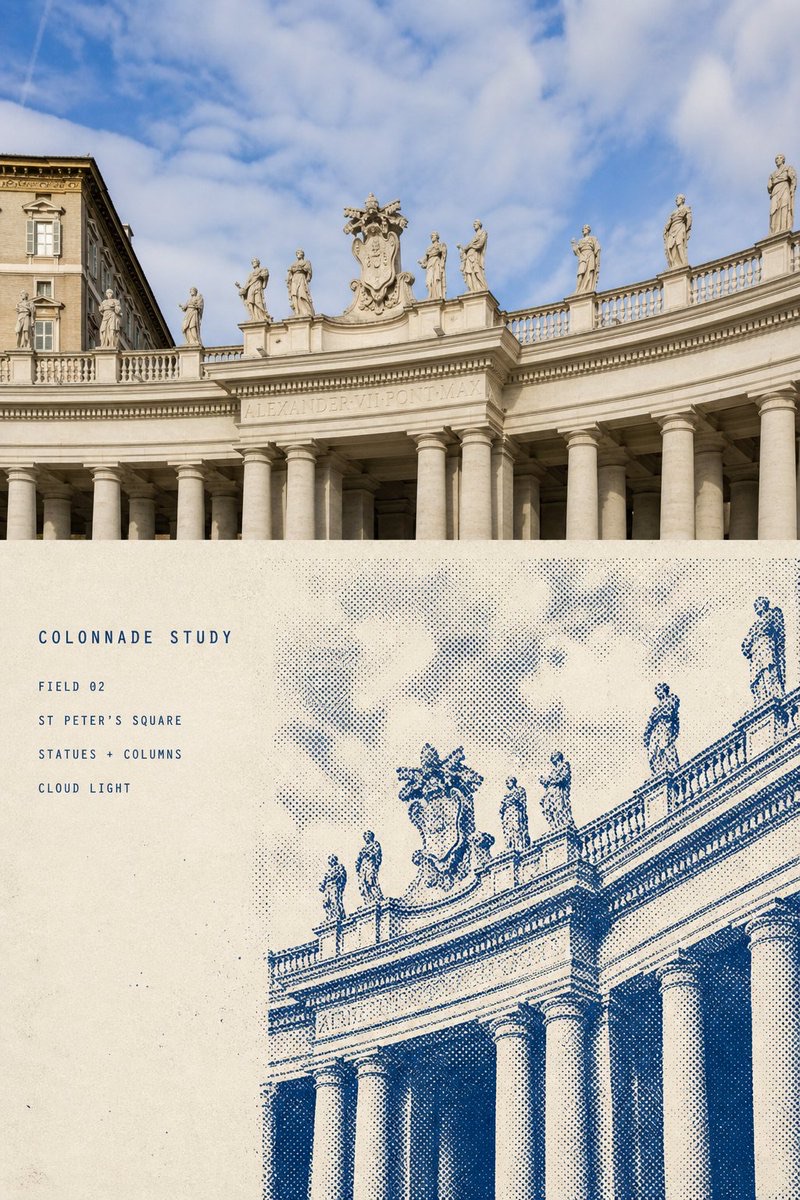
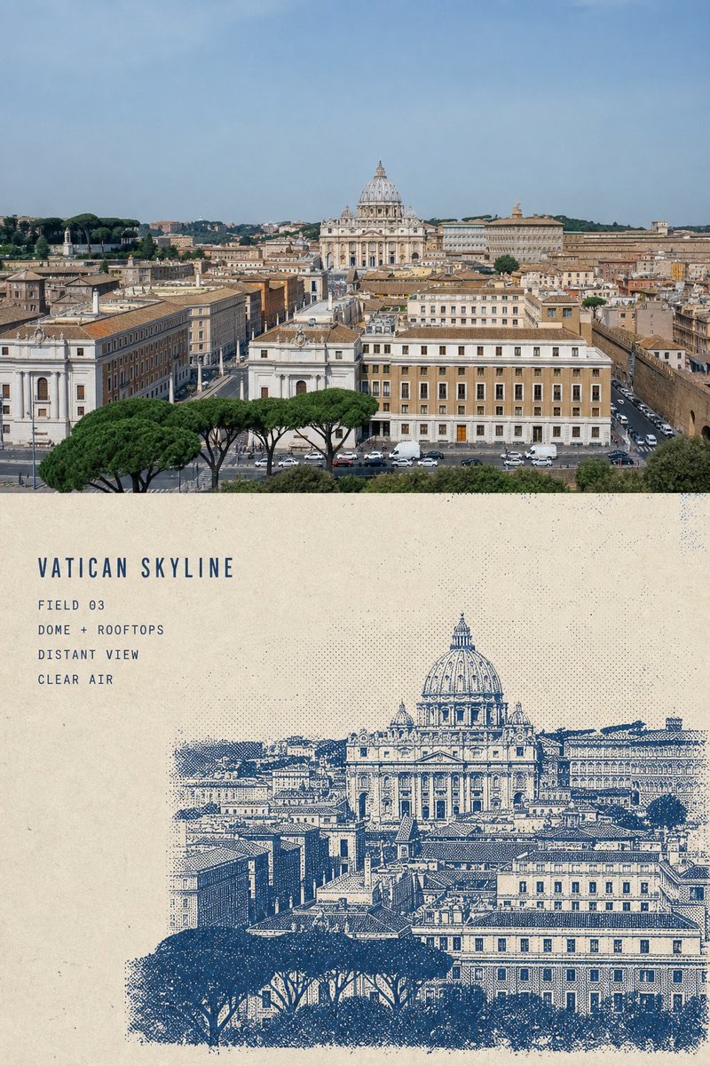
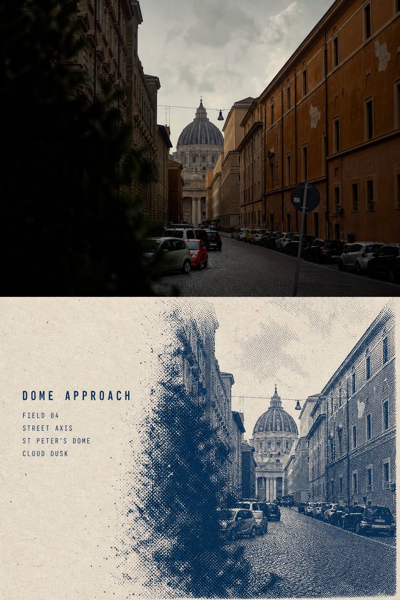
Turn each travel photo into a separate 3:4 top-and-bottom comparison city archive page: keep the real photograph on top, and rebuild the same location in monochrome blue-ink halftone below.
 蛋黄堡@Hamburgerai
Prompt
Please turn each travel photo I upload into its own separate
「BLUE HALFTONE CITY ARCHIVE|蓝墨网点城市档案」.

Output each photo individually, with no multi-image collage.
The overall layout uses a vertical 3:4 top-and-bottom comparison composition.

The top portion occupies about 48%–50% of the frame and preserves the high-fidelity original travel photograph.

The bottom portion occupies about 50%–52% and rebuilds the same location as a complete
monochrome blue-ink halftone city observation archive page.

The upper and lower areas use a clean, straight, restrained horizontal boundary.
They must not fade, feather, or bleed into each other.

The top half must faithfully preserve the original photograph.

Accurately maintain architectural identity, number of landmarks, domes, towers, bridges,
rooftops, roads, shorelines, trees, foreground anchors, viewing angle,
perspective relationships, real materials, natural light and shadow, and the original color mood.

Apply only slight premium travel-publication color balancing,
and add extremely thin film grain.

Do not repaint the photo. Do not move, mirror, replace, enlarge, or shrink landmarks.
Do not reshape buildings, change road directions, or add non-existent towers or urban structures.
The top half must still clearly read as a real photographic work.

The bottom half uses warm beige, ivory, or light oat-toned aged paper,
with subtle fibers, light grain, and uneven natural texture.

The redrawn area may use only one cool blue ink:

- Ultramarine
- Prussian blue
- Deep blue-gray

Choose one of these based on the mood of the original photo.
The entire bottom half must not include a second colored ink.

First understand the visual information that defines the location's identity:

- The main architectural silhouettes
- The height relationships between landmarks
- The rhythm of domes, towers, or rooflines
- The direction of roads, bridges, or shorelines
- Foreground trees, street lamps, boats, or railings
- Clouds, mist, backlight, and atmospheric perspective

Remove unrelated vehicles, tourists, advertisements, dense window panes,
cluttered facilities, and any details that do not help identify the location.

Do not trace the full framing of the upper photo proportionally.

Rearrange the bottom half's subject scale, cropping, and visual focus:
the architecture or city body should occupy about 55%–75% of the redrawn area,
which may be moderately enlarged and cropped from the lower edge or sides.

Reserve about 20%–30% of structured paper space on the left or upper left
for a few archive titles and fields.

The bottom of the city, foreground anchors, roads, tree clusters, and building bases
use heavier blue ink and dense halftone dots.

Mid-level buildings, rooftops, and facades use medium-density dots,
using dot size, density, and direction to build volume and distance.

Building upper edges, domes, spires, sculptures, mist, clouds, and soft light
gradually shift into looser halftone grain and naturally fade into the unprinted paper.

Must maintain:

The bottom is the most solid,
the middle structure is clear,
the top gradually dissolves point by point.

The dots must truly help shape architectural volume, spatial distance,
mist layers, and light, rather than acting as a uniform grain filter over the photo.

Real plate-making and screen-printing traces are allowed:

- Local ink starvation
- Uneven dot density
- Coarse-grain halftone
- Scratch-like paper white
- Eraser-like ink removal
- Broken plate edges
- Paper fibers showing through
- A few scattered ink specks
- Local ink overlap and dry areas

The main building outlines, domes, towers, and location identity must remain clear,
and must not lose recognizability because the grain dissolves.

In the left blank area, add a title of 2–3 English words,
plus 3–5 lines of short, accurate archive fields.

Before generating, explicitly replace the following:

TITLE: “[地点或观察主题]”
FIELD: “[FIELD 01]”
LOCATION: “[可确认的真实地点]”
SUBJECT: “[照片中的主要建筑或结构]”
LIGHT: “[可确认的天气或光线]”

The title uses a modern narrow sans-serif typeface with open letter spacing,
and the fields use small monospaced or narrow sans-serif type.

All text uses the same blue ink as the image.
Slight ink starvation, paper tooth, and incomplete print edges are allowed,
so the text reads like native plate-made fields on an archive page.

Do not add unverifiable dates, coordinates, years, citations, or stories.
Do not generate author names, signatures, social accounts, logos, URLs, or watermarks.

The overall mood should resemble a page from an international architecture publication,
an urban observation handbook, an old building archive, or an independent travel magazine:

Calm, restrained, rational, quiet, and collectible,
while still retaining real printed grain, defects, and handmade imperfections.

Avoid: ordinary blue photo filter, uniform halftone overlay,
generic skyline, altered landmark, invented architecture,
tiny bottom-only city residue, watercolor wash,
cyanotype photography, multicolor risograph,
charcoal smudge, smooth digital gradient,
full lower-panel ink coverage, meaningless center line,
decorative grid, fake quotation, fake coordinates,
fake date, author name, signature, logo, watermark,
gibberish, blurry split boundary.

The most important rule:

This is not about turning the photo blue;
it is about recreating the same location as a complete monochrome city archive page.

The building base must be clear, solid, and recognizable,
while domes, spires, clouds, mist, and light gradually turn into dots
and disappear into the warm aged paper.
请将我上传的每一张旅行照片分别制作成一张独立的
「BLUE HALFTONE CITY ARCHIVE|蓝墨网点城市档案」。
每张照片单独输出,不进行多图拼接。
整体采用3:4竖版上下对照构图。
上方约占画面48%–50%,保留高保真的原始旅行照片;
下方约占50%–52%,将同一地点重新构建为一页完整的
单色蓝墨网点城市观察档案。
上下区域使用清晰、平直、克制的水平边界,
不得渐变、羽化或相互渗透。
上半部分必须忠实保留原始照片。
准确保持建筑身份、地标数量、穹顶、塔楼、桥梁、
屋顶、道路、岸线、树木、前景锚点、观察角度、
透视关系、真实材质、自然光影和原有色彩氛围。
仅进行轻微的高级旅行出版物调色,
并加入极薄的胶片颗粒。
不得重绘照片,不得移动、镜像、替换、放大或缩小地标,
不得重塑建筑、改变道路方向、添加不存在的塔楼或城市结构。
上半部分仍须明确是一张真实摄影作品。
下半部分使用温暖的米色、象牙色或浅燕麦色旧纸,
纸面具有细微纤维、轻度颗粒与不均匀的天然质感。
转绘区域只能使用一种冷调蓝墨:
- 群青
- 普鲁士蓝
- 深蓝灰
根据原照片气氛选择其中一种,
整张下半部分不得加入第二种彩色油墨。
先理解照片中决定地点身份的视觉信息:
- 主要建筑剪影
- 地标之间的高低关系
- 穹顶、塔楼或屋顶节奏
- 道路、桥梁或岸线方向
- 前景树木、路灯、船只或栏杆
- 云层、雾气、逆光和空气透视
删除无关车辆、游客、广告、密集窗格、
杂乱设施和无法帮助辨认地点的细节。
不要按照上方照片的完整取景等比例描摹。
重新安排下半部分的主体尺度、裁切和视觉重心:
建筑或城市本体占转绘区域约55%–75%,
可适度放大并从下缘或侧边裁出画面。
在左侧或左上保留约20%–30%的结构化纸面留白,
用于放置少量档案标题和字段。
城市底部、近景锚点、道路、树群和建筑基座
使用较实的蓝墨与密集网点。
中层建筑、屋顶和立面使用中等密度网点,
通过点的大小、疏密和方向建立体积与远近。
建筑上缘、穹顶、塔尖、雕像、雾气、云层和柔光
逐渐转化为更疏松的半调颗粒,
并自然散失到未经印刷的纸张中。
必须保持:
底部最实,
中部结构清楚,
上部逐点消隐。
网点必须真正参与塑造建筑体积、空间距离、
雾层和光线,不能只是覆盖照片的统一颗粒滤镜。
允许出现真实制版与丝网印刷痕迹:
- 局部缺墨
- 点阵密度不均
- 粗颗粒半调
- 刮擦状纸白
- 橡皮擦般的退墨
- 破碎的制版边缘
- 纸张纤维透出
- 少量墨点散落
- 局部过墨与干涩区域
主要建筑轮廓、穹顶、塔楼和地点身份必须保持清楚,
不能因为颗粒消隐而失去识别度。
在左侧留白区域加入一个2–3个英文单词的标题,
以及3–5行简短、准确的档案字段。
生成前请明确替换以下内容:
TITLE: “[地点或观察主题]”
FIELD: “[FIELD 01]”
LOCATION: “[可确认的真实地点]”
SUBJECT: “[照片中的主要建筑或结构]”
LIGHT: “[可确认的天气或光线]”
标题采用字距疏朗的现代窄体无衬线字体,
字段采用小号等宽字体或窄体无衬线字体。
所有文字使用与画面相同的蓝墨,
允许出现轻微缺墨、纸齿和不完整印刷边缘,
使文字像档案页原生的制版字段。
不得添加无法确认的日期、坐标、年份、引用或故事。
不得生成作者名、签名、社交账号、Logo、网址和水印。
整体气质应像国际建筑出版物、城市观察手册、
旧建筑档案和独立旅行杂志中的一页:
冷静、克制、理性、安静、具有收藏感,
但仍保留真实印刷的颗粒、缺损和手工误差。
Avoid: ordinary blue photo filter, uniform halftone overlay,
generic skyline, altered landmark, invented architecture,
tiny bottom-only city residue, watercolor wash,
cyanotype photography, multicolor risograph,
charcoal smudge, smooth digital gradient,
full lower-panel ink coverage, meaningless center line,
decorative grid, fake quotation, fake coordinates,
fake date, author name, signature, logo, watermark,
gibberish, blurry split boundary.
最重要的规则:
这不是把照片变成蓝色,
而是把同一地点重新制作成一页完整的单色城市档案。
建筑底部需要清楚、坚实、可识别,
穹顶、塔尖、云雾和光线再逐渐化为网点,
消失在温暖的旧纸之中。
How to use
Usage tip: Upload a travel photo containing recognizable buildings or urban structures, and first confirm the location, subject, and lighting fields. Process one photo at a time, focusing on checking landmark identity, text accuracy, and blue halftone layering.
Details
More from 蛋黄堡
-

Travel Palette Watercolor Study Poster
-

Travel Photo to Glazed Mosaic Relief Poster
-

Clear White-Paper Travel Watercolor Editorial Poster
-

Vintage Matchbox Travel Label Poster
-

Travel Enamel Fridge Magnet Souvenir Poster
-

Two-Color Cultural Landmark Editorial Poster
-

Material Assemblage Contrast Poster from a Travel Photo
-
Fabric-Collage Travel Memory Poster