
Image
Two-Color Cultural Landmark Editorial Poster
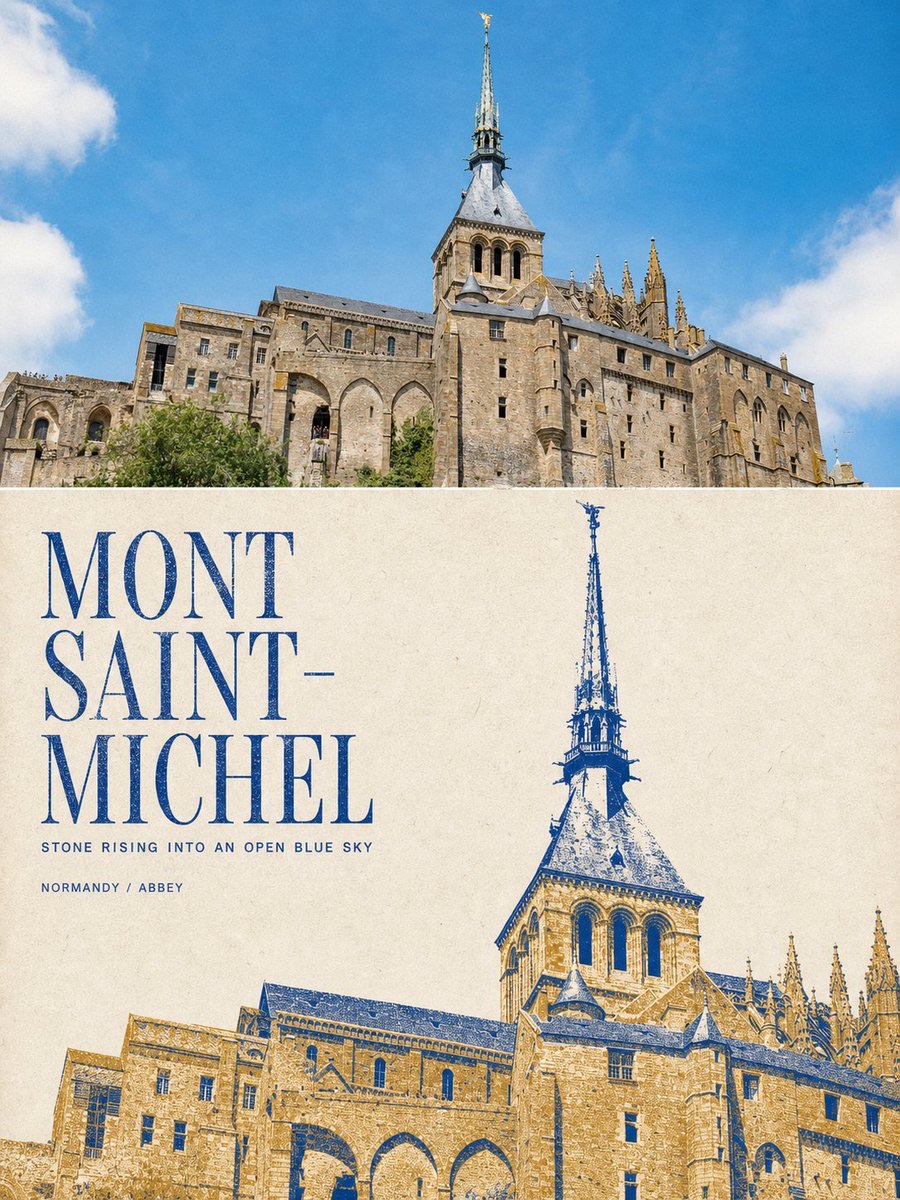
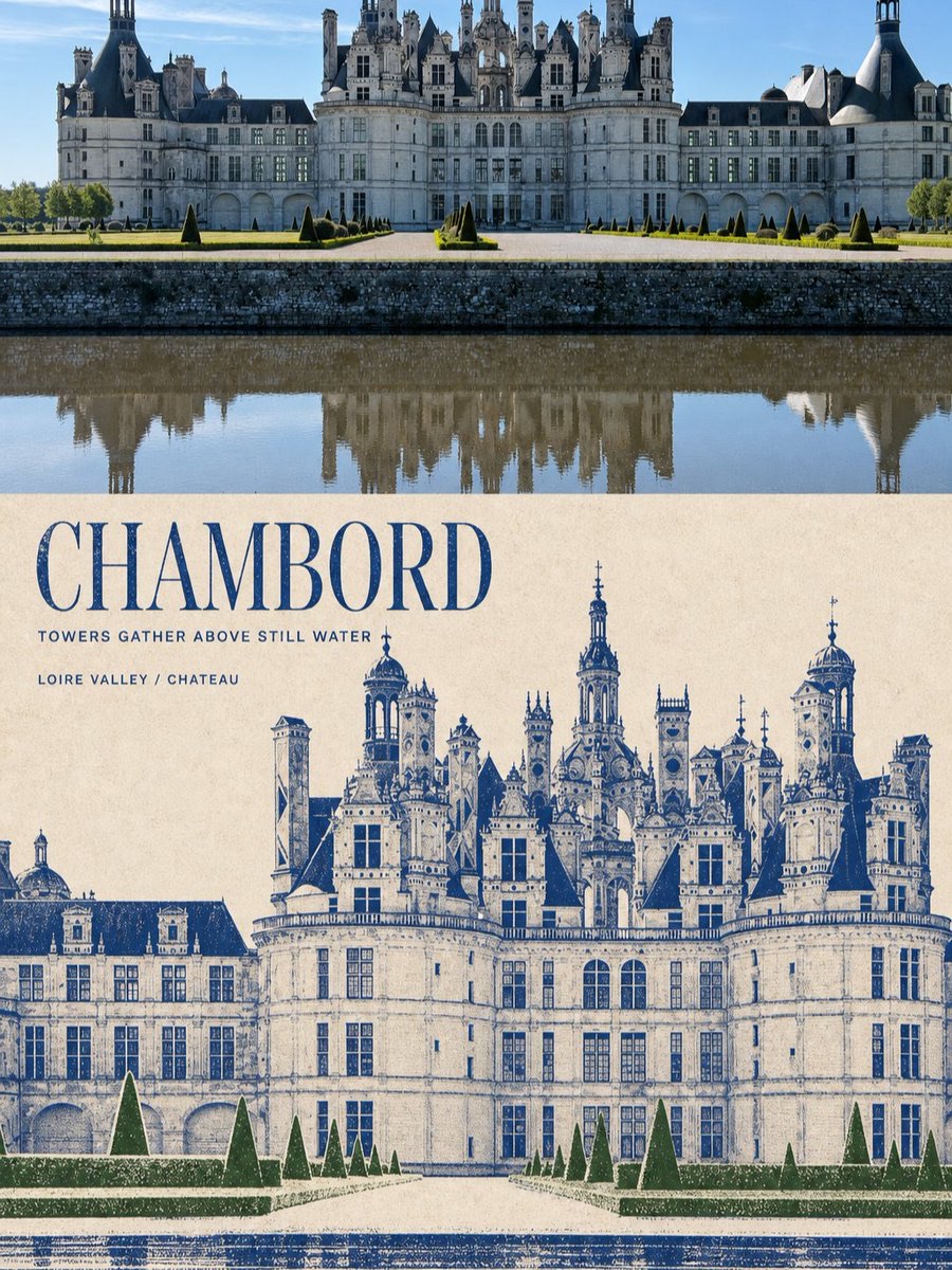
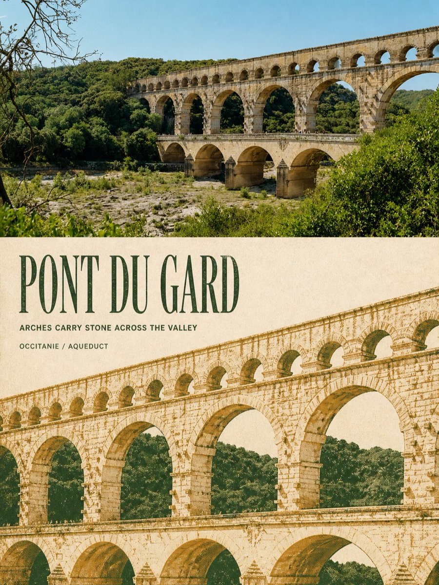
Turn each travel landmark photo into a separate 3:4 editorial poster with a top and bottom section: preserve a highly realistic photograph above, and below, reimagine the architecture as an engraving using extracted two-color spot inks, aged paper, halftone dots, and precise typography.
 蛋黄堡@Hamburgerai
Prompt
Create a separate premium design poster from each travel photo I upload. Do not combine multiple photos into a collage; output each photo separately.

Use a 3:4 vertical composition with two clear, substantial sections: the original photo occupies approximately 48%–52% of the top, and a two-color editorial reinterpretation of the same scene occupies approximately 48%–52% of the bottom. Separate the two sections with a perfectly straight, clear, restrained horizontal boundary. Do not feather, tear, or blend the boundary, and do not let architecture or text cross it.

The upper section must preserve the original photo itself rather than redraw it. Accurately retain the landmark’s identity, viewing angle, main structure, relationships between towers or domes, roof heights, rhythm of arches and windows, spatial relationship between the architecture and its surroundings, actual materials, natural lighting, and original color atmosphere. Apply only subtle premium photographic color grading and an extremely fine film grain to give it the feel of architecture magazines, art publications, and exhibition photography. To fit the format, you may crop naturally or carefully extend the sky, ground, and surroundings, but do not stretch, distort, mirror, move, alter, or invent the subject.

In the lower section, recreate the same landmark as a high-contrast, two-color screen-print/rough-grain engraved editorial poster on warm off-white, light oatmeal, or ivory aged paper. Strictly use only two matte spot colors extracted and distilled from the current photo, plus the paper color. Do not add a third colored ink. The first spot color handles architectural shadows, structural lines, and the main title; the second handles lit surfaces, local architectural colors, vegetation, or secondary text fields.

First understand the key structures that establish the landmark’s identity, then reorganize the scale, cropping, negative space, and visual center of the lower section. Do not copy the original composition and proportions of the photo above and simply add a halftone filter.

Actively choose a more striking secondary composition based on the current landmark’s most recognizable structures. You may enlarge a rose window, dome, spire, cluster of rooftops, sequence of arches, façade rhythm, or bridge framework; allow parts to extend beyond the image edges; and remove or reduce trees, squares, water, and distant views to a few halftone shadow shapes. The architecture must remain instantly recognizable, but the lower section must clearly differ from the live photograph above in the scale of the subject, cropping, background density, or spatial arrangement.

Keep approximately 28%–45% continuous aged-paper negative space in the lower section, so the architectural engraving, title, and open space form a publication-style layout together. Use the paper white between continuous arches, windows, and towers as important negative space; do not fill the entire background.

Use the authentic texture of two-color screen printing, old engravings, and cultural publications:

coarse controlled halftone dots, dry ink, ink starvation, uneven pigment coverage, chipped carved edges, rough paper tooth, exposed paper fibers, slight registration drift, small offset ink fringes, broken linework, matte pigment.

Halftone density must genuinely help shape the architecture’s depth, light and dark, and materials rather than acting as a uniform filter over a photo surface. Slight misregistration, ink loss, scratches, and paper showing through are allowed, but must not damage the landmark’s outline or turn it into glitch art.

Add a precise, restrained set of English typography to the lower section. Use the real place name or landmark name corresponding to the photo as the main title, preferably 1–3 English words, in an oversized, high-contrast, condensed editorial serif font, with generous letter spacing, forming a second visual framework with the architecture.

Under the main title, add one short English observation sentence drawn from the current image’s structure or atmosphere, then add a line stating the real location/building type. Every word must be precisely accurate and clearly legible, and should appear truly printed onto the paper in the same spot color as the image, with slight ink loss, paper grain, and natural registration errors, rather than as a floating digital text layer.

Generate only the text explicitly specified in the prompt. Do not add an author name, signature, brand, website, QR code, invented era, extended history, fake Chinese, garbled text, or meaningless numbers. Omit information that cannot be verified.

The overall style should evoke international architecture firms, museum cultural publications, independent travel magazines, archives of historic landmarks, and collectible screen-printed posters. The tone should be restrained, contemplative, monumental, tactile, and grounded in a clear cultural identity, with striking page design.

Avoid: missing source-photo comparison, tiny source thumbnail, full-poster redraw, same composition with a simple filter, generic landmark silhouette, altered architecture, invented cultural symbols, third spot color, ordinary duotone photo filter, uniform halftone overlay, clean vector tracing, smooth digital gradients, glossy 3D, watercolor wash, full background coverage, typography overload, fake Chinese, author name, signature, logo, watermark, gibberish.

Most important rule: the top must be a high-fidelity real photo that can be directly compared with the source; the bottom must be a two-color architectural engraving of the same landmark, distilled and actively recropped and rearranged. Do not only change the material; create a fresh visual impact using the landmark’s most recognizable structures, and let accurate small text grow naturally on the paper like ink.
请将我上传的每一张旅行照片分别制作成一张独立的高级设计海报,不多图拼接,每张照片单独输出。
整体采用3:4竖版构图,画面包含上下两个清晰、实质性的区域,上方约48%–52%为原始照片,下方约48%–52%为同一场景的双色文化地标编辑转绘。两部分之间使用完全笔直、清楚、克制的水平边界,不羽化、不撕裂、不互相渗透,也不要让建筑或文字跨越分界。
上半部分必须保留原始照片本身,而不是重新绘制。准确保持地标身份、观察角度、主体结构、塔楼或穹顶关系、屋顶高低、拱门与窗格节奏、建筑和周围环境的空间关系、真实材质、自然光影与原有色彩氛围。只进行轻微高级摄影调色和极薄胶片颗粒处理,使其具有建筑杂志、艺术出版物与展览摄影质感。为适配画幅,可以自然裁切或谨慎扩展天空、地面及周边环境,但不得拉伸、扭曲、镜像、移动、删改或虚构主体。
下半部分在温暖的米白色、浅燕麦色或象牙色旧纸上,将同一地标重新制作成高对比的双色丝网印刷/粗颗粒版画编辑海报。严格只使用从当前照片中提取并归纳的两种哑光专色,加上纸张本色,不得加入第三种彩色油墨。第一专色承担建筑暗部、结构线和主要标题;第二专色承担受光面、局部建筑色、植被或次要字段。
先理解决定地标身份的关键结构,再重新组织下半部分的尺度、裁切、留白和视觉重心。不要复制上方照片的原始构图和比例后简单添加网点滤镜。
根据当前地标最具识别度的结构,主动选择更有冲击力的二次构图:可以放大玫瑰窗、穹顶、塔尖、屋顶群、连续拱券、立面节奏或桥体骨架;允许局部从画面边缘出画;可以将树林、广场、水面和远景删除或压缩成少量网点暗面。建筑仍须一眼可认,但下半部分必须在主体尺度、裁切方式、背景密度或空间组织上与上方实拍形成明显差异。
下半部分保留约28%–45%的连续旧纸留白,让建筑版画、标题和空场共同形成出版物版面。连续拱洞、窗格、塔楼之间的纸白应作为重要的负形使用,不要铺满整个背景。
使用真实的双色丝网印刷、旧版画和文化出版物质感:
coarse controlled halftone dots, dry ink, ink starvation, uneven pigment coverage, chipped carved edges, rough paper tooth, exposed paper fibers, slight registration drift, small offset ink fringes, broken linework, matte pigment.
网点密度必须真正参与塑造建筑的远近、明暗和材质,而不是均匀覆盖在照片表面的滤镜。允许轻微套印偏差、脱墨、刮擦和纸张透底,但不能破坏地标轮廓,也不要演变为故障艺术。
下半部分加入一组准确、克制的英文排版。主标题使用照片对应的真实地点名或地标名,优先1–3个英文单词,采用超大、高对比、窄体的编辑衬线字体,字距舒展,与建筑共同形成第二视觉骨架。
主标题下方加入一句从当前画面结构或气氛中提炼的简短英文观察句,再加入一行真实地点/建筑类型字段。所有文字必须逐字准确、清晰可读,并像与图像使用同一专色真正印入纸面,带有轻微缺墨、纸纹和自然套印误差,而不是悬浮的数字排版图层。
只生成提示词明确给出的文字。不要添加作者名、签名、品牌、网址、二维码、虚构年代、长段历史、假中文、乱码或无意义编号。无法确认的信息直接省略。
整体参考国际建筑事务所、博物馆文化出版物、独立旅行杂志、历史地标档案和收藏级丝网印刷海报。气质克制、沉静、纪念性强、触感真实,并具有清楚的文化身份和版面冲击力。
Avoid: missing source-photo comparison, tiny source thumbnail, full-poster redraw, same composition with a simple filter, generic landmark silhouette, altered architecture, invented cultural symbols, third spot color, ordinary duotone photo filter, uniform halftone overlay, clean vector tracing, smooth digital gradients, glossy 3D, watercolor wash, full background coverage, typography overload, fake Chinese, author name, signature, logo, watermark, gibberish.
最重要的规则:上方必须是可以直接对照的高保真真实照片;下方必须是同一地标经过主动提炼、重新裁切和重新编排后的双色建筑版画。不要只更换材质,要用地标最有辨识度的结构制造新的视觉冲击,并让准确的小字像油墨一样自然生长在纸面上。
How to use
Usage tip: Upload clear travel landmark photos one at a time, and make sure the place name or building type can be verified. Suitable for travel publications, exhibition posters, and architectural archives. After generation, carefully check the landmark structure, English title, and location field for accuracy.
Details
More from 蛋黄堡
-

Travel Palette Watercolor Study Poster
-

Blue Halftone City Archive
-

Travel Photo to Glazed Mosaic Relief Poster
-

Clear White-Paper Travel Watercolor Editorial Poster
-

Vintage Matchbox Travel Label Poster
-

Travel Enamel Fridge Magnet Souvenir Poster
-

Material Assemblage Contrast Poster from a Travel Photo
-
Fabric-Collage Travel Memory Poster