
Image
Material Assemblage Contrast Poster from a Travel Photo
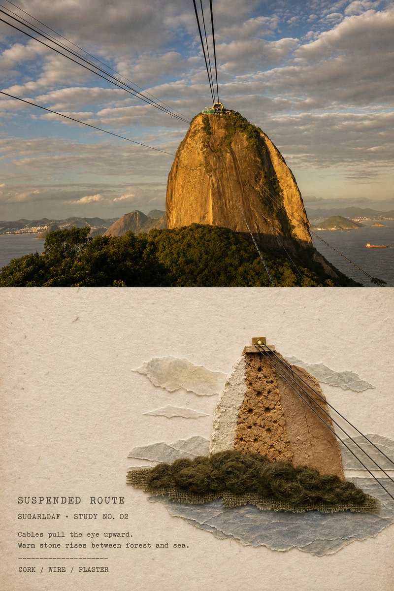
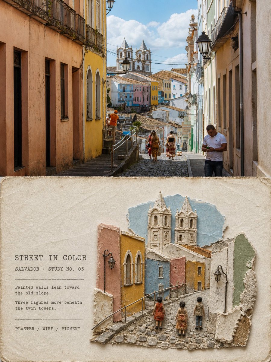
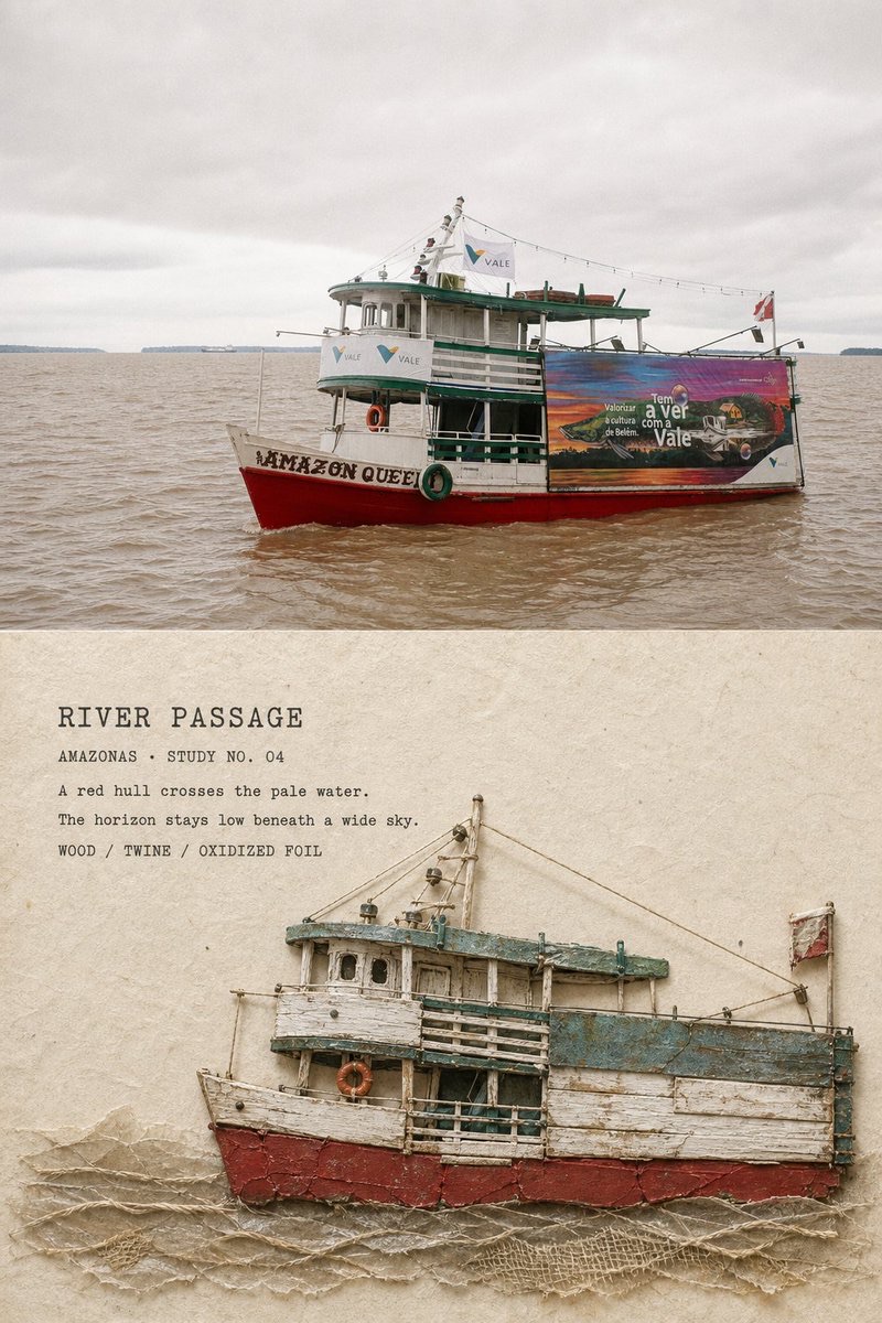
Turn each travel photo into a separate 3:4 vertical poster, preserving realistic photography in the top half and reorganizing the memory below with a variety of physical materials that carry meaning from the scene.
 蛋黄堡@Hamburgerai
Prompt
Please turn each travel photo I upload into its own premium contrast poster. Do not combine multiple photos; each photo must become a separate work.

Style name:

NAIVE MATERIAL ASSEMBLAGE POSTER | Contemporary Naïve Material Assemblage Poster

## Overall Structure

Use a 3:4 vertical composition.

Divide the image into an original photograph above and a material assemblage below:

- The top approximately 46%–50% is a high-fidelity original photo.
- The bottom approximately 50%–54% is a contemporary naïve material assemblage of the same scene.
- Keep the relationship between the two areas clear, but do not add a heavy, abrupt dividing line.
- Do not generate a frame, wall, hand-held display, or poster mockup.

The original photo must remain clearly recognizable and occupy a substantial area. Do not redraw the entire poster.

## Original Photo Above

Faithfully preserve the following in the original photo:

- The identity and number of subjects
- The pose, action, and direction of people or animals
- Key structures of buildings, vehicles, boats, or terrain
- The viewing angle and spatial relationships
- Realistic materials
- Natural light and shadow
- The original color atmosphere

Only apply subtle premium travel-magazine, independent-publication, or photography-exhibition color grading, with a very fine film grain.

For the layout, you may naturally crop or extend the sky, ground, water, or surrounding environment. Do not stretch, distort, mirror, move the subject, reshape buildings, replace the sky, or add or remove people.

The top must always look like a real photograph, not an illustration or AI-reconstructed image.

## Material Assemblage Below

Use warm off-white natural handmade paper as the background below.

Show the cotton-paper fibers, subtle texture, slight stains, and naturally matte finish clearly but with restraint. Leave a large, continuous area of bare paper so the material scene looks temporarily placed on it.

Do not faithfully recreate the whole photo, shrink it and fit it entirely into the lower half, or merely apply a paper, fabric, or grain filter to the photo.

First identify the truly recognizable content in the photo, then deliberately remove:

- Repeated buildings
- Dense vegetation
- Unrelated pedestrians
- Complicated signs
- Tiny windows
- Photographic noise
- Background details that do not affect recognition of the scene

Keep only one central subject and one to three necessary environmental clues.

The material assemblage should usually occupy approximately 42%–60% of the lower area. It may sit in the center or lower-middle, or shift slightly to follow the weight of the original subject. Leave generous breathing room around it.

## Material Semantics

Do not use one material to imitate the entire photo.

Choose real materials with physical meaning for each part of the scene. Use approximately 4–7 materials per work.

Possible pairings include:

- Mountains, rock faces, solid buildings: coarse paper pulp, bark, cork, plaster paper, old wood chips, clay fragments, graphite rubbings
- Snow, clouds, fog, distant scenery: cotton pulp paper, translucent tissue, gauze, chalk dust, wax paper
- Rivers, sea, reflections: tracing paper, crumpled wax paper, fine gauze, matte metallic foil
- Land, roads, cobblestones, sand dunes: sandpaper, clay fragments, burlap, ochre paper pulp, sand, and graphite smudges
- Trees and plants: twine, dried grass fibers, raw fabric edges, dyed wool
- People: coarse wool, strips of old fabric, charred fibers, or irregular fabric pieces
- Railings, cables, horizons, paths: fine wire, black thread, sewing thread, narrow paper strips, or graphite strokes
- Boats and vehicles: old wood chips, plaster paper, clay pieces, oxidized metallic foil, twine, and small amounts of fabric

Keep the number of people and their poses, direction of movement, and relationships the same as in the original photo, but do not depict facial features or clothing details.

Materials must look like real objects arranged, glued down, and photographed, not digitally rendered texture maps.

Clearly show:

- Ragged paper edges
- Bark cracks
- Cork holes
- Worn wood
- Charcoal and graphite smudges
- Plaster granules
- Curled edges
- Oxidation marks
- Loose threads
- Small traces of glue
- Misaligned, overlapping layers
- Small gaps between materials
- Natural, soft contact shadows

Materials may look slightly incongruous, temporary, asymmetrical, and clumsy, but the overall composition should remain restrained, perceptive, and characteristic of a contemporary art publication.

It should look as if an artist has rearranged a memory using materials found on a trip, not like a miniature landscape made by a meticulous model maker.

## Secondary Composition

Choose the most suitable approach for each photo; do not give every photo exactly the same lower layout.

### Reduce and Refine

Suitable for boats, vehicles, freestanding buildings, mountains, small groups of people, or landscapes with clear outlines.

The subject should occupy approximately 40%–65% of the width of the redrawn area. Leave large areas of bare paper around it and retain only the most important environmental relationships.

### Enlarge a Detail

Suitable for a building facade, mountain, rock face, road direction, or subject with strong action and contours.

You may crop part of the subject or let it extend past the natural edge of the material composition, but do not fill the entire lower half.

### Structure with Materials

Suitable for groups of buildings, streets, boats, and layered scenes.

Reassemble the same scene as a loose material construction rather than preserving the photo's complete perspective and proportions.

At least two of the following aspects of the redraw in the lower area must differ noticeably from the upper photo: subject scale, crop, amount of background retained, material relationships, or spatial arrangement.

## Color

Extract and simplify all colors from the original photo.

Preserve materials' natural, matte, low-saturation colors as much as possible. Use variations of the same color and nearby colors to create depth, retaining just one of the most distinctive colors as a focal point.

For example:

- A red boat hull
- A yellow exterior wall
- Blue doors and windows
- Warmly lit rock faces
- A piece of someone's clothing
- A green rooftop

Do not invent a fixed color scheme unrelated to the original photo or give every photo the same orange-and-blue treatment.

## Typography System

Add slightly richer editorial observation text below than you would on an ordinary minimalist poster, while keeping it subordinate to the material artwork rather than making it the main visual focus.

The text should be organized into 4–5 levels:

1. A main title of 1–3 English words
2. Place or scene theme + number
3. An observation about real space, weather, or action in the photo
4. A more specific description of the image
5. A line listing the materials

Example structure:

“SCENE TITLE”

“PLACE OR SUBJECT · STUDY NO. 01”

“A short observation about the visible atmosphere.”

“A second sentence about the subject or movement.”

“BARK / WIRE / PLASTER”

The observations must come from information actually visible in the photo. Do not invent a place, history, date, quote, coordinates, or story about a person.

Use:

- Small old-style typewriter serif type
- Graphite-rubbing lettering
- Broken type
- Light embossing
- Slight misalignment from hand-set typography

Arrange the text along the edge of the materials, in bare-paper areas, or along visual axes. It may break across two or three lines; do not squeeze all the information into one tiny line.

Text should cover approximately 5%–8% of the lower area. Keep it legible without covering people, defining architectural features, vehicles, boats, or major terrain.

Do not generate an author's name, signature, social media handle, brand logo, URL, QR code, invented coordinates, fake address, meaningless year, gibberish, or extra decorative text.

## Overall Mood

The overall feel should be:

Contemporary, naïve, restrained, quiet, natural, slightly clumsy, materially authentic, observant, and like a personal travel archive.

It should feel like an artist has used bark, old wood, wire, wool, plaster, wax paper, and fragments found on a trip to reassemble the photograph as a page in an independent publication.

This is not a neat handicraft or a realistic model, but a contemporary material work shaped through judgment, deletion, and reorganization.

## Strictly Avoid

Avoid:

single-material felt art, all-fabric collage, all-paper collage, embroidery picture, tufted rug, paper-cut illustration, scrapbook stickers, decorative craft supplies, children’s school project, polished miniature diorama, architectural scale model, glossy resin, plastic 3D, smooth digital illustration, clean vector geometry, complete background coverage, copied photographic composition, same-crop same-scale redraw, duplicated figures, changed poses, excessive typography, floating digital text, fake logo, watermark, QR code, invented coordinates, gibberish text.

Most important rule:

Different materials must convey different scenery and spatial meanings. Materials may be rough, misaligned, and incongruous, but the subject, place-defining features, relationships between people, and story in the photo must still be immediately recognizable.
请将我上传的每一张旅行照片分别制作成一张独立的高级对比海报。不要多图拼接,一张照片对应一张独立作品。
风格名称:
NAIVE MATERIAL ASSEMBLAGE POSTER|当代拙朴材料拼构海报
## 整体结构
采用3:4竖版构图。
画面由原始摄影与材料拼构上下组成:
- 上方约46%—50%为高保真原始照片
- 下方约50%—54%为同一场景的当代拙朴材料拼构
- 两个区域关系清晰,但不要添加粗重、突兀的分隔线
- 不要生成相框、墙面、手持展示或海报Mockup
必须保留具有实质面积、清楚可辨的原始照片对比,不得把整张海报全部转绘。
## 上方原始照片
忠实保留原始照片中的:
- 主体身份与数量
- 人物或动物的姿态、动作和方向
- 建筑、车辆、船只或地形的关键结构
- 观察角度与空间关系
- 真实材质
- 自然光影
- 原有色彩氛围
仅进行轻微的高级旅行杂志、独立出版物或摄影展调色,并加入极薄的胶片颗粒。
为适配版式,可以自然裁切或延展天空、地面、水面及周边环境,但不得拉伸、扭曲、镜像、移动主体、重塑建筑、替换天空或增删人物。
上方必须始终看起来是一张真实摄影作品,而不是插画或AI重建画面。
## 下方材料拼构
下方使用温暖的米白色天然手工纸作为背景。
纸张具有清楚但克制的棉纸纤维、细微凹凸、轻微污迹和自然哑光质感。保留大面积连续裸纸,让材料场景像被临时安放在纸上。
不要完整复刻照片,不要把原始场景缩小后全部塞进下方,也不要只是给照片增加纸张、布料或颗粒滤镜。
先理解照片中真正具有识别度的内容,再主动删除:
- 重复建筑
- 密集植被
- 无关行人
- 复杂招牌
- 微小窗户
- 摄影噪声
- 无法影响场景识别的背景细节
只保留一个核心主体,以及一至三组必要的环境线索。
材料拼构通常占下方区域约42%—60%,可以放在中央、中下部或顺应原始主体重心稍微偏移。四周必须保留充分呼吸空间。
## 材料语义
这不是使用一种材料模拟整张照片。
根据照片中的不同景物,为每一部分选择具有物理意义的真实材料。每张作品使用约4—7种材料即可。
可参考以下对应关系:
- 山体、岩壁、建筑实体:粗纸浆、树皮、软木、石膏纸、旧木片、陶土碎片、石墨拓印
- 雪、云、雾和远景:棉浆纸、半透明薄纸、纱布、粉笔灰、蜡纸
- 河流、海面和倒影:硫酸纸、皱蜡纸、薄纱、哑光金属箔
- 土地、道路、石街和沙丘:砂纸、陶土碎片、麻布、赭色纸浆、沙粒和石墨擦痕
- 树木与植物:麻线、干草纤维、粗布毛边、染色羊毛
- 人物:粗羊毛、旧布条、炭化纤维或不规则布块
- 栏杆、缆索、地平线和路径:细铁丝、黑线、缝线、窄纸条或石墨拖痕
- 船只和交通工具:旧木片、石膏纸、陶土片、氧化金属箔、麻线和少量布料
人物保持原照片中的数量、姿态、动作方向与相互关系,但不描绘五官和服装细节。
材料必须像真实物件被摆放、粘贴并摄影记录,而不是数字绘制的材质贴图。
清楚表现:
- 纸张毛边
- 树皮裂口
- 软木孔洞
- 木材磨损
- 炭粉与石墨擦痕
- 石膏颗粒
- 卷曲边缘
- 氧化痕迹
- 松散线头
- 少量胶痕
- 错位叠压
- 材料之间的小缝隙
- 真实而柔和的接触阴影
允许材料之间略显不协调、临时、不对称和笨拙,但整体构图必须克制、敏锐、具有当代艺术出版物气质。
它应该像艺术家用旅途中捡到的材料重新组织一段记忆,而不是精致模型师制作的微缩景观。
## 二次构图
根据照片选择一种最适合的方式,不要所有照片使用完全相同的下方布局。
### 缩小提炼
适合船只、车辆、单体建筑、山体、少量人物或具有清楚轮廓的景观。
主体占转绘区宽度约40%—65%,四周保留大面积纸白,只留下最重要的环境关系。
### 局部放大
适合轮廓强烈的建筑立面、山体、岩壁、道路方向或具有强烈动作的主体。
允许主体局部裁切或超出材料组合的自然边缘,但不能铺满整个下半区域。
### 实体结构化
适合建筑群、街道、船只和具有层级关系的场景。
将同一场景重组为一件松散的材料构成物,而不是沿用照片完整透视和相同比例。
下方转绘至少应在主体尺度、裁切、背景保留量、材料关系和空间组织中的两项明显不同于上方照片。
## 配色
颜色完全从原始照片中提取并压缩。
材料尽量保留天然、哑光、低饱和的本色。使用同色深浅和邻近色区分层次,只保留一处最有识别度的关键颜色作为视觉焦点。
例如:
- 红色船底
- 黄色外墙
- 蓝色门窗
- 暖光岩壁
- 一件人物服装
- 一处绿色屋顶
不要凭空加入与原照片无关的固定配色,也不要把所有照片统一处理成相同的橙蓝色。
## 文字系统
下方加入比普通极简海报稍丰富的编辑观察文字,但文字仍然服从材料作品,不得成为主要视觉中心。
文字建议分成4—5个层级:
1. 一个1—3个英文单词的主标题
2. 地点或场景主题+编号
3. 一句描述照片中真实空间、天气或动作的观察
4. 一句更具体的画面描述
5. 一行材料索引
参考结构:
“SCENE TITLE”
“PLACE OR SUBJECT · STUDY NO. 01”
“A short observation about the visible atmosphere.”
“A second sentence about the subject or movement.”
“BARK / WIRE / PLASTER”
观察文字必须来自照片中真实可见的信息,不得编造地点、历史、日期、引用、坐标或人物故事。
字体采用:
- 小号旧打字机衬线体
- 石墨拓印字
- 缺墨铅字
- 轻微压印
- 手工排版产生的小幅错位
文字可以沿材料边缘、裸纸区域或视觉轴线排列。允许断成两三行,不要把所有信息挤成一条细小横线。
文字面积建议占下方约5%—8%,保持清楚可读,但不得覆盖人物、建筑身份结构、车辆、船体或主要地形。
不要生成作者名字、签名、社交账号、品牌Logo、网址、二维码、虚构坐标、假地址、无意义年份、乱码或多余装饰文字。
## 整体气质
整体应具有:
当代、拙朴、克制、安静、自然、略显笨拙、材料真实、富有观察感和私人旅行档案气质。
像艺术家使用树皮、旧木、铁丝、羊毛、石膏、蜡纸和旅途中捡到的碎片,将照片重新拼成一页独立出版物。
不是整齐的手工艺品,也不是写实模型,而是一件经过判断、删除和重新组织的当代材料作品。
## 强制避免
Avoid:
single-material felt art, all-fabric collage, all-paper collage, embroidery picture, tufted rug, paper-cut illustration, scrapbook stickers, decorative craft supplies, children’s school project, polished miniature diorama, architectural scale model, glossy resin, plastic 3D, smooth digital illustration, clean vector geometry, complete background coverage, copied photographic composition, same-crop same-scale redraw, duplicated figures, changed poses, excessive typography, floating digital text, fake logo, watermark, QR code, invented coordinates, gibberish text.
最重要的规则:
不同材料必须承担不同的景物与空间语义。材料可以粗糙、错位和不协调,但照片里的主体、地点特征、人物关系与故事仍然必须一眼可辨。
How to use
Usage suggestion: After uploading a travel photo, choose materials and a composition based on its subjects and environmental clues. Generate text only from information visible in the photo, and check that the original photography and material assemblage areas contrast clearly.
Details
More from 蛋黄堡
-

Travel Palette Watercolor Study Poster
-

Blue Halftone City Archive
-

Travel Photo to Glazed Mosaic Relief Poster
-

Clear White-Paper Travel Watercolor Editorial Poster
-

Vintage Matchbox Travel Label Poster
-

Travel Enamel Fridge Magnet Souvenir Poster
-

Two-Color Cultural Landmark Editorial Poster
-
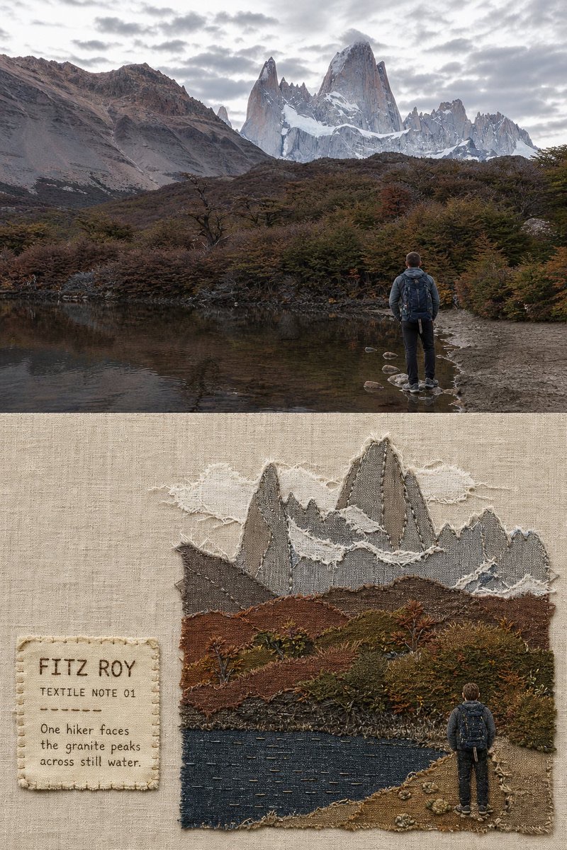
Fabric-Collage Travel Memory Poster