
Image
Clear White-Paper Travel Watercolor Editorial Poster
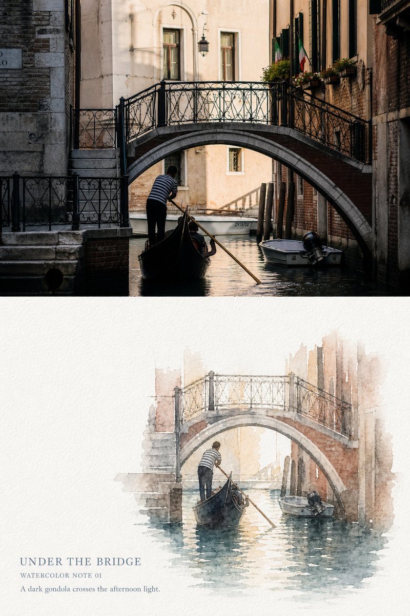
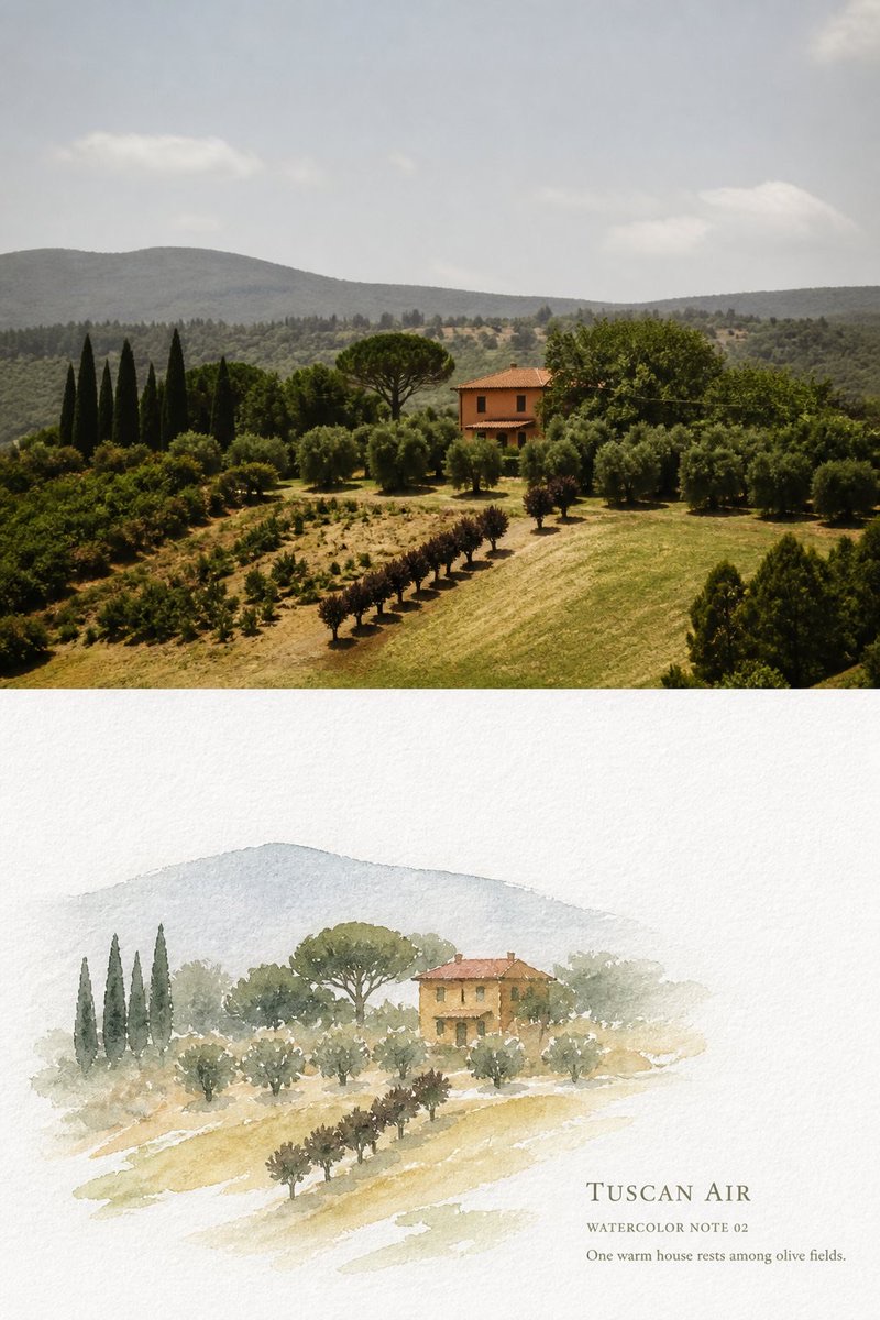
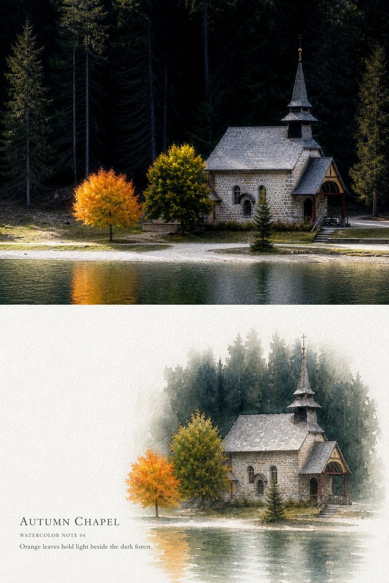
Turn each travel photo into a separate, vertically divided 3:4 travel editorial poster. Preserve high-fidelity photography in the upper section, and distill the visual memory of the same scene below using transparent watercolor and generous paper white.
 蛋黄堡@Hamburgerai
Prompt
Please turn each travel photo I upload into a separate, premium watercolor editorial poster. Do not combine multiple photos; output each photo on its own.

Use a 3:4 portrait composition, divided by default into two clear sections: the upper section, about 45%–50%, faithfully preserves the original photo; the lower section, about 50%–55%, distills the same scene into “clear white-paper travel watercolor.”

Separate the two sections with a clear, horizontal, restrained boundary. Do not blend them with a gradient or let watercolor paper texture or pigment spill into the photographic section.

[Upper section: high-fidelity original photo]

Accurately preserve the identity and number of subjects in the photo, the poses of people or animals, the direction of boats or vehicles, architectural structures, bridge outlines, the lie of the land, shorelines, water, trees, relative positions, viewing angle, real materials, natural light and shadow, and the original color atmosphere.

Apply only subtle color grading in the style of a travel art magazine, independent publication, or photography exhibition, and add very fine film grain. The upper section must still clearly read as a real photograph. Do not turn it into an illustration, redraw it, move subjects, replace buildings, change people's poses, or invent new travel elements.

To fit the aspect ratio, you may crop naturally or use clean paper-colored margins. Do not stretch, mirror, duplicate subjects, blur-fill the edges, or alter the original perspective.

[Lower section: clear white-paper travel watercolor]

Use content only from the same photo shown above.

Choose one visually distinctive anchor from the photo, such as a boat, bridge, isolated house, church, vehicle, person, tree, or clearly recognizable building silhouette, and retain one to three environmental cues that convey the location and spatial relationships.

The lower section is not a photo filter, nor should it depict the entire photo in watercolor with the same crop and proportions. Actively remove much of the background, change the scale of the subject and the spatial arrangement, and condense the same scene into a few airy, clear watercolor memory shapes.

The watercolor subject usually occupies about 48%–70% of the lower section's width and about 38%–58% of its height. It may be centered or placed to the left or right. Leave open space in front of the subject's direction: water in front of a boat, sky above a house or mountain peak, and paper white in front of a person's gaze.

Do not shrink the entire background to fit inside the watercolor shape.

For buildings, retain only the roof, bridge arch, spire, main window band, or facade color blocks; for cities and hillsides, retain only two or three layers of spatial depth; paint only a few broken reflections on the water; simplify trees into a few transparent shapes of color; and keep only the key outlines needed to preserve the identity and action of people, boats, and vehicles.

As the pigment approaches the image edges, let it gradually fade, break up, and stop naturally. The watercolor shape must not have a regular rectangular border. Let its outer edges disappear naturally into the paper through water marks, broken strokes, semi-dry brushwork, transparent color edges, and unfinished outlines.

[Watercolor and paper texture]

Use bright, natural white, cold-pressed cotton watercolor paper, not aged, yellowish paper. The paper should have visible yet delicate fibers, slight texture, and a matte surface.

Use transparent watercolor with plenty of water, clean-water edges, and a little dry brushwork:

transparent high-water watercolor,
luminous preserved paper white,
cold-pressed cotton paper grain,
translucent layered washes,
wet-on-wet blooms,
subtle pigment granulation,
natural backruns and tide marks,
broken dry-brush texture,
soft and crisp edge variation,
unfinished fading edges.

Let the paper itself provide all highlights, atmosphere, water glints, and pale buildings. Do not use opaque white paint to create highlights.

First establish one or two main environmental colors with extremely pale transparent washes, then layer a small amount of richer, still-transparent color over key parts of the subject. Preserve natural water marks, pigment granulation, backruns, and visible paper grain within the color shapes.

Some areas may have crisp dry edges, but do not outline every object completely.

Use only a very small amount of fine, light warm-gray pencil, pale gray-brown ink, or broken watercolor-pencil lines for key structural details. Do not use black pen to outline buildings, leaves, people, or water completely.

[Negative space]

Continuous natural paper white in the lower section usually occupies about 40%–60%. The negative space must be a single, complete, bright, visibly perceptible open area, not just tiny gaps that happen to appear between objects.

Paper white represents both the unpainted paper and the air, sunlight, sky, moisture in the air, distance, walls, or reflections on the water in the photo.

It should form a clear contrast with the watercolor subject in scale, visual weight, and color intensity, and provide a stable place for text.

The image must have the feeling of “keeping only the colors most worth remembering and leaving the rest to the white paper.”

[Color]

Extract 4–7 main colors from the upper photo, increase the overall brightness, reduce stray colors, and dilute them with plenty of clean water. Preserve the original photo's true warm-cool relationships and one color that is especially distinctive.

Dark water with pale pink walls, dry-grass yellow with olive green, Mediterranean blue with warm-colored buildings, and deep forest green with autumn-leaf orange may each form the color core of a different image. Do not force every photo into a template of pale blue, pink, or candy colors.

One color that truly appears in the photo may remain relatively pure, such as a boat's dark hull, the ochre-red of a tiled roof, the blue-green of the sea, a vehicle's color, or autumn foliage in orange-yellow. Let the other colors recede into the paper white.

Build dark areas with transparent layered washes and shifts in hue. Do not use large areas of pure black, airbrushed gray haze, or opaque gouache.

[Text and layout]

Add a light, clear travel caption set in the continuous white-paper area below, naturally integrated with the watercolor medium.

Determine the content from what is actually visible in the photo, then render it verbatim:

1. A main title of 1–3 English words;
2. A watercolor field label, such as “WATERCOLOR NOTE 01”;
3. An observation sentence of 5–12 English words describing a subject, action, color, weather, or spatial relationship actually visible in the photo.

Use a fine, gentle serif, light graphite handwriting, or watercolor-pencil typeface for the main title. It must remain clearly readable at chat preview size. The field label and observation sentence should be smaller, but must not be reduced to decorative gray lines.

Draw text colors from the quietest gray-blue, gray-brown, olive-gray, or pale ochre in the image, with subtly textured edges, broken ink, and uneven pigment.

Keep the caption together as a single group in the continuous white-paper area. Do not cross over the subject or scatter text evenly in the four corners, and do not use a smooth digital-interface font.

If the location cannot be confirmed, write only the scene's theme. Do not guess the city, building name, date, year, or coordinates.

No author name, signature, social media account, fabricated quotation, brand, logo, QR code, URL, fake Chinese characters, or gibberish.

[Overall mood]

The overall image should be bright, quiet, airy, clear, and restrained without looking pale, like a transparent watercolor study in a travel book with plenty of room to breathe.

The watercolor is not meant to reproduce every detail in the photo. It preserves the subject, color, and light that are clearest in the memory of that moment.

The upper section records the real travel scene; the lower section is like a small patch of transparent color left on white paper by a memory. The two sections must clearly correspond at a glance, while differing markedly in composition density, subject scale, and spatial arrangement.

[Strongly avoid]

Avoid making the entire poster watercolor, omitting a clear contrast with the original photo, redrawing the photographic section, using the same crop and subject proportions in both sections, covering the page with watercolor, copying the entire background, making the result feel like a photo filter, using hazy low contrast, covering the whole image with pink mist, creating highlights with opaque white gouache, drawing hard black-pen outlines, densely sketching buildings, rendering every leaf and blade of grass, using uniform digital watercolor brushes, smooth gradients, airbrushed halos, splattering pigment everywhere, traditional East Asian ink wash, oil paint, acrylic, gouache as the dominant medium, children's-book art, anime, 3D, postcard borders, color swatches, tape, stickers, ticket decorations, adding flowers, birds, vehicles, or travel icons from nowhere, fake handwriting, author names, signatures, logos, watermarks, frames, walls, or handheld mockups.

Most important rule: preserve the paper first, then decide what to paint. Brightness comes from the relationship between natural paper white and transparent pigment; leave on the paper only the colors needed to preserve the subject, location, and light of the moment.
请将我上传的每一张旅行照片分别制作成一张独立的高级水彩编辑海报,不多图拼接,每张照片单独输出。
整体采用3:4竖版构图,默认分为上下两个清晰区域:上方约占45%–50%,忠实保留真实原始照片;下方约占50%–55%,将同一场景重新提炼为“澄明纸白旅行水彩”。
上下区域使用清楚、水平、克制的边界,不做渐变融合,不让水彩纸纹和颜料污染摄影区域。
【上方:高保真原始照片】
准确保留照片中的主体身份与数量、人物或动物姿态、船只或车辆方向、建筑结构、桥梁轮廓、地形走势、岸线、水面、树木、相对位置、观察角度、真实材质、自然光影和原有色彩氛围。
只进行轻微的旅行艺术杂志、独立出版物与摄影展式调色,并加入极薄胶片颗粒。上方必须仍然明确是一张真实摄影作品,不得插画化、重绘、移动主体、替换建筑、改变人物姿态或发明新的旅行元素。
为适配画幅可以自然裁切或使用干净纸色边距,不得拉伸、镜像、复制主体、模糊补边或改变原始透视。
【下方:澄明纸白旅行水彩】
只从上方同一张照片提取内容。
选择照片中最具识别度的一个视觉锚点,例如一艘船、一座桥、一栋孤屋、一间教堂、一辆车、一个人物、一棵树或一处明确建筑轮廓,并保留一至三条能够说明地点和空间关系的环境线索。
下方不是照片滤镜,也不是按照相同裁切、相同比例把整张照片画成水彩。必须主动删除大量背景、改变主体尺度和空间组织,把同一场景压缩成一组轻盈、澄明的水彩记忆团块。
水彩主体通常占下方宽度约48%–70%、高度约38%–58%,可放在中央、偏左或偏右。根据主体方向保留迎面空间:船前方留水,房屋或山峰上方留天空,人物视线前方留纸白。
不要把完整背景缩小塞进水彩团块。
建筑只保留屋顶、桥拱、塔尖、主要窗带或立面色块;城市与山坡只保留两至三层空间关系;水面只画少量断续反光;树木归纳为几团透明色形;人物、船与车辆只留下维持身份和动作所需的关键轮廓。
让颜料在接近画面边缘时逐渐变淡、断开并自然停止。水彩团块没有规则矩形边框,外围由水痕、断笔、半干刷、透明色边和未完成轮廓自然消失到纸张中。
【水彩与纸张质感】
使用明亮的天然白色冷压棉浆水彩纸,而不是米黄色旧纸。纸张具有可见但细腻的纤维、轻微凹凸和哑光表面。
使用高含水量的透明水彩、清水边缘和少量干刷:
transparent high-water watercolor,
luminous preserved paper white,
cold-pressed cotton paper grain,
translucent layered washes,
wet-on-wet blooms,
subtle pigment granulation,
natural backruns and tide marks,
broken dry-brush texture,
soft and crisp edge variation,
unfinished fading edges.
纸张自身承担所有最高光、空气、水面闪光和浅色建筑,不使用不透明白色颜料覆盖制造亮部。
先以极淡透明色层确定一到两块主要环境色,再在主体关键处叠加少量较浓但仍透明的颜色。色块内部保留自然水痕、颗粒沉积、回流边和纸纹透底。
局部可以出现清楚干边,但不要把每个物体完整描边。
只在主体关键结构使用极少量细而浅的暖灰铅笔线、灰褐淡墨线或水彩铅笔断线。禁止使用黑色钢笔完整勾勒建筑、树叶、人物与水面。
【留白】
下方连续天然纸白通常占约40%–60%。留白必须是一块完整、明亮、肉眼可感知的空场,而不是物体之间偶然出现的细小缝隙。
纸白既代表未被绘制的纸张,也代表照片中的空气、阳光、天空、水汽、距离、墙面或水面反光。
它应与水彩主体形成明显的大小、轻重和浓淡对比,并为文字提供稳定位置。
画面必须具有“只留下最值得记住的颜色,其余交给白纸”的感觉。
【色彩】
从上方照片提取4–7个主要颜色,提高整体明度,减少杂色,并使用大量清水稀释。保留原照片真实的冷暖关系和一处最具识别度的颜色。
照片中的暗水与粉墙、干草黄与橄榄绿、地中海蓝与暖色建筑、深林绿与秋叶橙,都可以形成不同画面的色彩核心;不得把所有照片固定成浅蓝、粉色或糖果色模板。
允许一处真实存在的颜色保持较纯,例如船身深色、瓦屋顶赭红、海水青蓝、车辆颜色或秋树橙黄。其余色彩向纸白退让。
暗部使用透明叠染和色相变化,不使用大块纯黑、灰雾喷枪或不透明水粉。
【文字与版式】
在下方连续纸白中加入一组轻盈、清楚、与水彩媒介自然融合的旅行题签。
根据照片真实内容预先确定并逐字生成:
1. 一个1–3个英文单词的主标题;
2. 一个水彩字段,例如“WATERCOLOR NOTE 01”;
3. 一句5–12个英文单词的观察句,描述照片中真实可见的主体、动作、颜色、天气或空间关系。
主标题使用细而温和的衬线字体、淡石墨手写体或水彩铅笔字体,在聊天预览尺寸下必须清楚可读;字段与观察句更小,但不能缩成装饰性灰线。
文字颜色从画面中最安静的灰蓝、灰褐、橄榄灰或淡赭色提取,边缘带轻微纸齿、断墨和颜料不均。
题签集中为一组,放在连续纸白中,不跨越主体,不在四角平均散布,不使用光滑的数字界面字体。
无法确认地点时只写场景主题,不猜测城市、建筑名、日期、年份或坐标。
禁止作者名、签名、社交账号、虚构引用、品牌、Logo、二维码、网址、假中文和乱码。
【整体气质】
整体明亮、安静、轻盈、清澈、克制而不苍白,像旅行画册中一张保留了大量呼吸空间的透明水彩研究。
水彩不是用来复制照片的所有信息,而是保存当时最清楚的一处主体、颜色与光。
上方记录真实发生的旅行现场;下方像记忆在白纸上留下的一小片透明颜色。两者必须能一眼互相对应,但构图密度、主体尺度和空间组织明显不同。
【强制避免】
避免整张海报全部水彩化、缺少清楚的原始照片对比、摄影区被重绘、上下相同裁切相同主体比例、满版水彩覆盖、完整背景临摹、照片滤镜感、灰蒙低对比、粉雾覆盖全部画面、不透明白色水粉高光、硬黑钢笔轮廓、密集建筑速写、逐片树叶和逐根草、均匀数字水彩笔刷、平滑渐变、喷枪光晕、到处飞溅颜料、传统东方水墨、油画、丙烯、水粉主导、儿童绘本、动漫、3D、明信片边框、色卡、胶带、贴纸、票据装饰、凭空增加花朵、飞鸟、车辆或旅行图标、假手写文字、作者名、签名、Logo、水印、相框、墙面和手持Mockup。
最重要的规则:先保留纸,再决定画什么。亮度来自天然纸白和透明颜料的关系;只让维持主体、地点与当下光线所必需的颜色留在纸上。
How to use
Usage suggestion: Upload one or more travel photos and generate each separately. Make sure the subjects and surroundings in each photo are clearly recognizable, and check that the English title, caption, and observation sentence match what is actually shown.
Details
More from 蛋黄堡
-

Travel Palette Watercolor Study Poster
-

Blue Halftone City Archive
-

Travel Photo to Glazed Mosaic Relief Poster
-

Vintage Matchbox Travel Label Poster
-

Travel Enamel Fridge Magnet Souvenir Poster
-

Two-Color Cultural Landmark Editorial Poster
-

Material Assemblage Contrast Poster from a Travel Photo
-
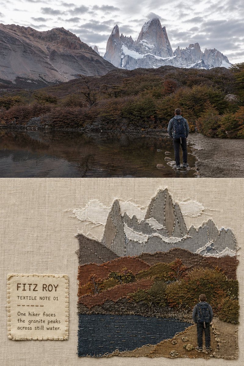
Fabric-Collage Travel Memory Poster