
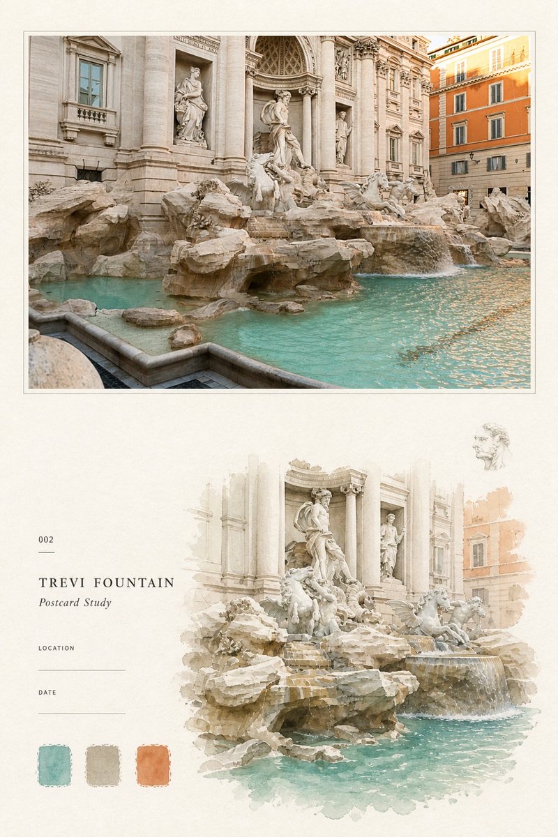
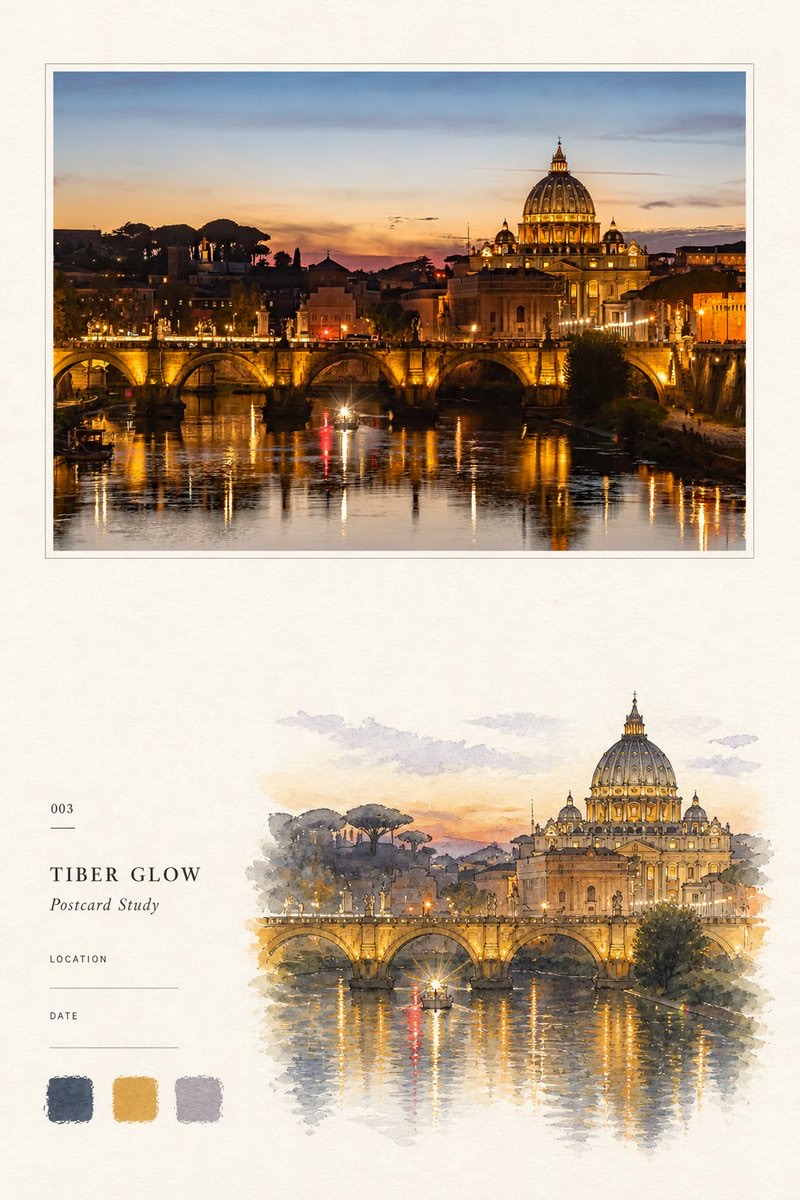
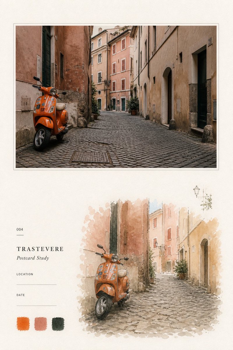
Image
Travel Palette Watercolor Study Poster
Arrange each travel photo into a separate 2:3 vertical observation page: at the top, keep the high-fidelity photo; below, use a selective watercolor study, travel archive text, and exactly three hand-painted color swatches derived from the photo to form a restrained editorial layout.
 蛋黄堡@Hamburgerai
Prompt
Please turn each photo I upload into a separate premium travel palette watercolor study poster, with each photo output on its own and no multi-image collage. The whole piece must be completed in a single image generation, without code-based compositing.

Overall, use a 2:3 vertical composition on warm ivory natural watercolor paper as the full canvas. The page contains four mutually echoing parts: a high-fidelity original photo, a same-scene watercolor study, travel archive text, and three hand-painted color swatches extracted from the photo.

Overall, keep large areas of unpainted paper, like a carefully organized travel observation note page, rather than an information-dense color chart or an ordinary top-bottom split template.

## Original Photo

Place a large, high-fidelity original photo at the top of the page, occupying about 44%–48% of the page height and 86%–90% of its width.

Keep a narrow, even ivory photo-paper border around the photo, and use a very fine warm-gray outline to create a restrained postcard or archival photo-mounting feel.

The photo must faithfully preserve from the uploaded image:

- subject identity and number of subjects
- pose of people or animals
- buildings, terrain, roads, and water surfaces
- core objects and viewing angle
- relative positions and spatial relationships
- real materials and natural light and shadow
- original color atmosphere

Apply only very slight premium travel-publication color grading and thin film grain.

Do not move, replace, or redesign the subject; do not add or remove people, change building structures, reshape terrain, mirror, duplicate, stretch, or distort the image.

To fit the photo frame, you may naturally extend the sky, ground, or environment edges, but do not fill with a blurred copy of the photo.

## Watercolor Study

In the lower right area of the page, reinterpret the same photo as a restrained-size hand-painted watercolor observation sketch, occupying about 54%–62% of the page width and 26%–32% of its height.

The watercolor study must keep the most important subject, outline, pose, direction, terrain, and narrative relationships of the original photo, so viewers can recognize the original scene at a glance.

However, do not fully replicate the photo's framing, subject proportions, or information density.

First select one to three of the most recognizable visual anchors from the photo, then reduce, crop, and reorganize them. Actively remove complex backgrounds, photographic light and shadow, fine textures, repeated structures, and irrelevant clutter.

Adapt by subject type:

- Natural landscapes: keep the relationship of mountains and water, shorelines, terrain direction, tree groves, and weather character
- Architectural scenes: keep the most distinctive roofs, facades, door and window proportions, roads, and surrounding plants
- Urban scenes: keep street direction, key buildings, vehicles, and a few person relationships
- People or animals: keep number, pose, hairstyle, main clothing colors, and key props, with facial features de-emphasized
- Still lifes and travel objects: keep overall silhouette, main material colors, openings, handles, and iconic structures

The watercolor must have a real, loose, selective hand-painted quality:

transparent watercolor layers, controlled wash, cold-pressed paper grain, dry-brush edges, broken pigment, subtle granulation, uneven pigment pooling, partially exposed paper, unfinished dissolving margins, restrained loose ink or pencil traces.

Watercolor edges must not form a complete rectangle, and must not cover the whole background.

Let parts of clouds, trees, roads, mountains, buildings, or figure outlines break off naturally and dissolve into the paper. Pigment may overlap locally, but must not turn the whole page into a large transparent watercolor wash.

The watercolor study should be lighter and sparser than the photo, and clearly differ from the photo above in subject scale, crop, background retention, and information density.

You may add one or two very small, very faint local observations, such as a cloud, a tree branch, a roof section, a bird, a street lamp, or an iconic object.

These elements must come from the original photo, must not add unrelated decoration, and must not form a second visual center.

## Travel Archive Text

In the lower left area, set a narrow, restrained column of travel archive information, keeping a clear distance from the watercolor and not overlapping it.

Place in order:

"[three-digit number, e.g. 001]"

a very short thin horizontal line

"[1—3个英文单词的地点或主题标题]"

"Postcard Study"

"LOCATION" and a blank writing line

"DATE" and a blank writing line

Set the number in very small vintage letterpress or monospaced type.

Set the English main title in small, widely letterspaced, high-contrast serif capitals.

Set "Postcard Study" in smaller italic serif.

Set "LOCATION" and "DATE" in very small uppercase sans-serif.

All text uses gentle charcoal or deep grayish-brown, kept accurate, clear, and restrained.

If the user does not provide a number, a three-digit number may be used automatically.

The title should be derived from the photo's real location, architecture, subject, or theme. If the specific location cannot be confirmed, use a general scene title; do not invent place names.

LOCATION and DATE default to blank writing lines; do not fill in fictional information.

Apart from the text above, do not add brands, logos, author names, URLs, QR codes, long copy, or irrelevant annotations.

## Three Swatches

Below the archive text, place exactly three separate hand-painted watercolor swatches.

Arrange the three swatches horizontally, similar in size and evenly spaced, with no text labels, color codes, HEX values, or Pantone numbers.

The three colors must each be extracted from the current original photo:

1. One color that best represents the main subject or dominant environmental color of the scene
2. One dark color responsible for structure, shadow, and spatial depth
3. One light or accent color responsible for air, highlights, or the place's character

Each photo must be newly analyzed and its colors newly selected; do not apply a fixed swatch set to all works.

The swatches should look like brush color tests painted directly on paper:

- irregular hand-painted rectangles
- dry-brush edges
- variation in pigment density
- slight transparency
- visible paper grain
- a small amount of pigment settling

Do not make them clean digital squares, UI components, colored circles, or printed color chips.

Exactly three swatches must appear: not more, not fewer.

## Paper and Overall Quality

The background uses warm ivory, off-white, or pale cream natural watercolor paper, with visible fibers, fine paper flecks, slight color variation, matte grain, and cold-press paper texture.

Paper texture runs across the whole page and is clearly visible in large areas of white space.

The photo, watercolor, archive text, and swatches should form a clear but relaxed editorial order.

The premium feel comes from real photography, selective watercolor translation, accurate color extraction, paper breathing room, and fine typography, not complex decoration.

The overall look should resemble an independent travel magazine, an architectural observation booklet, an artist's travel notes, or a boutique postcard study page.

The mood is light, clear, gentle, restrained, memorable, and collectible.

Style keywords: travel palette postcard study, editorial photo and watercolor field note, source-derived color swatches, selective watercolor translation, cold-pressed paper grain, dry-brush palette cards, archival travel typography, extreme ivory negative space, refined postcard layout, handmade visual research page.

Avoid: generic color-palette infographic, more or fewer than three swatches, hex codes, Pantone labels, colored circles, UI color chips, digital rectangles, sticker layout, scrapbook clutter, adhesive tape, push pins, torn-paper collage, multiple unrelated photos, full-page watercolor wash, photorealistic watercolor copy, same-crop same-scale redraw, automatic photo filter, cartoon landscape, flat vector illustration, smooth gradients, 3D objects, fake handwriting, excessive captions, invented location, fake date, author name, logo, watermark, frame or product mockup.

Most important rules: the top must faithfully preserve the original photo; the lower part must reinterpret the same scene as a selective watercolor study that has been reduced, cropped, and actively pared down, and must truly extract exactly three hand-painted swatches from the current photo. The swatches are not decoration but a real summary of the photo's main color, structural dark color, and air or accent color; the watercolor is not a photo filter, and must not follow the full composition of the photo above at the same proportions as a redraw.
请将我上传的每一张照片分别制作成一张独立的高级旅行色卡水彩研究海报,每张照片单独输出,不做多图拼贴。整张作品必须在一次图像生成中完成,不使用代码拼接。
整体采用2:3竖版构图,以温暖的米白色天然水彩纸作为完整画布。画面同时包含四个彼此呼应的部分:高保真原始照片、同场景水彩研究、旅行档案文字和三枚从照片中提取的手绘色卡。
整体保留大量未经绘制的纸张区域,像一页被认真整理过的旅行观察笔记,而不是信息密集的配色图表或普通上下分屏模板。
## 原始照片
在画面顶部放置一张大幅高保真原始照片,约占整页高度的44%—48%、宽度的86%—90%。
照片周围保留窄而均匀的米白色相纸边,并使用一条极细的暖灰色描边,形成克制的明信片或档案照片装裱感。
照片必须忠实保留上传图像中的:
- 主体身份与主体数量
- 人物或动物姿态
- 建筑、地形、道路和水面
- 核心物体与观察角度
- 相对位置与空间关系
- 真实材质与自然光影
- 原有色彩氛围
仅进行非常轻微的高级旅行出版物调色和薄胶片颗粒处理。
不得移动、替换或重新设计主体,不得增删人物、改变建筑结构、重塑地形、镜像、复制、拉伸或扭曲画面。
为适配照片框,可以自然延展天空、地面或环境边缘,但不得使用模糊照片副本填充。
## 水彩研究
在页面下部偏右的位置,将同一照片重新理解成一幅尺寸克制的手绘水彩观察稿,约占页面宽度的54%—62%、高度的26%—32%。
水彩研究必须保持原照片最重要的主体、轮廓、姿态、方向、地形与叙事关系,使观者能够一眼认出原始场景。
但不要完整复刻照片的取景、主体比例和信息密度。
先从照片中选择一至三个最有识别度的视觉锚点,再进行缩小、裁切和重新组织。主动删除复杂背景、摄影光影、细碎纹理、重复结构和无关杂物。
根据题材自适应处理:
- 自然风景保留山水关系、岸线、地形方向、树林与天气特征
- 建筑场景保留最独特的屋顶、立面、门窗比例、道路和周边植物
- 城市场景保留街道方向、核心建筑、交通工具与少量人物关系
- 人物或动物保留数量、姿态、发型、服装主色和关键道具,弱化五官
- 静物与旅行物件保留整体轮廓、材质主色、开口、把手与标志性结构
水彩必须具有真实、松散、具有选择性的手绘质感:
transparent watercolor layers, controlled wash, cold-pressed paper grain, dry-brush edges, broken pigment, subtle granulation, uneven pigment pooling, partially exposed paper, unfinished dissolving margins, restrained loose ink or pencil traces.
水彩边缘不要形成完整矩形,不要画满背景。
让部分云、树、道路、山体、建筑或人物轮廓自然断开并消失到纸张中。颜料可以局部叠加,但不能把整页变成大面积透明水彩晕染。
水彩研究应比照片更轻、更少,并在主体尺度、画面裁切、背景保留量和信息密度上明显区别于上方照片。
可以加入一至两枚极小、极淡的局部观察,例如一团云、一段树枝、一块屋顶、一只鸟、一盏路灯或某个标志性物体。
这些元素必须来自原照片,不得添加无关装饰,也不能形成第二视觉中心。
## 旅行档案文字
在页面下部偏左设置一列窄而克制的旅行档案信息,与水彩画保持清楚距离,不相互遮挡。
依次放置:
“[三位数编号,例如001]”
一条很短的细水平线
“[1—3个英文单词的地点或主题标题]”
“Postcard Study”
“LOCATION”及一条留空的书写横线
“DATE”及一条留空的书写横线
编号使用很小的复古铅字或等宽字体。
英文主标题使用字距舒展的小型大写高对比度衬线体。
“Postcard Study”使用较小的斜体衬线字。
“LOCATION”与“DATE”使用极小的大写无衬线体。
所有文字采用温和的炭灰或深灰褐色,保持准确、清晰、克制。
若用户没有提供编号,可以自动使用三位数编号。
标题应从照片的真实地点、建筑、主体或主题中提炼。无法确认具体地点时,使用概括性的场景标题,不得编造地名。
LOCATION与DATE默认保留空白横线,不得擅自填入虚构信息。
除上述文字外,不添加品牌、Logo、作者名、网址、二维码、长段文案或无关注释。
## 三枚色卡
在档案文字下方放置恰好三枚独立的手绘水彩色卡。
三枚色卡横向排列,大小接近、间距均匀,不添加文字标签、色号、HEX数值或Pantone编号。
三种颜色必须分别从当前原照片中提取:
1. 一种最能代表场景的主体色或环境主色
2. 一种负责结构、阴影和空间深度的深色
3. 一种负责空气、高光或地点特征的浅色或强调色
每张照片必须重新分析和选色,不得为所有作品套用固定色卡。
色卡应像直接使用水彩笔在纸面试色:
- 不规则手绘矩形
- 干刷毛边
- 颜料浓淡变化
- 轻微透底
- 可见纸张颗粒
- 少量颜料沉积
不得做成干净的数字方块、UI组件、彩色圆形或印刷色票。
必须恰好出现三枚色卡,不能多,也不能少。
## 纸张与整体气质
背景使用温暖的象牙白、米白或浅奶油色天然水彩纸,具有可见纤维、细小纸屑、轻微色差、哑光颗粒与冷压纸纹。
纸张纹理贯穿整页,并在大面积留白中清楚可见。
照片、水彩、档案文字和色卡之间应形成清楚但松弛的编辑秩序。
高级感来自真实摄影、选择性水彩转译、准确色彩提取、纸张呼吸感和细小排版,而不是复杂装饰。
整体像独立旅行杂志、建筑观察册、艺术家的旅行笔记或精品明信片研究页。
气质轻盈、清澈、温柔、克制、有记忆感和收藏价值。
Style keywords: travel palette postcard study, editorial photo and watercolor field note, source-derived color swatches, selective watercolor translation, cold-pressed paper grain, dry-brush palette cards, archival travel typography, extreme ivory negative space, refined postcard layout, handmade visual research page.
Avoid: generic color-palette infographic, more or fewer than three swatches, hex codes, Pantone labels, colored circles, UI color chips, digital rectangles, sticker layout, scrapbook clutter, adhesive tape, push pins, torn-paper collage, multiple unrelated photos, full-page watercolor wash, photorealistic watercolor copy, same-crop same-scale redraw, automatic photo filter, cartoon landscape, flat vector illustration, smooth gradients, 3D objects, fake handwriting, excessive captions, invented location, fake date, author name, logo, watermark, frame or product mockup.
最重要的规则:顶部必须忠实保留原始照片;页面下部必须把同一场景重新理解为经过缩小、裁切和主动删减的选择性水彩研究,并从当前照片中真实提取恰好三枚手绘色卡。色卡不是装饰,而是对照片主色、结构深色和空气或强调色的真实归纳;水彩不是照片滤镜,也不能沿用上方照片的完整构图等比例重画。
How to use
Usage tip: Upload a travel photo. You may supply your own number; if the location and date are uncertain, leave them blank to avoid having the model invent a place name or date.
Details
More from 蛋黄堡
-

Blue Halftone City Archive
-

Travel Photo to Glazed Mosaic Relief Poster
-

Clear White-Paper Travel Watercolor Editorial Poster
-

Vintage Matchbox Travel Label Poster
-

Travel Enamel Fridge Magnet Souvenir Poster
-

Two-Color Cultural Landmark Editorial Poster
-

Material Assemblage Contrast Poster from a Travel Photo
-
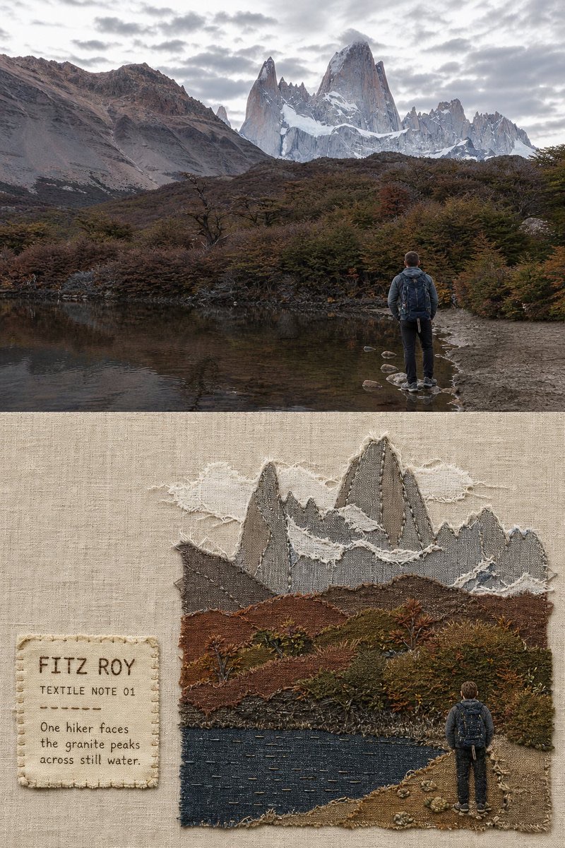
Fabric-Collage Travel Memory Poster