Image
Thai Travel Photo and Colour Overprint Poster Comparison
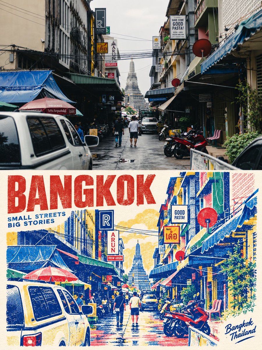
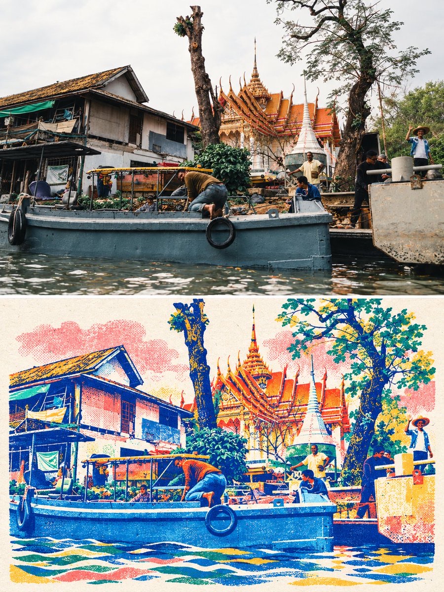
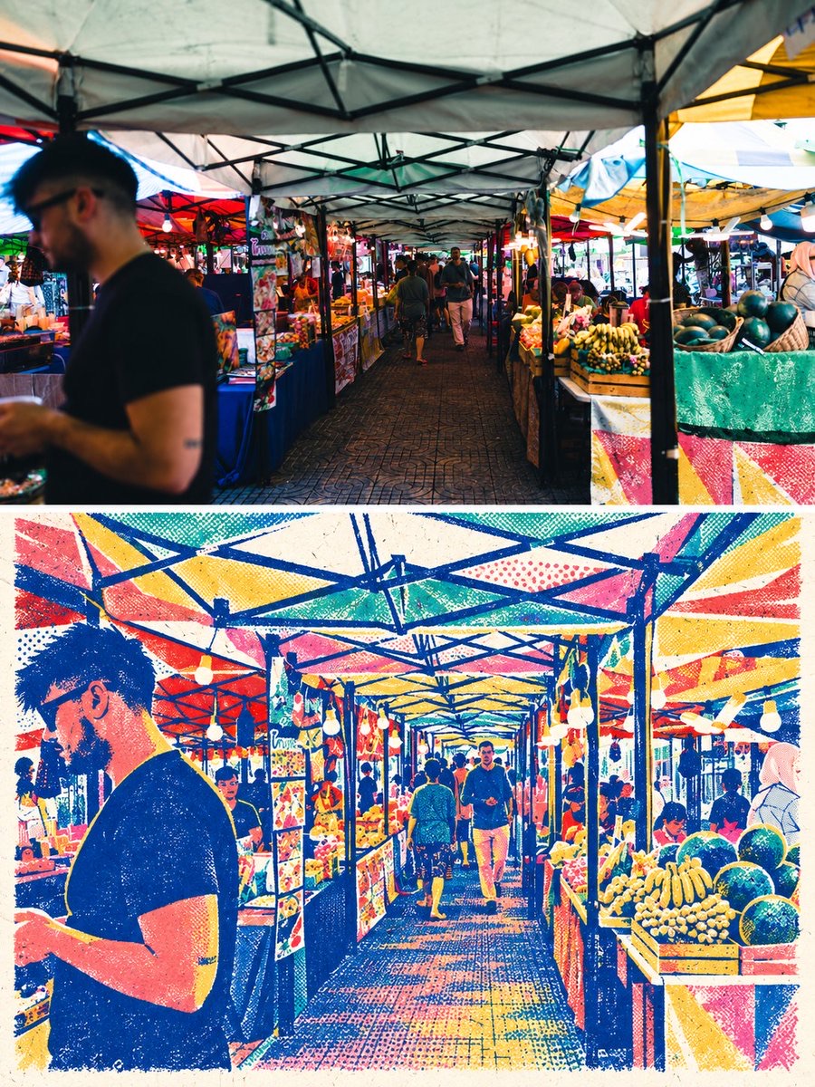
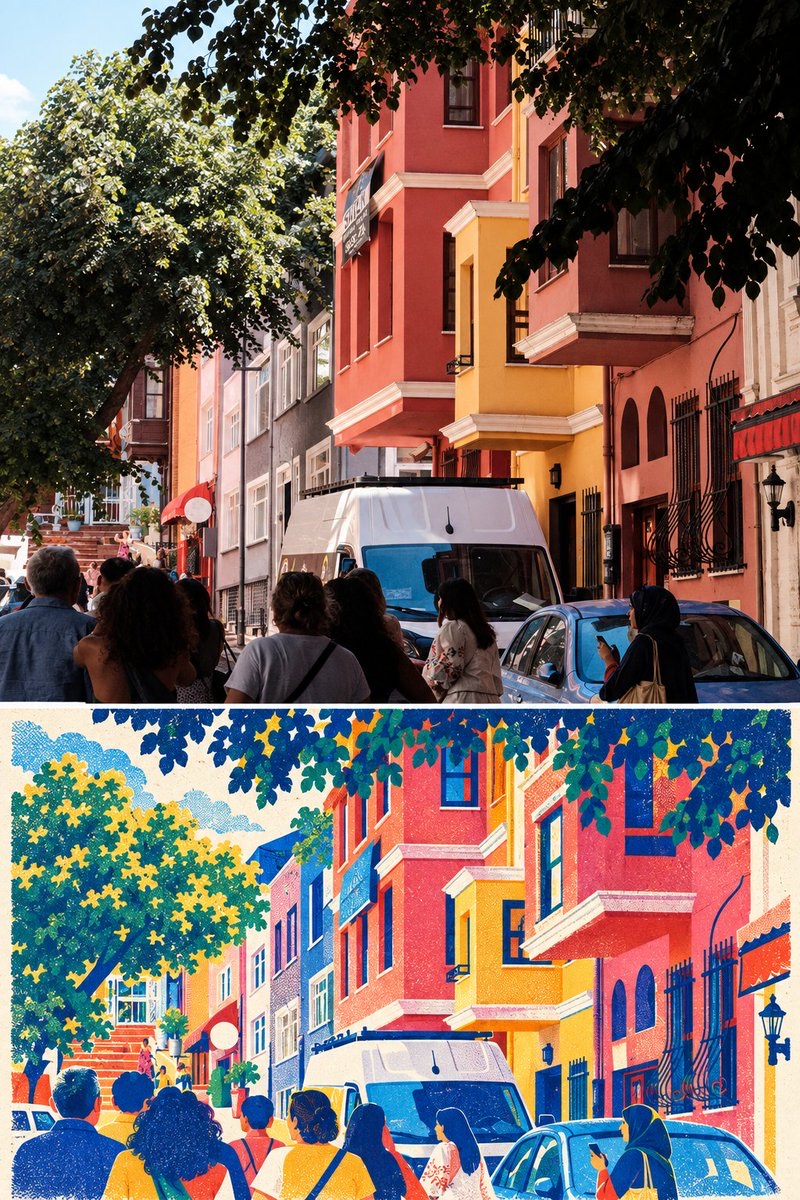
Turn the input Thai travel photo into a top-and-bottom comparison travel reinterpretation poster: the upper section keeps the real photo, while the lower section rebuilds it in a retro overprint style using highly saturated spot colours, halftone dots and paper texture.
 蛋黄堡@Hamburgerai
Prompt
Create a vertical 3:4 top-and-bottom comparison travel reinterpretation poster. The upper half fully preserves the input real Thai travel photo, keeping the original composition, the main people and architecture/street subjects, the actions, the lighting and the perspective; a thin white dividing line runs through the middle. The lower half extracts real elements from the same photo and rebuilds them as a colour overprint travel poster: an off-white paper base, limited to highly saturated spot colours such as indigo, vermilion, coral pink, bright yellow and lake green, with coarse grainy halftone dots and paper fibres, and obvious but restrained overprint misregistration and printmaking edges. Preserve subject recognisability and key spatial relationships, and actively change the information density and composition rather than just applying a filter to the original. Streets, temples, rivers, boats, stalls and other elements change according to the original photo, without using a template. The lower half may include a very small number of short English place labels derived from the photo, but do not generate long text that cannot be verified. Prohibited: logos, watermarks, AI corner marks, original-photo corner marks and unrelated landmarks.制作一张竖向3:4上下对比旅行转绘海报。上半部分完整保留输入的真实泰国旅行照片,保持原始构图、人物与建筑/街景主体、动作、光线和透视;中间用细白分隔线。下半部分从同一照片提炼真实元素,重构为彩色套印旅行海报:米白纸底,限制为靛蓝、朱红、珊瑚粉、明黄、湖绿等高饱和专色,粗颗粒网点与纸张纤维,明显但克制的套印错位和版画边缘。保留主体识别度和关键空间关系,主动改变信息密度与构图,不是原图换滤镜;街道、寺庙、河流、船只、摊位等元素按原图变化,不套模板。下半允许极少量源自照片的短英文地点标签,但不要生成无法确认的长文字。禁止 logo、水印、AI角标、原图角标和无关地标。
How to use
Usage tip: upload a Thai photo with a clear travel subject. After generating, check whether the lower half preserves the key spatial relationships, and remove any mistakenly generated landmarks, logos or unverifiable long text.
Details
More from 蛋黄堡
-

Travel Palette Watercolor Study Poster
-

Blue Halftone City Archive
-

Travel Photo to Glazed Mosaic Relief Poster
-

Clear White-Paper Travel Watercolor Editorial Poster
-

Vintage Matchbox Travel Label Poster
-

Travel Enamel Fridge Magnet Souvenir Poster
-

Two-Color Cultural Landmark Editorial Poster
-

Material Assemblage Contrast Poster from a Travel Photo