Image
Photo and Broken-Line Travel Poster
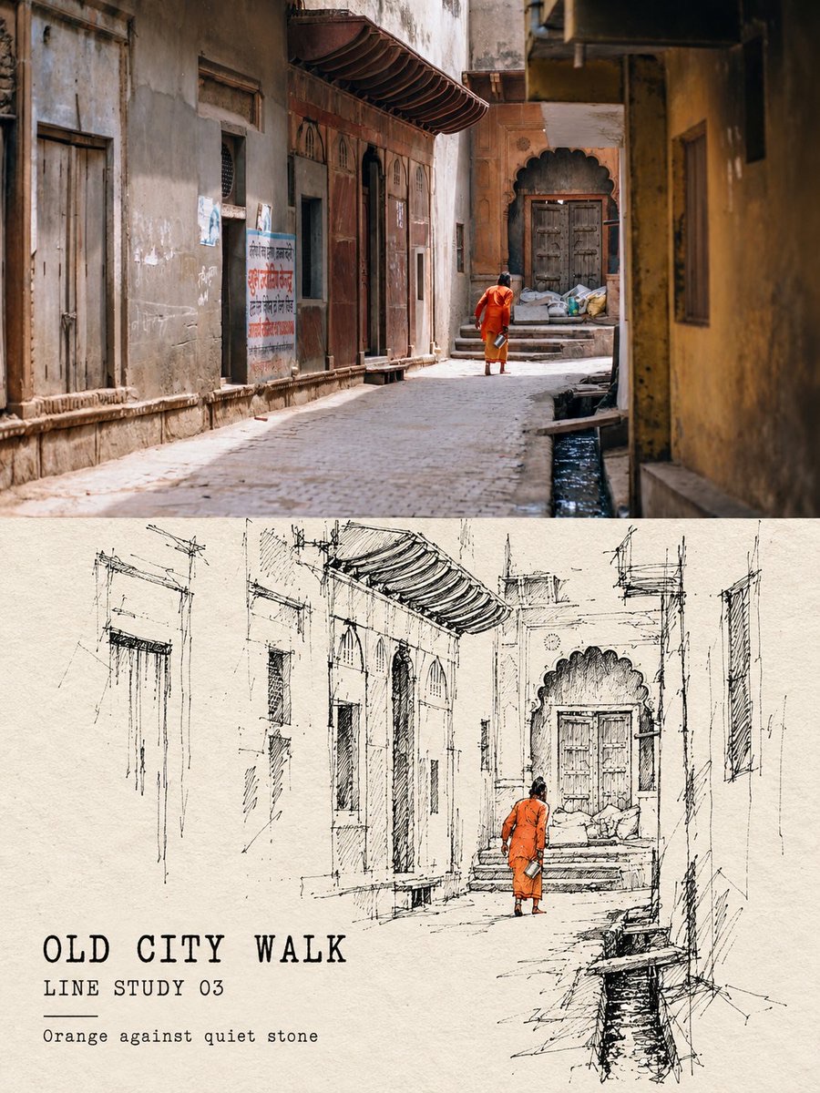
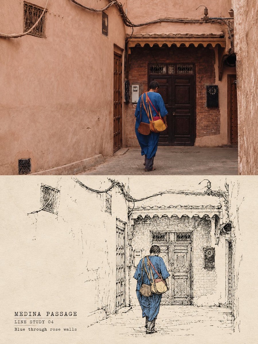
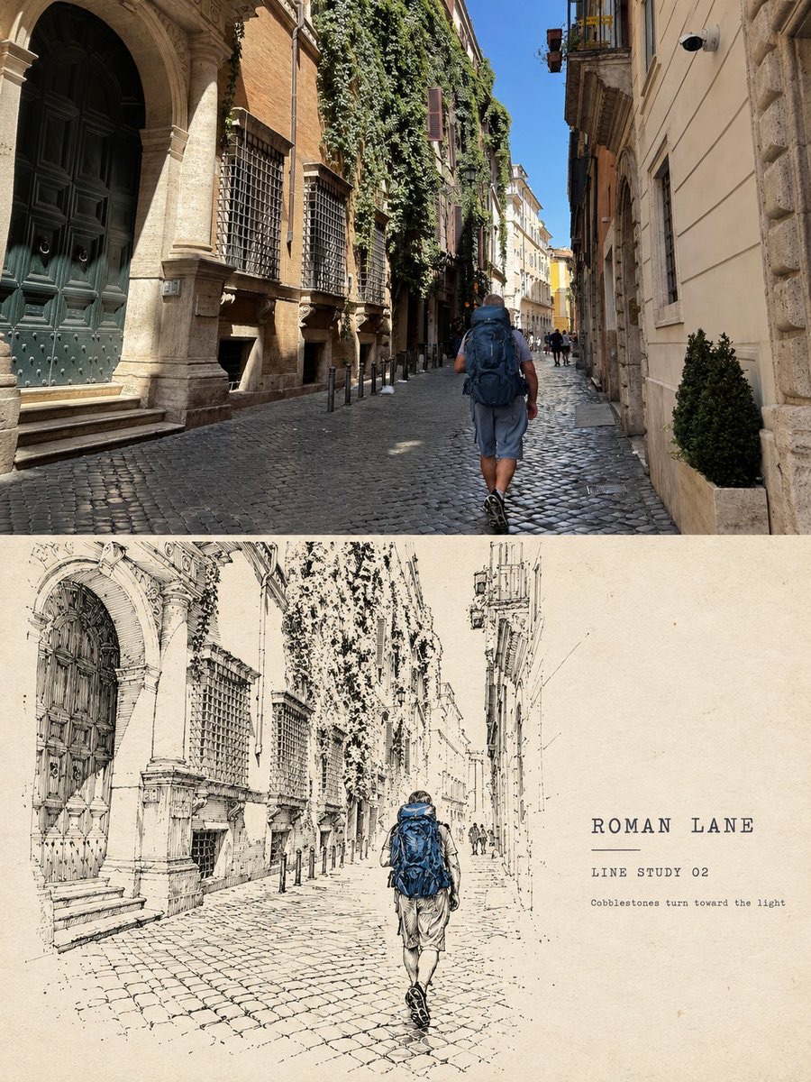
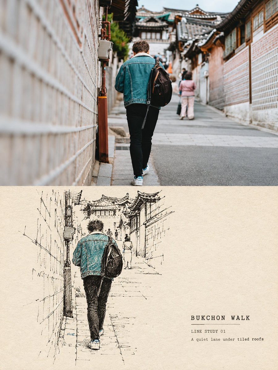
Arrange each travel photo separately as a 3:4 editorial poster, with the real photo above and a black broken-line observation study below.
 蛋黄堡@Hamburgerai
Prompt
Please turn each travel photo I upload into a separate premium line-drawn travel poster. Output each photo on its own, with no multi-photo collage.

Overall, use a 3:4 vertical composition to form a clear top-and-bottom contrast of "real photo above + line-drawn background figure re-sketch below." Use clear, horizontal, restrained boundaries between the upper and lower areas. Do not feather, tear, or blend with gradients, and do not let the photo, lines, or text cross the boundary.

The upper half must retain the uploaded photo itself. Accurately preserve the identity, number, posture, direction of movement, main clothing colors of the person or subject, the relationship between architecture and street, viewing angle, perspective, real materials, natural light and shadow, and the original color mood. Apply only a slight premium photographic color grade and very thin film grain, giving it the texture of a travel magazine or art publication. To fit the frame, you may naturally extend the sky, ground, or surrounding environment, but do not stretch, distort, mirror, move, replace, or redraw the subject.

In the lower half, on warm off-white, old-paper white, or light oat-colored paper, reorganize the same person and the same scene from the photo above into a "line-drawn background figure observation study." The figure remains the visual center, keeping the original number of people, body balance, direction of movement, distances between people, hairstyle silhouette, main clothing colors, and key identifying features such as the backpack. The street, buildings, sea, or environment behind the figure should retain only a few clues that show the location and spatial direction. Do not trace the entire background, and do not add people or landmarks that are not in the original photo.

The linework must use an unstable black pen, dip pen, or relatively dry ink to repeatedly search for form. Breaks, pauses, folded-back strokes, misaligned double lines, partial re-tracing, variations in thickness, light erasing, and unfinished line ends must all be clearly visible. The lines should look like the artist is continuously correcting on site, not like clean vector outlines, comic ink lines, or fashion sketches. Where needed, use a very small amount of solid black or dense hatching to hold down the backpack, hair, door frame, or shadows, but do not build full sketch shading and do not fill large areas with color.

The composition uses reduced, distilled, offset, or vertically reorganized layouts. The linear subject occupies roughly 38%–68% of the lower area's width and may lean toward one side. Keep at least 42% of continuous old-paper negative space around it. Use only one or two ground lines, perspective lines, wall boundaries, or structural lines to support the space; do not draw an engineering grid. The tension between lines and paper white matters more than background completeness.

The palette is mainly warm old paper and a single black ink. At most, extract one very small area of a pale color from the photo for clothing, location markers, short lines, or numbering, with colored area below 8% of the lower area. Do not use multicolor watercolor fills. The paper should show visible fibers, fine grain, and the matte feel of an old travel album.

Add a small amount of accurate, readable editorial text in the main empty areas: one short English title related to the location or subject; one line reading "LINE STUDY 01" or a location/object field; and one very short observation note. The text should use a small typewriter face, a worn letterpress face, or a handwriting style similar to the linework, as if written directly on the paper, and should not compete with the figure. Do not add author names, brands, logos, URLs, fake dates, signatures, watermarks, garbled text, or extra slogans.

Overall mood: fragmented black linework, repeated searching contours, sparse travel observation, warm archival paper, controlled negative space, one restrained accent color, handmade editorial study, quiet and intelligent travel memory.

Avoid: applying a plain line-art filter to the whole image, continuous smooth outlines, vector strokes, refined fashion sketching, detailed facial features, anatomical body correction, complete background tracing, dense architectural detail, full shadow sketching, heavy watercolor, oil painting, 3D, anime, unrelated people, intimate pose restrictions, author names, logos, URLs, signatures, watermarks, and garbled text.

Most important rule: The upper half is a real photo that can be compared directly. The lower half uses only black marks that break, fold back, overlap, and keep searching for form, to re-distill the relationship between the same person and the same scene. The style comes from the tension between line marks and negative space, not from any one fixed figure relationship.
请将我上传的每一张旅行照片分别制作成一张独立的高级线描旅行海报,每张照片单独输出,不进行多图拼贴。
整体采用 3:4 竖版构图,形成清晰的“上方真实照片+下方线描背景人物转绘”上下对照。上下区域使用明确、水平、克制的边界;不要羽化、撕裂、渐变融合,也不要让照片、线条或文字跨越边界。
上半部分必须保留上传照片本身。准确保持人物或主体的身份、数量、姿态、动作方向、衣着主色、建筑与街道关系、观察角度、透视、真实材质、自然光影和原有色彩氛围。只做轻微的高级摄影调色和极薄胶片颗粒,使其具有旅行杂志与艺术出版物的质感。为适配画幅,可以自然延展天空、地面或周边环境,但不得拉伸、扭曲、镜像、移动、替换或重新绘制主体。
下半部分在温暖的米白、旧纸白或浅燕麦色纸张上,将上方照片中的同一人物和同一现场重新组织为一幅“线描背景人物观察习作”。人物仍然是视觉中心,保持原始人数、身体重心、动作方向、彼此距离、发型轮廓、服装主色和背包等关键识别特征;人物身后的街道、建筑、海面或环境只保留能够说明地点和空间方向的少量线索。不要把整个背景完整描一遍,也不要添加原照片中不存在的人物或地标。
线描必须使用不稳定的黑色钢笔、蘸水笔或偏干墨线反复寻找形体:断裂、停顿、回折、错位复线、局部重描、粗细变化、轻微擦除和未完成的线端都要清楚可见。线条像画者在现场不断修正,而不是干净的矢量描边、漫画墨线或时装速写。必要处可用极少量实黑块或密集排线压住背包、头发、门框或阴影,但不要建立完整素描明暗,也不要大面积填色。
构图采用缩小提炼、偏置陈列或纵向重组。线性主体约占下半区域宽度的 38%—68%,可以偏向一侧;周围至少保留 42% 连续的旧纸留白。只保留一两条地面线、透视线、墙面边界或结构线来支撑空间,不要画成工程制图网格。线条和纸白之间的张力比背景完整性更重要。
色彩以暖旧纸和单一黑墨为主。最多从照片中提取一种极小面积的淡色,用于人物衣着、地点标记、短线或编号,彩色面积低于下半区域的 8%,不要使用多色水彩填充。纸张要有可见纤维、细微颗粒和旧旅行画册的哑光触感。
在主要留白处加入少量、准确、可读的编辑文字:一个与地点或主体有关的简短英文标题;一行 “LINE STUDY 01” 或地点/对象字段;一行极短的观察注释。文字使用小号打字机体、缺墨铅字或与线条相近的手写体,像直接写在纸面上,不要抢过人物。不要加入作者姓名、品牌、Logo、网址、虚假日期、签名、水印、乱码或额外口号。
整体气质:fragmented black linework, repeated searching contours, sparse travel observation, warm archival paper, controlled negative space, one restrained accent color, handmade editorial study, quiet and intelligent travel memory.
避免:把全图套成普通线稿滤镜、连续光滑轮廓、矢量描边、精致时装速写、详细五官、人体解剖修正、完整背景描摹、密集建筑细节、完整阴影素描、厚重水彩、油画、3D、动漫、无关人物、亲密姿态限制、作者名、Logo、网址、签名、水印和乱码。
最重要的规则:上半部分是可直接对照的真实照片;下半部分只用断裂、回折、重叠并不断寻找形体的黑色线迹,重新提炼同一人物与现场关系。风格来自线迹和留白的张力,而不是来自某一种固定人物关系。
How to use
Usage tip: Upload each travel photo separately and prepare accurate location or subject information for each image. After generation, focus on checking the number of people, direction of movement, the boundary between the photo and the line-drawn area, and the legibility of the text.
Details
More from 蛋黄堡
-

Travel Palette Watercolor Study Poster
-

Blue Halftone City Archive
-

Travel Photo to Glazed Mosaic Relief Poster
-

Clear White-Paper Travel Watercolor Editorial Poster
-

Vintage Matchbox Travel Label Poster
-

Travel Enamel Fridge Magnet Souvenir Poster
-

Two-Color Cultural Landmark Editorial Poster
-

Material Assemblage Contrast Poster from a Travel Photo