Image
Scenic Notes Travel Postcard Poster
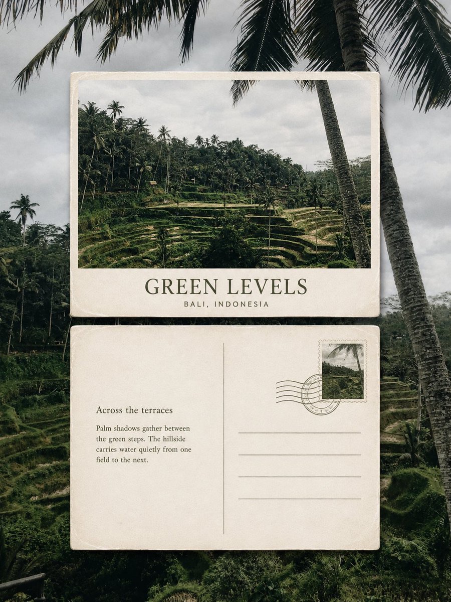
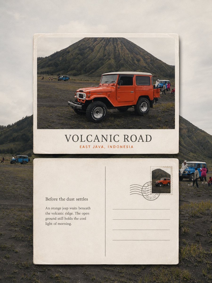
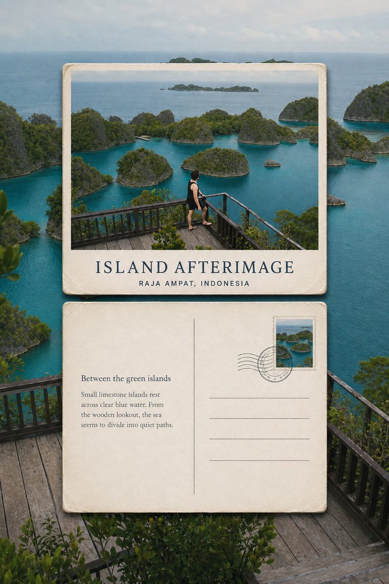
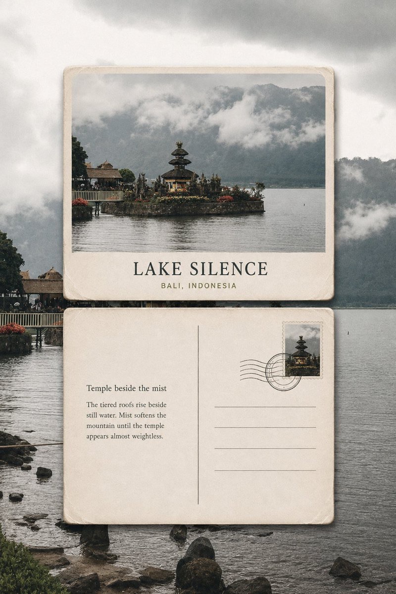
Edit each travel photo into a separate 3:4 vertical collectible poster, layering the front and back of a postcard aligned top and bottom over the original scenic background, and generate a travel phrase based on the image.
 蛋黄堡@Hamburgerai
Prompt
Please turn each travel photo I upload into a separate premium editorial poster titled 'Scenic Notes Postcard'. Do not stitch multiple images together; output each photo individually.

Use an overall 3:4 vertical composition. The original photo serves as a clear, realistic, recognizable full-bleed background filling the entire frame, faithfully preserving the location, subjects, architecture, people, terrain, perspective, natural lighting and real photographic texture of the original photo. Apply only light premium travel photo color grading, and moderately reduce the contrast of the area behind the postcards so the physical cards emerge naturally. Do not blur, redraw, replace or arbitrarily change the background photo.

Place two separate physical landscape-oriented postcards at the center of the frame, arranged vertically one above the other along the same central vertical axis:

- The postcard front is on top;
- The postcard back is below;
- Both cards must have the same width, same height, and the same standard landscape postcard proportions;
- Left and right edges must be strictly aligned, kept level, not rotated or tilted;
- The card width should occupy about 72%–82% of the overall frame width;
- Leave breathing space between the two cards of about 5%–10% of the card height;
- Must not overlap, be misaligned, placed side by side, or scattered.

The front of the top postcard uses a representative landscape crop of the same original photo, highlighting the most recognizable subject, landmark, human action or natural scenery in the photo. It must retain a real photographic texture and must not be redrawn as an illustration. A short English main title and an accurate, real place name may be added.

The back of the bottom postcard uses warm white or off-white thick cardstock, retaining slight paper grain, edge wear, creases and collectible traces. The back includes a thin-line divider section, four restrained address lines, a stamp in the upper-right corner, and a slight postmark.

The stamp design must be extracted from the same original photo; it may use landmark outlines, architecture, plants, vehicles, mountains or figure silhouettes from the photo, and must not add a second location or unrelated imagery. The postmark serves only as an abstract mark and must not fabricate dates, postal codes, addresses or false postal information.

In the blank area on the back, add an original travel observation of no more than two sentences. The text should describe based on the location, light, weather, actions and environmental imagery actually visible in the photo, quiet, natural and restrained, like a private note jotted down during the trip. Do not use famous quotes, and do not invent stories that do not exist in the photo.

Before generating, clearly define and accurately present the following text:

Main title:
“[根据照片提炼的简短英文标题]”

Location:
“[Real place, country]”

Back subtitle:
“[简短的旅行观察标题]”

Back body text:
“[根据真实画面创作的不超过两句英文短文]”

Typography uses an elegant, restrained editorial serif and a clean postal sans-serif. Text colors are extracted from the original photo and may use low-saturation colors such as dark gray, dark green, gray-blue and brown, with one representative color from the photo used as a small accent. Text must be clearly legible, and no garbled text or extra text may be generated.

Both cards use warm white thick cardstock with clean paper edges, slight wear and natural short shadows, so they look like real collectible postcards quietly placed over the original scenery.

Overall, the look blends real photography, old postcards, travel publications, private correspondence and collection archives: quiet, poetic, restrained, warm, with a sense of time, while maintaining a premium editorial design feel.

Avoid the ordinary two-panel poster structure of 'original photo above, redrawn version below'; avoid side-by-side placement, tilted cards, scattered collage, a third card, complex decoration, fictional place names, false postal information, handwritten gibberish, excessive retro filters, cartoon feel, plastic 3D feel, e-commerce template feel, brand logos and watermarks.
请将我上传的每一张旅行照片分别制作成一张独立的「风景余笺明信片」高级编辑海报,不多图拼接,每张照片单独输出。
整体采用3:4竖版构图。原始照片作为清晰、真实、可辨认的全幅背景铺满整张画面,忠实保留原照片中的地点、主体、建筑、人物、地形、透视关系、自然光影与真实摄影质感。仅进行轻微的高级旅行摄影调色,并适度降低明信片后方区域的对比度,使实体卡片自然浮现。不得模糊、重绘、替换或随意改变背景照片。
画面中央放置两张独立的实体横向明信片,沿同一条竖向中轴上下排列:
- 上方为明信片正面;
- 下方为明信片背面;
- 两张卡片必须同宽、同高、采用相同的标准横向明信片比例;
- 左右边缘严格对齐,保持水平,不旋转、不倾斜;
- 卡片宽度约占整体画面的72%—82%;
- 两张卡片之间保留约为卡片高度5%—10%的呼吸间距;
- 不得重叠、错位、并排或散落排列。
上方明信片正面使用同一张原始照片的代表性横向裁切,突出照片中最具识别度的主体、地标、人物动作或自然景观。必须保持真实摄影质感,不转绘成插画。可加入一个简短英文主标题,以及真实、准确的地点名称。
下方明信片背面使用暖白色或米白色厚纸,保留轻微纸张颗粒、边缘磨损、折痕与收藏痕迹。背面设置细线分隔区、四条克制的地址横线、一枚位于右上角的邮票,以及一处轻微邮戳。
邮票图案必须从同一张原照片中提取,可使用照片中的地标轮廓、建筑、植物、车辆、山体或人物剪影,不得加入第二个地点或无关图案。邮戳仅作为抽象印迹,不编造日期、邮编、地址或虚假邮政资料。
在背面的留白区域加入一段不超过两句的原创旅行观察。文字应根据照片中真实可见的地点、光线、天气、动作与环境意象进行描写,安静、自然、克制,像旅途中随手写下的一则私人注记。不得使用名人名言,不虚构照片中不存在的故事。
生成前请明确写定并准确呈现以下文字:
主标题:
“[根据照片提炼的简短英文标题]”
地点:
“[真实地点,国家]”
背面小标题:
“[简短的旅行观察标题]”
背面正文:
“[根据真实画面创作的不超过两句英文短文]”
字体采用优雅克制的编辑衬线体与简洁邮政无衬线体。文字颜色从原照片中提取,可使用深灰、墨绿、灰蓝、褐色等低饱和色,并以一种照片中的代表性色作为少量强调。文字必须清晰可读,不得生成乱码或额外文字。
两张卡片使用暖白厚纸材质,拥有清晰纸边、轻微磨损和自然短投影,让它们像真实存在的收藏明信片,被安静地放置在原本的风景之上。
整体呈现真实摄影、旧明信片、旅行出版物、私人通信与收藏档案相融合的气质:安静、诗意、克制、温暖、有时间痕迹,同时保持高级编辑设计感。
避免普通的“上方原图、下方转绘”双联海报结构;避免左右并排、倾斜卡片、散乱拼贴、第三张卡片、复杂装饰、虚构地名、虚假邮政信息、手写乱码、过度复古滤镜、卡通感、塑料3D感、电商模板感、品牌标志和水印。
How to use
Usage tip: Upload one clear travel photo at a time, and add or verify the real location. Keep the generated title, location and back short text within readable range of the image, and avoid letting the model invent information that does not exist in the photo.
Details
More from 蛋黄堡
-

Travel Palette Watercolor Study Poster
-

Blue Halftone City Archive
-

Travel Photo to Glazed Mosaic Relief Poster
-

Clear White-Paper Travel Watercolor Editorial Poster
-

Vintage Matchbox Travel Label Poster
-

Travel Enamel Fridge Magnet Souvenir Poster
-

Two-Color Cultural Landmark Editorial Poster
-

Material Assemblage Contrast Poster from a Travel Photo