Image
Crayon Travel Notes Comparison Poster
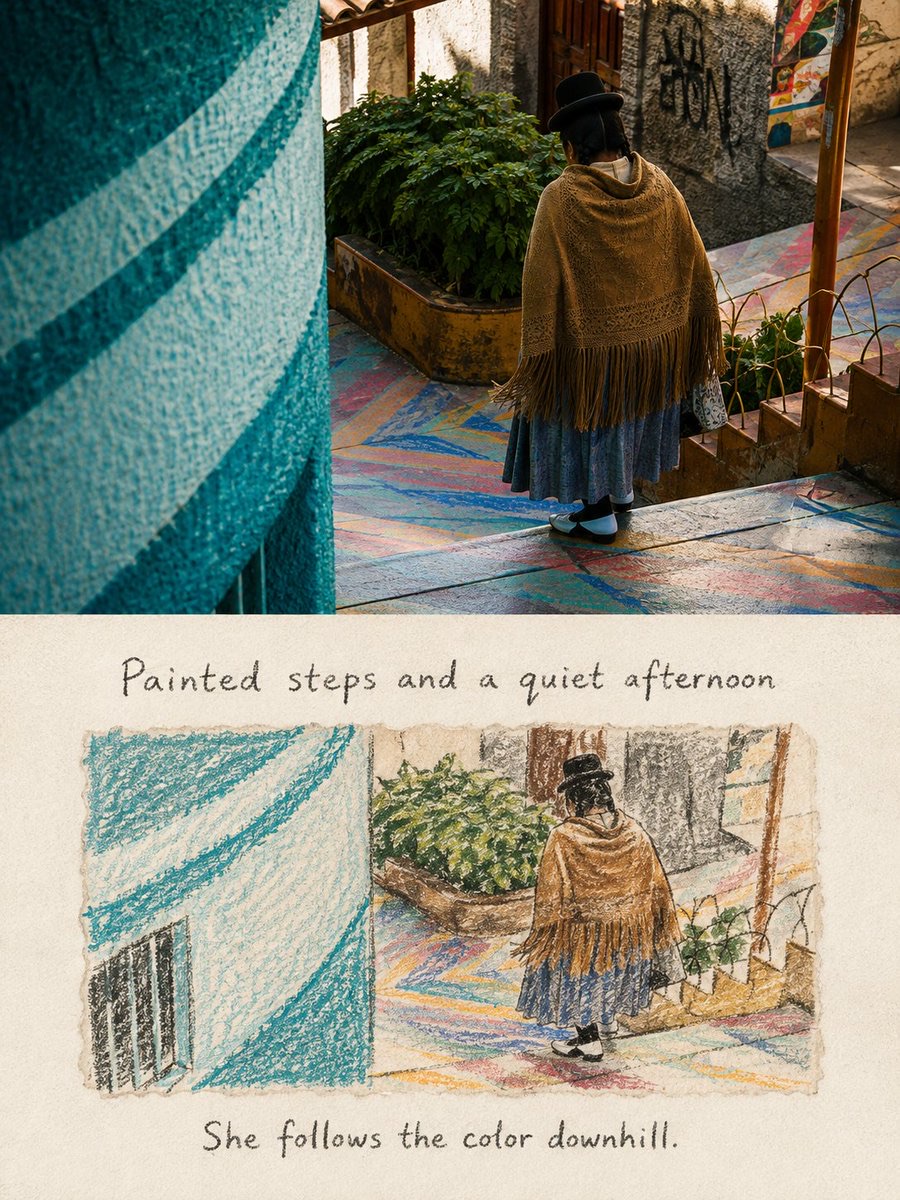
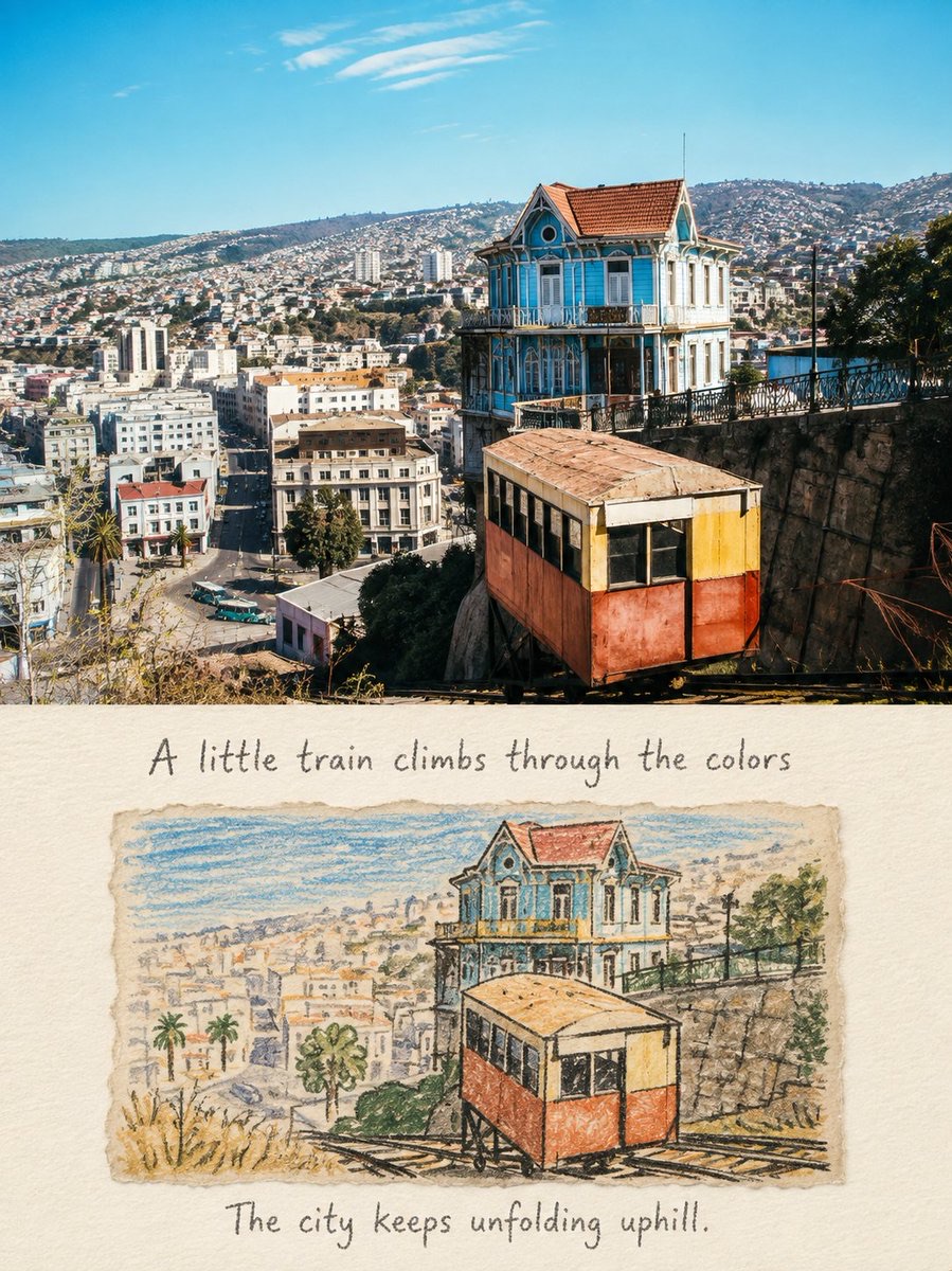
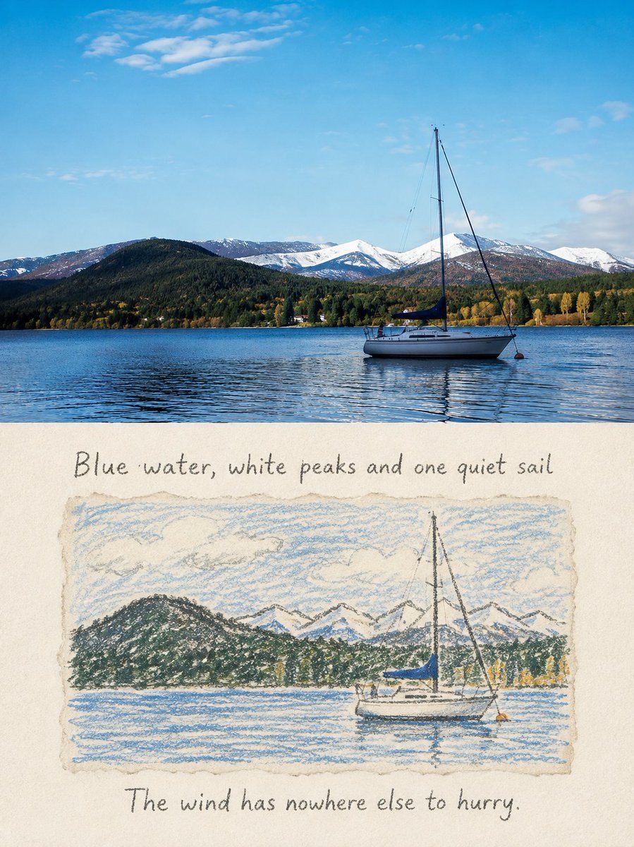
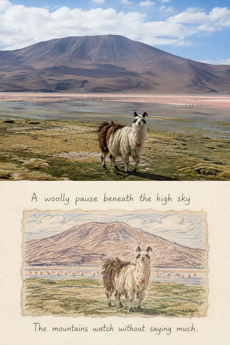
Keep a single travel photo as the real image in the upper half, and transform it in the lower half into a corresponding horizontal crayon memory drawing, creating a gentle contrast between photography and hand-drawing.
 蛋黄堡@Hamburgerai
Prompt
Please turn each travel photo I upload into a separate "Crayon Travel Notes" comparison poster. Do not tile multiple photos together; output each photo on its own.

Overall, use a 3:4 vertical composition, with the upper and lower areas of nearly equal height, 1:1, separated by a clean, straight horizontal boundary. Do not use gradients, feathering, or blending effects at the middle.

The upper half faithfully preserves the original photo, accurately keeping the people, animals, buildings, vehicles, boats, natural scenery, direction of movement, viewing angle, spatial relationships, real materials, natural light and shadow, and original color atmosphere. Apply only a slight travel-magazine photographic color grade, and add an extremely thin film grain. Do not redraw, move, replace, or distort the subjects in the original photo.

The lower half is a warm off-white drawing paper with clearly visible fibers and slight paper tooth, leaving large areas of clean, continuous paper space.

Embed an independent horizontal sheet of drawing paper in the center of the lower half. The sheet should occupy about 70%–80% of the lower half's width and about 40%–50% of its height, with soft, natural, slightly irregular hand-torn edges and paper fibers. Do not use a smooth, regular digital photo frame.

The crayon illustration on the horizontal sheet must come from the same photo above. Do not extract just one isolated person or object; instead, preserve the most important narrative composition and spatial relationships of the original photo:

- Keep one most recognizable subject;
- Keep the subject's original pose, direction, and positional relationships;
- Keep one to three clues that indicate the place or environment;
- Make sure the subject, road, buildings, mountains, water, sky, or other key elements in the illustration clearly correspond to the photo above;
- Remove cluttered backgrounds, distant details, photographic noise, tiny text, and irrelevant decorations.

Rather than tracing the whole photo mechanically, compress the complete scene into a short, naive, memory-like horizontal crayon sketch. Adjust the cropping, detail density, and number of colors as appropriate, but do not change the subject's identity, number, direction of movement, or key scene relationships.

Complete the illustration with thick round-tip crayons, oil pastels, and a very small amount of pencil. Use intermittent, slightly hesitant thick dark-gray or black crayon outlines as the main structure, showing uneven hand pressure, pauses, retracing, color going over lines, paper texture showing through, slight smudging, areas where color does not fully fill the shape, and irregular broken strokes.

The forms should be simple, rounded, and slightly clumsy, with the intimacy of a private travel sketchbook or an old picture book. Realistic facial features need not be drawn, and accurate perspective is not required, but the subject must remain recognizable at a glance through its silhouette, pose, and iconic objects. The image should feel naive but not childish, relaxed but not sloppy.

Extract two to four soft colors from the photo above and pair them with black or dark-gray outlines. Keep the photo's most memorable characteristic colors, such as the blue of a building, the orange of a vehicle, the gray-blue of lake water, the green of grass, or the pink of flowers. Reduce the number of colors and their saturation. Do not use a fixed sea-blue, a rainbow palette, or colors unrelated to the original photo.

Add one natural handwritten English sentence above and one below the horizontal drawing:

- The sentence above describes the place, weather, subject, or scene relationship that is actually visible in the photo;
- The sentence below records the slight emotion or observation this moment brought;
- The two sentences should be short, natural, and human, like lines jotted down casually during a trip;
- Do not use numbering, years, archive fields, advertising slogans, or standardized poster titles.

The text should use loose, slightly wobbly graphite pencil or crayon handwriting, retaining paper tooth, broken strokes, and natural writing errors. The font size must be clearly readable in chat previews, and the text should look truly written on the paper, not like smooth, digitally added typography.

Overall, present a gentle contrast between real travel photography and a private crayon sketchbook. The upper part records the scene as it actually happened; the lower part keeps the shapes, colors, and a single quiet note left after memory has trimmed the scene away.

Avoid: isolated person icons, sticker-like subjects, fully realistic background redraws, children's cartoon style, memes, rainbow palettes, smooth vector lines, automatic photo outlines, digital filters, full-bleed illustrations, regular picture frames, dense decoration, garbled text, pseudo-Chinese characters, author names, signatures, brand logos, QR codes, and watermarks.
请将我上传的每一张旅行照片分别制作成一张独立的“蜡笔旅行小记”对比海报,不多图拼接,每张照片单独输出。
整体采用3:4竖版构图,上下两个区域高度接近1:1,以清晰、平直的水平边界分隔。不得在中间使用渐变、羽化或相互渗透效果。
上半部分忠实保留原始照片,准确保持原照片中的人物、动物、建筑、车辆、船只、自然景观、动作方向、观察角度、空间关系、真实材质、自然光影和原有色彩氛围。仅进行轻微的旅行杂志摄影调色,并加入极薄的胶片颗粒。不得重新绘制、移动、替换或扭曲原照片中的主体。
下半部分是一张具有明显纤维和轻微纸齿的温暖米白色画纸,保留大面积干净、连续的纸张留白。
在下半部分中央嵌入一张独立的横向绘画纸片。纸片占下半区域宽度约70%—80%、高度约40%—50%,边缘带有柔软、自然、轻微不规则的手撕毛边和纸纤维,不使用光滑规则的数码相框。
横向纸片中的蜡笔插画必须来自上方同一张照片。不要只提取一个孤立人物或物件,而是保留原照片最主要的叙事构图和空间关系:
- 保留一个最具识别度的主体;
- 保留主体原本的姿态、方向和位置关系;
- 保留一至三项能够说明地点或环境的线索;
- 让插画中的主体、道路、建筑、山、水、天空或其他关键元素能够与上方照片清楚对应;
- 删除杂乱背景、远处细节、摄影噪声、微小文字和无关装饰。
下方不是将整张照片机械描摹一遍,而是把完整确的场景压缩成一幅简短、稚拙、带有记忆感的横向蜡笔小画。适当改变裁切、细节密度和色彩数量,但不得改变主体身份、数量、动作方向和关键场景关系。
使用圆头粗蜡笔、油画棒和少少少量量铅笔完成插画。以断断续续、略带迟疑的深灰或黑色粗蜡笔轮廓作为主要结构,表现软硬不均的手部压力、停笔、重描、越线填色、纸纹透底、轻微擦脏、颜色没有完全填满以及不规则的笔触断口。
造型简洁、圆润、略显笨拙,带有私人旅行画本和旧绘本的亲切感。可以不描绘写实五官,也不追求准确透视,但必须通过主体轮廓、姿态和标志性物件保持一眼可辨。画面应稚拙但不幼稚,轻松但不潦草。
从上方照片中提取两至四种柔和颜色,配合黑色或深灰色轮廓。保留照片最具有记忆点的特征色,例如建筑的蓝色、车辆的橙色、湖水的灰蓝、草地的绿色或花朵的粉色。降低颜色数量和饱和度,不使用固定海蓝色、彩虹色盘或与原照片无关的颜色。
在横向画芯上方和下方分别加入一句自然的英文手写配文:
- 上方文字描述照片中真实可见的地点、天气、主体或画面关系;
- 下方文字记录这一刻带来的轻微情绪或观察;
- 两句话应简短、自然、有人味,像旅行途中随手写下的句子;
- 不使用编号、年份、档案字段、广告口号或标准化海报标题。
文字采用松动、略微摇晃的石墨铅笔或蜡笔手写体,保留纸齿、断笔和自然书写误差。字号必须能在聊天预览中清楚阅读,文字像真正写在纸面上,而不是后期添加的光滑数码排版。
整体呈现真实旅行摄影与私人蜡笔画本之间的温柔对照。上方记录当时真正发生的场景,下方留下经过记忆删减后的形状、颜色和一句轻轻的注解。
避免孤立人物图标、贴纸式主体、完整背景写实重画、儿童卡通、表情包、彩虹配色、光滑矢量线条、自动照片描边、数字滤镜、满版插画、规则相框、密集装饰、乱码、假中文、作者名字、签名、品牌标志、二维码和水印。
How to use
Usage tip: after uploading one travel photo, generate a single 3:4 vertical poster separately; make sure the photo's subject, scene clues, and key colors are clearly recognizable, and check that the handwritten English captions accurately describe the picture.
Details
More from 蛋黄堡
-

Travel Palette Watercolor Study Poster
-

Blue Halftone City Archive
-

Travel Photo to Glazed Mosaic Relief Poster
-

Clear White-Paper Travel Watercolor Editorial Poster
-

Vintage Matchbox Travel Label Poster
-

Travel Enamel Fridge Magnet Souvenir Poster
-

Two-Color Cultural Landmark Editorial Poster
-

Material Assemblage Contrast Poster from a Travel Photo