Image
Blue-Green Landscape Handscroll-Style Travel Poster
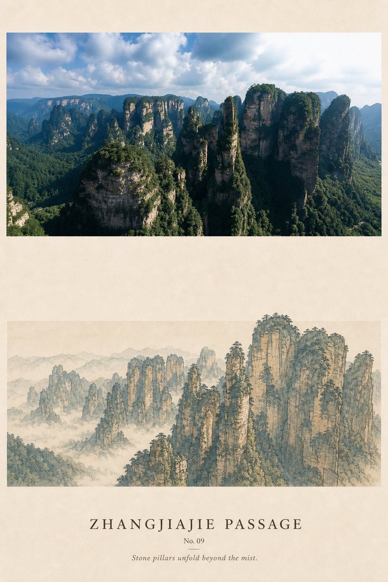
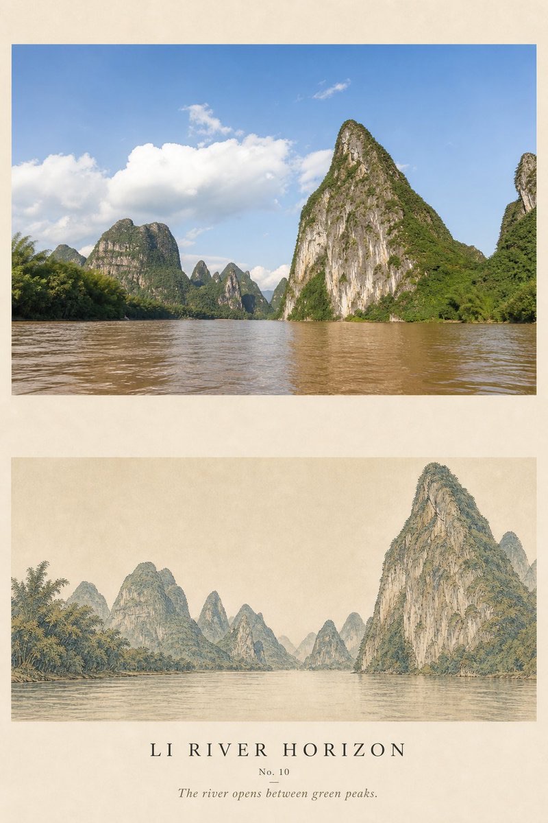
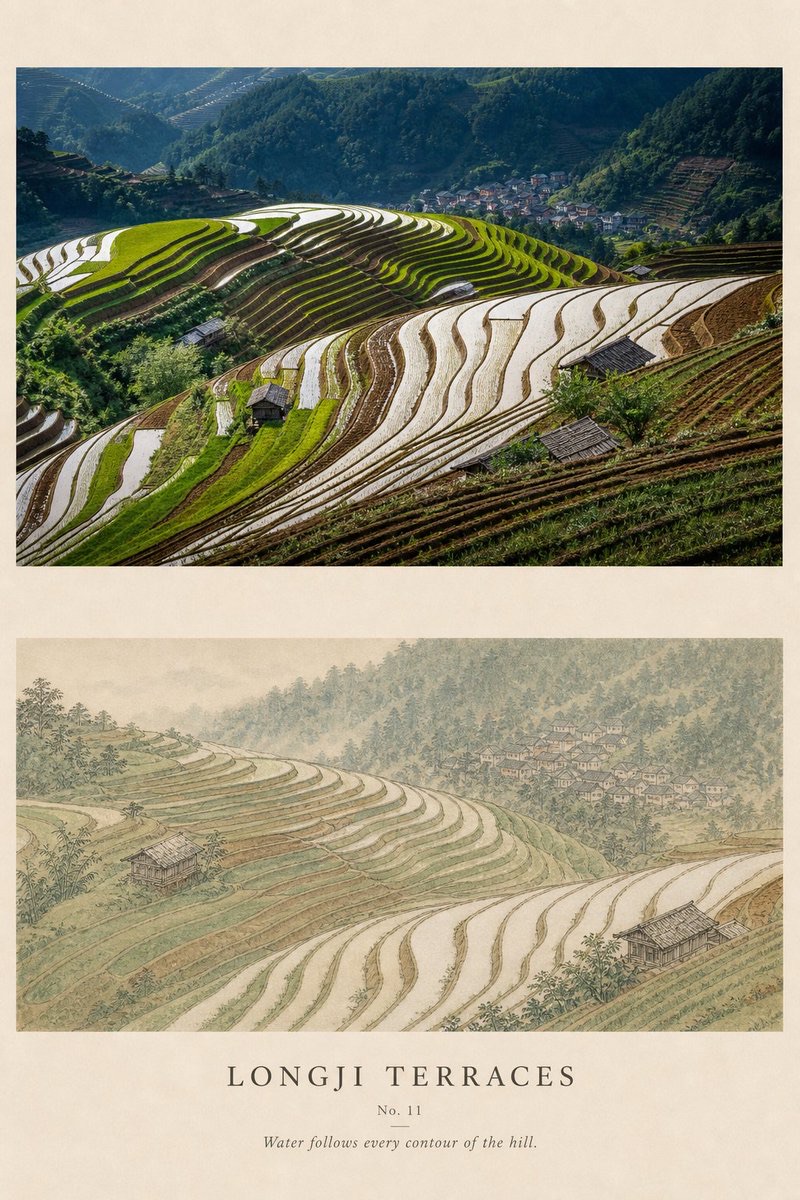
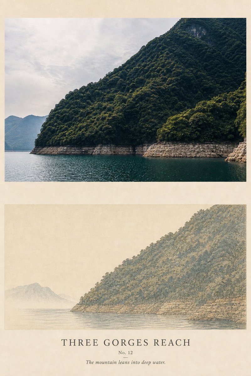
Turn each travel photo into a separate 3:4 premium poster: the real image kept on top, and below, a blue-green landscape painting redrawn from the real terrain as a wide, low horizontal section with generous blank space, with restrained English typography added.
 蛋黄堡@Hamburgerai
Prompt
Please make each travel photo I upload into a separate premium design poster, with each photo output individually and no multi-image collage.

Overall, use a 3:4 vertical composition, with warm ivory natural silk paper as the background. The final image must clearly keep both the original photo and a blue-green landscape repainting of the same scene, forming a contrast between real travel imagery and a classical handscroll painting.

The upper part, about 40%—45%, faithfully keeps the peaks, rivers, terraced fields, villages, woodland, roads and their relative positions from the original photo. Apply only slight art-publication color grading and extremely thin grain; do not redraw the original photo, and do not add buildings, boats, people or peaks that are not in the photo.

The lower part, about 55%—60%, sets a wide, low horizontal painting area within a large expanse of ivory blank silk, so that it looks like a segment cut from a blue-green landscape handscroll. Do not generate a complete physical scroll, and do not show wooden rods, rolled edges, tassels or product display.

Re-analyze the spatial route of the photo and organize the real landscape into a viewing sequence that unfolds from left to right. You may arrange, in turn, distant mountains, river surfaces, peak clusters, terraced fields, shorelines, villages or woodland, but must follow the real terrain and positional relationships in the photo; do not invent traditional architecture or ancient figures out of thin air.

Use fine outline work, texture strokes and restrained mineral pigments, mainly stone blue, stone green, grey-blue, ochre and light ink, with a very small amount of cinnabar permitted as visual emphasis. Pigments should feel quiet and delicate with a silk-grain texture; do not use highly saturated jade green or gilded, ornate decorative effects.

Inside the painting area, keep obvious blank silk. Water surfaces, sky, clouds and mist valleys can be indicated by uncolored areas, letting the blank space act as a pause in the horizontal route. The top and bottom edges of the painting area should be clear, and the area outside the painting should keep a broad expanse of silk surface, avoiding stuffing the lower half into a full-bleed landscape.

In the blank space outside the painting area, add a small amount of accurate English typography: a title of 2—4 words derived from the place or landscape, a number, and one short observation sentence. Use widely spaced, restrained serif type or small capitals; the text must be clearly legible and echo the horizontal rhythm of the handscroll.

Overall, reference blue-and-green landscape painting, silk handscroll, mineral pigments and modern museum publication design. The image should feel quiet, distant and clear, with a horizontal sense of wandering through the scene, while preserving the real regional identity of the travel photo.

Avoid: fake Chinese, calligraphy, seals, classical poems, author names, complete scroll products, wooden rods, tassels, frames, wall mockups, fictional temples, ancient figures, cranes, extra boats, arbitrarily added peaks, gilded decoration, neon blue-green, full-sheet color fill, photographic realism in the lower half, and simple filter effects.
请将我上传的每一张旅行照片分别制作成一张独立的高级设计海报,每张照片单独输出,不进行多图拼贴。
整体采用3:4竖版构图,以温暖的象牙色天然绢纸作为背景。最终画面必须同时保留清楚可见的原始照片和同场景的青绿山水转绘,形成真实旅行影像与古典手卷绘画之间的对照。
上方约占40%—45%,忠实保留原始照片中的山峰、河流、梯田、村落、树林、道路及其相对位置。仅进行轻微艺术出版物调色和极薄颗粒处理,不重新绘制原图,不增加照片中不存在的建筑、舟船、人物或山峰。
下方约占55%—60%,在大面积象牙色空绢中设置一条宽而低的横向绘画区域,使其像从一幅青绿山水手卷中截取出来的一段画面。不要生成完整实体卷轴,不出现木杆、卷边、流苏或商品展示。
重新分析照片的空间路线,将真实景观组织成从左到右逐步展开的游观顺序。可以依次安排远山、江面、峰林、梯田、岸线、村落或林地,但必须遵循照片中的真实地形和位置关系,不得凭空制造传统建筑或古代人物。
使用精细勾线、皴擦纹理和克制的矿物颜料表现,色彩以石青、石绿、灰蓝、赭石、淡墨为主,允许极少量朱砂作为视觉强调。颜料沉静、细腻、有绢本颗粒感,不使用高饱和翡翠绿或金碧辉煌的装饰效果。
画芯内部保留明显的空绢。水面、天空、云雾和山谷可以由未着色区域直接表示,让空白成为横向路线中的停顿。画芯上下边界应清楚,画芯外继续保留宽阔绢面,避免将下半部分塞成完整满幅风景。
在画芯外的留白中加入少量准确英文排版:一个由地点或景观提炼的2—4词标题、编号与一句简短观察句。使用字距宽松、克制的衬线字体或小型大写字,文字应清楚可读,并与手卷的横向节奏呼应。
整体参考青绿山水、绢本手卷、矿物颜料与现代博物馆出版设计。画面沉静、悠远、清晰、有横向游观感,同时保留旅行照片的真实地域身份。
避免:假中文、书法、印章、古诗、作者名字、完整卷轴产品、木杆、流苏、画框、墙面样机、虚构寺庙、古人、仙鹤、额外舟船、随意增加山峰、金碧装饰、霓虹青绿、满幅填色、下半部分摄影写实和简单滤镜化。
How to use
Usage tip: Upload travel photos one by one, and provide a place or landscape name for each photo so that a 2–4-word English title can be generated; after generation, check whether the original landscape positions are preserved, whether the painting area keeps blank silk, and whether the English text is clear and accurate.
Details
More from 蛋黄堡
-

Travel Palette Watercolor Study Poster
-

Blue Halftone City Archive
-

Travel Photo to Glazed Mosaic Relief Poster
-

Clear White-Paper Travel Watercolor Editorial Poster
-

Vintage Matchbox Travel Label Poster
-

Travel Enamel Fridge Magnet Souvenir Poster
-

Two-Color Cultural Landmark Editorial Poster
-

Material Assemblage Contrast Poster from a Travel Photo