Image
Swift-Line Architectural Observation Poster
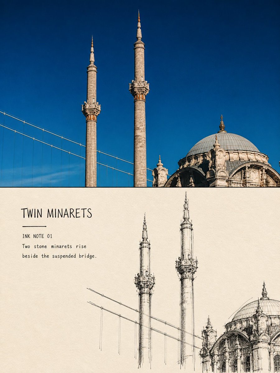
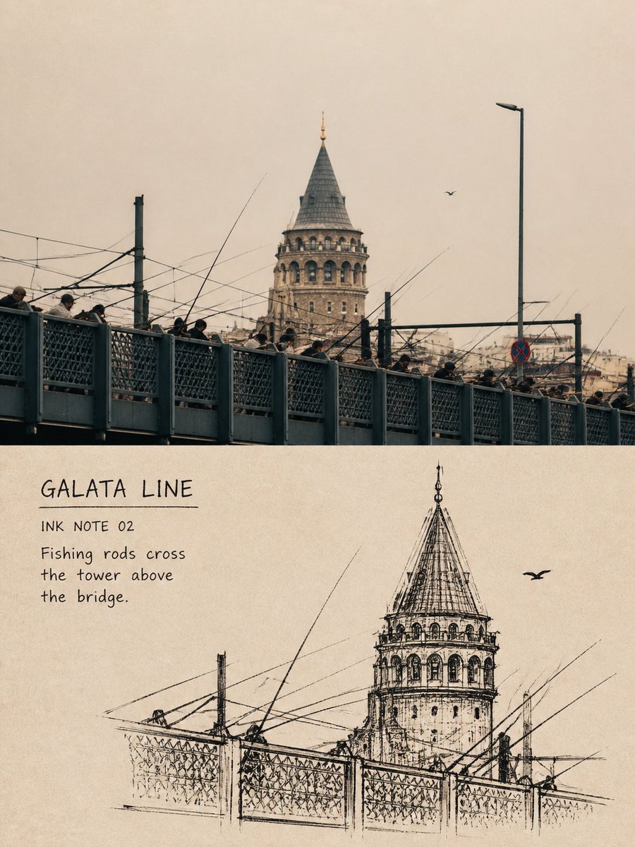
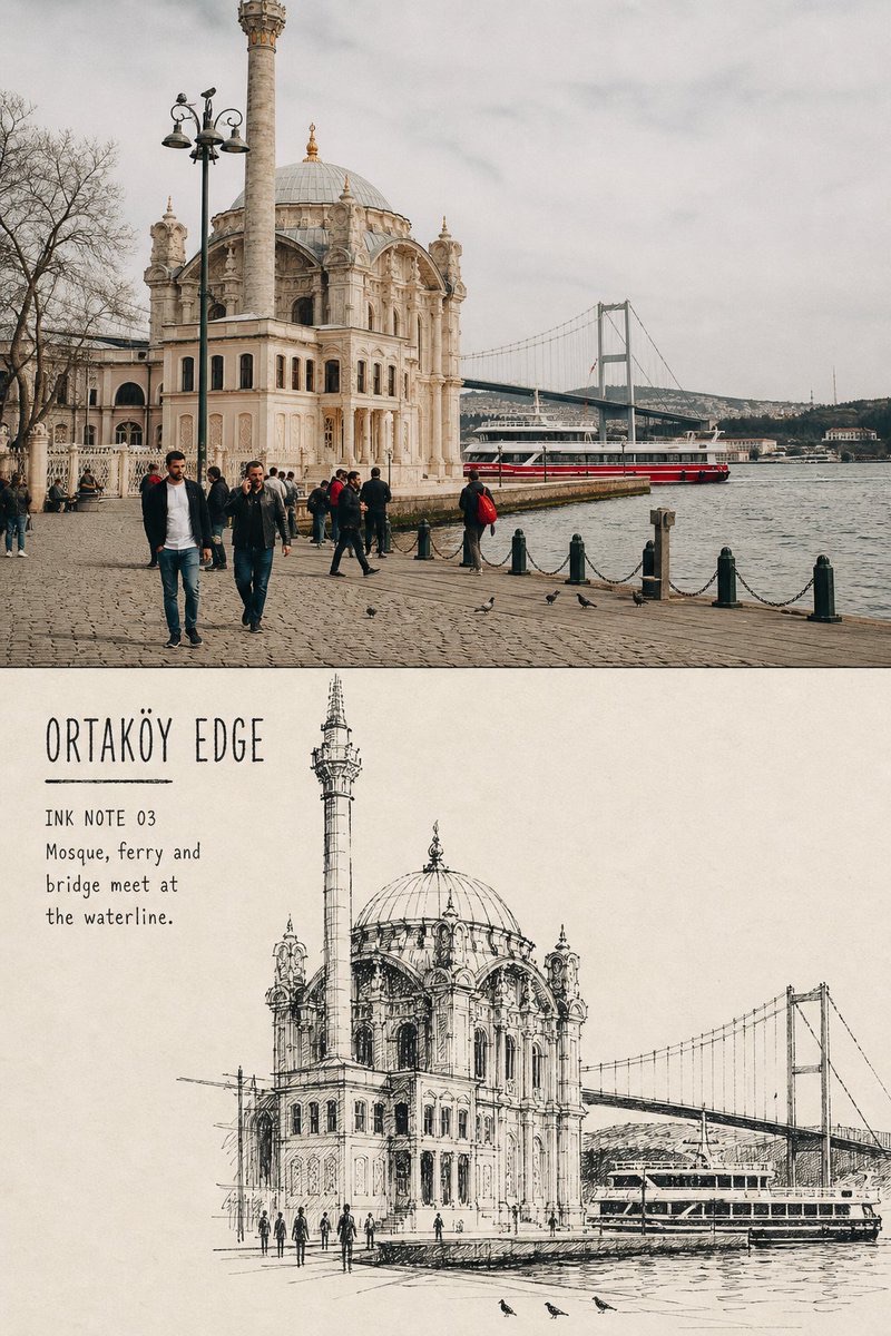
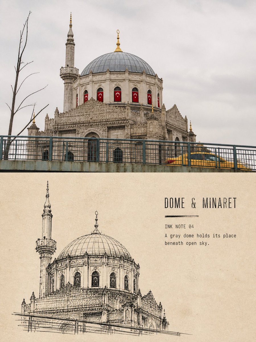
Combine a single travel architecture photo with a black-ink architectural sketch on warm off-white paper to create a 3:4 vertical editorial poster with a restrained, strongly unfinished feel that preserves the building’s identifying features.
 蛋黄堡@Hamburgerai
Prompt
Make a separate “Swift-Line Architectural Observation” editorial poster from each travel photo I upload. Do not combine multiple photos; output each photo separately.

Use an overall 3:4 vertical composition. Leave a substantial area at the top for the original photo. Accurately preserve the building’s identity, number of floors, proportions, dome, towers, eaves, column grid, arches, roads, waterfront, people, and spatial relationships. Apply only light art-publication color grading and an extremely fine film grain; do not stretch, move, reshape, or turn the photographic subject into an illustration.

In the lower section, use warm natural off-white sketch paper to actively shrink, simplify, and reorganize the architecture from the same photo into an unfinished, rapid black-ink architectural study. Do not faithfully reproduce the full photographic background. Keep only the main silhouette, central axis, roof or spire, rhythm of openings, and one to three essential directional lines for roads, bridges, waterfront, or tree shadows that establish the place’s identity.

Draw with black steel-nib pens, technical pens, and a small amount of dry, rough brush tip. Let the contours show repeated searching and correction, preserving overlapping lines, doubled outlines, hand tremors, pauses, ink breaks, overshoots, and unerased exploratory marks. Establish the column grid with hurried vertical strokes, and reinforce structural intersections with short, closely packed hatching. Concentrate black ink density at a few key points; do not fill the entire building evenly.

The architectural sketch should occupy 45%–65% of the lower area’s width and 38%–58% of its height, and may lean to one side. Preserve at least 40%–55% of continuous, clean paper white. Let the lines stop naturally on the paper, with clear but unfinished edges; do not use digital feathering, soft focus, or a regular rectangular frame.

In the lower section, use only paper white and carbon-black ink. Do not add watercolor, gray washes, colored lines, or a fixed accent color.

Add a small amount of text based on the facts in the photo:
- A main title of 1–3 English words;
- The field “INK NOTE 01”;
- One on-site observation of 5–10 English words.

Group the text in the continuous white-paper area. Use narrow type with an inky, slightly chipped texture or plain handwriting, and optionally add a short ink line. The title must be clearly readable at normal preview size; do not reduce it to decorative gray lines.

The overall feel should be like an architect or travel sketcher rapidly searching out the structure on site: perceptive, hurried, restrained, incomplete, yet true to the building’s character.

Avoid: photo-outline filters, CAD drawings, uniformly fine hatching, academic pen-and-ink illustration, densely filled pages, complete backgrounds, transparent watercolor, gray washes, colored washes, softened edges, tracing the composition exactly, illegibly small text, author names, signatures, logos, QR codes, and watermarks.
请将我上传的每一张旅行照片分别制作成一张独立的「疾线建筑观察」编辑海报,不得多图拼接,每张照片单独输出。
整体采用3:4竖版构图。上方保留具有实质面积的原始照片,准确保持建筑身份、层数、比例、穹顶、塔楼、屋檐、柱网、拱券、道路、水岸、人物与空间关系,只进行轻微艺术出版物调色和极薄胶片颗粒处理,不得拉伸、移动、重塑或插画化摄影主体。
下方使用温暖的天然米白速写纸,将同一照片中的建筑主动缩小、删减并重新组织为一幅未完成的快速黑墨建筑观察稿。不要完整复刻照片背景,只保留决定地点身份的主体轮廓、主轴、屋顶或塔尖、开口节奏,以及一至三条必要的道路、桥梁、水岸或树影方向线。
使用黑色钢笔、针管笔和少量干涩毛笔尖绘制。轮廓应经过反复寻找与修正,保留重叠线、双重轮廓、手抖、停顿、断墨、越线和未擦除的试探痕迹;以急促竖线建立柱网,用短促密排线压住结构交界。黑色密度只集中在少量关键节点,不要平均铺满整座建筑。
建筑速写约占下方区域宽度45%–65%、高度38%–58%,可以偏向一侧;至少保留40%–55%的连续完整纸白。线条应在纸面自然停笔,边界清楚但未完成,不使用数字羽化、柔焦或规则矩形画框。
下方只使用纸白与碳黑墨,不加入水彩、灰色铺染、彩色线条或固定强调色。
根据照片事实加入少量文字:
- 1–3个英文单词的主标题;
- 字段“INK NOTE 01”;
- 一句5–10个英文单词的现场观察。
文字集中在连续纸白区域,使用具有吸墨与轻微缺口的窄体铅字或朴素手写体,可配一条短墨线。标题在正常预览尺寸下必须清楚可读,不得缩成装饰灰线。
整体像建筑师或旅行画者站在现场快速寻找结构:敏锐、急促、克制、不完整,却准确保留建筑气质。
避免:照片描边滤镜、CAD制图、均匀精细排线、学院派钢笔画、满页密线、完整背景、透明水彩、灰洗、彩色淡彩、柔化边缘、同构图临摹、不可读小字、作者名、签名、Logo、二维码与水印。
How to use
Usage tips: Enter one architectural travel photo at a time. Carefully check the subject’s proportions, building identity, and poster text readability.
Details
More from 蛋黄堡
-

Travel Palette Watercolor Study Poster
-

Blue Halftone City Archive
-

Travel Photo to Glazed Mosaic Relief Poster
-

Clear White-Paper Travel Watercolor Editorial Poster
-

Vintage Matchbox Travel Label Poster
-

Travel Enamel Fridge Magnet Souvenir Poster
-

Two-Color Cultural Landmark Editorial Poster
-

Material Assemblage Contrast Poster from a Travel Photo