Image
Ingredient Study Travel Plate: Food Photo to Editorial Poster
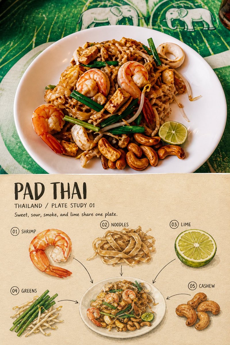
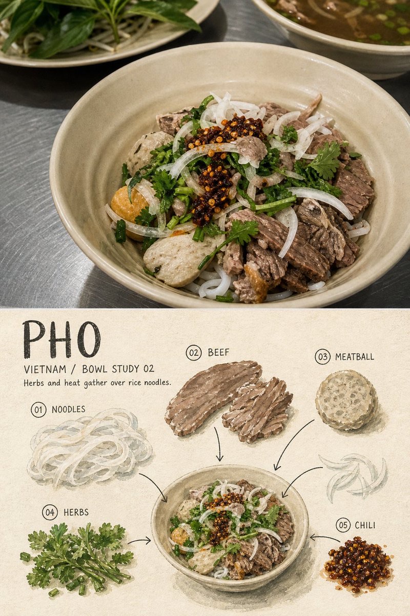
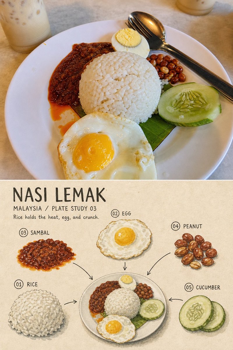
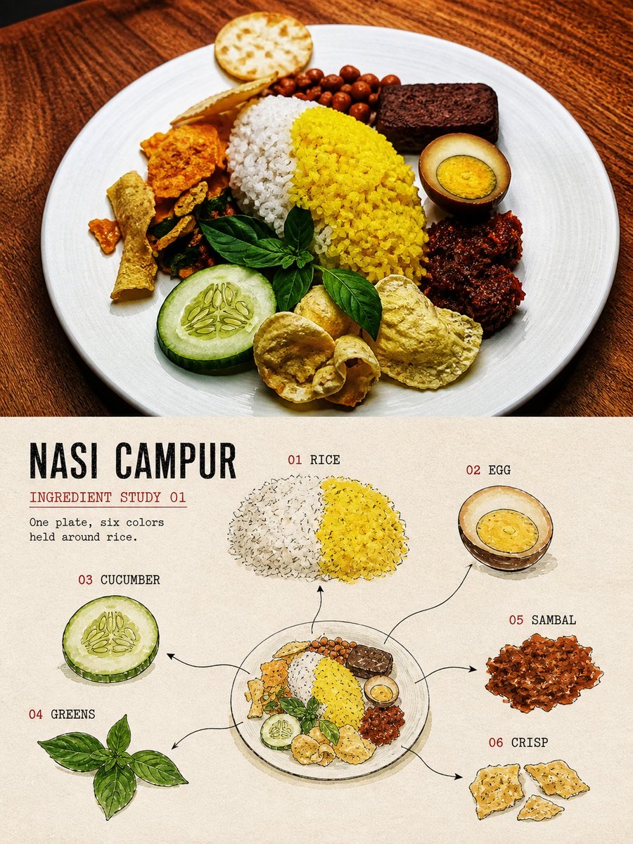
Turn a single photo of a local dish into a travel ingredient-study poster with upper and lower sections: preserve the real plate photography above, and break down the identifiable ingredients, plate, and tasting notes below in gouache and ink.
 蛋黄堡@Hamburgerai
Prompt
For each local dish photo I upload, create a separate, premium editorial “Ingredient Study Travel Plate” poster. Output each photo separately. Do not combine multiple photos, different plates, or different dishes into one artwork.

The input photo should have one complete plate or bowl as its clear subject, with at least three separately identifiable components, such as a staple food, meat, seafood, egg, vegetables, herbs, nuts, pickles, sauce, or garnishes.

Use a vertical 3:4 composition, with a clear contrast between the original food photography and the ingredient study drawing.

The upper section should take up about 45%–50% of the image and faithfully preserve the original photo. Accurately retain the plate or bowl outline, number of ingredients, arrangement, proportions, real textures, natural lighting and shadows, viewing angle, and original colors. Apply only light color grading in the style of an independent food magazine or travel publication, with a very fine film grain.

Do not rearrange the food, replace ingredients, move food, alter portions, add decorations, or redraw the real photography as an illustration in the photo area. To fit the aspect ratio, you may carefully crop the surroundings, but the complete plate must remain clearly recognizable.

Use a straight, clear, restrained horizontal boundary between the upper and lower sections. A very narrow warm-toned paper gap is acceptable. Do not use gradients, feathering, dissolves, or let ingredients cross the boundary.

The lower section should take up about 50%–55% of the image. Use warm off-white or ivory natural drawing paper, showing paper fibers, grain, slight stains, and an irregular surface.

Do not redraw the entire dish above in the same composition below. Instead, break down the same dish into a spacious ingredient study on paper:

1. Select 3–6 real, clearly identifiable components visible in the original photo;
2. In the center or lower part of the lower section, draw a small, highly simplified but instantly recognizable depiction of the complete plate or bowl;
3. The small complete plate should usually take up only 28%–40% of the lower section's width;
4. Pull each selected ingredient out of the plate and depict it separately as a gouache sample, cross-section, leaf, cluster of grains, sauce swatch, or small structural sketch;
5. Use different scales and directions for different ingredients, arranging them around the small plate in a spacious, slightly asymmetrical study;
6. Use fine, slightly hesitant black ink lines, arrows, and numbers to connect each ingredient sample to its approximate position on the plate;
7. Leave at least 35%–50% of continuous off-white paper space around them. Do not fill the entire lower section with arrows, text, and ingredients.

Use the materials and style of hand-drawn culinary field notes in the lower section:

- Matte opaque gouache
- Restrained black ink contours
- Dry brush gaps
- Uneven pigment coverage
- Visible paper grain
- Imperfect hand-painted edges
- Subtle pencil construction marks
- Handmade culinary field notebook

Keep the forms highly simplified, while retaining the most recognizable colors, outlines, cut surfaces, and grain structures of the ingredients. Do not copy them realistically or draw them as cartoon food icons.

Extract the palette from the original photo and reduce complex colors to 4–6 low-to-medium-saturation natural food colors. Keep the background off-white, warm gray, or a very light color related to the photo. One warm-colored element such as sauce, egg yolk, chili, or fruit may be the visual focus, but avoid neon and highly saturated commercial menu colors.

Determine the text word for word from the facts visible in the photo. By default, include:

- A dish title of 1–3 English words;
- A location and study number field, such as “THAILAND / PLATE STUDY 01”;
- A tasting or ingredient note of 5–12 English words;
- 3–6 short numbered labels, such as “01 RICE”“02 EGG”“03 HERBS”.

If a specific ingredient cannot be reliably identified, do not invent a name. Use:

“RICE”
“NOODLES”
“GREENS”
“SAUCE”
“GRILLED ITEM”
“PICKLED ITEM”

Use narrow handwritten recipe lettering, old cookbook type, or a gentle humanist sans-serif font, in warm black, dark gray-brown, or a dark color from the photo. Slightly broken ink, paper tooth, and handmade irregularities are acceptable.

The main title must be legible in a chat preview. Numbering and ingredient labels can be smaller, but must not shrink to decorative hairlines. Keep the text together in one continuous area of negative space, like notes the artist wrote on the paper, rather than smooth digital typesetting added afterward.

The overall effect should be that of a traveler who, after tasting a local dish, has broken down, examined, and recorded the whole meal: restrained, warm, clear, handmade, with a hint of flavor memory and the feel of a travel archive.

Strictly avoid:

Photos with no single complete plate as the subject, an entire table of multiple dishes, collages of multiple plates, making the restaurant or chef the main subject, invented ingredients, adding ingredients not present in the photo, redrawing the whole plate to scale, realistic menu illustrations, dense nutrition infographics, cartoon food, smooth vector icons, plastic 3D food, full-bleed backgrounds, excessive text, prices, brands, logos, author names, signatures, dates, QR codes, URLs, social media interfaces, garbled text, fake Chinese, and watermarks.
请将我上传的每一张地方料理照片,分别制作成一张独立的高级“食材观察旅行盘”编辑海报。每张照片单独输出,禁止把多张照片、不同餐盘或不同菜品拼接在同一张作品中。
输入照片应以一只完整餐盘或餐碗为明确主体,盘中至少包含三种可以分别识别的组成,例如主食、肉类、海鲜、蛋、蔬菜、香草、坚果、腌菜、酱料或装饰配料。
整体采用3:4竖版构图,由原始食物摄影与食材观察转绘构成清晰对照。
上半部分约占画面45%—50%,忠实保留原始照片。准确保持餐盘或餐碗轮廓、食材数量、摆放方向、面积关系、真实质感、自然光影、观察角度和原有色彩。只进行轻微的独立美食杂志与旅行出版物调色,并加入极薄胶片颗粒。
不得在照片区域重新摆盘、替换食材、移动食物、改变份量、增加装饰或将真实摄影重画成插画。适配画幅时可以克制裁切环境,但必须保持完整餐盘主体清楚可辨。
上下区域之间使用笔直、清楚、克制的水平边界,可保留一道很窄的暖色纸张间隔。不要渐变、羽化、溶解或让食材跨越边界。
下半部分约占画面50%—55%,使用温暖的米白色或象牙色天然绘画纸,呈现纸张纤维、颗粒、轻微污迹和不规则表面。
下半部分不要把上方整盘料理以相同构图重新画一遍,而要将同一盘料理拆解为一页疏朗的纸上食材观察记录:
1. 从原照片中选择3—6种真实可见、能够明确识别的组成;
2. 在下半部分中央或偏下位置,绘制一枚高度概括、但仍然一眼可认的完整餐盘或餐碗小像;
3. 小型完整餐盘通常只占下半部分宽度的28%—40%;
4. 将所选食材分别从盘中抽离,表现为独立的水粉样本、切面、叶片、颗粒簇、酱汁色块或结构小稿;
5. 不同食材使用不同尺度和方向,围绕小型餐盘形成疏朗、不完全对称的观察关系;
6. 使用细而略带迟疑的黑色墨线、箭头和编号,将食材样本对应回餐盘中的大致位置;
7. 周围至少保留35%—50%的连续米白纸张留白,不要让箭头、文字和食材塞满整个下半区域。
下半部分使用手绘美食田野笔记的材料语言:
- matte opaque gouache
- restrained black ink contours
- dry brush gaps
- uneven pigment coverage
- visible paper grain
- imperfect hand-painted edges
- subtle pencil construction marks
- handmade culinary field notebook
形体应高度概括,但仍然保留食材最有辨识度的颜色、轮廓、切面和颗粒结构。不要写实复制,也不要画成卡通食物图标。
配色必须从原照片提取,将复杂颜色压缩为4—6种低至中等饱和度的食材本色。背景保持米白、暖灰或非常浅的照片关联色。允许酱汁、蛋黄、辣椒或水果等一处暖色成为视觉重点,但避免霓虹色和高饱和商业菜单配色。
文字必须在提示词中根据照片事实逐字确定,默认包含:
- 一个1—3个英文单词的料理标题;
- 一个地点与观察编号字段,例如“THAILAND / PLATE STUDY 01”;
- 一句5—12个英文单词的味觉或食材观察;
- 3—6个简短编号标签,例如“01 RICE”“02 EGG”“03 HERBS”。
如果无法可靠确认具体食材,不要编造名称,可使用:
“RICE”
“NOODLES”
“GREENS”
“SAUCE”
“GRILLED ITEM”
“PICKLED ITEM”
文字使用窄体手写食谱字、旧食谱铅字或温和的人文无衬线字体,颜色为暖黑、深灰褐或照片中的深色。允许轻微断墨、纸齿和手工误差。
主标题必须在聊天预览尺寸下清楚可读,编号与食材标签可以较小,但不能缩成装饰性细线。文字应集中在一块连续留白中,像画者写在纸上的观察记录,而不是后期覆盖的光滑数字排版。
整体应像旅行者在品尝一道地方料理后,将整盘食物重新拆解、观察和记录下来:克制、温暖、清楚、有手工感,也带一点味觉记忆和旅行档案气质。
强制避免:
没有完整单盘主体的照片、整桌多菜、多盘拼贴、餐厅或厨师成为主角、虚构食材、加入照片中不存在的配料、把整盘等比例重画、写实菜单插画、密集营养信息图、卡通食物、光滑矢量图标、塑料3D食物、满版背景、过度文字、价格、品牌、Logo、作者姓名、签名、日期、二维码、网址、社交媒体界面、乱码、假中文和水印。
How to use
Usage tip: Upload a photo centered on one complete plate or bowl of food, with at least three identifiable components. Generate a separate 3:4 vertical poster for each photo, and verify the location, title, and ingredient labels against the facts in the photo.
Details
More from 蛋黄堡
-

Travel Palette Watercolor Study Poster
-

Blue Halftone City Archive
-

Travel Photo to Glazed Mosaic Relief Poster
-

Clear White-Paper Travel Watercolor Editorial Poster
-

Vintage Matchbox Travel Label Poster
-

Travel Enamel Fridge Magnet Souvenir Poster
-

Two-Color Cultural Landmark Editorial Poster
-

Material Assemblage Contrast Poster from a Travel Photo