Image
Impasto Memory Travel Poster
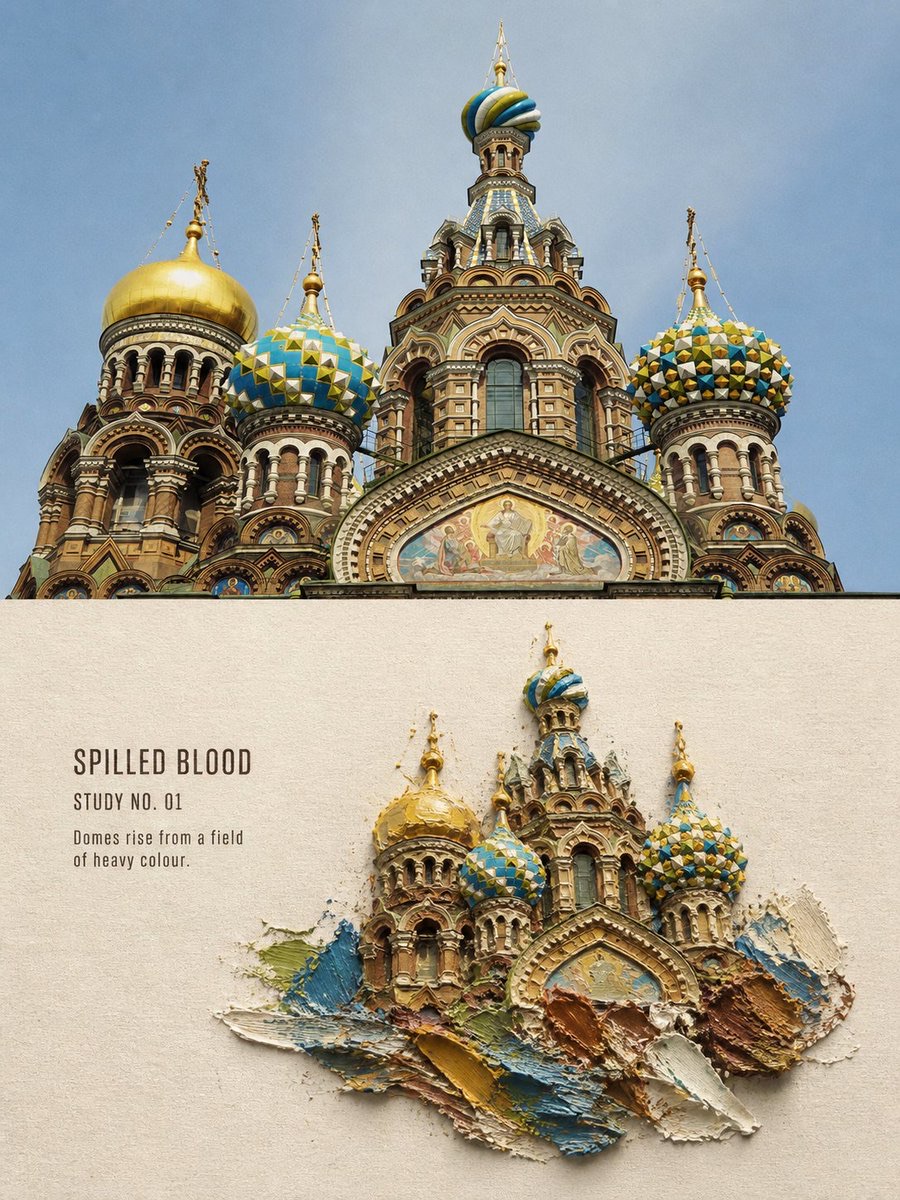
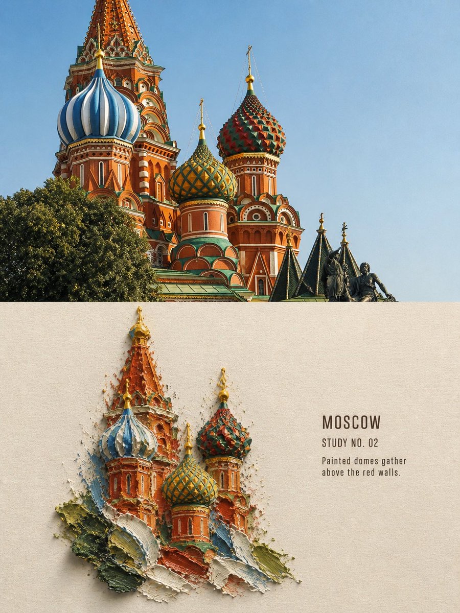
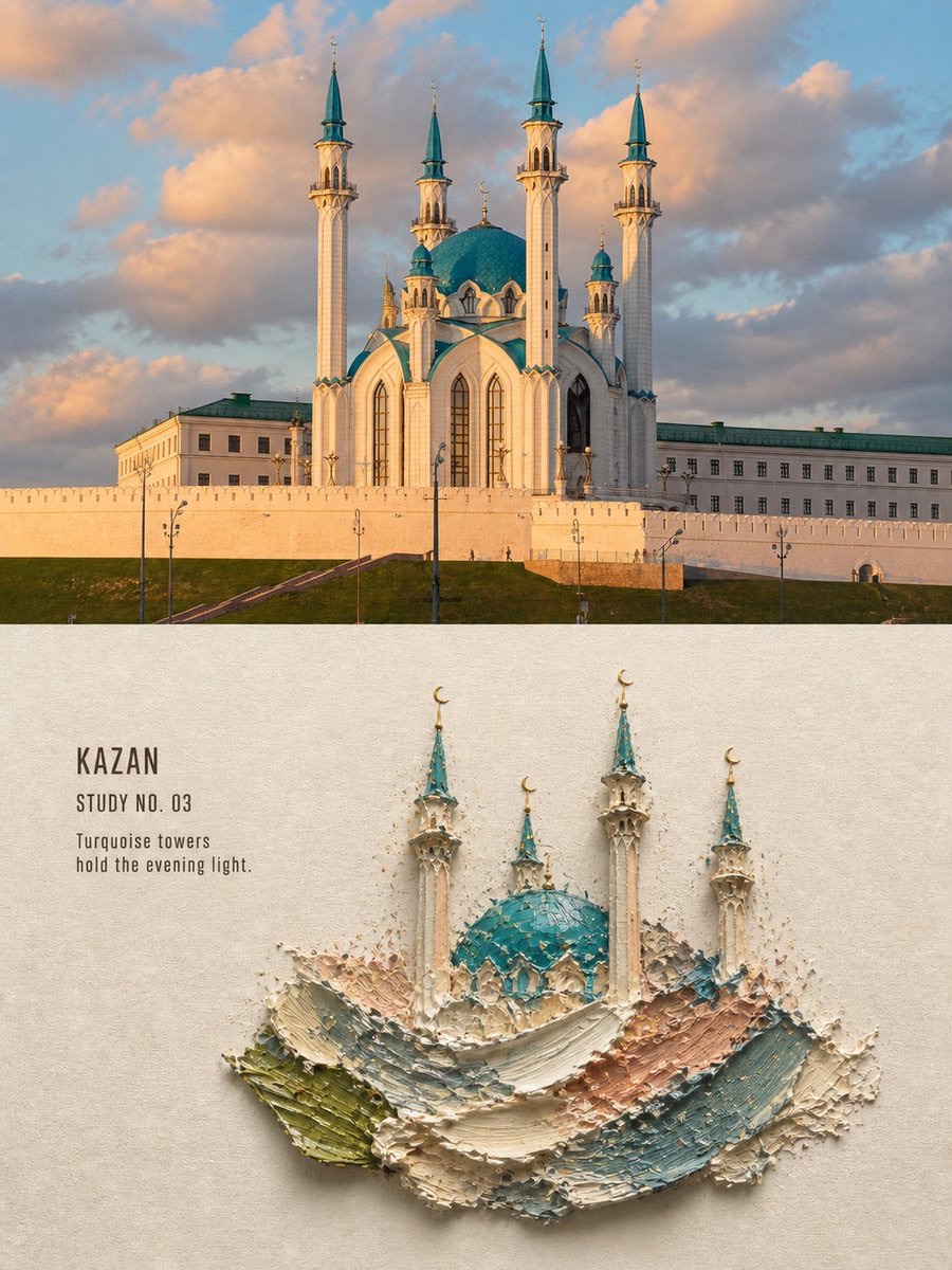
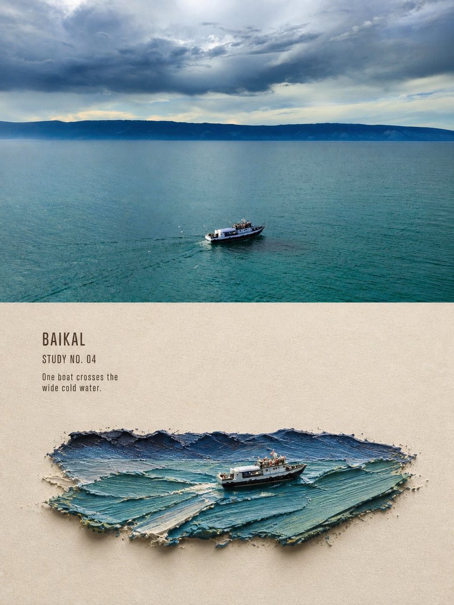
Transform each travel photo into a 3:4 art publication poster: preserve an area of the original photo, and reconstruct a place or subject from the photo in miniature using acrylic paint with tangible impasto thickness.
 蛋黄堡@Hamburgerai
Prompt
Please turn each travel photo I upload into a separate, high-end design poster. Do not combine multiple images into a collage; output one poster for each photo.

Use an overall vertical 3:4 composition made of two clearly bounded areas: an authentic photograph and a stylized reinterpretation. The real photo should occupy about 40%–50% of the entire image, with the reinterpretation taking up the other main area. Separate the two with a straight, crisp horizontal boundary, with no feathering or bleed. The proportions may be adjusted to suit the subject; they do not need to be mechanically equal, but the contrast with the original image must remain clear.

Faithfully preserve the original photo’s subject identity and quantity, architectural structures, terrain, people or vehicles, viewing angle, spatial relationships, authentic materials, natural light and shadows, and original colors in the photo area. Apply only restrained art-publication or photography-exhibition color grading and add a very fine film grain. Do not distort, mirror, move, add to, remove, or reshape the subject.

Use a warm ivory natural-paper background in the reinterpretation area, preserving about 38%–55% continuous blank paper. Do not redraw the original photo as a complete view at the same scale. Instead, extract the most recognizable subject, architectural grouping, vehicle, or terrain relationship from the photo and reorganize it as an “impasto memory miniature” placed on the paper.

The subject must be embedded in a mass of irregular, thick acrylic paint, as if growing from inside the paint. The paint should have a visual thickness of 5–15 millimeters, clearly showing palette-knife ridges, rounded raised areas, deep grooves, scratches, lifted thick edges, paint sidewalls, built-up cross-sections, tiny paint fragments, and differences between localized wet gleam and dry matte areas. A short, crisp, realistic contact shadow should fall between the paint and paper.

This is not layered paper, torn paper, papier-mâché, plasterboard, embossed paper cutouts, or an ordinary miniature model. The thickness must come from the volume, sidewalls, and palette-knife marks of real acrylic paint.

Select the form of the paint mass to suit the subject in the photo:

- A tower, church, or group of buildings can form a vertically stacked paint mountain;
- A lake, road, coastline, or vehicle can form a low, horizontally elongated paint island;
- A single person, boat, or small subject can be reduced in size and embedded in a few paint strokes.

Keep only the minimum structure needed to preserve the identity and story of the place. The edges of buildings gradually blend into pure palette-knife color blocks, paint fragments, and exposed paper, without forming a rectangular landscape painting. Take the palette entirely from the photo, reducing it to 1–3 main colors, one dark color, and one small-area accent color.

By default, add a set of clearly readable editorial text:

- A location or subject title of 1–3 English words;
- An archival field such as “STUDY NO. 01”;
- An original observational sentence of 5–12 English words.

The text must come from the actual places, subjects, weather, actions, or spatial impressions visibly present in the photo. The main title must be clearly readable at a normal preview size; it must not shrink into a thin gray line. The title can appear pressed into the edge of the paint with a palette knife, while supporting text sits in the exposed paper area, using a narrow humanist sans-serif or gentle serif typeface with slight dry-brush gaps.

The overall feel should be a quiet, restrained, poetic art publication with tangible handmade weight and collectible appeal.

Avoid: paper layers, torn paper, papier-mâché, plaster sheets, flat appliqué, flat paint patches, smooth digital brush, ordinary miniature model, plastic CGI, resin, same-crop repainting, full-background painting, rectangular duplicate photo, missing source-photo comparison, tiny unreadable text, floating digital typography, cartoon, logo, watermark, frame or wall mockup.
请将我上传的每一张旅行照片分别制作成一张独立的高级设计海报,不多图拼接,每张照片单独输出。
整体采用3:4竖版构图,由真实照片与风格化转绘构成两个边界清晰的区域。真实照片占整张画面约40%–50%,转绘区域占另一主要部分;两者使用笔直、清楚、没有羽化和渗透的水平边界。比例可以根据主体适当调整,不必机械等分,但原图对比必须清楚可见。
照片区域忠实保留原始照片的主体身份、数量、建筑结构、地形、人物或交通工具、观察角度、空间关系、真实材质、自然光影与原有色彩。仅进行克制的艺术出版物或摄影展调色,并添加极薄胶片颗粒。不得扭曲、镜像、移动、增删或重塑主体。
转绘区域使用温暖的象牙色天然纸张背景,并保留约38%–55%的连续纸面留白。不要沿用原照片的完整取景进行等比例重画,而是从照片中提取一个最具识别度的主体、建筑组合、交通工具或地形关系,重新组织成一件安放在纸面上的“厚涂记忆微缩”。
主体必须嵌入一块不规则的重体丙烯颜料之中,像从颜料内部生长出来。颜料具有约5–15毫米的视觉厚度,清楚表现调色刀峰脊、圆钝隆起、深沟、刮痕、抬起的厚边、颜料侧壁、堆积断面、微小颜料碎屑,以及局部湿润反光与干燥哑光之间的差异。颜料与纸面之间具有短而清楚的真实接触投影。
这不是纸张叠层、撕纸、纸浆、石膏板、浮雕纸片或普通微缩模型。厚度必须来自真实丙烯颜料的体积、侧壁和调色刀痕迹。
根据照片主体主动选择颜料岛形态:
- 高塔、教堂或建筑群可形成垂直堆积的颜料山体;
- 湖面、道路、海岸或车辆可形成低矮、横向延伸的颜料岛;
- 单一人物、船只或小型主体可以缩小并嵌入少量颜料笔触中。
只保留维持地点身份和故事所需的最少结构。建筑外缘逐渐融入纯粹的刮刀色块、颜料碎屑和裸露纸张,不形成矩形风景画。色盘完全从照片中提取,压缩为1–3个主色、一种深色与一个小面积强调色。
默认加入一组清楚可读的编辑文字:
- 一个1–3个英文单词的地点或主题标题;
- 一个类似“STUDY NO. 01”的档案字段;
- 一句5–12个英文单词的原创观察句。
文字内容必须来自照片中真实可见的地点、主体、天气、动作或空间感受。主标题在正常预览尺寸下清楚可读,不能缩成灰色细线。标题可像被刮刀压入颜料边缘,辅助文字放置在裸露纸张区域,使用带轻微干刷缺口的窄体人文无衬线或温和衬线字体。
整体呈现安静、克制、诗意、具有真实手工重量和收藏感的艺术出版物气质。
Avoid: paper layers, torn paper, papier-mâché, plaster sheets, flat appliqué, flat paint patches, smooth digital brush, ordinary miniature model, plastic CGI, resin, same-crop repainting, full-background painting, rectangular duplicate photo, missing source-photo comparison, tiny unreadable text, floating digital typography, cartoon, logo, watermark, frame or wall mockup.
How to use
Usage tip: Upload travel photos one at a time, ensuring the subject is clearly recognizable. After generation, check the original photo area, paint sidewalls and palette-knife texture, readability of the English title, and consistency of the subject's identity.
Details
More from 蛋黄堡
-

Travel Palette Watercolor Study Poster
-

Blue Halftone City Archive
-

Travel Photo to Glazed Mosaic Relief Poster
-

Clear White-Paper Travel Watercolor Editorial Poster
-

Vintage Matchbox Travel Label Poster
-

Travel Enamel Fridge Magnet Souvenir Poster
-

Two-Color Cultural Landmark Editorial Poster
-

Material Assemblage Contrast Poster from a Travel Photo