Image
Torn-Edge Ink Travel Memory Poster
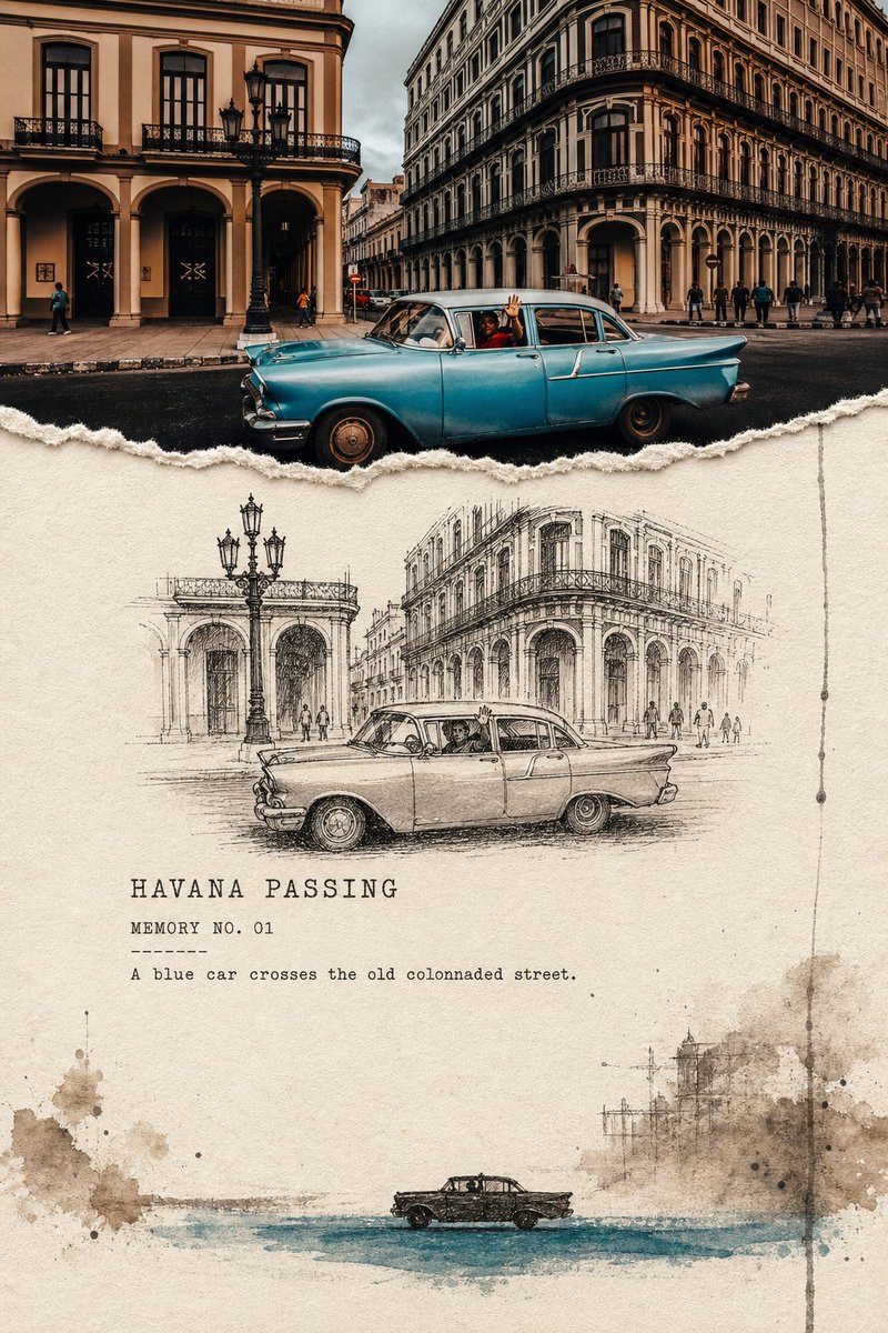
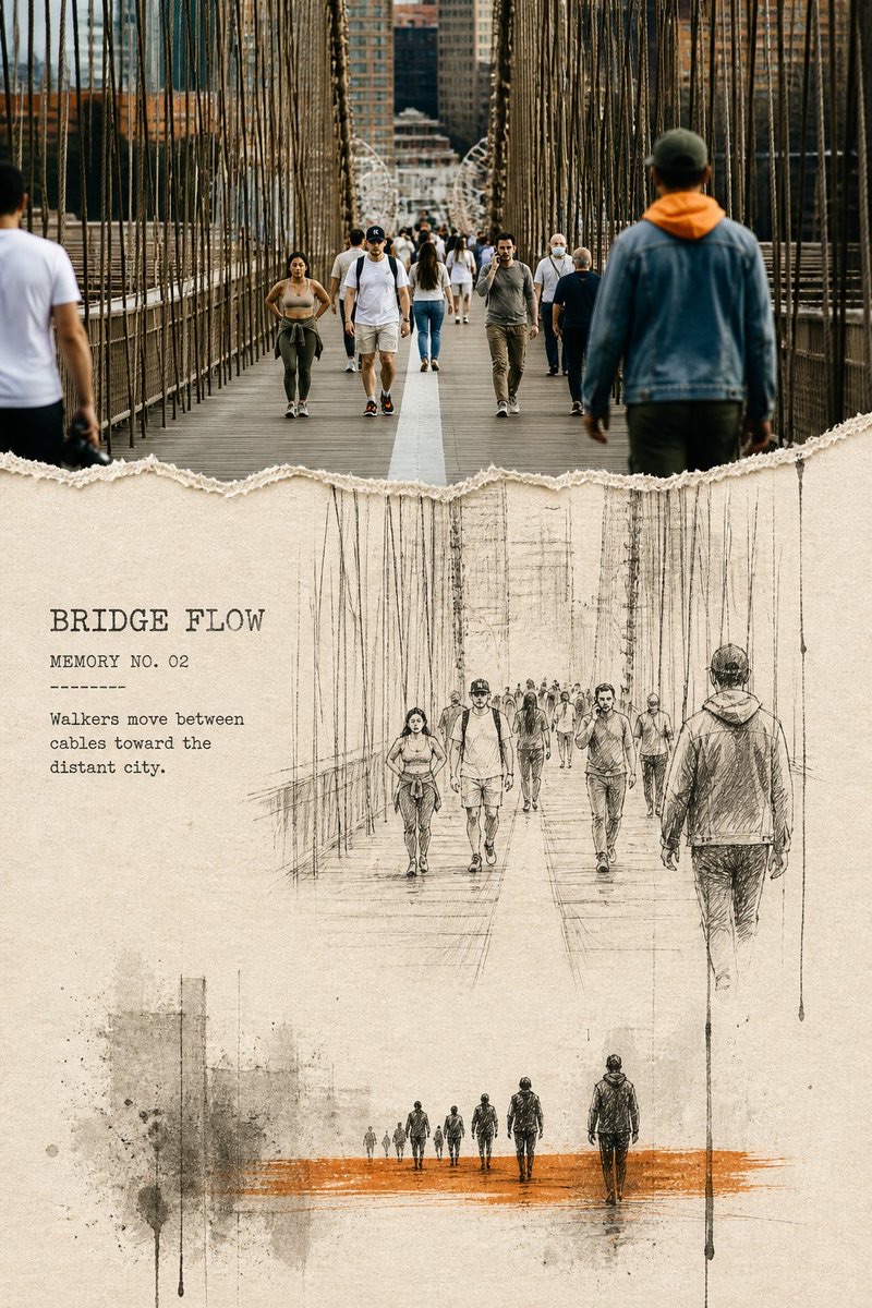
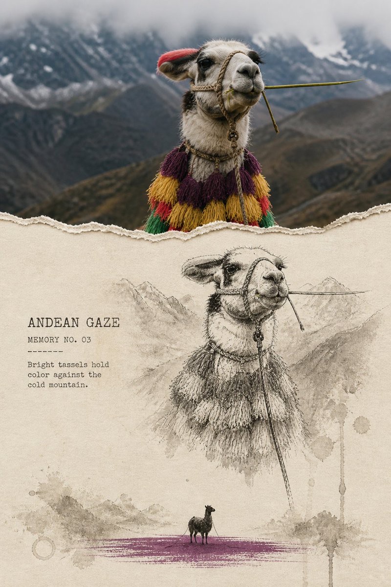
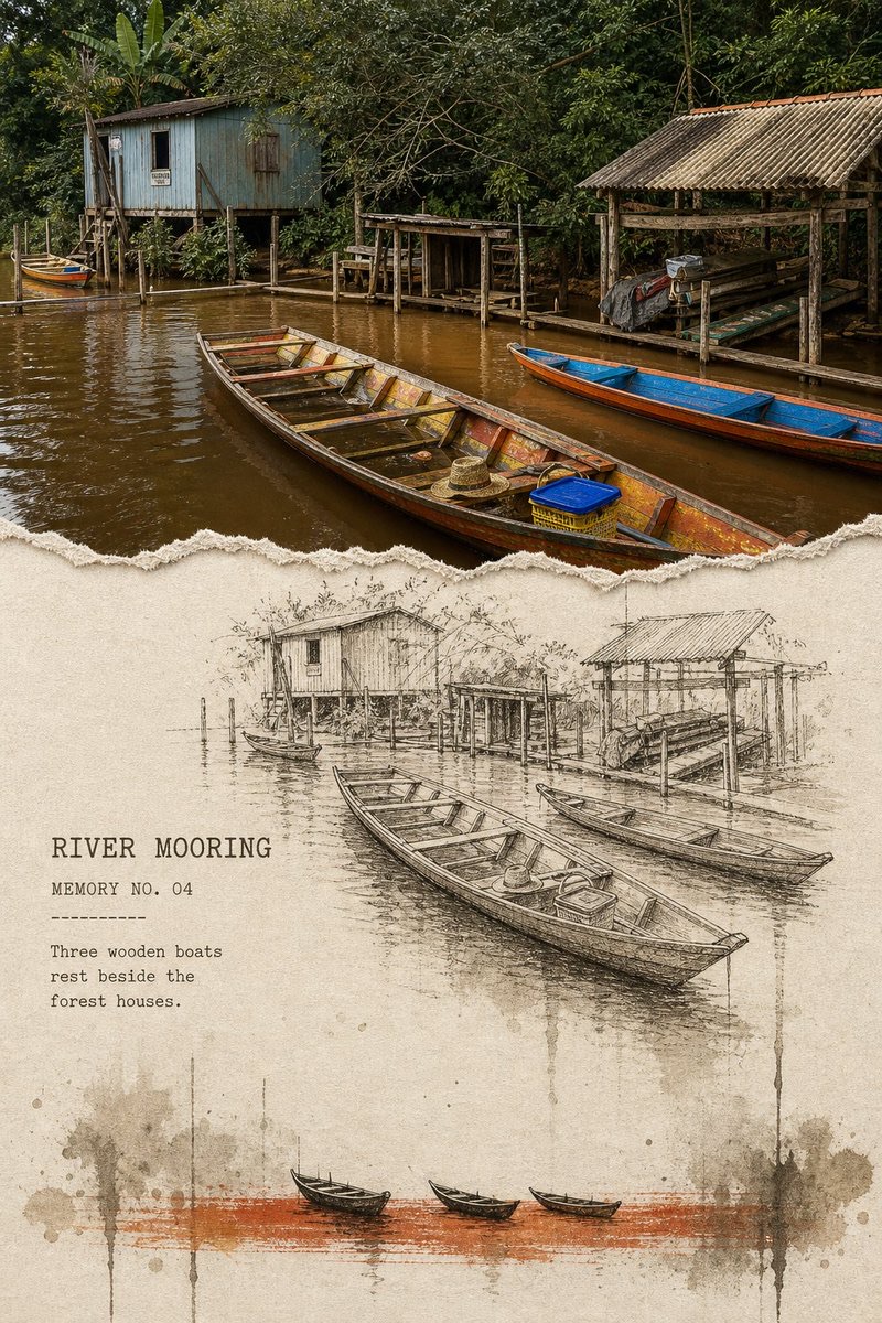
Turn each travel photo into a separate vertical editorial poster, showing the process of memory receding through a real photograph, observational line drawing, and gradually vanishing ink silhouette.
 蛋黄堡@Hamburgerai
Prompt
Create a separate torn-edge ink memory editorial poster for each travel photo I upload. Output each photo individually; do not combine multiple images into a collage. Use an overall 3:4 portrait layout, with a three-stage descending structure—“real photograph → observational line drawing → ink silhouette”—to depict the same scene.

The top should occupy about 28%–36% of the image height and faithfully preserve the most important scene in the original photo. Accurately retain the subjects' identity, number, pose, orientation, spacing, architecture, vehicles, boats, animals, people's actions, real materials, spatial direction, natural light and shadows, and distinctive colors. Apply only subtle art-publication color grading. The photograph must remain clearly recognizable; do not turn it into an illustration or decorative thumbnail.

Connect the top photograph to the paper below with clearly visible, hand-torn ragged edges: real paper fibers, irregular bumps, and slight thickness. Do not use digital blur, feathering, or a soft-light gradient.

The middle section is warm ivory, unbleached cotton paper, or light beige rough paper, forming the observation page with the most open space. Redraw the same subject with unstable pen lines, short hatching, dry ink, and a little gray wash, accurately preserving number, pose, and relative position while deliberately removing irrelevant backgrounds and tiny details. Choose a tree trunk, lighthouse, bridge cables, building edge, ship mast, mountain crevice, or vehicle outline from the photo as a vertical memory anchor. Keep the drawing within a narrower horizontal area; do not fill the page or automatically trace the photo's edges.

At the bottom, let the scene further dissolve into pale gray-brown, smoke gray, blue-gray, or olive-black ink masses, uneven water stains, dry-brush grain, fine broken lines, and 1–2 restrained drips. Reduce the subjects to a small group of dark silhouettes that still show the correct number and direction, placed on a horizontal brushstroke in an accent color drawn from the original photo. Use only one accent color; do not default to orange.

The information density must decrease from top to bottom: the photo is densest, the line drawing comes next, and the silhouettes are simplest. Keep continuous, clearly visible breathing room on the paper around the middle section and subjects. Let the ink masses enter incompletely from one side or the bottom edge; do not enclose all four sides.

In the open space in the middle, add a title of 1–3 English words, a “MEMORY NO. 01”-style field, and an observation sentence of 5–10 English words. Use legible typewriter bold, monospaced archival lettering, or uppercase letterpress type with missing ink. Supporting text should be smaller but must not shrink to gray lines. Text must come from the subject, action, weather, or spatial relationships in the photo. Do not copy the author's text or invent research data.

The overall effect should be a travel archive page that has been torn open, observed, and gradually faded away—restrained and poetic, with authentic paper fibers, dry ink, and a sense of time.

Strictly avoid: a hard, straight division between top and bottom; a standard half-photo, half-sketch template; digitally softened transitions; unrelated illustrations below; watercolor covering the whole page; imitation of traditional Chinese ink landscape painting; cute cartoons; detailed animal or plant field-guide illustrations; automatic tracing; dense technical infographics; oversized titles that overwhelm the image; multiple accent colors; author names, signatures, account names, logos, URLs, QR codes, watermarks, and garbled text.
请将我上传的每一张旅行照片分别制作成一张独立的撕边墨迹记忆编辑海报,每张照片单独输出,不多图拼接。整体采用3:4竖版,使用“真实摄影→观察线稿→墨迹剪影”三阶段递减结构表达同一场景。
顶部约占画面高度28%–36%,忠实保留原始照片中最重要的场景。准确保持主体身份、数量、姿态、朝向、间距、建筑结构、车辆、船只、动物、人物动作、真实材质、空间方向、自然光影和标志性色彩,只进行轻微艺术出版物调色。照片必须清楚可辨,不能插画化或变成装饰性缩略图。
顶部照片与下方纸面使用清楚可见的手工撕纸毛边连接:边缘有真实纸纤维、不规则凹凸与轻微厚度,不能使用数字雾化、羽化或柔光渐变。
中部为温暖象牙色、未漂白棉纸或浅米色粗纸,是留白最多的观察页。用不稳定钢笔线、短排线、干墨和少量灰洗重画同一主体,准确保留数量、姿态和相对位置,但主动删除无关背景与微小细节。选择照片中的树干、灯塔、桥索、建筑边缘、船桅、山体裂隙或车辆轮廓作为一条竖向记忆锚点。线稿集中在较窄的水平场域,不铺满纸面,也不做照片自动描边。
底部让场景进一步消散成淡灰褐、烟灰、蓝灰或橄榄黑的墨团、不均匀水痕、干笔颗粒、细长断线和1–2道克制滴落。主体缩成一组小型深色剪影,仍保持正确数量和方向,落在一道从原照片提取的强调色水平笔迹上。只使用一个强调色,不固定为橙色。
信息密度必须自上而下递减:照片最密,线稿次之,底部剪影最简。中部和主体周围保留连续、明显的纸面呼吸空间;墨团从一侧或下缘不完整地涌入,不封闭四边。
在中部留白加入一个1–3个英文单词标题、MEMORY NO. 01式字段和一行5–10个英文单词观察句。文字使用可读的打字机粗体、等宽档案字或带缺墨的大写铅字,辅助文字较小但不能缩成灰线。文字内容必须来自照片中的主体、动作、天气或空间关系,不复制作者文字,不虚构研究数据。
整体应像一页被撕开、观察并逐渐褪去的旅行档案,克制、诗意,具有真实纸纤维、干墨与时间感。
强制避免:硬直上下分界、普通半照片半速写模板、数字柔化过渡、无关下方插画、满页水彩、传统水墨山水模仿、可爱卡通、精细动物或植物图鉴、自动描边、密集技术信息图、大标题压过画面、多种强调色、作者名、签名、账号、Logo、网址、二维码、水印、乱码。
How to use
Usage suggestion: Upload one travel photo with a clearly visible subject and generate one image at a time. Based on the subject, action, and spatial relationships in the photo, have the model automatically fill in an English title, number, and observation sentence.
Details
More from 蛋黄堡
-

Travel Palette Watercolor Study Poster
-

Blue Halftone City Archive
-

Travel Photo to Glazed Mosaic Relief Poster
-

Clear White-Paper Travel Watercolor Editorial Poster
-

Vintage Matchbox Travel Label Poster
-

Travel Enamel Fridge Magnet Souvenir Poster
-

Two-Color Cultural Landmark Editorial Poster
-

Material Assemblage Contrast Poster from a Travel Photo