Image
Travel Photo Paper-Clay City Relief Poster
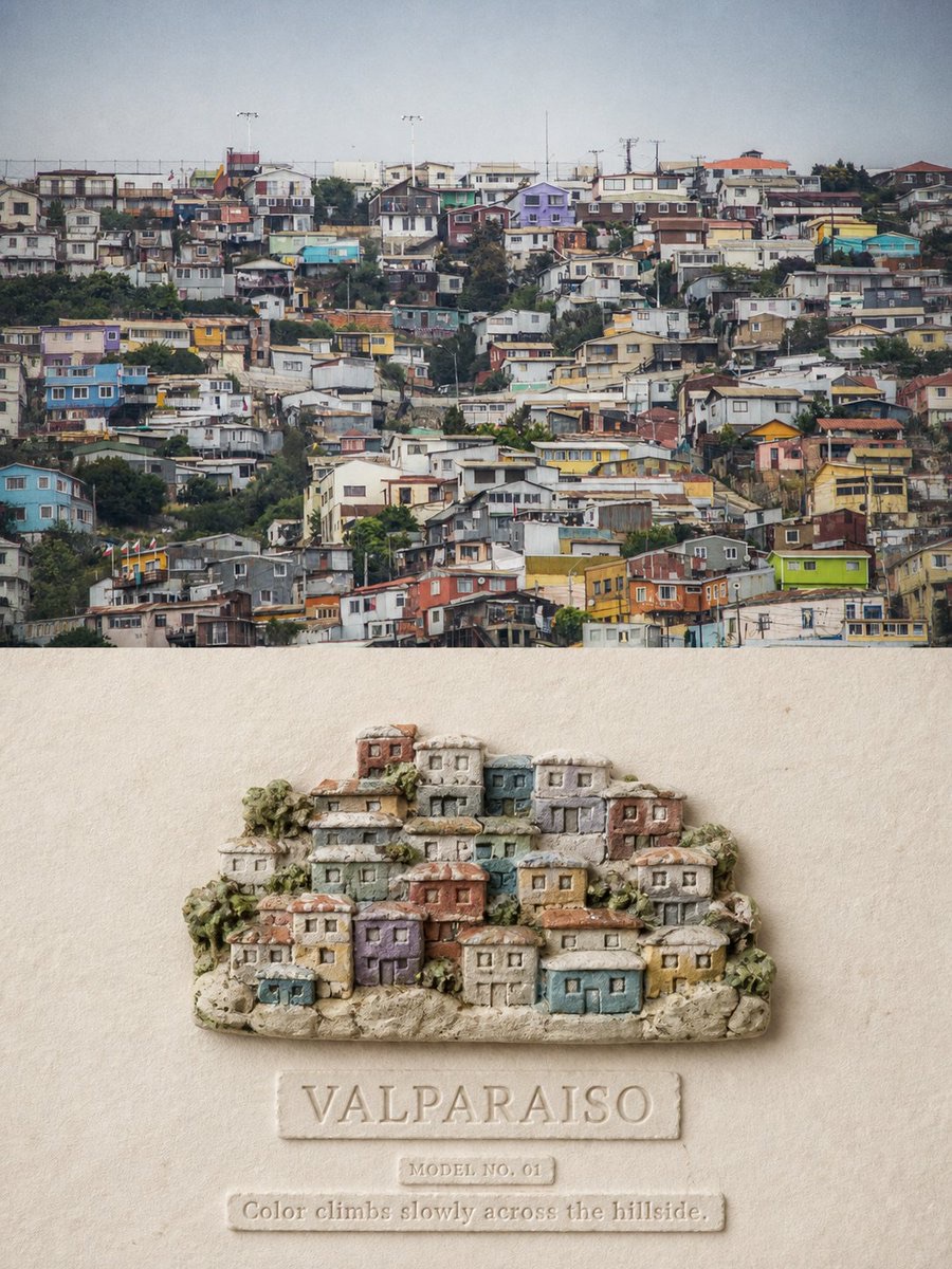
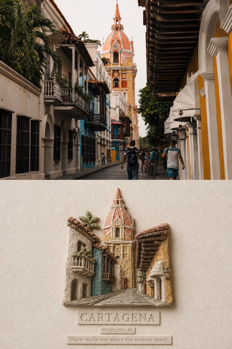
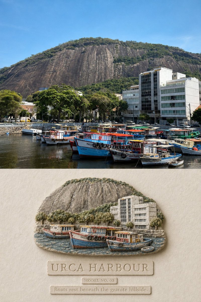
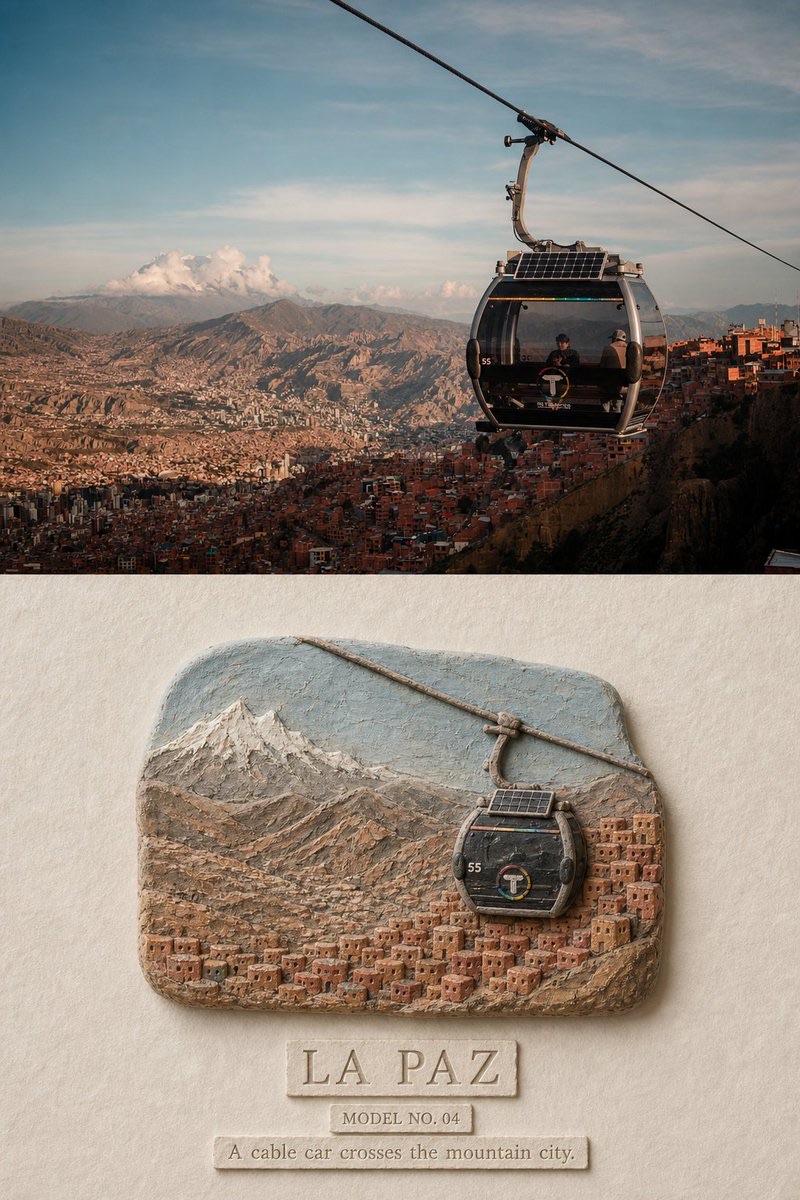
Turn each travel photo into a collectible poster with top-and-bottom sections: preserve the real photo above, and below reconstruct its defining location features as a hand-molded paper-clay miniature in shallow relief.
 蛋黄堡@Hamburgerai
Prompt
Turn each travel photo I upload into a separate, premium reinterpretation poster. Do not collage multiple photos; output each photo separately.

Use a vertical 3:4 composition, divided into a clearly distinguishable real-photo section and a stylized reinterpretation section. Separate them with a straight, clear horizontal boundary; do not blend, feather, or use torn-paper collage between them. The real-photo section should occupy about 45%–50% of the image, and the reinterpretation section about 50%–55%.

Faithfully preserve the original photo in the upper section. Accurately retain subject identities, architectural structures, mountain terrain, roads, bodies of water, boats, vehicles, the number of people, viewing angle, spatial relationships, real materials, natural light and shadow, and the original color atmosphere. Apply only subtle color grading at the level of an art publication, travel magazine, or exhibition photography, and add an extremely fine film grain. Do not redraw the photo as an illustration, stretch or mirror it, replace the sky, alter buildings, move subjects, or add or remove important objects.

In the lower section, extract 3–7 structures from the same photo that best establish the location’s identity, such as a distinctive building silhouette, mountain contours, city slopes, shoreline, roads, boats, cable cars, or tiers of rooftops. Rebuild them as a “hand-molded paper-clay miniature city in shallow relief,” displayed on warm natural paper.

Do not copy the photo’s full framing or compress a complex scene into a crowded model. Deliberately remove repeated windows, dense streets, advertising, clutter, unrelated people, and photographic noise. Keep only the forms necessary for the original scene to be recognizable at a glance. Based on the photo, reorganize the subject as an irregular miniature base, shallow-relief terrain, or small cluster of buildings, so the reinterpretation section clearly differs from the photo above in subject scale, crop, amount of background, and spatial arrangement.

Center the relief in the middle or lower middle of the reinterpretation section. The subject should generally occupy about 40%–60% of that section’s width, with about 40%–60% of continuous warm-white paper around it. The negative space must form a single, complete, quiet area of paper, not scattered little gaps between objects.

The material must clearly appear to be:

paper clay, stone-powder clay, air-dry clay, handmade plaster relief, soft ceramic slip, shallow sculptural relief.

Show the rounded edges, slightly crooked forms, fingertip impressions, carving grooves, impressed doors and windows, tiny cracks, slight powdering, uneven thickness, powdery matte pigment, and real contact shadows of hand-molded paper clay. Buildings, mountains, water, and vehicles should rise only slightly from the paper. Do not make them look like smooth plastic models, toy cities, or finely detailed photorealistic dioramas.

Extract colors entirely from the original photo, then soften and mute them. Preserve the photo’s most recognizable overall colors and unify them into a small number of chalk-like natural colors. One small area of a location-defining color may be kept as a focal point. Do not apply a fixed palette to every photo.

By default, add three tiers of accurate, legible English text:

1. Create a main title of 1–3 English words, distilled from the photo’s location or subject;
2. Add a relief number in a format like “MODEL NO. 01”;
3. Add an observation sentence of 5–10 English words describing mountains, streets, buildings, boats, or spatial relationships actually visible in the photo.

The main title must be clearly legible at normal chat-preview size and occupy about 20%–35% of the reinterpretation section’s width. The text should look lightly pressed into the paper, or carved into a small irregular clay plaque, with slightly powdery edges and handmade imperfections. Do not overlay smooth digital fonts. Do not invent a location, date, coordinates, brand, or quotation.

The overall design should feel quiet, restrained, tactile, and collectible, with a hint of childhood memories of model-making.

Avoid: smooth glossy CGI, polished ceramic, plastic resin, toy city, Lego, isometric game art, cardboard architecture, folded paper, thick impasto, photoreal scale model, generic skyline, crowded miniature, hyper-detailed windows, fixed colour palette, full-poster redraw, same-crop same-scale redraw, tiny source-photo thumbnail, fake text, author name, signature, logo, watermark.

Most important rule: the upper section must preserve a clear, substantial area of the real original photo. The lower section is not an ordinary 3D city model; it is a hand-molded paper-clay travel miniature, reduced and reorganized from the original photo, with authentic fingerprints, cracks, a powdery surface, and shallow-relief depth.
请将我上传的每一张旅行照片分别制作成一张独立的高级转绘海报,不多图拼接,每张照片单独输出。
整体采用3:4竖版构图,画面分为清楚可辨的真实照片区与风格化转绘区,两者之间使用平直、明确的水平边界,不做渐融、羽化或撕纸拼贴。真实照片区约占画面45%~50%,转绘区约占50%~55%。
上半部分忠实保留原始照片。准确保持主体身份、建筑结构、山体地形、道路、水体、船只、交通工具、人物数量、观察角度、空间关系、真实材质、自然光影和原有色彩氛围。仅进行轻微的艺术出版物、旅行杂志或展览摄影调色,并加入极薄的胶片颗粒。不得把照片重绘成插画,不得拉伸、镜像、替换天空、改变建筑、移动主体或增删重要物体。
下半部分从同一张照片中提取3~7个最能证明地点身份的结构,例如代表性建筑轮廓、山体走势、城市坡度、岸线、道路、船只、缆车或屋顶层级,将其重新构建为陈列在温暖天然纸面上的“手捏纸黏土城市浅浮雕微缩”。
不要完整复制照片取景,也不要把复杂场景缩成拥挤的模型。主动删除重复窗户、密集街道、广告、杂物、无关人物和摄影噪声,只保留让人一眼认出原场景所必需的形体。根据照片内容,将主体重组为一块不规则的微型基座、浅浮雕地形或小型建筑群,使转绘区在主体尺度、裁切、背景数量和空间组织上明显区别于上方照片。
浮雕集中在转绘区中央或中下部,主体通常占转绘区宽度约40%~60%,周围保留约40%~60%的连续暖白纸张。留白必须是一块完整、安静的纸面,而不是物体之间零碎的小缝隙。
材质必须明确表现为:
paper clay, stone-powder clay, air-dry clay, handmade plaster relief, soft ceramic slip, shallow sculptural relief.
表现手捏纸黏土真实的圆钝边缘、略微歪斜的形体、指腹压痕、刻刀槽、压印门窗、细小裂纹、轻微掉粉、厚薄不均、粉质哑光颜料和真实接触阴影。建筑、山体、水面与交通工具只需浅浅隆起于纸张,不得做成光滑塑料模型、玩具城市或精细写实沙盘。
颜色完全从原照片提取,再进行粉化、柔化与限色处理。保留照片中最有识别度的综合色彩,将其统一为少量粉笔般的自然色,可保留一个小面积地点特征色作为视觉焦点。不要为所有照片套用固定色盘。
默认加入三层准确、可读的英文文字:
1. 根据照片地点或主题提炼一个1~3个英文单词的主标题;
2. 一个类似“MODEL NO. 01”的浮雕编号;
3. 一行5~10个英文单词的观察句,描述照片中真实可见的山体、街道、建筑、船只或空间关系。
主标题在正常聊天预览尺寸下必须清楚可读,约占转绘区宽度的20%~35%。文字应像浅浅压入纸面,或刻在一块不规则的小型黏土铭牌上,边缘略有粉质和手工误差,不要叠加光滑的数字字体。不得虚构地点、日期、坐标、品牌或引用。
整体呈现安静、克制、触感真实、略带童年模型记忆的收藏级旅行编辑设计。
Avoid: smooth glossy CGI, polished ceramic, plastic resin, toy city, Lego, isometric game art, cardboard architecture, folded paper, thick impasto, photoreal scale model, generic skyline, crowded miniature, hyper-detailed windows, fixed colour palette, full-poster redraw, same-crop same-scale redraw, tiny source-photo thumbnail, fake text, author name, signature, logo, watermark.
最重要的规则:上方必须保留清楚、具有实质面积的真实原始照片;下方不是普通3D城市模型,而是从原照片主动删减并重新组织之后,真正具有指痕、裂纹、粉质表面与浅浮雕厚度的手捏纸黏土旅行微缩。
How to use
Usage suggestion: Upload travel photos one at a time, and confirm the location or subject can be identified from the photo itself. After generation, focus on checking the original-image fidelity, recognition of the location’s structures, and accuracy of the English text.
Details
More from 蛋黄堡
-

Travel Palette Watercolor Study Poster
-

Blue Halftone City Archive
-

Travel Photo to Glazed Mosaic Relief Poster
-

Clear White-Paper Travel Watercolor Editorial Poster
-

Vintage Matchbox Travel Label Poster
-

Travel Enamel Fridge Magnet Souvenir Poster
-

Two-Color Cultural Landmark Editorial Poster
-

Material Assemblage Contrast Poster from a Travel Photo