Image
Paper-Cutout People Travel Street-Scene Poster
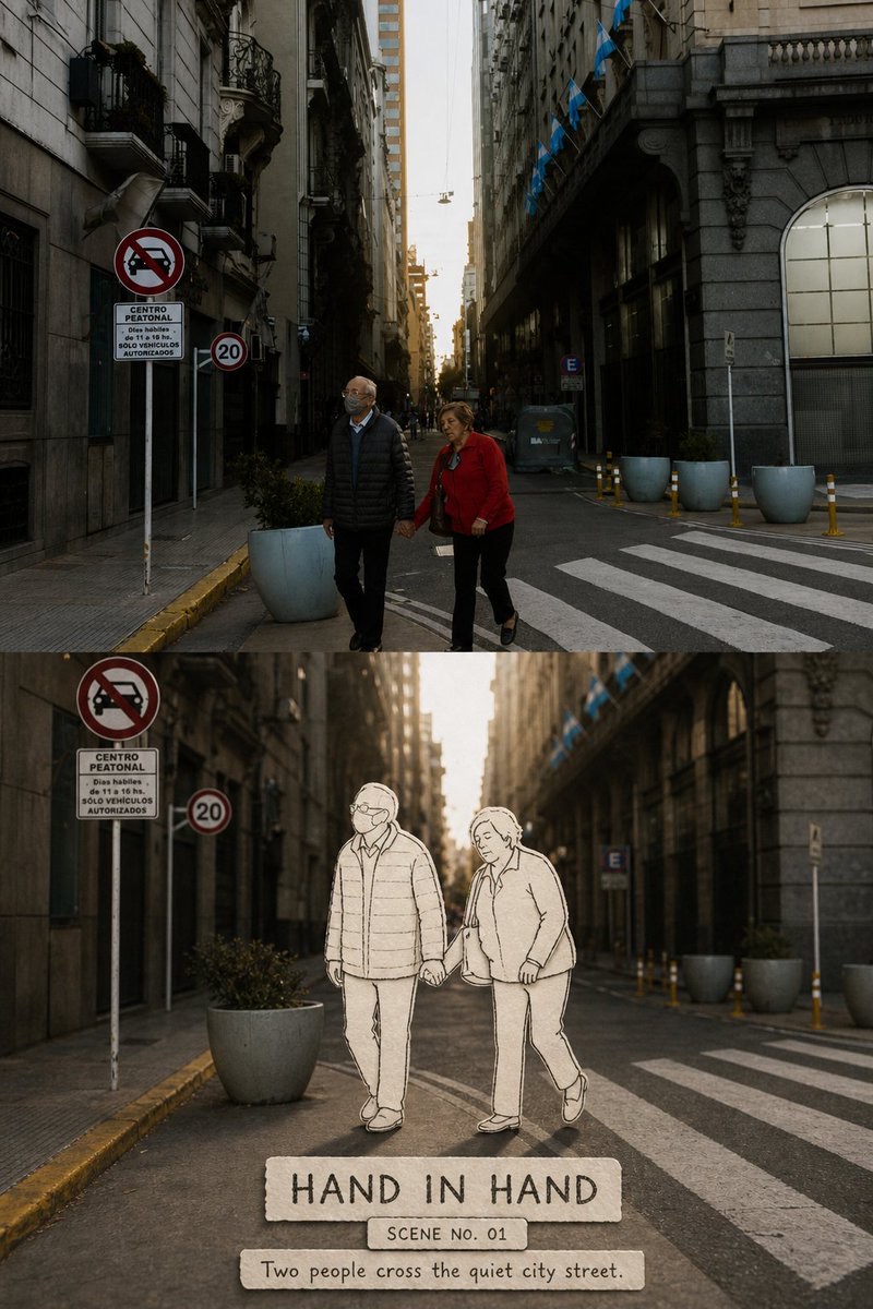
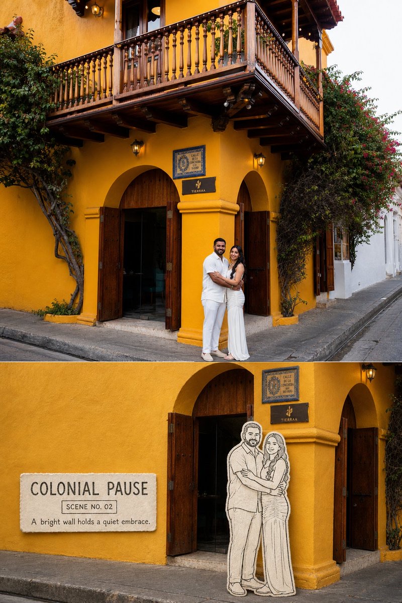
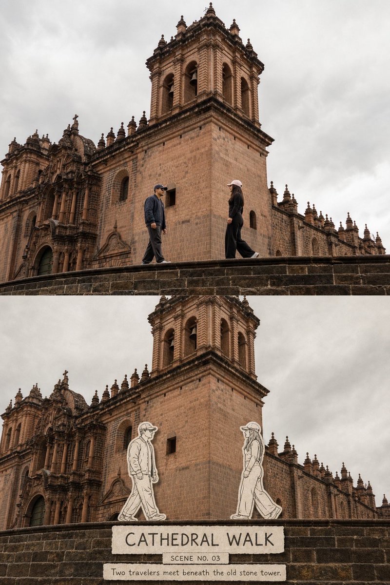
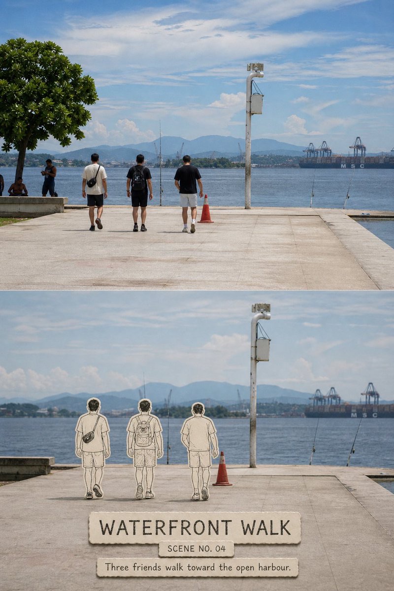
Turn each travel photo into a separate 3:4 top-and-bottom comparison poster: preserve the real original photo above and reconstruct the same scene below, transforming only the real people into warm-white paper cutouts and hesitant black-ink line-drawn characters.
 蛋黄堡@Hamburgerai
Prompt
Turn each travel photo I upload into a separate, premium reinterpretation poster. Do not collage multiple photos; output each photo separately.

Use a vertical 3:4 top-and-bottom comparison layout. The upper section should occupy about 48%–50% of the image and preserve the complete original photo; the lower section should occupy about 50%–52% and reconstruct the same location, same people, and same moment. Separate the upper and lower sections with a clear, straight horizontal boundary. Do not blend them, use torn paper, create multilayered collages, or add a decorative band between them.

Faithfully preserve the people’s identities, number, facial features, poses, direction of movement, gestures, clothing, belongings, spacing between people, foreground/background occlusion, architectural structures, road perspective, real materials, natural light and shadow, and atmosphere of the location in the upper section. Apply only subtle color grading at the level of a travel magazine, art publication, or exhibition photography, and add extremely fine film grain. Do not alter people, replace the background, move buildings, add or remove pedestrians, or turn the photo into an illustration.

The lower section should reconstruct the same space, but allow for a more editorial secondary composition based on the relationships between the people. Choose a portion of the real photographic setting sufficient to establish the location. Tighten the crop moderately, lower background contrast, or remove unrelated people at the edges so the 1–4 most important people in the photo become a clear narrative focus. Leave about 20%–32% of continuous, low-detail open space in the sky, wall, street, water, or ground, so the image can breathe and accommodate text.

Keep the buildings, streets, walls, trees, vehicles, sky, water, and lighting in the lower section photorealistic. Do not turn the entire scene into line art. Transform only the people actually present in the photo who carry the main narrative into “warm-white paper cutouts + hesitant black line drawings,” as physical collage-sketch characters.

Strictly preserve the actual number, position, size, pose, direction of action, distance from one another, hand contact, foreground/background occlusion, and interaction between the people. Construct each person from the following:

- Opaque warm-white or natural-white paper fill that completely covers the person’s original photographic content;
- Visible but restrained natural paper grain and slight fibers;
- Clean die-cut paper edges with slight handmade imperfections;
- Loose, hesitant charcoal-black or ink-black outlines with subtle variation in weight;
- Very few internal sketch lines for hair, collars, arms, hands, legs, shoes, backpacks, or cameras;
- Very faint, correctly oriented contact shadows beneath the feet and between overlapping paper layers.

The people must feel like real paper figures standing in the location. Ensure their feet on the ground, occlusion between figures, perspective scaling, and the direction of the scene’s light all look credible. Do not merely overlay white line art on transparent photographic people, and do not make the figures look like thick foam stickers, cartoon characters, reaction stickers, comic characters, or an AR interface.

Distant, very small people may be cropped out of the lower section. If they remain clearly identifiable, depict their actual number as simpler white-paper silhouettes. Do not duplicate them, add more, or give them identical poses. Bags, hats, cameras, umbrellas, or bicycles related to the people’s actions may be turned into paper cutouts along with them.

By default, add three tiers of accurate, legible English text:

1. Create a title of 1–3 English words distilled from the people’s actions or the relationships in the scene;
2. Add an observation number in a format like “SCENE NO. 01”;
3. Add a short sentence of 5–10 English words describing the walking, waiting, meeting, embracing, or looking that is actually happening in the photo.

The main title must be clearly legible at normal chat-preview size and occupy about 25%–38% of the lower section’s width. Use loose black-ink capitals, hand-set type, or narrow sketchbook-style lettering. It may be printed on a piece of warm-white handmade paper, or arranged along a low-detail wall or ground area. Let the ink show slight breaks and paper tooth, but do not reduce it to decorative gray lines or make it look like smooth digital typesetting overlaid in post-production.

Do not invent relationships between people, locations, dates, brands, quotations, or author information. Do not let text cover people’s faces, hand interactions, or points where their feet touch the ground.

The overall effect should feel uncanny, with real travel photography and sketched paper figures existing together: the setting remains part of reality, while the people seem cut from a memory, diary, or sketchbook and gently placed back into the journey.

Avoid: full-poster redraw, illustrated buildings, illustrated street, all-white background replacing the scene, transparent line overlay on photographic people, cartoon people, colored comic characters, kawaii stickers, speech bubbles, AR interface, thick foam stickers, altered person count, invented pedestrians, duplicated figures, changed poses, separated hands, floating figures, missing contact shadows, tiny source-photo comparison, fake text, author name, signature, social handle, logo, watermark.

Most important rule: the upper section must preserve the complete real original photo. The lower section must remain a real photographic space, transforming only the people actually present in the photo into physical collage characters made of warm-white paper cutouts and hesitant black-ink lines.
请将我上传的每一张旅行照片分别制作成一张独立的高级转绘海报,不多图拼接,每张照片单独输出。
整体采用3:4竖版上下对比结构。上半部分约占画面48%~50%,完整保留原始照片;下半部分约占50%~52%,重建同一地点、同一人物和同一时刻。上下之间使用清楚、平直的水平边界,不做渐融、撕纸、多层拼贴或中间装饰带。
上半部分忠实保留原照片中的人物身份、数量、面部特征、姿态、行进方向、手势、服装、随身物件、人物间距、前后遮挡、建筑结构、道路透视、真实材质、自然光影和地点氛围。仅进行轻微的旅行杂志、艺术出版物或展览摄影调色,并加入极薄胶片颗粒。不得改变人物、替换背景、移动建筑、增删行人或把照片插画化。
下半部分重建同一空间,但允许根据人物关系进行更有编辑感的二次构图。选择一段足以证明地点的真实摄影环境,适度收紧裁切、降低背景对比或删除无关边缘人物,使照片中最重要的1~4个人物成为清楚的叙事中心。天空、墙面、街道、水面或地面中保留约20%~32%的连续低信息空场,让画面可以呼吸并容纳文字。
下半部分的建筑、街道、墙壁、树木、车辆、天空、水面和光影继续保持真实摄影质感。不要把整个场景一起画成线稿。只将照片中实际存在、并承担主要叙事作用的人物转化为“暖白纸片+黑色迟疑线描”的实体剪贴速写角色。
严格保持人物真实数量、位置、大小、姿态、动作方向、彼此距离、手部接触、前后遮挡和互动关系。每个人物由以下部分构成:
- 不透明的暖白或自然白纸片填充,完全遮住原本的人物摄影内容;
- 可见但克制的天然纸张颗粒和轻微纤维;
- 干净却略有手工误差的模切纸边;
- 松动、迟疑、粗细略有变化的炭黑或墨黑轮廓;
- 极少量用于头发、衣领、手臂、手掌、腿部、鞋子、背包或相机的内部速写线;
- 非常浅、方向正确的脚底接触阴影和纸片叠层阴影。
人物必须像真实的薄纸角色站在现场中,脚底与地面、人物间遮挡、透视缩放和现场光向都要可信。不得只在透明摄影人物上叠加白色线稿,也不能做成厚泡棉贴纸、卡通人物、表情包、漫画角色或AR界面。
远处非常小的人物可以根据下半部分裁切主动移出画面;若仍清楚可辨,则应按真实数量以更简洁的白纸剪影处理,不得复制、增加或统一成相同姿势。与人物动作有关的包、帽子、相机、雨伞或自行车可以随人物一起纸片化。
默认加入三层准确、可读的英文文字:
1. 根据照片中的人物动作或场景关系提炼一个1~3个英文单词的标题;
2. 一个类似“SCENE NO. 01”的观察编号;
3. 一行5~10个英文单词的短句,描述照片里真实发生的行走、等待、相遇、拥抱或观看。
主标题必须能在正常聊天预览尺寸下清楚辨认,约占下半区域宽度的25%~38%。文字使用松动黑墨大写、手工铅字或速写本式窄体字,可印在一块暖白色手工纸签上,也可以沿低信息的墙面或地面排列。墨迹允许轻微断裂和纸齿,但不能缩成装饰灰线,不能像后期叠加的光滑数字排版。
不得虚构人物关系、地点、日期、品牌、引用或作者信息。文字不能覆盖人物面部、手部互动和脚底接触位置。
整体具有真实旅行摄影与纸上人物速写同时存在的奇妙感觉:环境仍然属于现实,人物像从记忆、日记或速写本中被剪下,再轻轻放回旅途中。
Avoid: full-poster redraw, illustrated buildings, illustrated street, all-white background replacing the scene, transparent line overlay on photographic people, cartoon people, colored comic characters, kawaii stickers, speech bubbles, AR interface, thick foam stickers, altered person count, invented pedestrians, duplicated figures, changed poses, separated hands, floating figures, missing contact shadows, tiny source-photo comparison, fake text, author name, signature, social handle, logo, watermark.
最重要的规则:上方必须完整保留真实原照片;下方仍然是真实摄影空间,只将照片中真实存在的人物转化为暖白纸片与迟疑黑墨线构成的实体剪贴角色。
How to use
Usage suggestion: Upload each travel photo separately and generate a separate poster. Check the horizontal boundary between the upper and lower sections, the number of people and their actions, the contact shadows beneath the paper figures’ feet, and whether the English title and sentence are accurate and clearly legible.
Details
More from 蛋黄堡
-

Travel Palette Watercolor Study Poster
-

Blue Halftone City Archive
-

Travel Photo to Glazed Mosaic Relief Poster
-

Clear White-Paper Travel Watercolor Editorial Poster
-

Vintage Matchbox Travel Label Poster
-

Travel Enamel Fridge Magnet Souvenir Poster
-

Two-Color Cultural Landmark Editorial Poster
-

Material Assemblage Contrast Poster from a Travel Photo