Image
Travel photo and keepsake ticket comparison poster
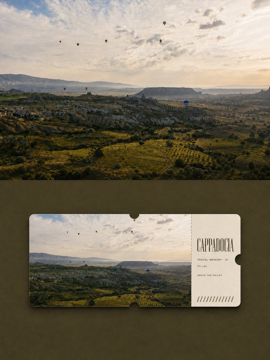
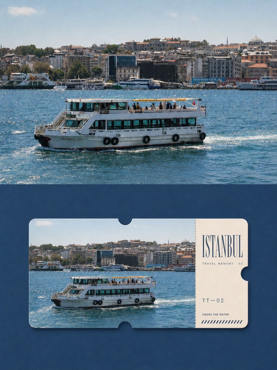
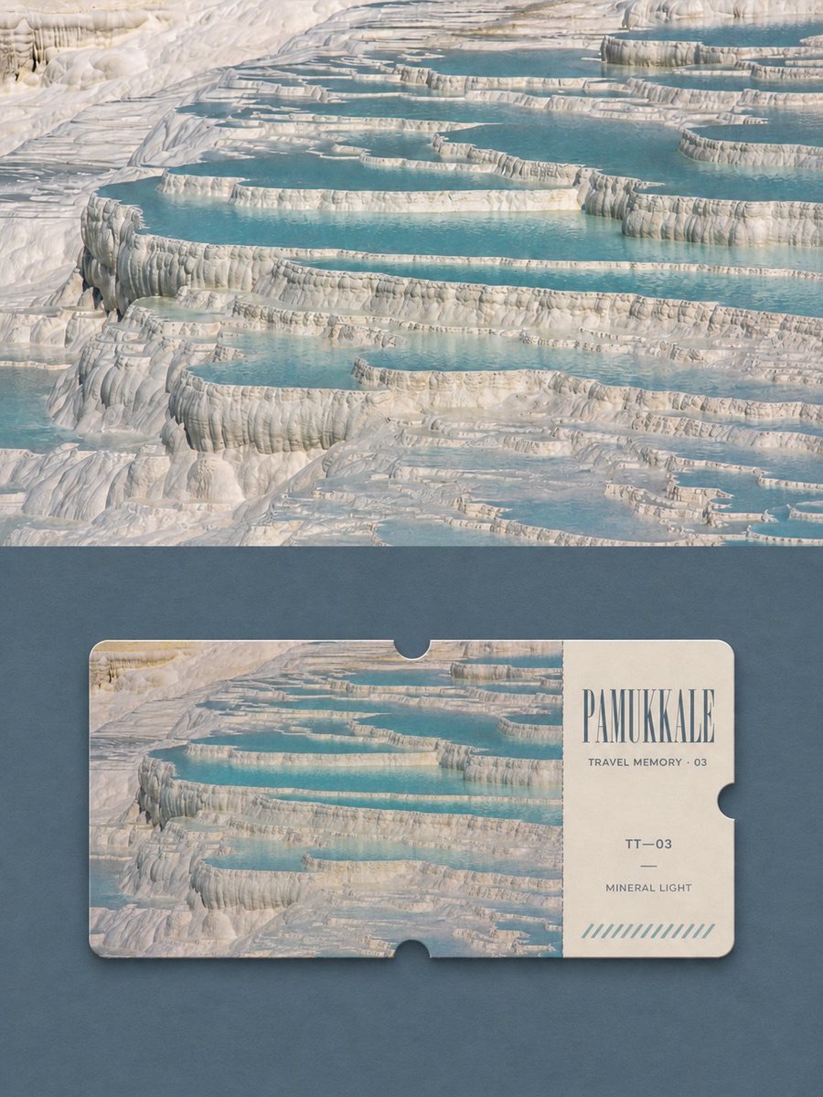
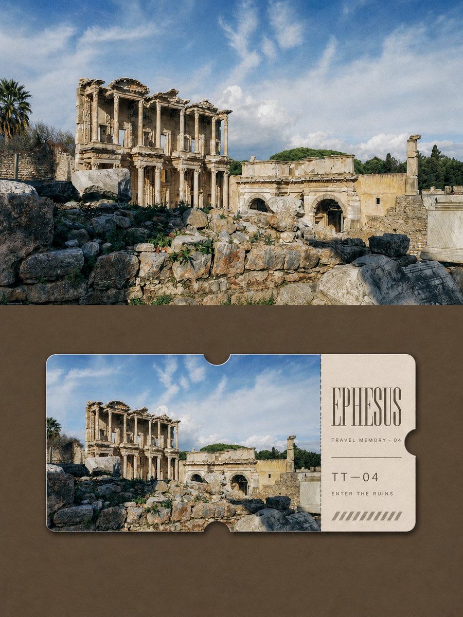
Turn each travel photo into a separate 3:4 vertical poster with a top-and-bottom comparison: preserve the real scene above and design the same scene below as a restrained travel keepsake ticket.
 蛋黄堡@Hamburgerai
Prompt
Please make each travel photo I upload into its own premium design poster. Do not combine multiple photos; output each photo separately.

Use a 3:4 vertical composition, divided into two clearly contrasted upper and lower sections, in an approximate ratio of 1:1. Use a straight, clear, restrained horizontal boundary between the two sections: no gradient, feathering, torn-paper effect, or overlap.

Show the original travel photo in full in the upper half. Faithfully preserve the location, subject identity and number, horizon, direction of the terrain, architecture, people, vehicles or boats, viewing angle, relative positions, realistic materials, natural light and shadow, and original colors. Apply only subtle color grading inspired by travel magazines and art publications, and add an extremely fine film grain. The upper half must clearly read as a real full-color photograph; do not turn it into an illustration or monochrome image, and do not add a ticket, text, border, or travel icon. You may naturally extend the sky, ground, or surroundings to fit the format, but do not stretch, mirror, copy, move, or alter the subject.

In the lower half, use one medium-dark color drawn from the shadows of the original photo as a matte paper background, leaving a large area of plain color. Place a single horizontal, full-color travel keepsake ticket in the center, about 80%–88% of the lower section's width, level, facing forward, and unrotated.

Give the ticket softly rounded corners, a slight thick-paper edge, and a very subtle contact shadow. Cut a true semicircular notch into the ticket's outer edge at the center of the top, bottom, and right sides. About 74%–79% of the left side of the ticket is a high-fidelity, full-color wide photograph of exactly the same scene as above; about 21%–26% of the right side is a warm ivory information stub, separated by a clear vertical fine dotted perforation line.

Extract a headline of 1–3 English words from reliable location information, and add only a very small amount of series numbering and a short phrase of 2–4 English words. Use an elegant, narrow serif font for the headline and a small, neutral sans-serif font for supporting text. A few unscannable registration stripes may be added to the bottom of the ticket stub, but do not generate a real barcode or QR code. Do not invent a date if it cannot be verified.

Overall, it should look like a collectible ticket comparison page made by an international travel magazine or design studio: the upper section lets us see the real scene, and the lower shows how that same scene has been preserved as a ticket. Quiet, restrained, modern, and collectible.

Must avoid: missing upper photo, two different scenes in the upper and lower sections, illustrated photo, monochrome upper photo, multiple tickets, boarding-pass template, airline or railway brands, passport elements, map pins, travel icons, QR codes, scannable barcodes, fabricated locations or dates, logos, author names, photographer names, accounts, signatures, watermarks, plastic 3D, metallic foil, desktop or handheld mockups.
请将我上传的每一张旅行照片分别制作成一张独立的高级设计海报,不进行多图拼接,每张照片单独输出。
整体采用3:4竖版构图,画面分为上下两个清晰的对照区域,比例约为1:1。上下之间使用笔直、清楚、克制的水平边界,不渐变、不羽化、不撕纸、不互相覆盖。
上半部分完整展开原始旅行照片。忠实保持地点、主体身份与数量、地平线、地形方向、建筑、人物、车辆或船只、观察角度、相对位置、真实材质、自然光影和原有色彩。只进行轻微的旅行杂志与艺术出版物调色,并加入极薄胶片颗粒。上半必须明显是一张真实的全彩摄影作品,不得插画化、单色化,也不要出现票卡、文字、边框或旅游图标。为适配画幅可自然扩展天空、地面或环境,但不得拉伸、镜像、复制、移动或改变主体。
下半部分使用从原照片暗部提取的一种中深色作为哑光纸面背景,并保留大面积纯色空场。在中央放置唯一一枚横向全彩旅行纪念票卡,票卡宽度约占下半区域的80%–88%,保持水平、正面、不旋转。
票卡使用柔和圆角、轻微厚纸边缘和极浅接触阴影。票卡上边中央、下边中央与右边中央分别具有一个真正切入外轮廓的半圆票口缺口。票卡左侧约74%–79%是与上方完全相同场景的高保真全彩宽幅摄影;右侧约21%–26%是暖象牙色信息票联,以清晰的竖向细点划穿孔线分隔。
从可靠地点信息中提取1–3个英文单词作为主标题,并只加入极少量系列编号与2–4个英文单词的短句。主标题使用优雅、窄长的衬线字体,辅助文字使用细小中性无衬线字体。票联底部可以加入少量不可扫描的登记条纹,但不得生成真实条码或二维码。无法确认日期时不要编造日期。
整体应像国际旅行杂志或设计机构制作的收藏票卡对照页:上方让人看见真实现场,下方让人看见同一现场如何被收藏为一枚票卡。安静、克制、现代、具有收藏感。
强制避免:缺失上方照片、上下两个不同场景、插画化照片、单色上方照片、多张票卡、登机牌模板、航空或铁路品牌、护照元素、地图图钉、旅游图标、二维码、可扫描条码、虚构地点与日期、Logo、作者名、摄影师名、账号、签名、水印、塑料3D、金属箔、桌面或手持Mockup。
How to use
Usage: Upload one travel photo to generate one poster on its own. Confirm the location information before asking the model to extract an English headline; leave the date blank if it cannot be verified.
Details
More from 蛋黄堡
-

Travel Palette Watercolor Study Poster
-

Blue Halftone City Archive
-

Travel Photo to Glazed Mosaic Relief Poster
-

Clear White-Paper Travel Watercolor Editorial Poster
-

Vintage Matchbox Travel Label Poster
-

Travel Enamel Fridge Magnet Souvenir Poster
-

Two-Color Cultural Landmark Editorial Poster
-

Material Assemblage Contrast Poster from a Travel Photo