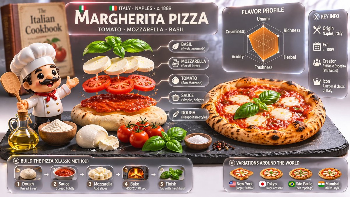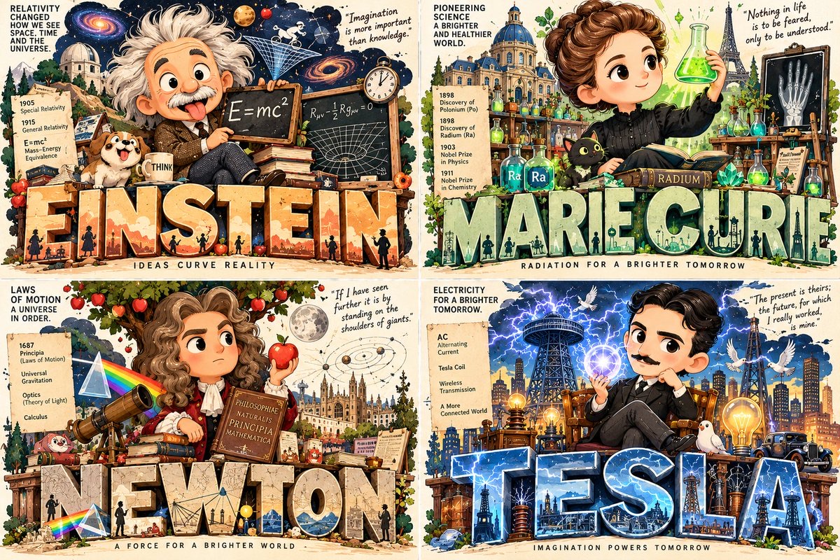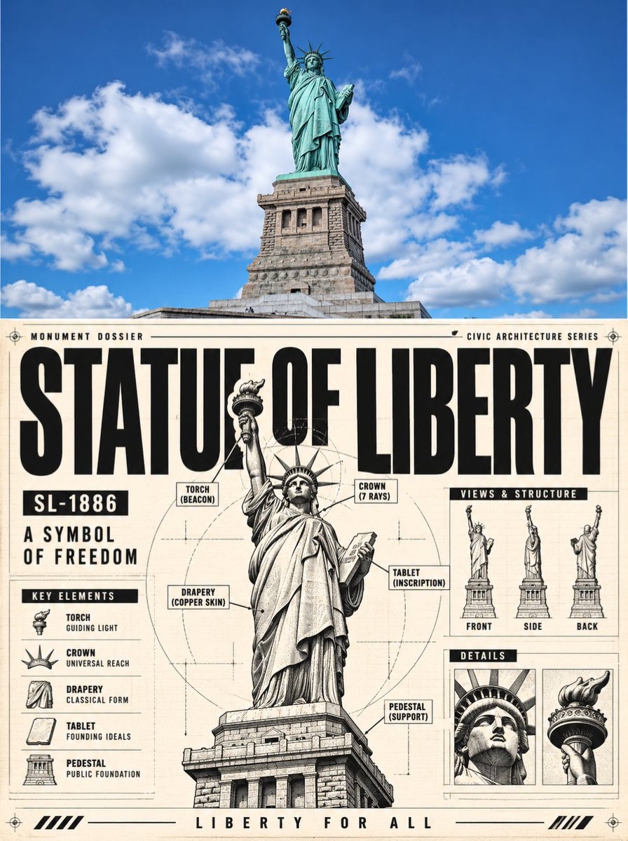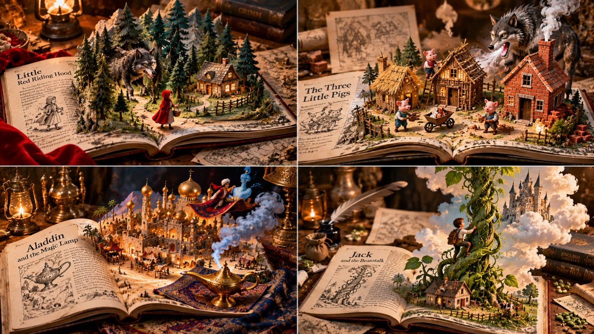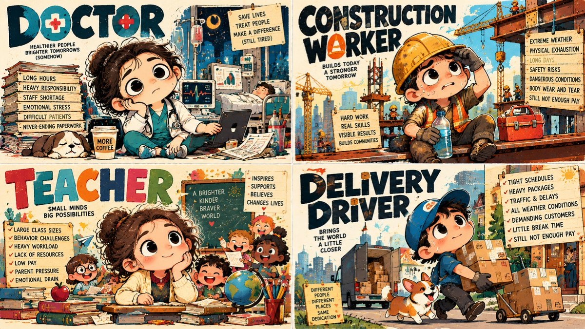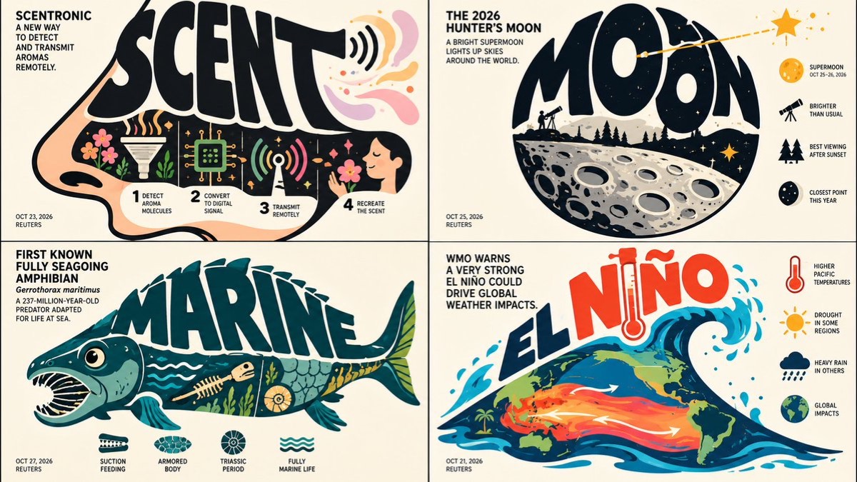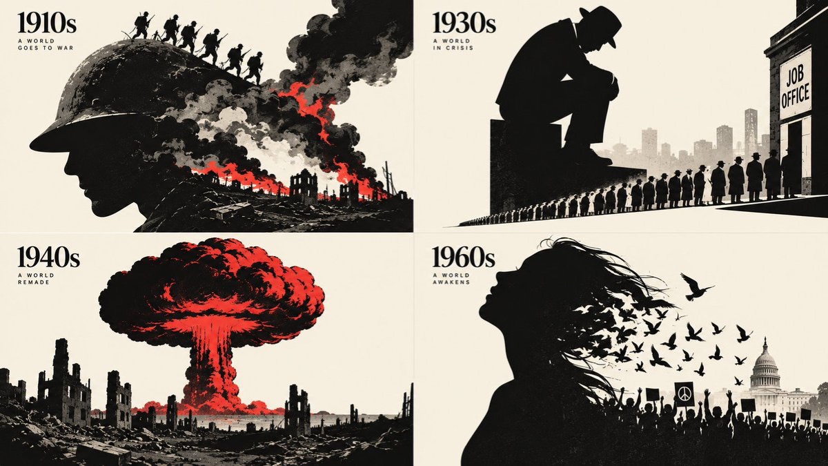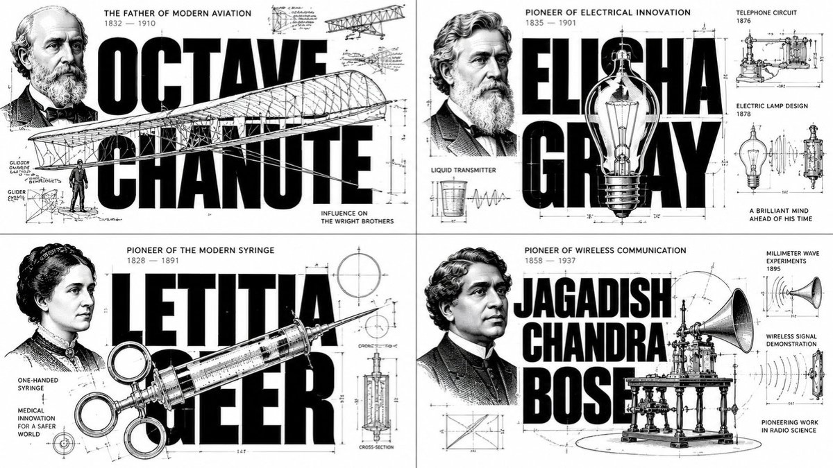
图片
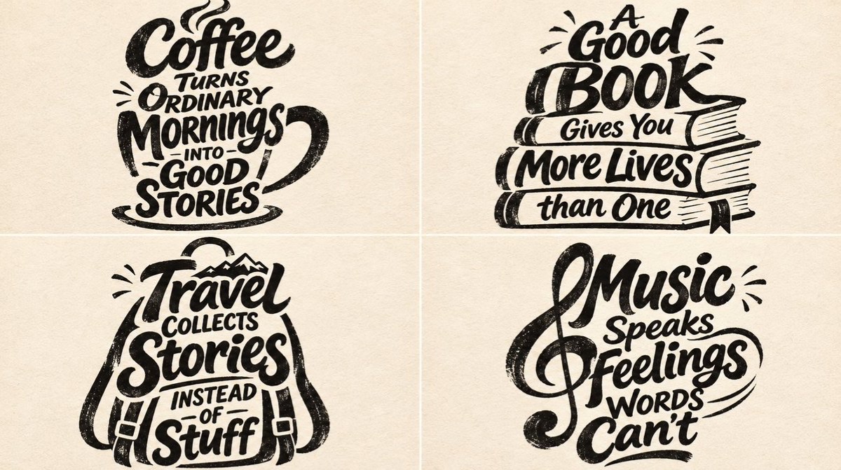
主题手绘字海报
根据主题自动创作短句,并将主题特征融入粗笔手绘字形,形成黑墨纸感海报。
 Gadgetify@Gdgtify
Prompt
2x2网格,16:9,AI自动选题:输入:[SUBJECT]

为[SUBJECT]创作一张视觉新颖的手绘字句海报。

首先,分析主题并推断:

其核心视觉特征
情感性格
最易辨认的形状和轮廓
独特特征
常见行为或特点
文化联想
与之相关的机智、有见地或令人难忘的观察

然后,为[SUBJECT]创作一句原创短句。

短句应约为5–12个词,可以是:

亲切温情
机智幽默
富有哲理
讽刺挖苦
鼓舞人心
奇趣俏皮

措辞必须自然、令人难忘,并且与主题紧密相关。

避免泛泛的励志语句。

字体结构

将短句拆分为约3–6组有意义的短语。

针对每组短语,确定:

情感重要性
视觉重要性
合适的字形
在句子中的语义作用

重要词语应更大、更醒目。

连接词应保持较小。

将所有内容排成一体化且紧凑的字体构图,形成鲜明的视觉节奏。

不要只是把普通文字排成居中版式。

让字体本身成为主题

用定制的手工字形绘制整句短句。

使用:

粗重笔画
自然有机的笔刷形态
受控的不规则感
不完美的边缘
紧凑的字距
富有表现力的手工几何形态

将字形的特定部分变形成源自[SUBJECT]的可辨识特征。

可采用的变形包括:

将字母上伸部变成主题特有的延展结构
将字母收笔变成富有表现力的延伸
让弯曲笔画沿着可辨识的自然轮廓延伸
让花饰笔画变成某种特征性动态
将字母内白变成独特的开口或空隙
让一组字母组合成可辨识的形态或轮廓

只采用确实与主题相关的变形。

字体应让人联想到主题,同时保持可读性。

主题特征

根据主题的独特特征对其进行排序,判断哪些最有助于辨认。

只选择1–3个主要特征。

将这些特征直接融入字形。

规则:

特征必须仿佛自然地从字体中生长出来
延伸部分必须像是经过有意设计
主题仍须保持可辨认
短句的可读性始终优先

对于抽象主题,使用概念符号、运动模式、力量或动作姿态,代替具象的生理结构。

不要自动添加耳朵、胡须、尾巴或其他动物特征,除非它们确实属于主题。

让字的个性与主题相匹配

根据[SUBJECT]的情感特质调整手绘字体风格。

如果主题给人活泼的感觉:

使用:

跳跃起伏的基线
圆润的收笔
富有活力的不规则感

如果主题给人优雅的感觉:

使用:

流畅的书法笔画
修长的花饰
优美的比例

如果主题给人强大的感觉:

使用:

紧凑厚重的大写字母
有力的垂直形态
戏剧性的尺寸变化

如果主题给人神秘的感觉:

使用:

流动的不规则轮廓
不寻常的负空间
微妙的不对称

如果主题给人技术感:

使用:

结构严谨的手绘几何形态
规整的字母构造
受控的精确度

否则,推断出另一种与主题契合且风格统一的表现形式。

所有字形都必须属于同一套协调一致的手工视觉体系。

象征性点缀

只添加少量源自主题的装饰性笔触。

可采用的点缀包括:

富有表现力的侧边花饰
一两个典型轮廓
主题相关的下划线
有机的笔画延伸
小型象征性镂空

每个点缀都必须强化含义。

不要使用:

通用剪贴画
无关装饰
单独摆在字旁的吉祥物

主题应当从字体本身显现出来。

构图

根据短句和主题选择构图形态。

可选的整体轮廓包括:

上窄下宽的纵向排列
紧凑的矩形堆叠
不对称轮廓
沙漏形构图
有机柱状排列
富有表现力的对角结构

版式应根据主题推导,而不是在每个设计中重复使用同一种形式。

一种可选的层级是:

顶部:视觉引入

中部:最重要的短语、最大的主标题词,以及最鲜明的主题特征变形

底部:令人难忘的收尾短语

所有文字都必须按正常阅读顺序保持可读。

在整组字体构图周围留出充足的负空间。

印刷与字体风格

只使用:

100%黑色墨水

印在:

暖白色或淡象牙色纸张上

字体应呈现以下质感:

手绘笔刷字
不完美的粗重笔画
字宽略有不均
自然有机的字腔
定制连字
富有表现力的花饰笔画

添加细微的真实印刷质感:

干笔颗粒
偶尔出现的小块掉墨
清晰可见的细纸纤维
克制的模拟印刷瑕疵

避免:

3D效果
渐变
摄影灯光
过度光滑、毫无瑕疵的数字质感

最终成品

创作一张原创手绘字句海报,让[SUBJECT]同时影响文字内容和字体的物理结构。

设计应呈现:

手工制作的字体
×语义轮廓
×巧妙的视觉化短句
×极简版画
完成的作品必须达到:
高度切合主题的短句
准确无误的文字

强烈的视觉融合

鲜明的主题辨识度
低装饰干扰
避免:
泛泛的短句
默认套用的动物结构

普通的字体组合

独立的装饰性插画
过度装饰
难以辨认的文字
最终海报应让人觉得,主题的含义仿佛已经从物理形态上重塑了字体本身。
2x2 grid, 16:9, Ai picks topics: INPUT: [SUBJECT]
Create a visually inventive hand-lettered quote poster about [SUBJECT].
First, analyze the subject and infer:
its core visual identity
emotional personality
most recognizable shapes and silhouettes
distinctive features
common behaviors or characteristics
cultural associations
witty, insightful, or memorable observations connected to it
Then generate an original short quote about [SUBJECT].
The quote should be approximately 5–12 words and may be:
affectionate
witty
philosophical
sarcastic
inspirational
whimsical
The wording must feel natural, memorable, and specifically connected to the subject.
Avoid generic motivational phrases.
Typographic Structure
Break the quote into approximately 3–6 meaningful phrase groups.
For each phrase, determine:
emotional importance
visual importance
appropriate letterform shape
semantic role within the statement
Important words should become larger and more visually dominant.
Connecting words should remain smaller.
Arrange everything into one tightly integrated typographic composition with a distinctive visual rhythm.
Do not simply typeset ordinary centered text.
Turn Typography Into the Subject
Draw the entire quote using custom handmade lettering.
Use:
heavy strokes
organic brush forms
controlled irregularity
imperfect edges
compressed spacing
expressive handmade geometry
Transform selected parts of the letters into recognizable features derived from [SUBJECT].
Possible transformations include:
an ascender becoming an elongated subject-specific feature
a terminal becoming an expressive extension
a curved stroke following a recognizable natural contour
a flourish becoming a characteristic motion
a letter counter becoming a distinctive opening or void
a group of letters combining into a recognizable mass or silhouette
Only use transformations that genuinely relate to the subject.
The lettering should suggest the subject without sacrificing readability.
Subject-Specific Features
Rank the subject's distinctive features according to how strongly they support recognition.
Select only 1–3 dominant features.
Integrate those features directly into the letterforms.
Rules:
the features must appear to grow naturally from the typography
extensions must feel intentionally designed
the subject should remain recognizable
quote readability always comes first
For abstract subjects, use conceptual symbols, motion patterns, forces, or gestures instead of literal physical anatomy.
Do not automatically use ears, whiskers, tails, or other animal features unless they genuinely belong to the subject.
Match the Lettering Personality to the Subject
Adapt the handmade lettering style to the emotional character of [SUBJECT].
If the subject feels playful:
Use:
bouncing baselines
rounded terminals
energetic irregularity
If the subject feels elegant:
Use:
flowing calligraphic strokes
elongated flourishes
graceful proportions
If the subject feels powerful:
Use:
compressed heavy capitals
strong vertical forms
dramatic scale changes
If the subject feels mysterious:
Use:
flowing irregular silhouettes
unusual negative space
subtle asymmetry
If the subject feels technical:
Use:
structured hand-drawn geometry
disciplined letter construction
controlled precision
Otherwise, infer another coherent expressive style that fits the subject.
All lettering must belong to one consistent handmade visual family.
Symbolic Accents
Add only minimal subject-derived decorative gestures.
Possible accents include:
expressive side flourishes
one or two characteristic contours
a thematic underline
an organic stroke extension
small symbolic cutouts
Every accent must reinforce meaning.
Do not use:
generic clipart
unrelated decoration
a separate mascot sitting beside the lettering
The subject should emerge from the typography itself.
Composition
Choose a composition shape based on the quote and subject.
Possible overall silhouettes include:
tapered vertical arrangement
compact rectangular stack
asymmetric silhouette
hourglass-shaped composition
organic column
diagonal expressive structure
The layout should be inferred from the subject rather than repeated across every design.
A possible hierarchy is:
Top: visual introduction
Middle: the most important phrase, largest hero word, and strongest subject-specific transformations
Bottom: memorable concluding phrase
All words must remain readable in normal reading order.
Keep generous negative space around the entire typographic composition.
Print and Lettering Style
Use only:
100% black ink
on:
warm white or subtle ivory paper
The lettering should resemble:
hand-painted brush typography
imperfect thick strokes
slightly uneven letter widths
organic counters
custom ligatures
expressive swashes
Add subtle physical print texture:
dry-brush grain
occasional small areas of ink loss
visible fine paper fibers
restrained analog print imperfections
Avoid:
3D effects
gradients
photographic lighting
polished digital perfection
Final Result
Create an original hand-lettered quote poster where [SUBJECT] influences both the message and the physical structure of the typography.
The design should feel like:
handcrafted typography
× semantic silhouette
× clever visual quote
× minimalist printmaking
The finished artwork must achieve:
high quote relevance
high text accuracy
strong visual integration
strong subject recognition
low decorative noise
Avoid:
generic quotes
default animal anatomy
ordinary font stacks
separate decorative illustrations
excessive ornament
illegible lettering
The final poster should feel as though the meaning of the subject has physically reshaped the typography itself.
使用建议
替换[SUBJECT]后,可尝试咖啡、旅行或音乐等具体主题。
信息
- 类型
- 图片
- 许可
- Source-author-rights
- 发布时间