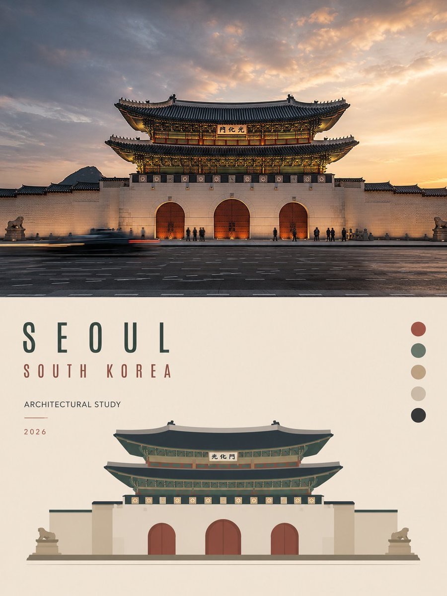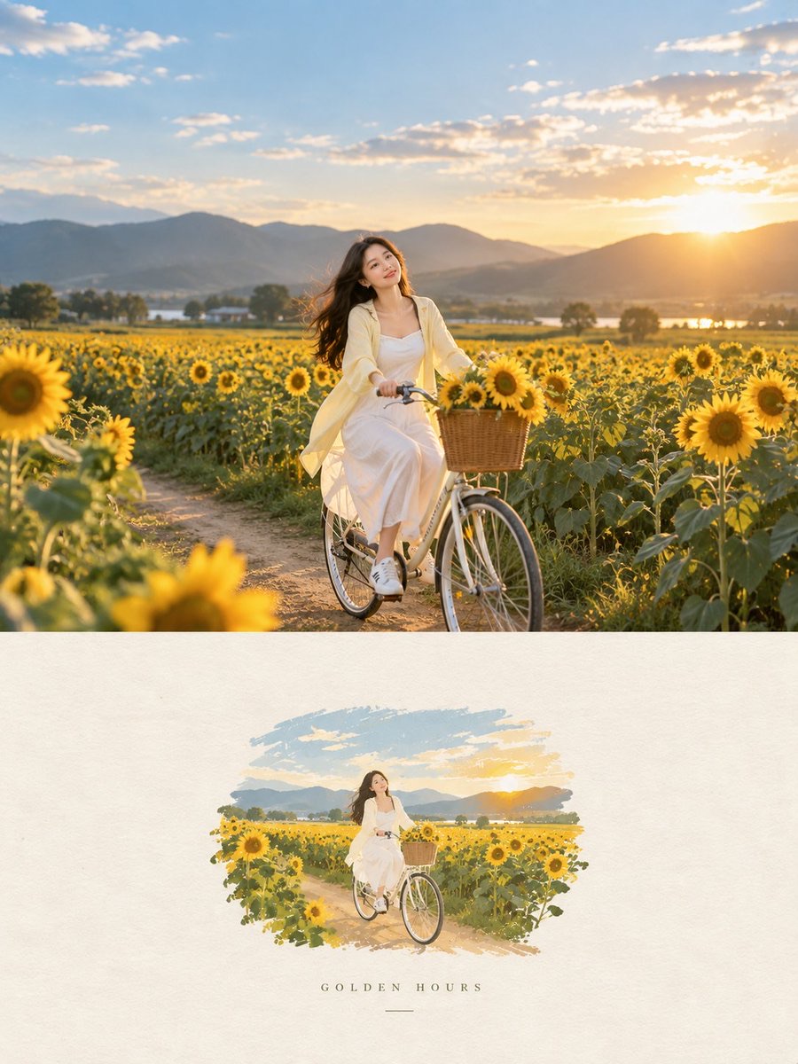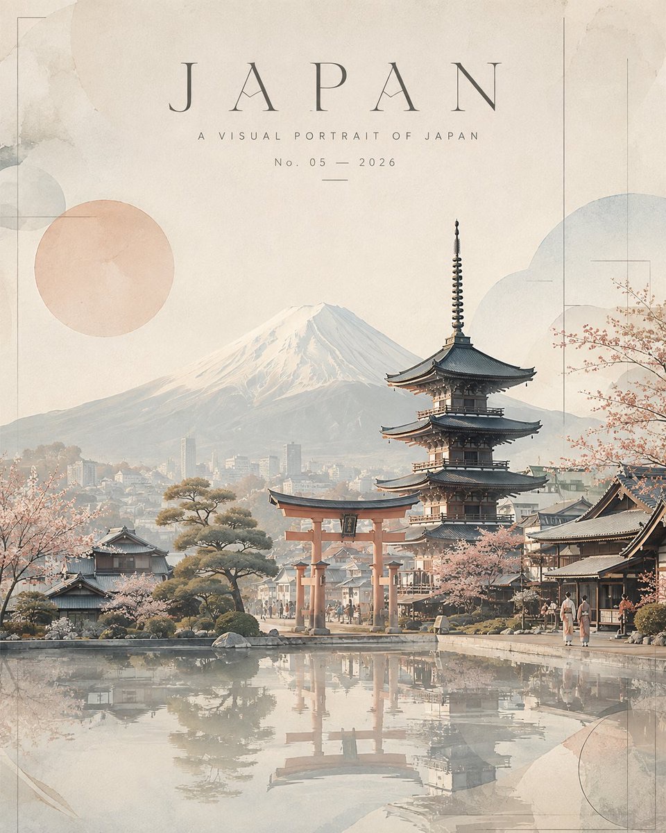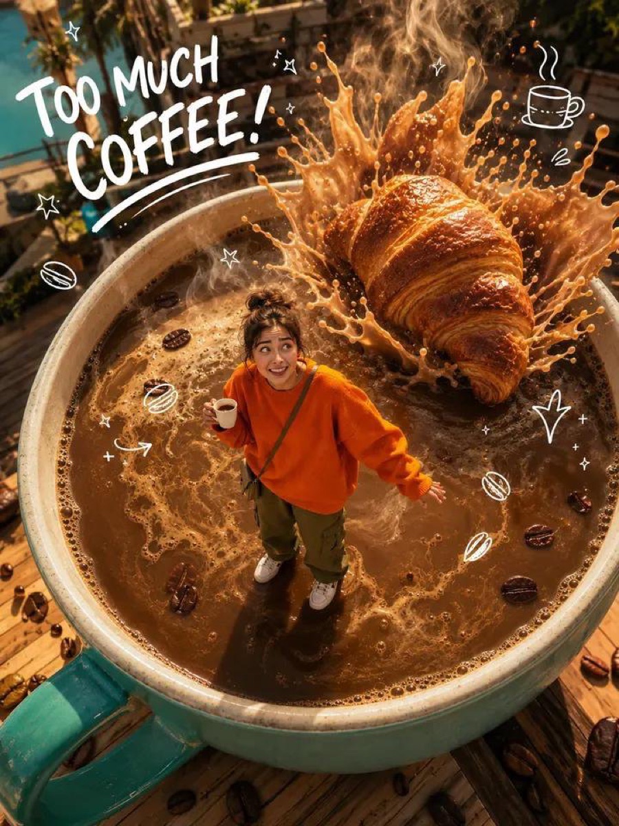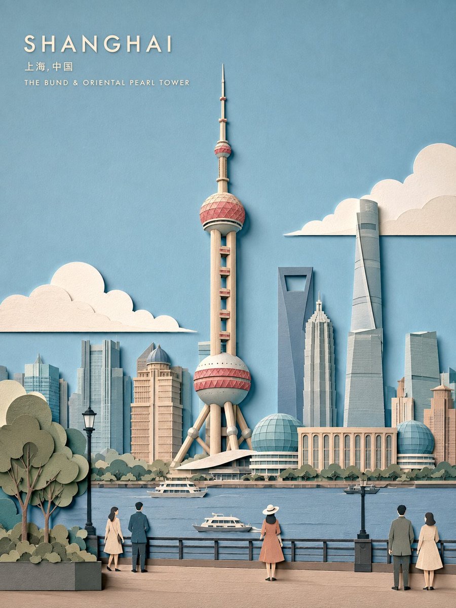
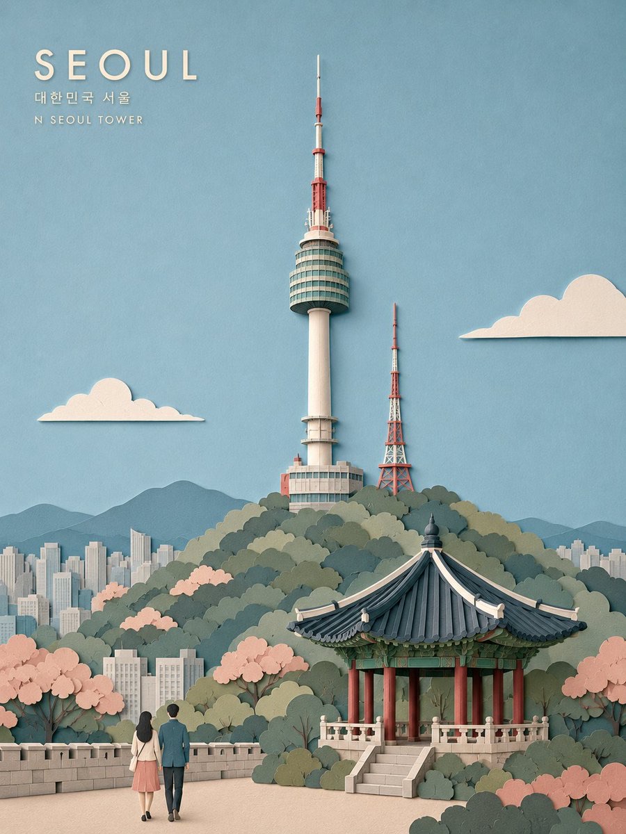
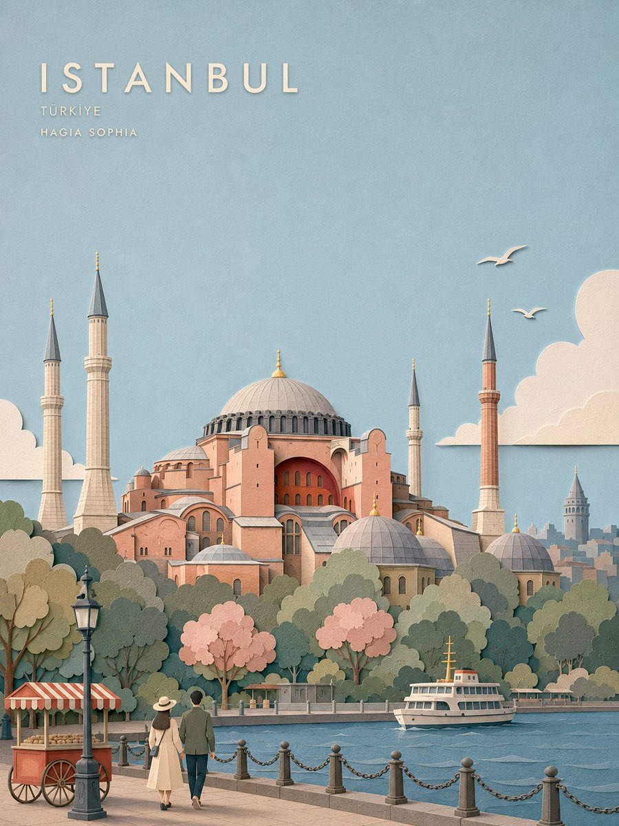
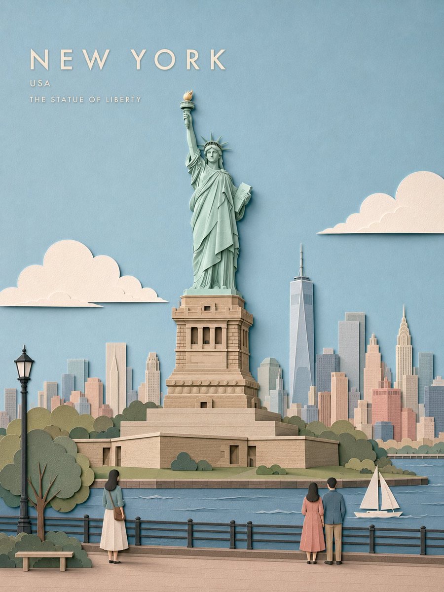
图片 · GPT image 2
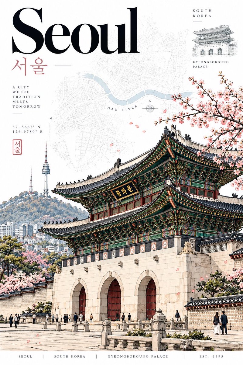
城市地标分层纸雕旅行海报
把指定城市转化为具有真实地理依据的垂直旅行海报,以单一标志性地标为主体,结合分层剪纸、克制配色和编辑式排版。
 Laraib Fatima@AiwithLariab
Prompt
城市 = {CITY}
创作一张精致的竖版 3:4 {CITY} 旅行海报,采用手工分层剪纸插画风格。

首先识别城市、国家、建筑、景观、气候和视觉特征。选择一个标志性的主地标,并确定一个可信的现实世界观景点。所有辅助建筑、街道、公园、水域和天际线元素都必须与该观景点的视角相符。不要拼贴多个地标。

视觉构图

让主地标成为画面主角,占据约 45–60% 的画面高度。保留其真实的轮廓、比例、屋顶线条、结构细节和周边环境,同时简化次要细节。

仅使用 1–3 个微妙的辅助元素,例如当地建筑、天际线、桥梁、公园、滨水区域、街道树木、微小行人或车辆。让这些元素更小、更扁平、对比度更低。

构图:

顶部:25–35% 留作开阔天空和负空间

中部:主地标和远处城市

底部:符合人体尺度的街道、公园、滨水区域或社区

至少 30% 的画面保持视觉上的宁静。

剪纸风格

采用浅层 2–6 层剪纸结构,使用哑光手工纸,带有微妙纹理、整洁的裁切边缘、重叠形状,以及精致的 1–3 mm 阴影。

采用平面设计和编辑插画风格,而非微缩模型。

将建筑简化为干净的纸片形块。避免过多的窗户、砖块、电缆、栏杆、屋瓦和琐碎细节。通过尺度、重叠和有层次的色彩营造深度,而非使用 3D 建模。

色彩与光线

采用真实的 6–8 色低饱和柔和粉彩配色,以 {CITY} 为灵感:淡天蓝、象牙白、奶油色、柔和砖红、灰粉色、浅石色、鼠尾草绿和蓝灰色,并根据城市调整。

使用明亮、柔和、漫射的日光。阴影保持微妙。

字体排版

在左上或右上方的负空间中放置一个小号大写 {CITY} 标题,可选添加当地名称、国家或主地标名称。

使用简洁的几何字体,字距宽松,平面呈现于奶油白/白色纸面上。字体应作为次要元素,占画面比例不超过 12–18%。

最终目标

高端当代旅行插画。
优雅、通透、精致、手工感十足,并且地理上可信。

观者应能辨认出:

1。{CITY} → 2。主地标 → 3。剪纸工艺

不要照片级写实,不要摄影纹理,不要深层立体模型,不要地标拼贴,不要不可能的天际线,不要过度细节,不要奇幻建筑,不要过大的字体,不要标志,不要水印
CITY = {CITY}
Create a refined vertical 3:4 travel poster of {CITY} as a handcrafted layered papercut illustration.
First identify the city, country, architecture, landscape, climate, and visual character. Choose ONE iconic HERO LANDMARK and establish one believable real-world viewpoint. All supporting buildings, streets, parks, water, and skyline elements must realistically fit that viewpoint. No landmark collage.
VISUAL COMPOSITION
Make the HERO landmark the dominant element, occupying roughly 45–60% of the image height. Preserve its authentic silhouette, proportions, roofline, structural details, and surrounding environment while simplifying minor details.
Use only 1–3 subtle secondary elements such as local buildings, skyline, bridge, park, waterfront, street trees, tiny pedestrians, or vehicles. Keep them smaller, flatter, and lower contrast.
Composition:
Top: 25–35% open sky and negative space
Middle: HERO landmark and distant city
Bottom: human-scale street, park, waterfront, or neighborhood
Keep at least 30% visually quiet.
PAPERCUT STYLE
Use shallow 2–6 layer cut-paper construction with matte handmade paper, subtle grain, clean cut edges, overlapping shapes, and delicate 1–3 mm shadows.
Graphic and editorial, not a miniature model.
Simplify architecture into clean paper masses. Avoid excessive windows, bricks, cables, railings, roof tiles, and tiny details. Create depth through scale, overlap, and atmospheric color rather than 3D modeling.
COLOR & LIGHT
Use an authentic 6–8 color muted pastel palette inspired by {CITY}: pale sky blue, ivory, cream, muted brick, dusty blush, pale stone, sage, and blue-grey, adjusted to the city.
Use bright, soft, diffused daylight. Keep shadows subtle.
TYPOGRAPHY
Place a small uppercase {CITY} title in the upper-left or upper-right negative space, optionally with the local name, country, or HERO landmark name.
Use clean geometric lettering, wide spacing, flat cream/white paper. Typography must remain secondary and occupy no more than 12–18% of the image.
FINAL TARGET
Premium contemporary travel illustration.
Elegant, airy, sophisticated, handcrafted, and geographically believable.
The viewer should recognize:
1. {CITY} → 2. HERO landmark → 3. Papercut craftsmanship
NO photorealism, NO photographic textures, NO deep diorama, NO landmark collage, NO impossible skyline, NO excessive detail, NO fantasy architecture, NO oversized typography, NO logos, NO watermark
使用建议
使用建议:将 {CITY} 替换为目标城市;适合制作旅行海报、城市文化视觉或纪念性插画,生成后可人工核对地标轮廓、视角和标题文字的准确性。
信息
- 类型
- 图片
- 模型
- GPT image 2
- 许可
- Source-author-rights
- 发布时间