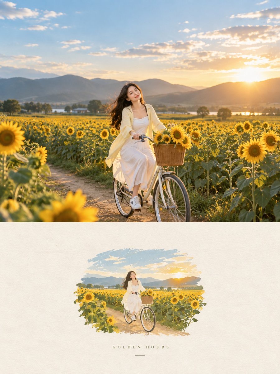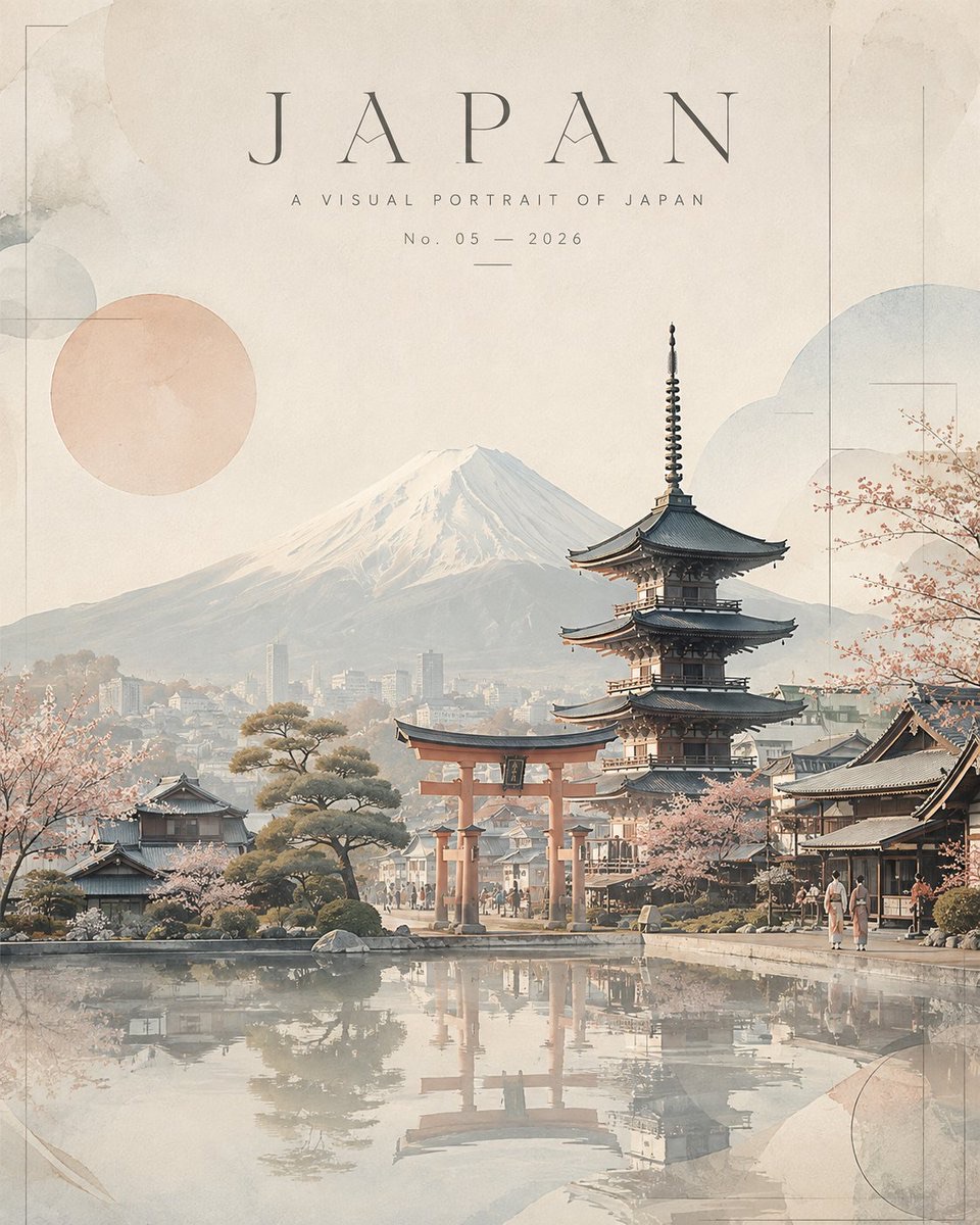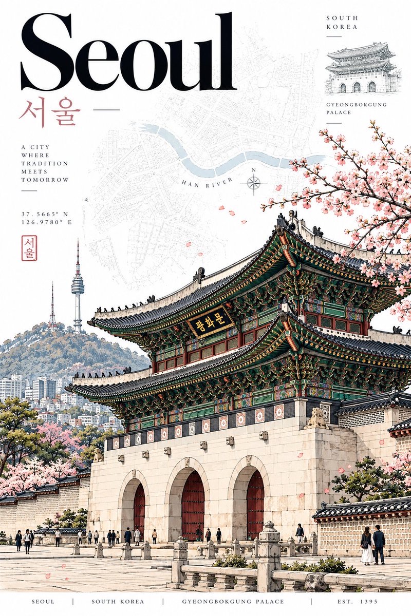
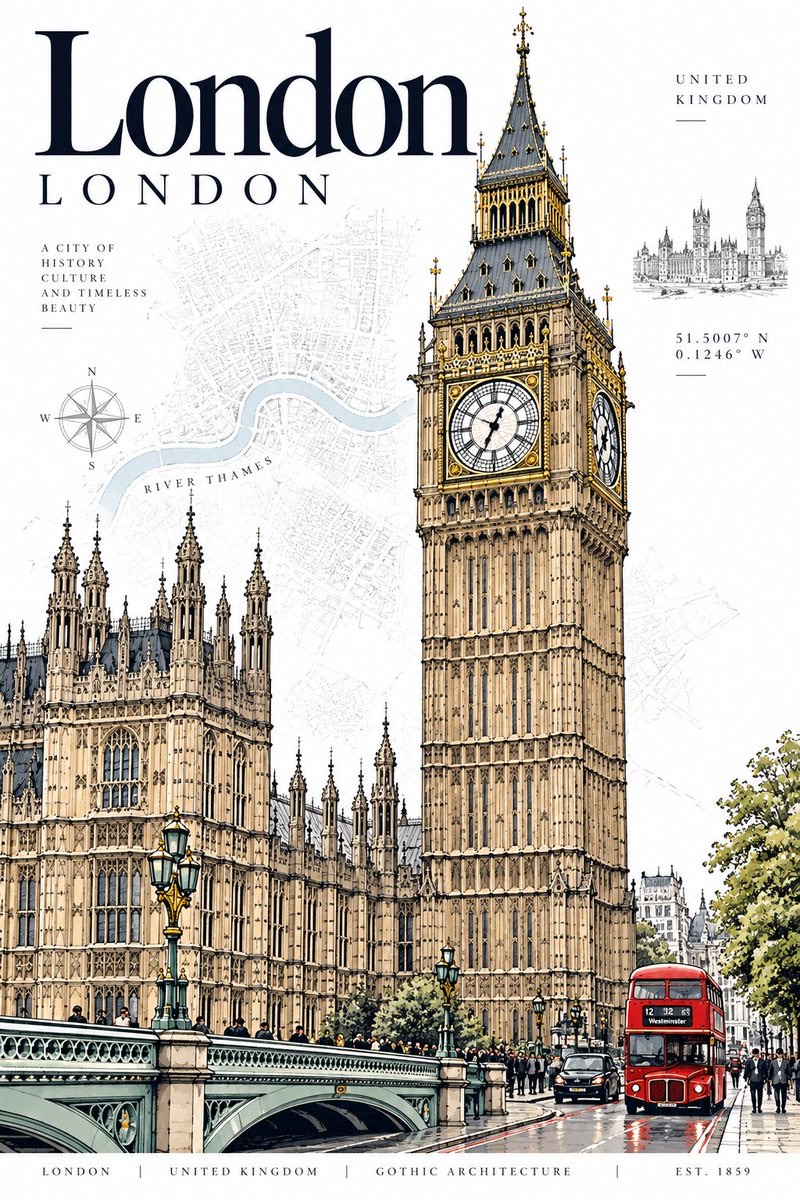
图片 · GPT image 2
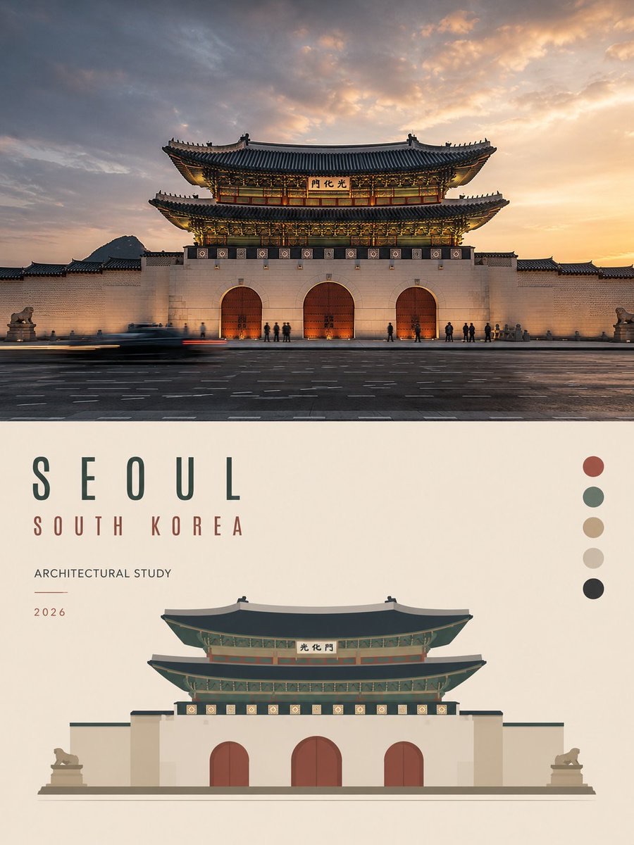
目的地建筑旅行明信片
将城市、地标和地域信息组织成具有博物馆商店质感的竖版建筑旅行海报,融合精细墨线、淡彩、地图图形与编辑设计。
 Laraib Fatima@AiwithLariab
Prompt
目的地:[CITY / DESTINATION]
国家:[COUNTRY]

为 [DESTINATION]、[COUNTRY]创作一张精致的竖版 2:3 高端建筑旅行明信片。

核心风格

采用高端当代建筑旅行海报的视觉语言,并结合精致的复古编辑插画风格。

整体设计应显得:
- 优雅
- 有文化底蕴
- 历久弥新
- 具有建筑感
- 值得收藏
- 高端
- 具有博物馆商店商品的品质

结合极其细致的建筑钢笔墨线插画、精巧的石墨线描、克制的水彩风格平涂色彩、典藏级制图图形、优雅的编辑字体,以及宽裕的留白。

不要做成普通的旅游海报。

主要建筑主体

选择一处与 [DESTINATION] 密切相关、标志性鲜明且一眼可辨的建筑地标。

例如:
- 历史古迹
- 宫殿
- 大教堂
- 清真寺
- 寺庙
- 塔楼
- 桥梁
- 政府建筑
- 著名街道立面
- 传统建筑地标
- 现代建筑标志

所选地标必须是画面的主体。

以可信的三分之四视角或略带戏剧性的建筑视角呈现。

确保建筑比例准确,结构细节清晰可辨。

不要将多个主要地标合并成一幅主体插画。

插画风格

用极其精细的黑色或深石墨色墨线描绘主体地标。

包括:
- 细致的建筑排线
- 精确的窗户
- 门
- 柱子
- 屋顶
- 拱门
- 装饰
- 立面细节
- 真实的结构几何
- 微妙的手绘不完美感

建筑整体以细致的线描为主,辅以选择性的平涂色彩。

采用精致的插画细节,而非照片般的写实渲染。

色彩搭配

以大面积留白为主,只使用 2–4 种精致且具有目的地特色的颜色。

选择与 [DESTINATION] 或该地标自然相关的颜色。

例如:
- 柔和的建筑石材色调
- 传统的当地色彩
- 克制的蓝色
- 柔和的绿色
- 赤陶色
- 勃艮第红
- 柔和的红色
- 建筑金色
- 微妙的自然色调

色彩应优雅且略显柔和。

避免:
- 霓虹色
- 过度饱和
- 渐变
- 亮面效果
- 浑浊的棕褐色
- 过多的米色
- 照片写实的调色

背景

使用干净的纯白背景。

在建筑后方添加极其微妙的典藏风格图形元素,例如:

- 淡淡的城市地图
- 街道平面图
- 河流轮廓
- 坐标
- 等高线
- 建筑示意图
- 指南针
- 网格线
- 当地语言注释
- 极简地理标记

这些元素必须保持次要,并以浅淡方式呈现。

不要让背景地图盖过主体建筑。

构图

采用竖版 2:3 编辑式构图。

主体地标应占画面约 60–75%。

在文字和建筑主体周围留出充足的负空间。

采用不对称的高端编辑式布局。

构图应显得经过精心设计,而非像普通旅游纪念品一样简单居中。

若能让建筑构图更有力量,可以采用雅致的裁切方式。

字体

在顶部或左上区域显示:

[DESTINATION]

使用大号、优雅且对比鲜明的编辑衬线字体,灵感来自高端建筑杂志和博物馆图录。

下方可选择添加:

[LOCAL NAME]

使用目的地真实的本地书写系统。

例如:
Seoul
서울

London
London

Tokyo
東京

Paris
Paris

采用克制的字体设计,并留出宽裕的字距。

不要使用喧宾夺主的巨大装饰字体。

辅助信息

添加一个小巧优雅的信息栏,包含目的地特有的细节,例如:

[SHORT DESTINATION DESCRIPTION]

[COORDINATES]

[LOCAL NAME]

[COUNTRY]

采用精巧的细小字体,并留出宽裕的间距。

可选的微妙元素:

- 指南针
- 小型建筑草图
- 微型地标插画
- 类似印章的当地语言标记
- 淡淡的地图标签

所有辅助元素都应保持简约。

典藏地图元素

加入一层与 [DESTINATION] 有关的、极其微妙的地图或街道平面图。

如果目的地有辨识度高的河流、海岸线、山脉、历史街区或城市网格,就自然地融入背景。

适当位置加上一个小巧低调的地理标签。

不要制作杂乱的地图。

环境细节

仅在符合当地环境的情况下添加少量微小元素:

- 行人
- 自行车
- 树木
- 路灯
- 当地车辆
- 长椅
- 街道小细节
- 鸟类

这些元素主要用于体现尺度和氛围。

不要将画面变成繁忙的城市街景。

目的地真实性

确保建筑、字体、环境细节、色彩、地图元素和小型环境物件都符合 [DESTINATION]、[COUNTRY] 的文化与地理特征。

避免使用看起来属于其他城市的泛化建筑。

地标必须让人一眼联想到目的地。

视觉层级

优先顺序:

1. 主要建筑地标
2. 目的地名称
3. 辅助地图/典藏图形
4. 当地语言名称
5. 微小环境细节
6. 坐标和信息栏

所有元素都应服务于主要地标。

底部信息栏

在底部添加一条精致的博物馆图录风格信息栏:

[DESTINATION]  |  [COUNTRY]  |  [ARCHITECTURAL STYLE]  |  EST. [YEAR]

保持小巧、优雅、间距均匀且低调。

如果地标的建成年份不确定,请使用恰当的历史日期,或省略年份,不要编造信息。

氛围

静谧而精致的都市气质。

真实的文化底蕴。

建筑遗产。

现代编辑式设计。

将历史气质与当代平面设计相结合。

最终作品应像一张高端收藏级建筑版画,可在博物馆设计商店购得。

避免

不要拼贴多个地标。

不要虚构建筑。

不要出现随意拼凑的建筑。

不要采用普通旅游海报的审美。

不要使用卡通风格。

不要使用3D渲染。

不要采用亮面照片写实效果。

不要过度使用复古滤镜。

不要使用厚重的棕褐色调。

不要使用虚假的护照印章。

不要加入过多装饰元素。

不要杂乱。

不要出现巨大且无必要的文字。

不要出现随机旗帜。

不要使用不准确的文化符号。

不要扭曲建筑。

不要采用不真实的透视。

不要过度使用渐变。

不要过多使用米色。

最终目标

创作一张细节丰富、精致且历久弥新的建筑旅行明信片,可一致地用于任何城市或国家,同时保持相同的高端视觉识别。

只更改目的地特有的元素,例如:

[DESTINATION]
[COUNTRY]
[ICONIC LANDMARK]
[LOCAL NAME]
[ARCHITECTURAL STYLE]
[COORDINATES]
[ESTABLISHED / CONSTRUCTION YEAR]
[DESTINATION-SPECIFIC COLORS]
[MAP / GEOGRAPHICAL ELEMENTS]

其他所有内容都应保持相同的精致编辑式明信片设计语言。
DESTINATION: [CITY / DESTINATION]
COUNTRY: [COUNTRY]
Create a sophisticated vertical 2:3 premium architectural travel postcard for [DESTINATION], [COUNTRY].
CORE STYLE
Use the visual language of a high-end contemporary architectural travel poster combined with refined vintage editorial illustration.
The design should feel:
- elegant
- cultured
- timeless
- architectural
- collectible
- premium
- museum-shop quality
Combine extremely detailed architectural pen-and-ink illustration, delicate graphite linework, restrained watercolor-style flat color, archival cartographic graphics, elegant editorial typography, and generous white space.
Do NOT make it look like a generic tourist poster.
MAIN ARCHITECTURAL HERO
Select ONE iconic and instantly recognizable architectural landmark strongly associated with [DESTINATION].
Examples can include:
- historic monument
- palace
- cathedral
- mosque
- temple
- tower
- bridge
- government building
- famous street façade
- traditional architectural landmark
- modern architectural icon
The selected landmark must be the dominant visual subject.
Show it from a believable three-quarter or slightly dramatic architectural perspective.
Maintain accurate architectural proportions and recognizable structural details.
Do not combine multiple major landmarks into one main illustration.
ILLUSTRATION STYLE
Render the main landmark using exceptionally fine black or dark graphite ink lines.
Include:
- detailed architectural hatching
- precise windows
- doors
- columns
- roofs
- arches
- ornaments
- façade details
- realistic structural geometry
- subtle hand-drawn imperfections
Keep the architecture primarily as detailed line art with selective flat color.
Use refined illustrative detailing rather than photorealistic rendering.
COLOR PALETTE
Use mostly white space with only 2–4 sophisticated destination-specific colors.
Choose colors naturally associated with [DESTINATION] or the landmark.
Examples:
- muted architectural stone tones
- traditional local colors
- restrained blue
- muted green
- terracotta
- burgundy
- soft red
- architectural gold
- subtle natural tones
Colors should be elegant and slightly muted.
Avoid:
- neon colors
- excessive saturation
- gradients
- glossy effects
- muddy sepia
- excessive beige
- photorealistic color grading
BACKGROUND
Use a clean pure white background.
Behind the architecture, add extremely subtle archival graphic elements such as:
- faint city map
- street plan
- river outline
- coordinates
- contour lines
- architectural diagram
- compass
- grid lines
- local-language annotations
- minimal geographical markings
These elements must remain secondary and lightly faded.
Do not allow the background map to overpower the main architecture.
COMPOSITION
Use a vertical 2:3 editorial composition.
The main landmark should occupy approximately 60–75% of the artwork.
Create generous negative space around the typography and architectural subject.
Use an asymmetric premium editorial layout.
The composition should feel carefully designed rather than centered like a basic tourist souvenir.
Tasteful cropping is allowed when it creates a stronger architectural composition.
TYPOGRAPHY
At the top or upper-left area, display:
[DESTINATION]
Use large elegant high-contrast editorial serif typography inspired by premium architecture magazines and museum catalogues.
Below it, optionally include:
[LOCAL NAME]
using the authentic local writing system of the destination.
For example:
Seoul
서울
London
London
Tokyo
東京
Paris
Paris
Use restrained typography with generous letter spacing.
Do not use giant decorative typography that overwhelms the architecture.
SECONDARY INFORMATION
Include a small elegant information block containing destination-specific details such as:
[SHORT DESTINATION DESCRIPTION]
[COORDINATES]
[LOCAL NAME]
[COUNTRY]
Use tiny refined typography with generous spacing.
Optional subtle elements:
- compass
- small architectural sketch
- miniature landmark drawing
- local-language stamp-like mark
- faint map label
Keep all secondary elements minimal.
ARCHIVAL MAP ELEMENT
Include a very subtle map or street-plan layer related specifically to [DESTINATION].
If the destination has a recognizable river, coastline, mountain, historic district, or urban grid, integrate it naturally into the background.
Add a small understated geographical label where appropriate.
Do not create a cluttered map.
CONTEXTUAL DETAILS
Add only a few tiny environmental elements when they naturally belong to the location:
- pedestrians
- bicycles
- trees
- street lamps
- local vehicles
- benches
- small street details
- birds
These elements should primarily establish scale and atmosphere.
Do not turn the image into a busy city scene.
DESTINATION AUTHENTICITY
Make the architecture, typography, environmental details, colors, map elements, and small contextual objects culturally and geographically appropriate to [DESTINATION], [COUNTRY].
Avoid generic architecture that could belong to another city.
The landmark must immediately communicate the destination.
VISUAL HIERARCHY
Priority order:
1. Main architectural landmark
2. Destination name
3. Supporting map / archival graphics
4. Local-language name
5. Small contextual details
6. Coordinates and information strip
Everything should support the main landmark.
BOTTOM INFORMATION STRIP
At the bottom, add a refined museum-catalogue-style information strip:
[DESTINATION] | [COUNTRY] | [ARCHITECTURAL STYLE] | EST. [YEAR]
Keep it small, elegant, evenly spaced, and understated.
If the landmark's construction date is uncertain, use an appropriate historical date or omit the year rather than inventing information.
MOOD
Quiet urban sophistication.
Cultural authenticity.
Architectural heritage.
Modern editorial design.
Historical character combined with contemporary graphic design.
The final artwork should feel like a premium collectible architectural print purchased from a museum design shop.
AVOID
No landmark collage.
No fake architecture.
No random buildings.
No generic tourist-poster aesthetic.
No cartoon style.
No 3D rendering.
No glossy photorealism.
No excessive vintage filters.
No heavy sepia.
No fake passport stamps.
No excessive decorative elements.
No clutter.
No giant unnecessary text.
No random flags.
No inaccurate cultural symbols.
No distorted architecture.
No unrealistic perspective.
No excessive gradients.
No excessive beige.
FINAL GOAL
Create a highly detailed, sophisticated, timeless architectural travel postcard that could work consistently for ANY city or country while maintaining the same premium visual identity.
Only change the destination-specific elements such as:
[DESTINATION]
[COUNTRY]
[ICONIC LANDMARK]
[LOCAL NAME]
[ARCHITECTURAL STYLE]
[COORDINATES]
[ESTABLISHED / CONSTRUCTION YEAR]
[DESTINATION-SPECIFIC COLORS]
[MAP / GEOGRAPHICAL ELEMENTS]
Everything else should maintain the same refined editorial postcard design language.
使用建议
使用建议:替换目的地、国家、地标、当地名称、建筑风格、坐标、年份和地图元素;为保证文化与建筑准确性,先准备可靠的地标资料,并检查生成文字与历史信息。
信息
- 类型
- 图片
- 模型
- GPT image 2
- 许可
- Source-author-rights
- 发布时间