图片
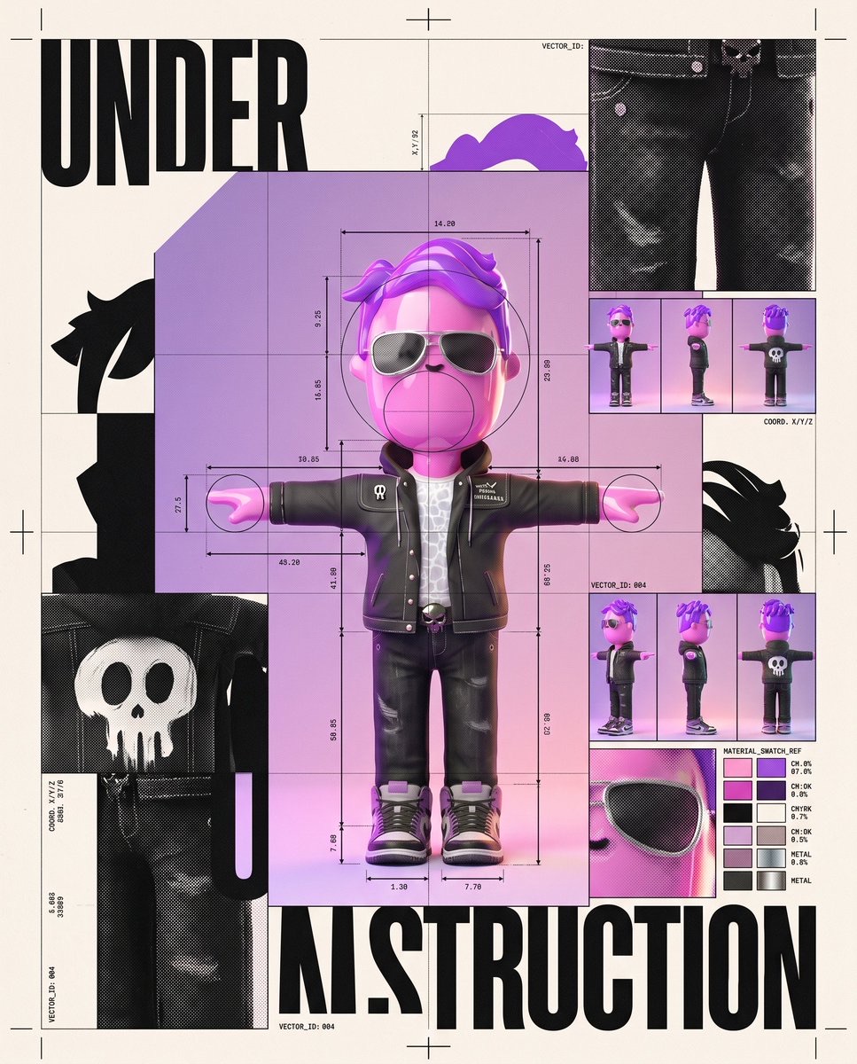
角色施工档案:实验性编辑海报
将用户上传的角色设计成兼具成品与工作文件质感的实验性编辑海报,融合不对称网格、构造线、局部放大和复古印刷效果。
 Edizkan ⭕🦇@edizkan_
Prompt
创作一张实验性编辑设计海报,以已上传的参考角色为核心视觉形象,并在周围呈现用于“设计”该角色的可见构建系统。
形象一致性

保留角色准确的头身比例、眼睛形状与间距、风格化表现、轮廓、服装、配饰、材质和原始配色。不要将角色拟人化。不要改变解剖结构或面部结构。不要添加参考图中没有的面部特征。角色必须始终一眼可辨。
核心概念

将角色表现为既是完成的作品,也是平面设计师的工作文件。
将一个大幅、干净的角色形象略微偏离中心放置。在它周围呈现视觉构建过程的片段:
• 放大的裁切标记

• 套准十字

• 测量线

• 模块化网格

• 用于界定比例的圆

• 放大的角色眼睛、轮廓、纹理和配色局部

• 微型姿势变化缩略图

• 从角色几何形态中提取的抽象矢量图形

• 根据角色原始颜色生成的 CMYK 风格色块
部分构建线从角色后方穿过,另一些则刻意横跨被裁切的区域,营造层叠的编辑设计纵深感。
海报应同时呈现未完成与已完成的感觉,仿佛有人在发布前几秒打开了主设计文件。
视觉语言

将实验性的瑞士编辑设计与当代艺术指导系统相结合。
采用强烈的不对称网格。

大胆的尺度对比。

大面积留白。

相互叠加的图像裁切。

纤细的技术线条与巨大的几何色块形成对比。

刻意错位,并营造受控的视觉张力。
不要让版面显得过于平衡或居中。
字体

只使用一个大标题:
“UNDER CONSTRUCTION”
采用超粗、窄体无衬线粗黑字体,全部大写。
以非常规方式将标题拆分并铺排在画面中。允许部分字母被角色遮挡,或延伸出画框。
只添加极少量微小的抽象文字细节,例如坐标、数字或设计系统标签。保持稀疏,并作为次要元素。
构图

竖版海报。
角色约占画面45–55%,并避开正中心。
角色的一处放大局部延伸至海报边缘之外。
画面另一部分放置一个从角色轮廓衍生而来的巨大几何图形。
构图应略显不稳定,但极具设计感。
景深层级

第1层:放大的裁切文字和几何局部。

第2层:主体角色,清晰易读。

第3层:网格、测量标记、套准标记和较小的研究图。
主体角色和标题保持清晰。外围构建图形可略微柔化,或延伸至裁切范围之外。
色彩系统

以角色的原始配色作为主要设计系统。
只加入克制的黑色、暖调米白色和一种对比鲜明的技术点缀色。
不要使用彩虹配色。

不要使用过多渐变。

不要让色彩泛滥。
加入细微的印刷套准偏差、半色调纹理、油墨颗粒和略微不完美的胶印边缘,让海报呈现实体设计感,避免数字化的生硬感。
成品感觉

博物馆级别的当代平面设计海报。

实验性的视觉识别系统。

具有编辑设计感、收藏价值和些许叛逆气息。
它应当适合丝网印刷、装框,或作为独立设计杂志的封面。
不要出现样机环境。

不要出现房间或墙壁。

不要添加装饰性 3D 效果。

不要使用通用的未来风 UI。

不要采用对称版式。

不要添加不必要的文字。

不要重新设计角色。
ar 4:5
Create an experimental editorial graphic-design poster featuring the uploaded reference character as the central visual identity, surrounded by the visible construction system used to “design” the character.
Likeness Integrity
Preserve the character’s exact head-to-body proportions, eye shape, eye spacing, stylization, silhouette, outfit, accessories, materials, and original color palette. Do not humanize. Do not alter anatomy or facial structure. Do not add facial features absent from the reference. The character must remain instantly recognizable.
Core Concept
Treat the character as if it is simultaneously the finished artwork and the graphic designer’s working file.
Place one large, clean representation of the character slightly off-center. Around it, expose fragments of the visual construction process:
• oversized crop marks
• registration crosses
• measurement lines
• modular grids
• circles defining proportions
• enlarged fragments of the character’s eye, silhouette, textures, and color palette
• tiny alternate pose thumbnails
• abstract vector shapes extracted from the character’s geometry
• CMYK-style swatches derived from its original colors
Some construction lines pass behind the character, while others deliberately cross in front of cropped areas, creating layered editorial depth.
The poster should feel unfinished and finished at the same time, as if someone opened the master design file seconds before publication.
Graphic Language
Experimental Swiss editorial design mixed with contemporary art-direction systems.
Strong asymmetric grid.
Radical scale contrast.
Large areas of negative space.
Overlapping image crops.
Thin technical lines against massive geometric blocks.
Intentional misalignment and controlled visual tension.
Do not make the layout perfectly balanced or centered.
Typography
Use only one large headline:
“UNDER CONSTRUCTION”
Set it in an ultra-bold condensed grotesk sans-serif, uppercase.
Break the headline across the composition in an unconventional way. Allow part of the lettering to disappear behind the character or leave the frame.
Add only tiny abstract typographic details such as coordinates, numbers, or design-system labels. Keep them sparse and secondary.
Composition
Vertical poster.
The character occupies roughly 45–55% of the composition and sits away from the exact center.
One enlarged fragment of the character extends beyond an edge of the poster.
A giant geometric shape derived from the character’s silhouette occupies another part of the frame.
The composition should feel slightly unstable but extremely deliberate.
Depth Hierarchy
Layer 1: oversized cropped typography and geometric fragments.
Layer 2: main character, perfectly readable.
Layer 3: grids, measurements, registration marks, and smaller studies.
Keep the main character and headline crisp. Allow peripheral construction graphics to soften subtly or disappear beyond the crop.
Color System
Use the character’s original palette as the main design system.
Add only restrained black, warm off-white, and one contrasting technical accent color.
No rainbow palette.
No excessive gradients.
No color flooding.
Use subtle print misregistration, halftone texture, ink grain, and slightly imperfect offset-print edges to make the poster feel physically designed rather than digitally sterile.
Output Feel
Museum-grade contemporary graphic-design poster.
Experimental identity system.
Editorial, collectible, slightly rebellious.
It should look worthy of being screen-printed, framed, or used as the cover of an independent design magazine.
No mockup environment.
No room or wall.
No decorative 3D effects.
No generic futuristic UI.
No symmetrical layout.
No unnecessary text.
No character redesign.
ar 4:5
使用建议
使用建议:上传一张希望保留造型与配色的角色参考图,再将提示词交给图像生成工具;适合制作角色视觉识别、独立杂志封面或展览海报。
信息
- 类型
- 图片
- 许可
- Source-author-rights
- 发布时间