Image · GPT Image 2
Make a quiet poster for a small event
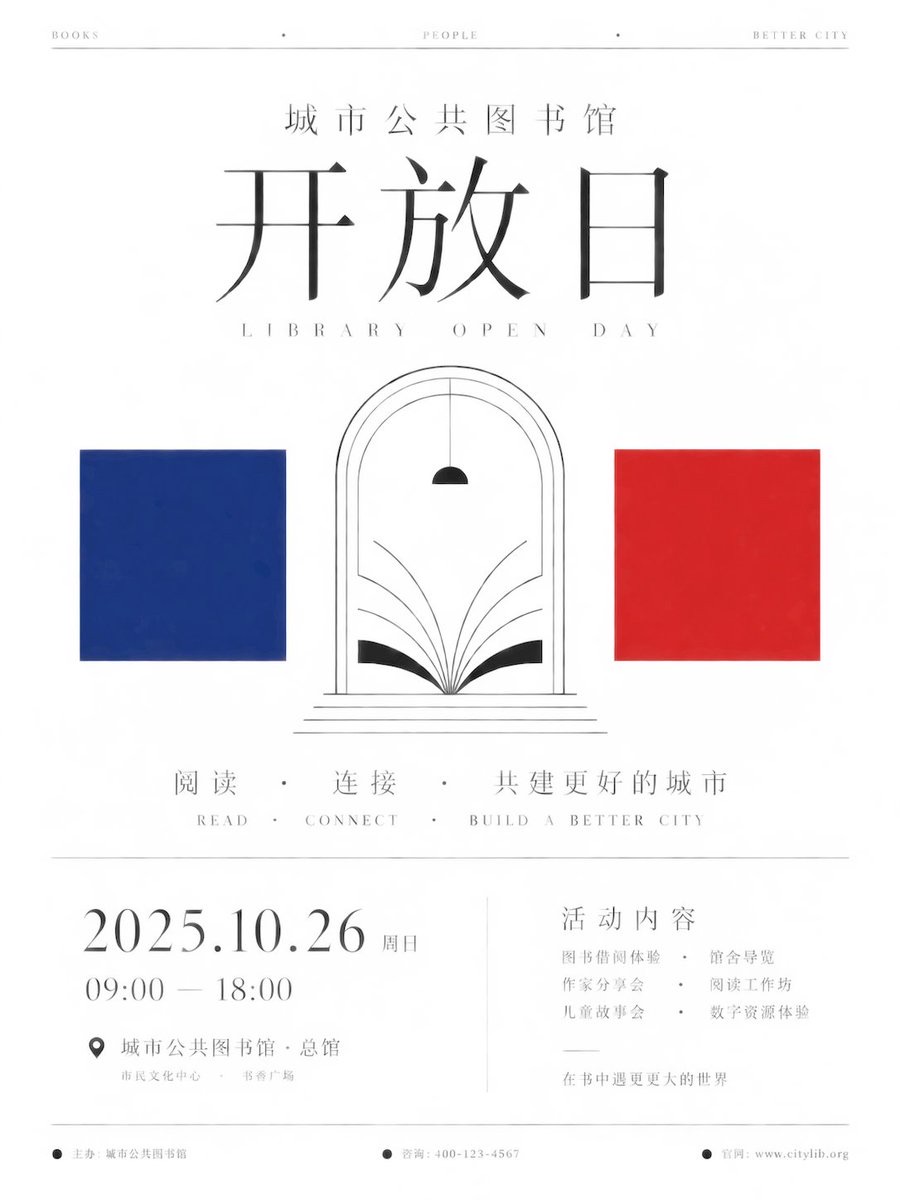
Warm-white negative space, fine serif type, and geometric color blocks, like an event invitation in an art museum.
小小东@xiaoxiaodong01Prompt
Create a minimalist ceremonial information poster around any given theme. The first impression must be a large expanse of warm-white empty space, with the main title precisely centered and held in a solemn alignment with three thematic symbols: transform the core name, participants, or keywords supplied by the theme into a large, fine-stroked title at the top, a central group of recognizable abstract marks, and solid color blocks at either side; the semantics may vary, but retain this order. Preserve a high proportion of negative space, a vertical central axis, upper and lower zones, and the pause created by thin black horizontal lines; arrange every element with the restraint of an exhibition catalog or international institutional yearbook. Use high-contrast, refined serif type or an equivalent glyph structure for body text, with open counters, thin strokes, sharp terminals, and spacious rhythm; when switching to any writing system, retain a slender skeleton, loose letterspacing, clear legibility, and calm breathing rather than copying a particular Latin typeface. Extract two high-saturation representative colors from the theme as hard-edged squares; use only black lines and the simplest geometric forms for the central marks; keep the background warm white with a slight paper texture, avoiding gradients, shadows, and decorative textures. Place subtitles and small explanatory text low in the composition, with footer microtext close to the edges, creating a contrast in which a grand theme is tamed by museum-like whitespace; signs of failure include crowded elements, chaotic colors, overly heavy type, realistic icons, or a poster that loses its austere ceremonial order.

Set the theme as “City Public Library Open Day,” for the main poster of a public cultural institution event: use indigo and vermilion as the two high-saturation square colors; draw abstract open pages and a doorway arch in black lines at the center, with the symbol group sitting steadily below the title along the vertical axis; place the main title in the center of the upper half, and form a sparse two-level information hierarchy with the subtitle and date below, retaining broad warm-white negative space and thin black-line pauses; vertical aspect ratio 3:4.
围绕任意给定主题创建一张极简主义仪式信息海报。第一印象必须是大面积的暖白色空白区域,主标题精确居中,并与三个主题符号形成庄重的对齐关系:将主题提供的核心名称、参与者或关键词转化为顶部的大号细笔画标题、中心的一组可识别抽象标志以及两侧的纯色块;语义可以变化,但顺序保持不变。保留高比例留白、垂直中轴线、上下分区以及细黑水平线带来的停顿感;像展览目录或国际机构年鉴那样克制地排列所有元素。正文使用高对比度的精细衬线体或等效字形结构,具有开阔的字腔、纤细的笔画、锐利的终端和宽敞的节奏,在切换到任何书写系统时保持纤细的骨架、宽松的字距、清晰的辨识度和平静的呼吸感,而不是复制特定的拉丁字体。从主题中提取两种高纯度的代表色作为硬边正方形;中心标志仅使用黑色线条和最简几何图形;背景保持略带纸张纹理的暖白色,避免渐变、阴影和装饰性纹理。副标题和小号说明文字置于底部较低的重心位置,页脚微信息紧贴边缘,营造出宏大主题被博物馆式留白驯服的对比感;失败的症状包括元素拥挤、色彩混乱、字体过粗、写实图标或海报失去冷峻的仪式秩序。
将主题设定为“城市公共图书馆开放日”,用于公共文化机构活动的主海报:使用靛蓝色和朱砂红作为两种高纯度方块颜色;中心用黑色线条绘制抽象的打开书页和门拱,让符号组沿垂直轴稳定落在标题下方;主标题置于上半部分中央,副标题和日期在下方形成稀疏的两级信息层级,保留大面积暖白色留白和细黑线停顿;纵横比为垂直 3:4。
How to use
Replace the event name, date, and location with your own while keeping the information hierarchy clear. The event and date in the preview are examples; check all text and numbers after generation.