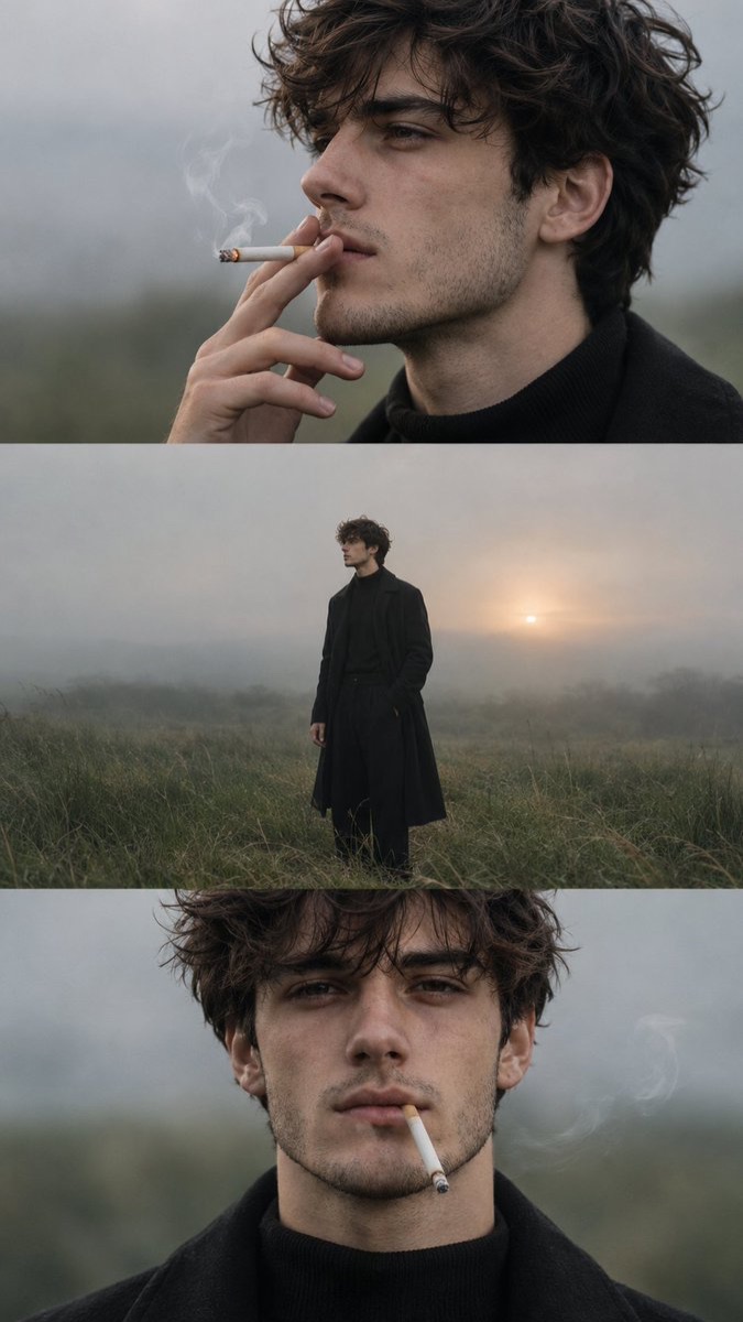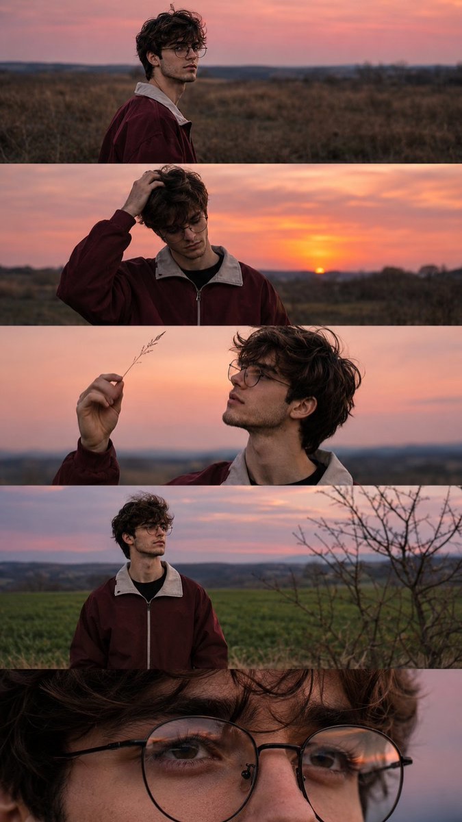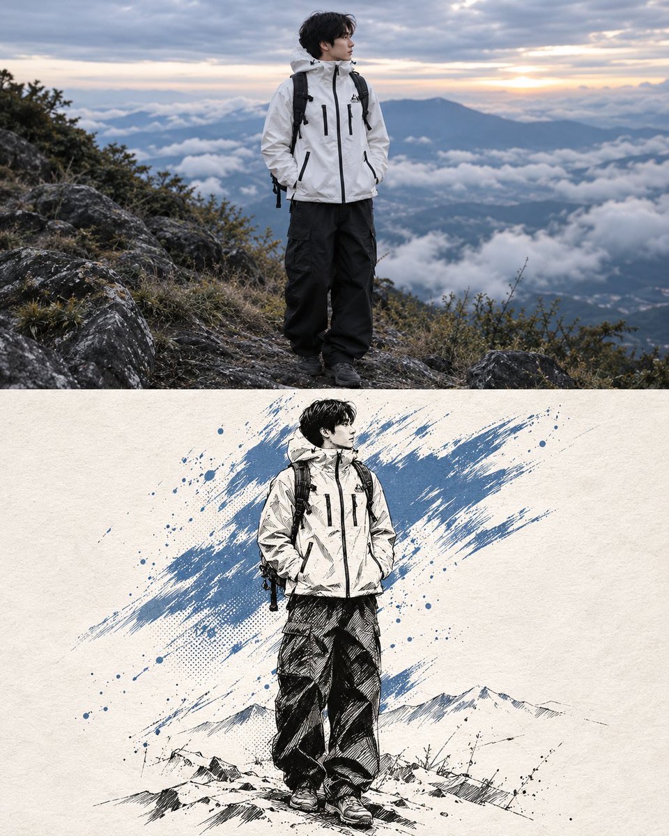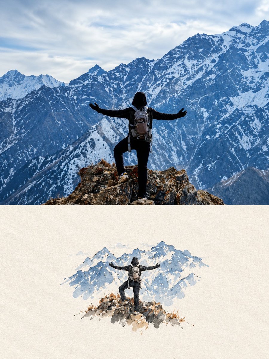
图片 · GPT Image 2.5
照片转旅行插画海报
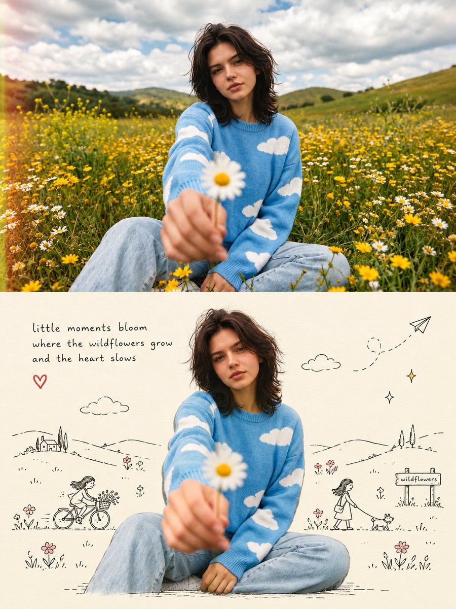
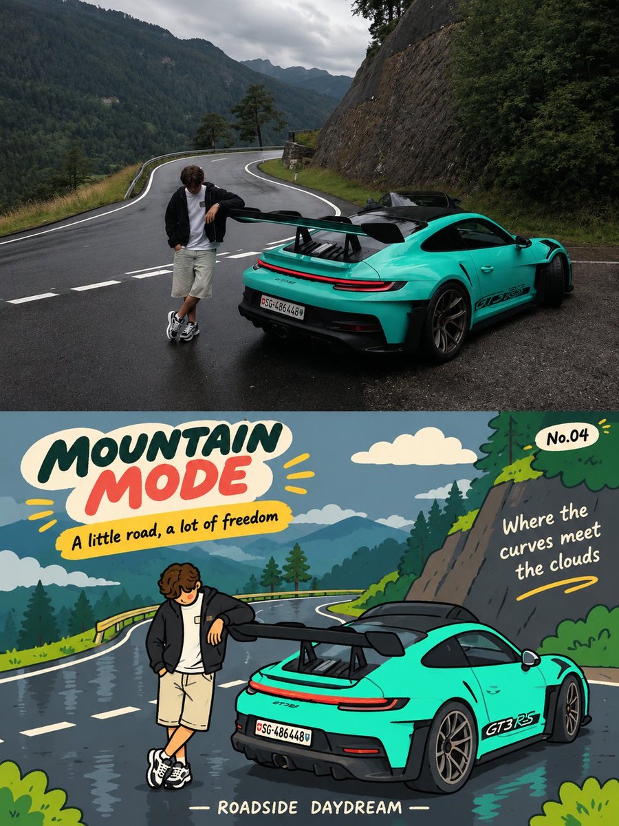
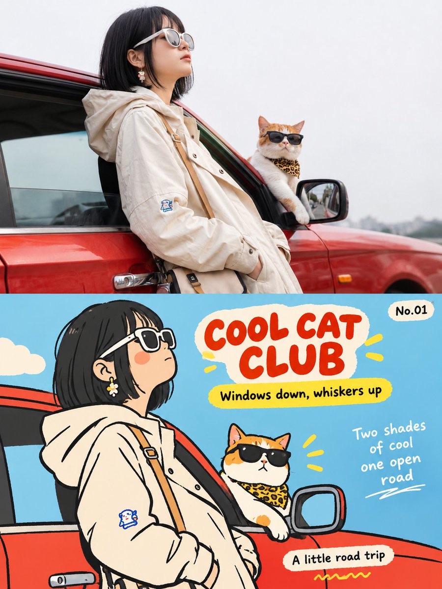
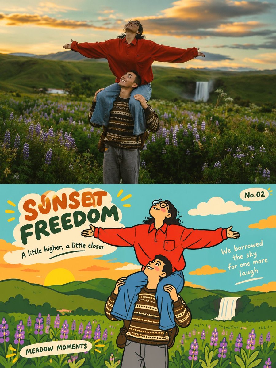
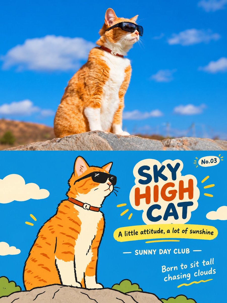
将单张照片保留为海报上半部,并在下半部绘制同一场景的活泼平面插画,配以英文标题和编辑式小字。
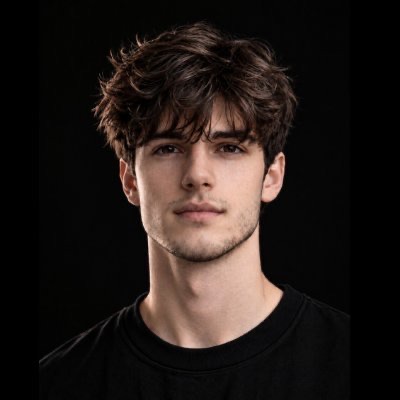 Harboris@harboriis
Prompt
为每张上传的照片分别制作一幅独立的高端编辑海报。逐张单独处理。绝不将照片拼贴、组合成网格、分屏或多照片构图。

版式

严格的3:4竖版构图,水平均分为两个完全相等的50/50区域。上半部分50%为原始摄影;下半部分50%为扁平编辑插画。整体设计需保持高级、干净、经过艺术指导、视觉平衡,并保留充足留白。

顶部50% - 原始照片

将上传的照片视为唯一的事实依据。保留原始主体、身份、面部特征、身体比例、姿势、表情、服装、物体、环境、构图、色彩、空间关系、光影、阴影、景深与摄影质感。不得重新设计、替换、美化、变形、拉伸、复制或重新诠释主体。仅允许进行轻微专业调色,风格应接近独立艺术杂志、高端旅行编辑或展览摄影。若需要更多空间,可在不改变主体的前提下自然延展原有背景。

底部50% - 扁平编辑插画

将同一张照片重新诠释为一幅俏皮、略带笨拙感的韩式灵感扁平编辑插画。识别并保留最具辨识度的主体、轮廓、姿势、动作、关键关系与原场景的叙事。将它们简化为圆润、略微夸张的几何形状,采用干净的纯色填充,并搭配粗糙、不完美的黑色手绘轮廓线,线条带有细微抖动、粗细不均、断续边缘与不规则轮廓。去除写实光照、阴影、透视与材质纹理。避免常规卡通或写实风格。目标是呈现当代韩国儿童绘本、独立杂志图形或俏皮编辑艺术的感觉。

构图

保持一个主导焦点,次要物体仅作为点缀。通过多变的比例、轻微错位、叠压、局部裁切、不规则间距与细微不对称,营造轻松的视觉节奏。允许部分形状延伸到画面之外或相互叠压。使用大胆的色块与充裕的留白。保留关键视觉关系,但无需复刻每一个细节。插画应显得经过设计、轻松且刻意不完美,绝不能是机械描摹或杂乱拥挤的。

色彩

提取照片中最具辨识度的色彩,将其重新诠释为一组有限的高纯度、高饱和度扁平色彩。使用大胆、干净的色块与明亮、年轻的对比。不使用渐变、写实阴影、浑浊的灰色调、光泽效果、复杂混色或过多纹理。配色应显得欢快、充满活力、童趣、温暖并且视觉自信。

排版与编辑文字

生成受照片主题、动作、情绪、氛围或故事启发的英文文字。将排版自然地融入插画之中。

主标题:2–4个英文单词,放置在插画上部区域附近。使用俏皮、略带手写感、不完美的字体;允许不规则的对齐或大小写。

副标题:标题下方一句简短、克制的英文短语。

地点/年份:下中部区域的一行小字编辑信息。已知并经核实时使用已核实的地点/年份;否则使用主体、活动、事件或旅行主题。绝不编造地点。

诗意微型文案:一条简短的1–2行诗意或俏皮短句,自然地放置于留白处、色块旁、边缘处或视觉中轴线上。

系列编号:如角落中的“No.01”般小巧、低调的编辑编号。

文字可以顺应主体轮廓、与色块对齐、占据留白、轻微叠压形状、微微旋转,或使用不规则间距/裁切。可读性必须保持良好。标题可以富有表现力,辅助文字则应保持干净、克制。

艺术方向

将真实旅行摄影 × 俏皮扁平插画 × 高端编辑设计 × 韩式图形感 × 旅行日记美学相结合。成品应明亮、年轻、欢快、温暖、俏皮、略带古怪、精致,并具有限量版旅行艺术印刷品或当代插画旅行日记的收藏感,而不是普通的游客海报。

严格限制

一张照片对应一张独立海报。绝不合并照片。绝不虚构不同场景、替换主体、改变身份或姿势,或引入无关物体。确保底部插画明显源自上方所示的同一张照片。不得出现写实插画、过度渐变、阴影、3D/光泽效果、视觉杂乱或过度拥挤。顶部与底部必须呈现同一旅行时刻的两种相互关联的诠释。
Create one independent high-end editorial poster for each uploaded photo. Process each photo separately. Never combine photos into a collage, grid, split-screen, or multi-photo composition.
FORMAT
Strict 3:4 vertical composition, horizontally divided into two exactly equal 50/50 sections. Top 50% = original photography; bottom 50% = flat editorial illustration. Keep the overall design premium, clean, art-directed, visually balanced, and rich in negative space.
TOP 50% - ORIGINAL PHOT
Treat the uploaded photo as the single source of truth. Preserve the original subject, identity, facial features, body proportions, pose, expression, clothing, objects, environment, composition, colors, spatial relationships, lighting, shadows, depth, and photographic texture. Do not redesign, replace, beautify, distort, stretch, duplicate, or reinterpret the subject. Only subtle professional color grading is allowed, with the feel of an independent art magazine, premium travel editorial, or exhibition photograph. If more space is needed, naturally extend the existing background without altering the subject.
BOTTOM 50% - FLAT EDITORIAL ILLUSTRATION
Reinterpret the same photograph as a playful, slightly awkward Korean-inspired flat editorial illustration. Identify and preserve the most recognizable subject, silhouette, pose, action, key relationships, and narrative of the original scene. Simplify them into rounded, slightly exaggerated geometric shapes with clean solid fills and rough, imperfect black hand-drawn outlines featuring subtle wobble, uneven thickness, broken edges, and imperfect contours. Remove photorealistic lighting, shadows, perspective, and material textures. Avoid conventional cartoon or photorealistic styles. Aim for a contemporary Korean children's book, independent magazine graphic, or playful editorial artwork.
COMPOSITION
Keep one dominant focal point with secondary objects used only as accents. Create relaxed visual rhythm through varied scale, slight misalignment, overlaps, partial cropping, irregular spacing, and subtle asymmetry. Allow some shapes to extend beyond or overlap the composition. Use bold color blocks and generous negative space. Preserve key visual relationships without reproducing every detail. The illustration should feel designed, relaxed, and intentionally imperfect, never mechanically traced or cluttered.
COLOR
Extract the photograph's most distinctive colors and reinterpret them as a limited palette of high-purity, high-saturation flat colors. Use bold, clean color blocks and bright youthful contrasts. No gradients, realistic shadows, muddy gray tones, glossy effects, complex blending, or excessive texture. The palette should feel cheerful, energetic, childlike, warm, and visually confident.
TYPOGRAPHY & EDITORIAL TEXT
Generate English text inspired by the photo's theme, action, emotion, atmosphere, or story. Integrate typography naturally into the
illustration.
MAIN TITLE: 2-4 English words, placed near the upper illustration area. Use playful, slightly handwritten, imperfect lettering; irregular alignment or capitalization is allowed.
SUBTAGLINE: One short, restrained English phrase below the title.
LOCATION / YEAR: Small editorial line in the lower-middle area. Use a verified location/year when known; otherwise use the subject, activity, event, or travel theme. Never invent a location.
POETIC MICRO-CAPTION: A short 1-2 line poetic or playful phrase, placed naturally within negative space, beside a color block, along
an edge, or on the visual axis.
SERIES NUMBER: Small, subtle editorial numbering such as "No.01" in a corner.
Typography may follow subject contours, align with color blocks, occupy negative space, overlap shapes slightly, rotate subtly, or use irregular spacing/cropping. Readability must remain strong. Title can be expressive; supporting text should stay clean and restrained.
Art DIRECTION
Combine real travel photography x playful flat illustration x premium editorial design x Korean graphic sensibility x travel diary aesthetics. The result should feel bright, youthful, cheerful, warm, playful, slightly quirky, sophisticated, and collectible-like a limited-edition travel art print or contemporary illustrated travel diary, not a generic tourist poster.
STRICT RESTRICTIONS
One photo = one independent poster. Never combine photos. Never invent a different scene, replace the subject, alter identity or pose, or introduce unrelated objects. Keep the bottom illustration clearly derived from the same photo shown above. No photorealistic illustration, excessive gradients, shadows, 3D/glossy effects, visual clutter, or overcrowding. The top and bottom must feel like two connected interpretations of the same travel moment.
使用建议
上传一张旅行照片,生成上下各占一半的独立旅行主题海报。