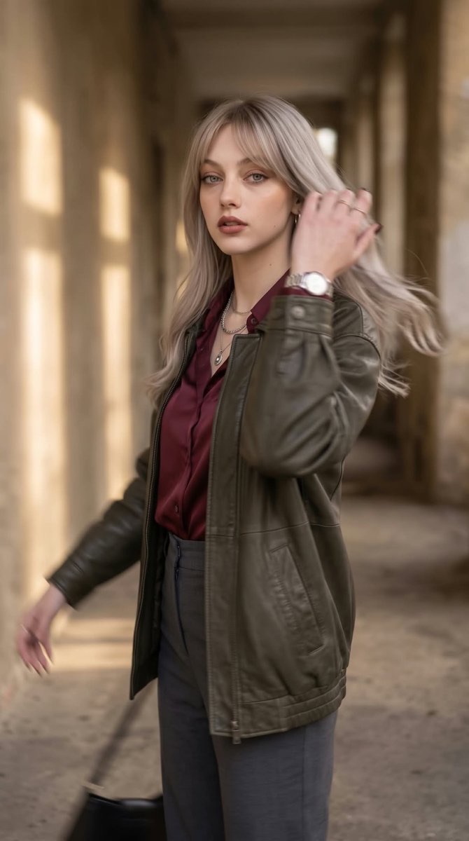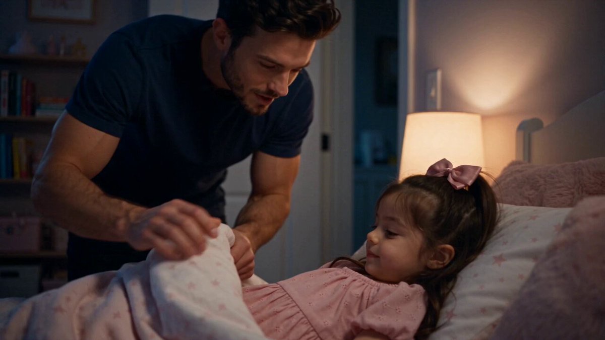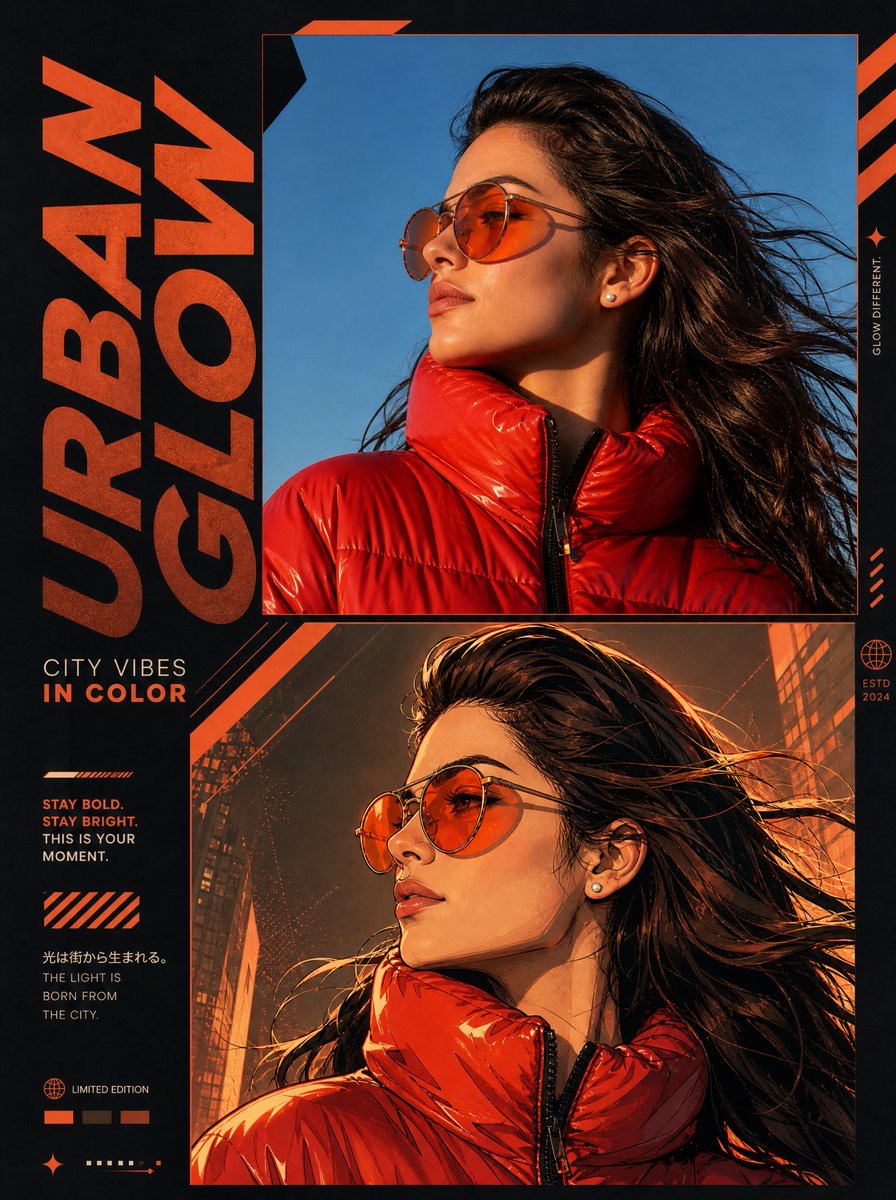
图片 · Nano Banana
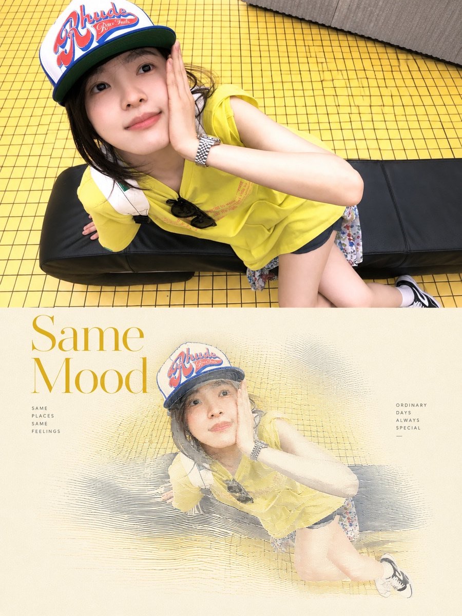
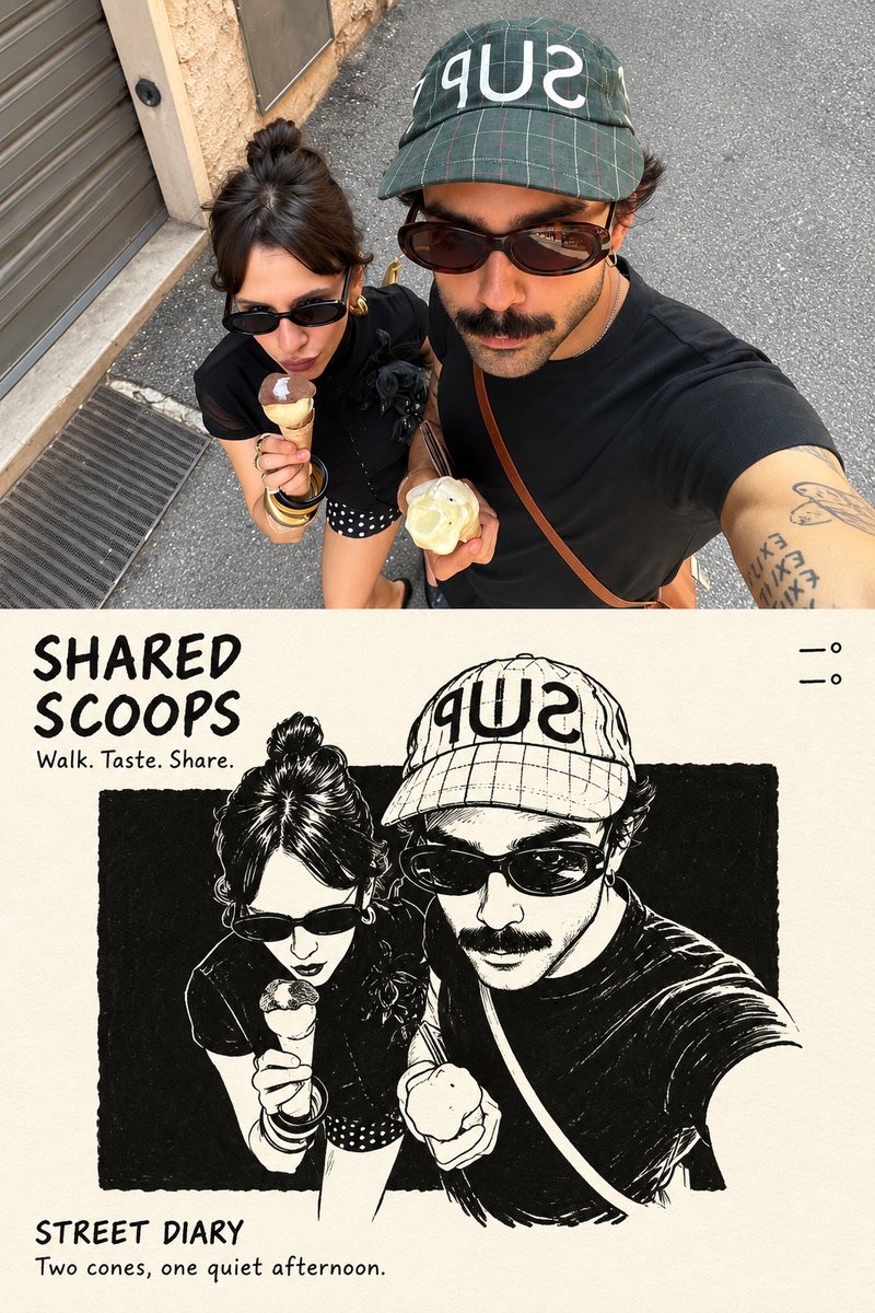
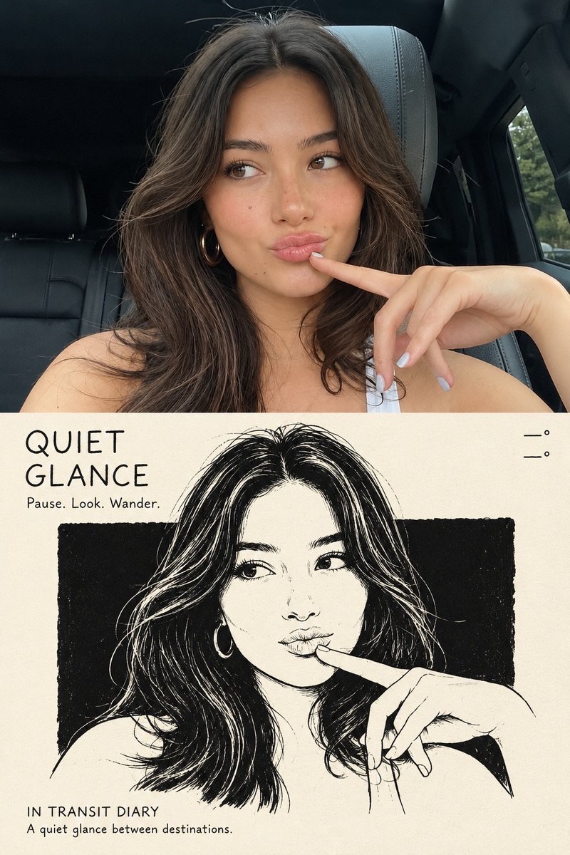
摄影与黑白插画对照海报
将参考照片与极简黑色钢笔插画上下分区结合,制作具有独立出版物气质的竖版艺术海报。
 K@ChillaiKalan__
Prompt
使用上传的参考图像,创作一张单幅高分辨率竖版2:3编辑艺术海报。

将画布划分为两个完全相等的水平区域,每个区域恰好占总高度的50%。用一条干净、完全笔直的水平分割线将它们隔开。

1. 上半部分——原始参考照片

在海报上方50%的区域直接使用上传的参考照片。

保留照片原有的质感、清晰度、自然光线和色彩关系。

必要时,仅可在外缘进行细微且恰当的裁切,不得损害主体。

如有需要,可自然延展少量周围环境以适应构图。

不得重绘、插画化、拉伸、模糊或修改主体的外观、结构或空间关系。

不得添加黑色边框、白色边距或空白边缘。

2. 下半部分——极简编辑插画

使用温暖的近白色象牙纸背景,并加入极其细微的纸张纹理。

分析上传参考图像中的主体和视觉故事。

仅提取主要主体,并保留一两个关键识别特征。

移除或大幅简化所有次要细节,包括背景建筑、人群、车辆、围栏、标识、树木及其他不必要元素。

将主要主体转化为精致的黑墨编辑插画。

插画风格:

使用自然、干净且线条粗细有变化的笔触。

保留真实的手绘质感,线条富有表现力但有所节制。

避免过于精细的雕版美学、过多的内部细节和密集的交叉排线。

在插画主体后方放置一块大幅、近乎纯黑的矩形墨块。

矩形墨块的边缘应略带手工印刷般的不规则感。

黑色背景保持干净,只保留细微的纸张颗粒和极少的噪点。

避免明显的排线、刮痕、建筑线条或复杂纹理。

插画尺寸与构图:

插画主体应占画布宽度的约72–77%,并占下半部分高度的58–64%。

确保视觉焦点清晰,并在插画周围留出充足的负空间。

3. 色彩规则

默认情况下,下半部分的插画必须严格采用黑白配色。

只有当原始参考图像中存在明显醒目、集中且具有重要叙事意义的色彩元素时,才保留一个局部点缀色。

普通的蓝天、绿色植被、石材表面、肤色和环境色彩不得作为点缀色处理。

任何保留的点缀色都必须严格局限于相关主体或区域。

绝不能让点缀色扩散到整幅插画中。

4. 字体与编辑版式

根据上传的参考照片内容,自动生成简洁且有意义的英文文字。

文字应类似独立艺术刊物中的手写编辑批注。

左上角:

生成一个由2–5个单词组成的简短手写标题,分两行排列。

标题正下方加入三个与照片相关的简短英文动作动词。

右上角:

仅显示两行地理坐标:

纬度
经度

此区域不得加入任何其他文字。

左下角:

显示地点名称,后接单词“DIARY.”

其正下方添加一句受照片启发的简短英文描述。

字体风格:

使用粗粝、直立、略带不规则感的手写字体。

保留细微的不完美,呈现自然的编辑批注质感。

避免优雅的草书、书法、过度装饰的字形和过分精致的排版。

5. 最终艺术指导

成品海报必须融合:

真实、高品质的摄影。
极简黑白编辑插画。
充足的负空间。
独立艺术刊物美学。
安静、克制、精致的视觉叙事。
自然的手写字体。
纪实写实风格与富有表现力的手绘艺术之间的平衡关系。

整体效果应像一幅经过精心设计、值得收藏的编辑艺术版画。

6. 最终输出要求

宽高比:
2:3竖版。

分辨率:
高分辨率、清晰、适合印刷的输出。

构图:

上方恰好为50%的原始参考照片。

下方恰好为50%的编辑插画。

一条完全笔直的水平分割线。

一张完整、独立的海报。

限制:

不得制作拼贴。
不得采用多张海报的版式。
不得组合多张图像。
不得添加不必要的装饰元素。
不得修改原始主体的身份或外观。
不得加入过多插画细节。
不得改变原始照片的自然色彩关系。

最终目标:

创作一张精致且视觉平衡的编辑艺术海报,在忠实保留上传参考照片的同时,将其主要主体转化为富有表现力的极简黑墨插画。
Using the uploaded reference image, create a single high-resolution vertical 2:3 editorial art poster.
Divide the canvas into two perfectly equal horizontal sections, each occupying exactly 50% of the total height. Separate them with a clean, perfectly straight horizontal dividing line.
1. TOP HALF — ORIGINAL REFERENCE PHOTOGRAPH
Use the uploaded reference photograph directly in the upper 50% of the poster.
Preserve its original photographic quality, sharpness, natural lighting, and color relationships.
Allow only subtle, intelligent cropping around the outer edges when necessary, without compromising the main subject.
If required, naturally extend a small portion of the surrounding environment to fit the composition.
Do not redraw, illustrate, stretch, blur, or modify the subject's appearance, structure, or spatial relationships.
Do not introduce black borders, white margins, or empty edges.
2. BOTTOM HALF — MINIMALIST EDITORIAL ILLUSTRATION
Use a warm, near-white ivory paper background with an extremely subtle paper texture.
Analyze the main subject and visual story of the uploaded reference image.
Extract only the primary subject, preserving one or two essential identifying elements.
Remove or heavily simplify all secondary details, including background architecture, crowds, vehicles, fences, signs, trees, and other unnecessary elements.
Transform the primary subject into a sophisticated black-ink editorial illustration.
ILLUSTRATION STYLE:
Use natural, clean pen strokes with varied line weight.
Preserve an authentic hand-drawn appearance with expressive but controlled linework.
Avoid overly precise engraving aesthetics, excessive internal details, and dense cross-hatching.
Place a large, nearly pure-black rectangular ink block behind the illustrated subject.
The rectangular block should have subtly imperfect, handmade print-style edges.
Keep the black background clean, with only fine paper grain and minimal noise.
Avoid obvious hatching, scratches, architectural lines, or complex textures.
ILLUSTRATION SCALE AND COMPOSITION:
The illustrated subject must occupy approximately 72–77% of the canvas width and 58–64% of the bottom section's height.
Maintain a clear visual focal point with generous negative space surrounding the illustration.
3. COLOR RULES
The bottom illustration must follow a strictly black-and-white color palette by default.
Preserve only one localized accent color if the original reference image contains a clearly distinctive, concentrated color element with meaningful narrative importance.
Ordinary blue skies, green vegetation, stone surfaces, skin tones, and environmental colors must not be treated as accent colors.
Any preserved accent color must remain strictly localized to the relevant subject or area.
Never allow accent colors to spread across the entire illustration.
4. TYPOGRAPHY AND EDITORIAL LAYOUT
Automatically generate concise, meaningful English typography based on the content of the uploaded reference photograph.
The typography must resemble handwritten editorial annotations from an independent art publication.
TOP-LEFT CORNER:
Generate a short handwritten title consisting of 2–5 words, arranged across two lines.
Directly beneath the title, include three short English action verbs relevant to the photograph.
TOP-RIGHT CORNER:
Display only two lines of geographic coordinates:
Latitude
Longitude
Do not include any additional text in this area.
BOTTOM-LEFT CORNER:
Display the location name followed by the word "DIARY."
Directly beneath it, add one short descriptive English sentence inspired by the photograph.
TYPOGRAPHY STYLE:
Use a rough, upright, slightly irregular handwritten typeface.
Maintain subtle imperfections and a natural editorial annotation aesthetic.
Avoid elegant cursive, calligraphy, overly decorative lettering, and excessively polished typography.
5. FINAL ART DIRECTION
The finished poster must combine:
Authentic, high-quality photography.
Minimalist black-and-white editorial illustration.
Generous negative space.
Independent art publication aesthetics.
Quiet, restrained, sophisticated visual storytelling.
Natural handwritten typography.
A balanced relationship between documentary realism and expressive hand-drawn artwork.
The overall result should resemble a carefully designed, collectible editorial art print.
6. FINAL OUTPUT REQUIREMENTS
ASPECT RATIO:
2:3 vertical.
RESOLUTION:
High-resolution, sharp, print-quality output.
COMPOSITION:
Exactly 50% original reference photography on top.
Exactly 50% editorial illustration on the bottom.
One perfectly straight horizontal dividing line.
One complete, standalone poster.
RESTRICTIONS:
No collages.
No multi-poster layouts.
No combined images.
No unnecessary decorative elements.
No modifications to the original subject's identity or appearance.
No excessive illustration details.
No changes to the original photograph's natural color relationships.
FINAL GOAL:
Create a sophisticated, visually balanced editorial art poster that faithfully preserves the uploaded reference photograph while transforming its primary subject into an expressive, minimalist black-ink illustration.
使用建议
使用建议:上传主体清晰、环境信息适度的参考照片,并根据画面内容核对自动生成的标题、地点与坐标文字。