图片 · GPT Image 2
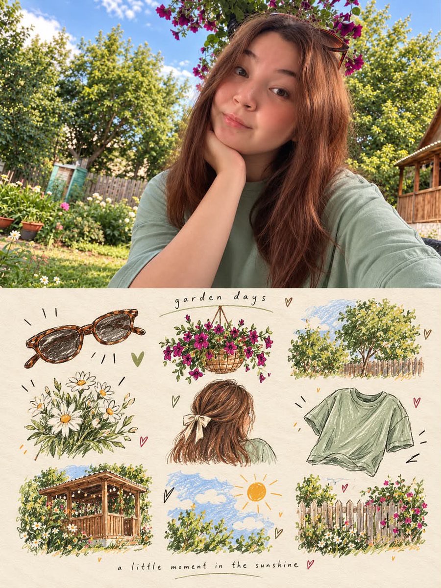
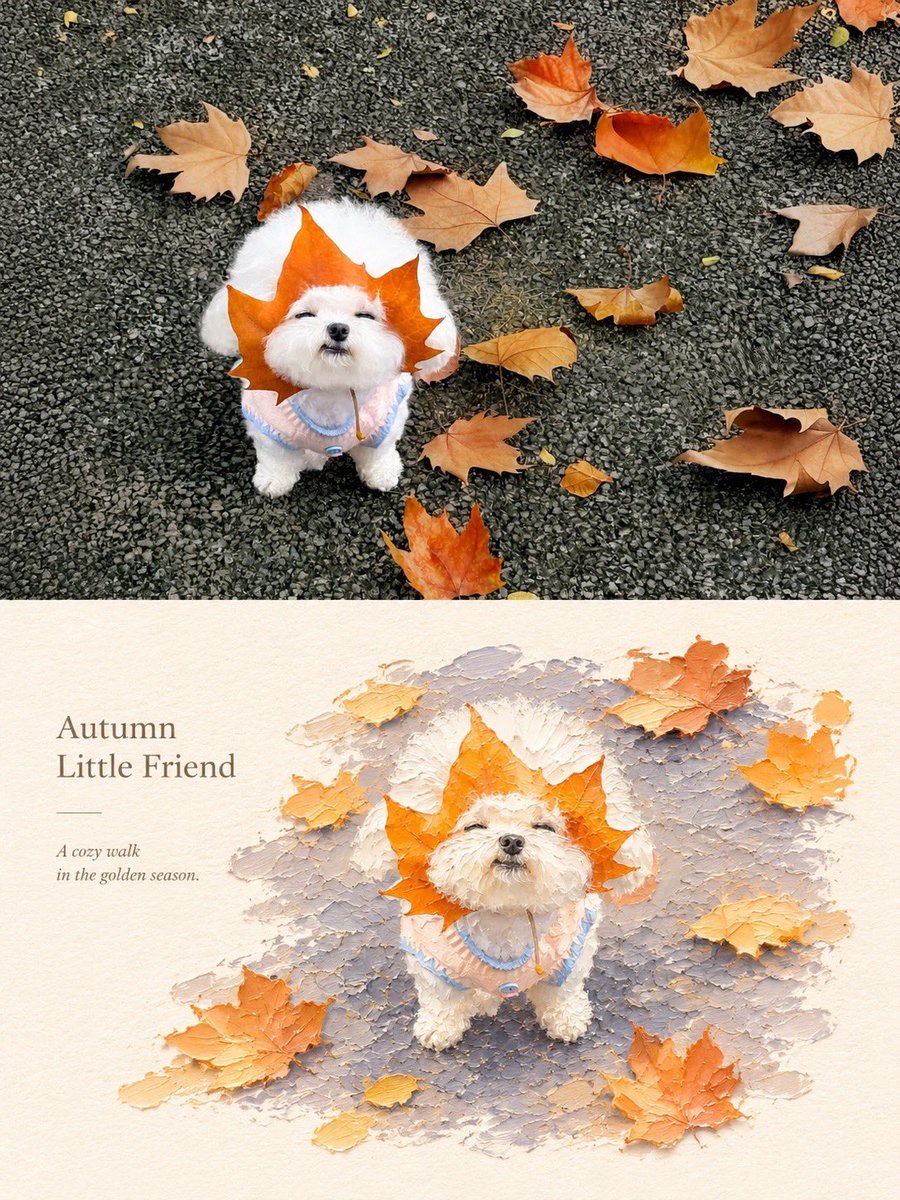
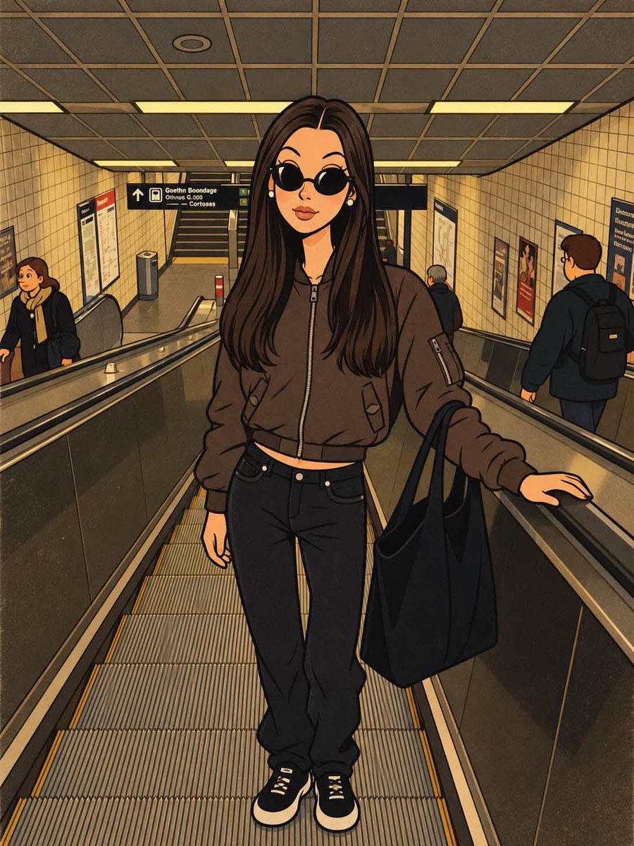
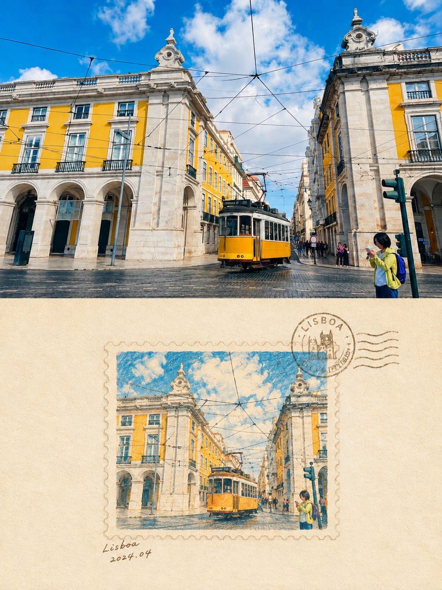
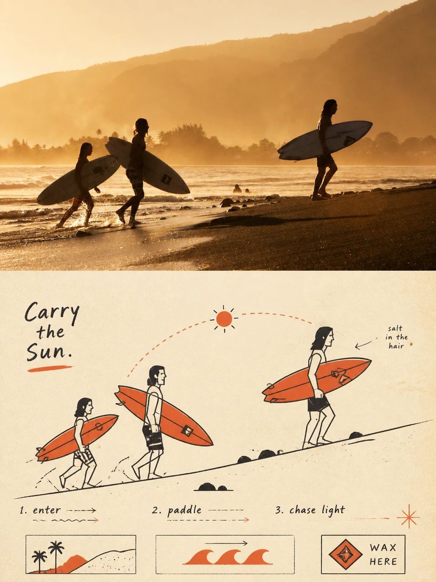
照片与图解插画上下分栏海报
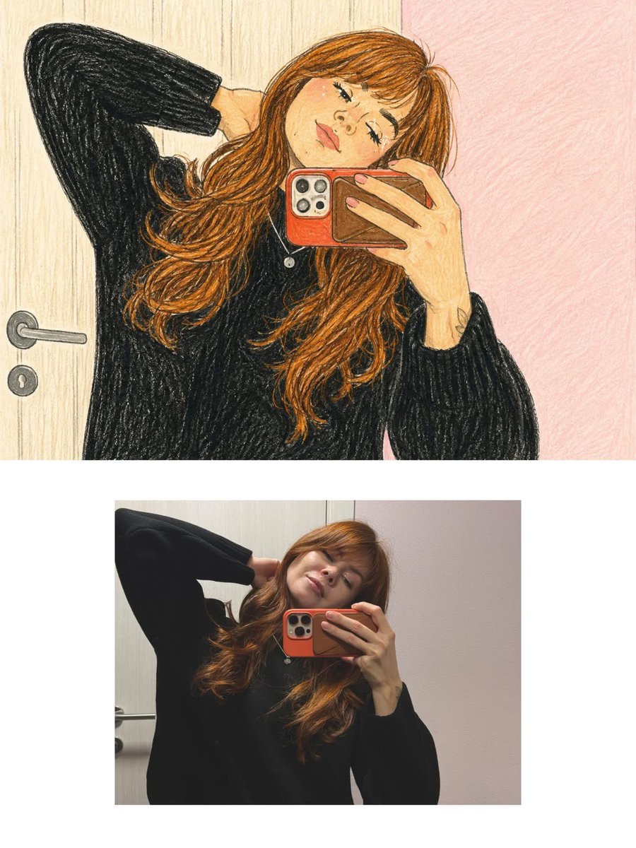
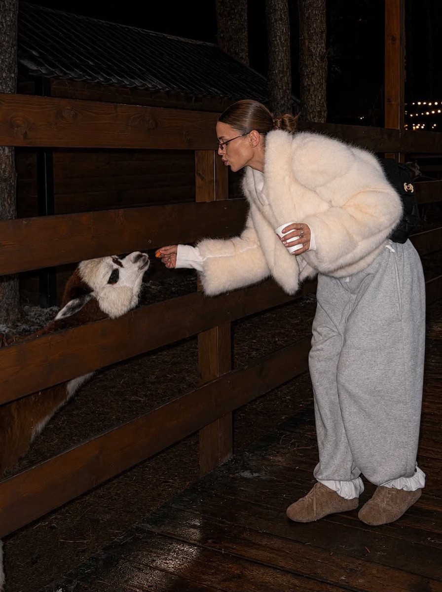
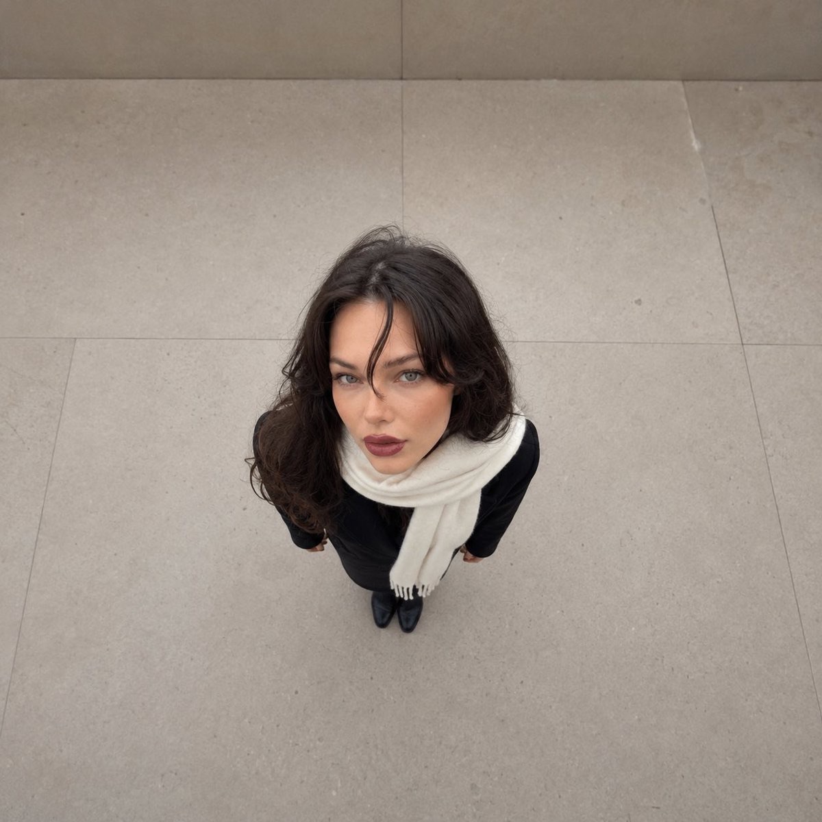
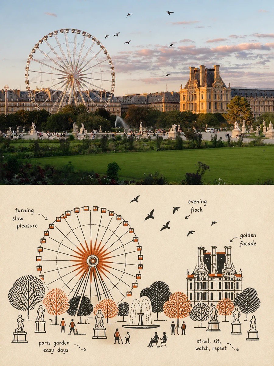
将每张照片分别制作成3:4竖版海报:上半部保留摄影质感,下半部以20世纪中叶民俗图形插画、示意线稿和双色套印重构主体叙事。
 Sairah@Sairah_0
Prompt
请为每张上传的照片分别创作一张独立设计的高端海报。不要将多张照片合并成一幅构图;每张照片都要单独输出一张海报。采用竖版 3:4 构图,上下两部分严格划分 1:1,各自恰好占总高度的 50%。

上半部分:
保留原始照片,维持主体的身份特征、结构、姿势、真实质感、自然光线和原有的色彩氛围。只进行细微而精致的色彩调整,使其具有艺术杂志、独立出版物或展览图像的视觉质感。为适配 3:4 格式,可以自然延展周围背景,但不要拉伸、扭曲或改变主体。

下半部分:
提取照片中最具辨识度的主体、轮廓、结构、姿势和叙事关系,并以世纪中叶乡土图形插画 + 示意线描 + 双专色印刷的风格重新构建。

不要完全描摹或复刻照片,而要运用图解式抽象,将复杂物体压缩为少量清晰的几何形状、功能性轮廓和关键结构元素。成品应类似旧式说明手册、广告卡片、技术标签或民间印刷品中的插画:一眼可辨,同时比真实物体本身更直接、幽默且具有象征意味。

强调线条的简练:若一条线就能说明某个结构,就不要使用多余笔画。用直接的黑色钢笔轮廓、矩形、圆形、菱形、直线和简单平面来描绘物体。人物、动物和物体的比例可以略微夸张,而机器、建筑和复杂结构则应简化为清晰的方框、开口、面板以及轮廓关系。

采用扁平、示意图式的透视,而非真实光照或严格准确的空间纵深。整体视觉语言应介于插画与技术示意图之间,并在整个构图中保持这种鲜明特征。

根据原图中最重要的叙事关系重新组织构图。保留一个明确的主体,同时用少量辅助物件、引导线、方向关系或结构符号来强化故事。

仔细处理视觉层级、几何秩序、尺度对比、正负空间和有意留白。图像可以带有一丝质朴、笨拙或民间手作的感觉,但绝不能显得杂乱。每个视觉元素都应服务于“解释正在发生什么”,而不只是装饰。
Please create a separate, independently designed premium poster from each uploaded photo. Do not combine multiple photos into one composition; output one individual poster for each photo. Use a vertical 3:4 composition, with the upper and lower sections strictly divided 1:1, each occupying exactly 50% of the total height.
Upper Half:
Preserve the original photograph, maintaining the subject’s identity, structure, pose, realistic texture, natural lighting, and original color atmosphere. Apply only subtle, sophisticated color grading to give it the visual quality of an art magazine, independent publication, or exhibition image. To adapt the image to the 3:4 format, the surrounding background may be naturally extended, but do not stretch, distort, or alter the subject.
Lower Half:
Extract the most recognizable subject, silhouette, structure, pose, and narrative relationship from the photograph and reconstruct it in the style of Mid-century vernacular graphic illustration + schematic line drawing + two-color spot printing.
Do not completely trace or replicate the photograph. Instead, use diagrammatic abstraction to compress complex objects into a small number of clear geometric shapes, functional contours, and essential structural elements. The result should resemble an illustration from an old instruction manual, advertising card, technical label, or vernacular print: immediately recognizable, yet more direct, humorous, and symbolic than the realistic object itself.
Emphasize economy of line: if a structure can be explained with a single line, do not use unnecessary strokes. Use direct black pen outlines, rectangles, circles, diamonds, straight lines, and simple planes to describe the objects. People, animals, and objects may have slightly exaggerated proportions, while machines, buildings, and complex structures should be simplified into clear boxes, openings, panels, and silhouette relationships.
Use a flat, schematic diagrammatic perspective rather than realistic lighting or strictly accurate spatial depth. The visual language should exist somewhere between illustration and technical diagram, maintaining this distinctive character throughout the composition.
Reorganize the composition according to the most important narrative relationship in the original image. Maintain one clear primary subject, while using a small number of supporting objects, guide lines, directional relationships, or structural symbols to reinforce the story.
Pay close attention to visual hierarchy, geometric order, scale contrast, positive and negative space, and intentional whitespace. The image may feel slightly naïve, awkward, or handmade in a vernacular way, but it must never feel cluttered. Every visual element should appear to exist for the purpose of “explaining what is happening”, rather than simply serving as decoration.
使用建议
使用建议:为每张参考照片单独运行一次,优先选择主体和叙事关系清晰的照片;生成后检查上下区域是否各占一半、主体是否未被拉伸,以及下半部是否保持简洁的图解层级。