图片 · GPT Image 2
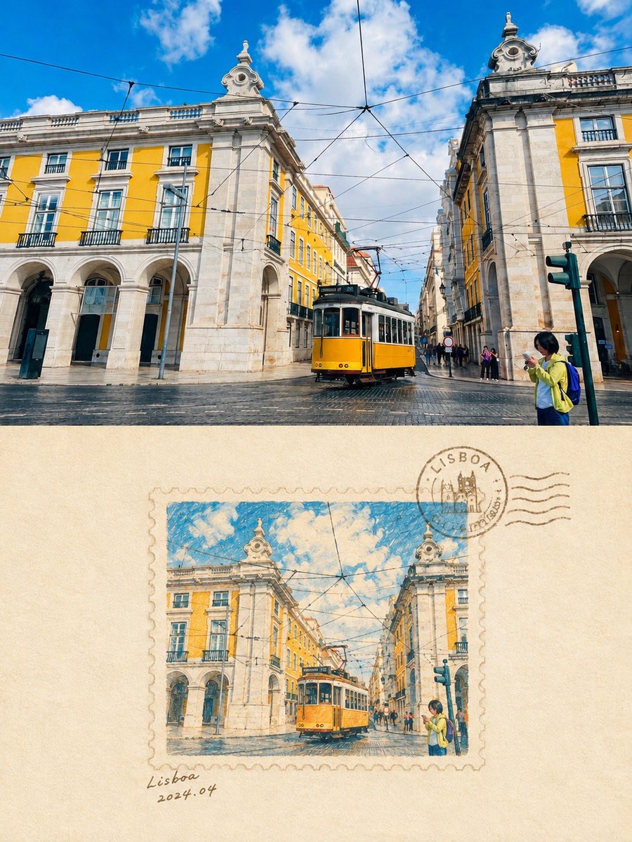
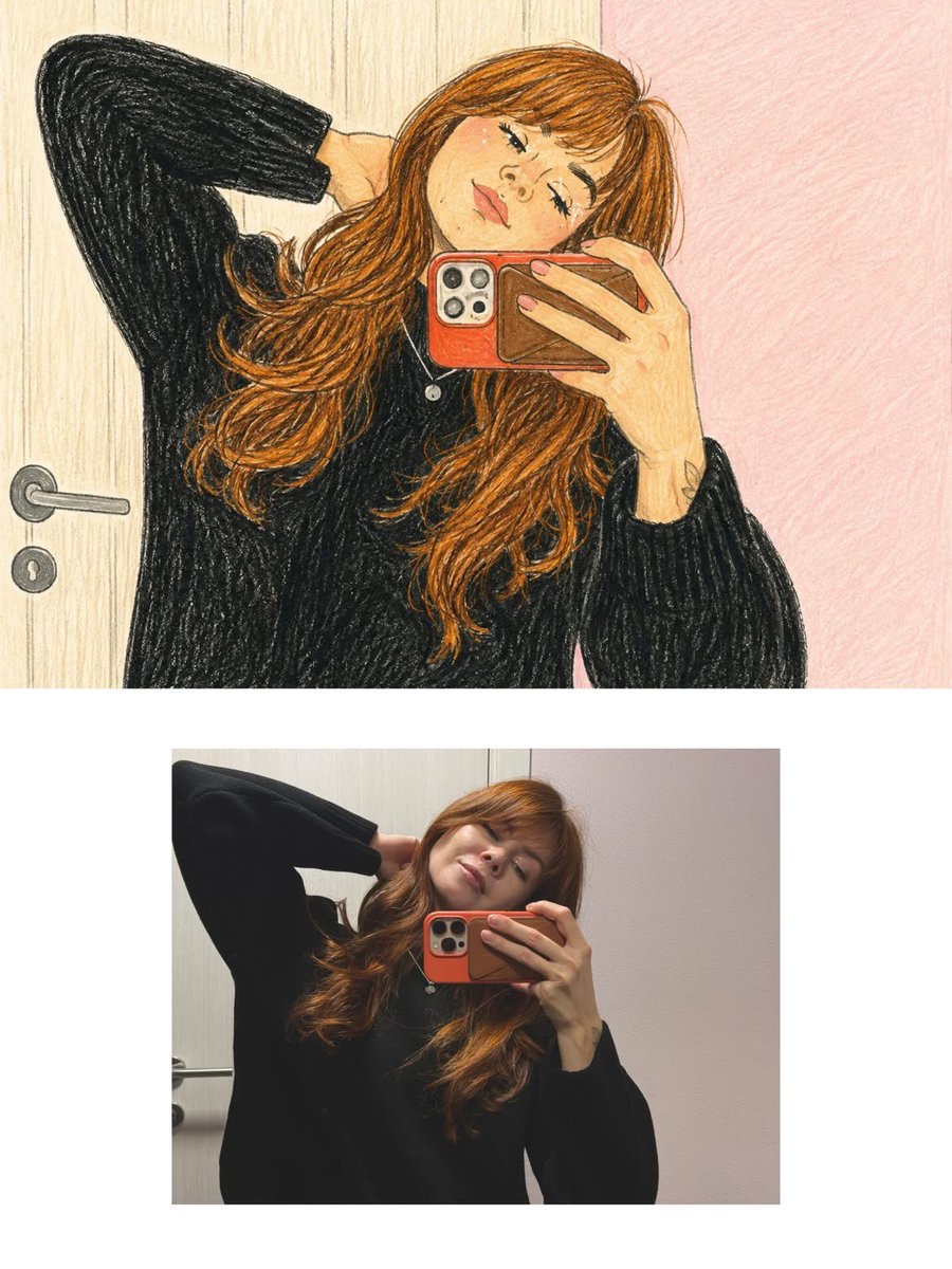
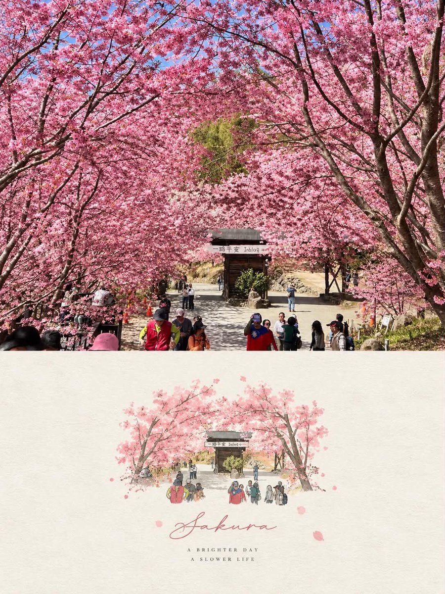
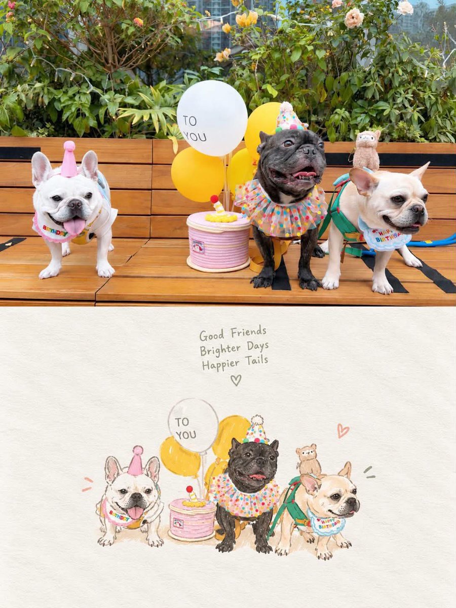
照片与手绘插画的编辑感双层海报
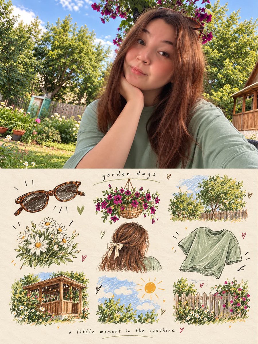
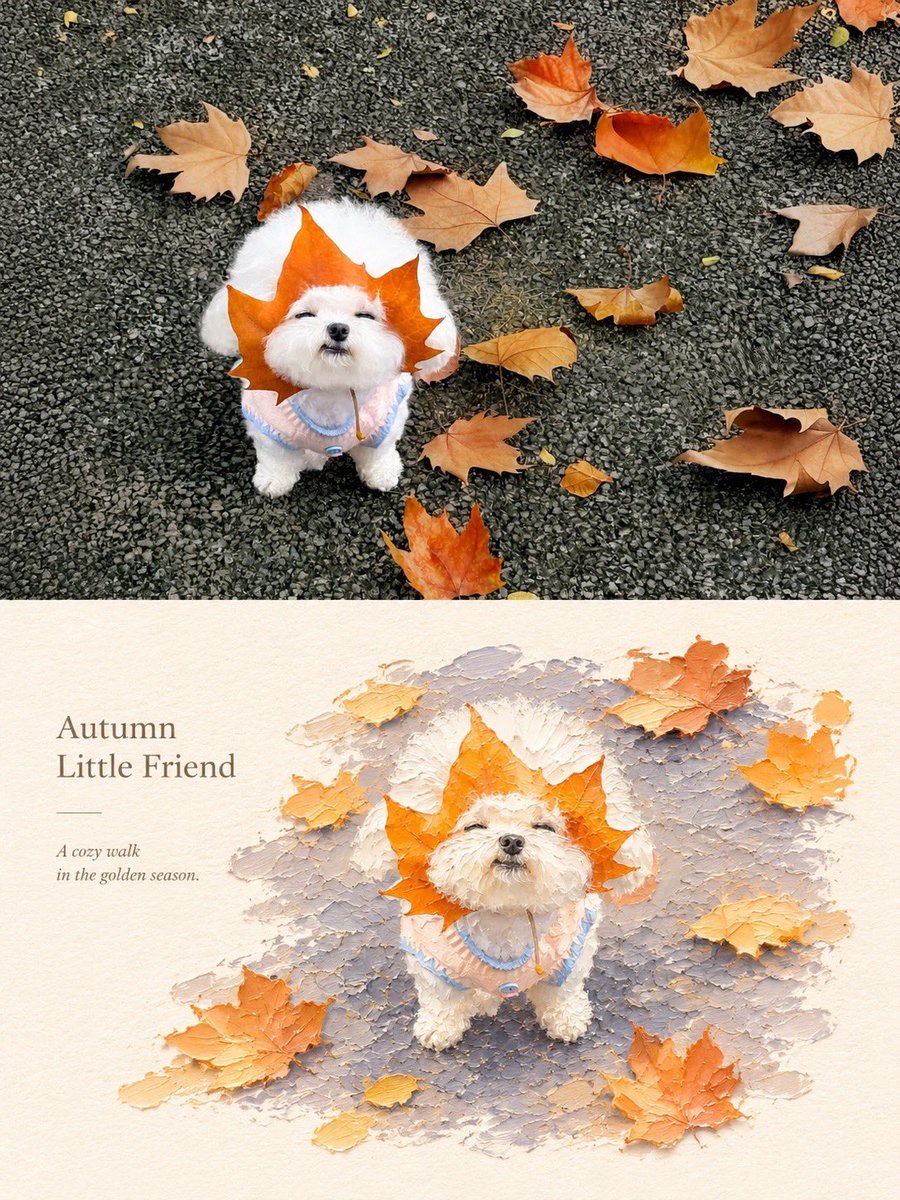
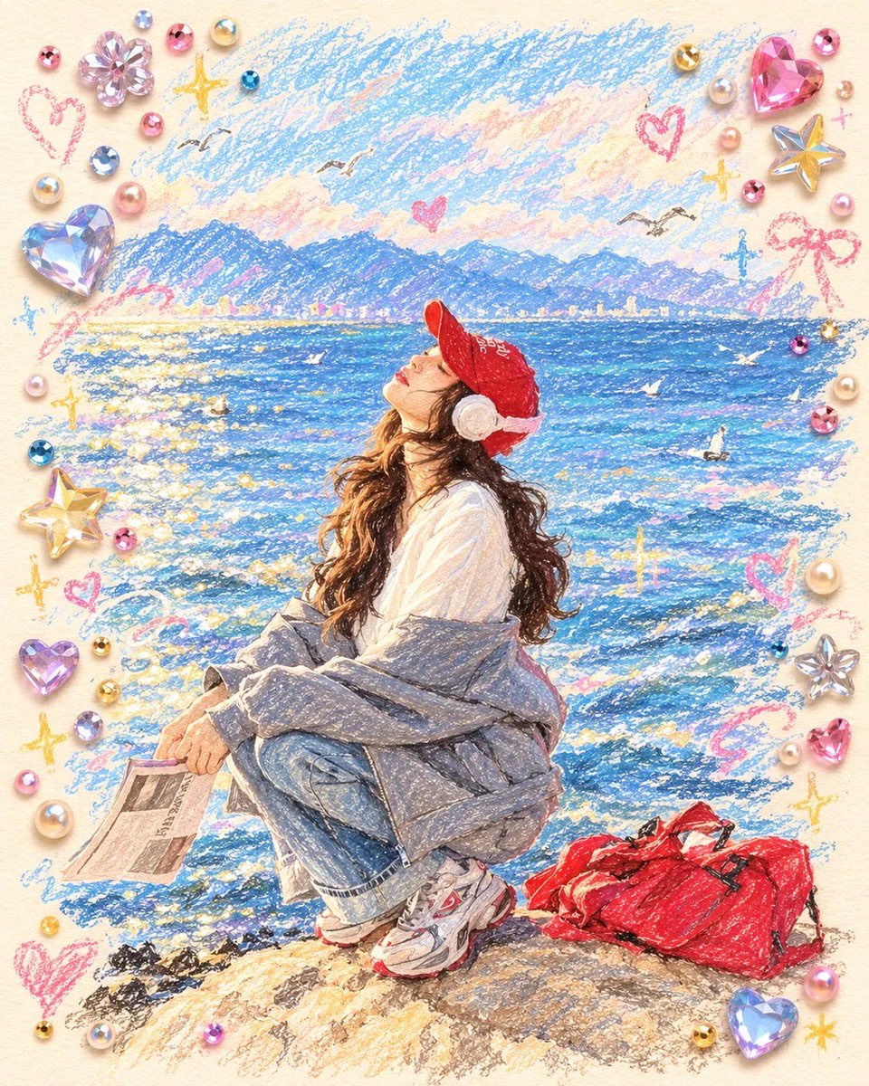
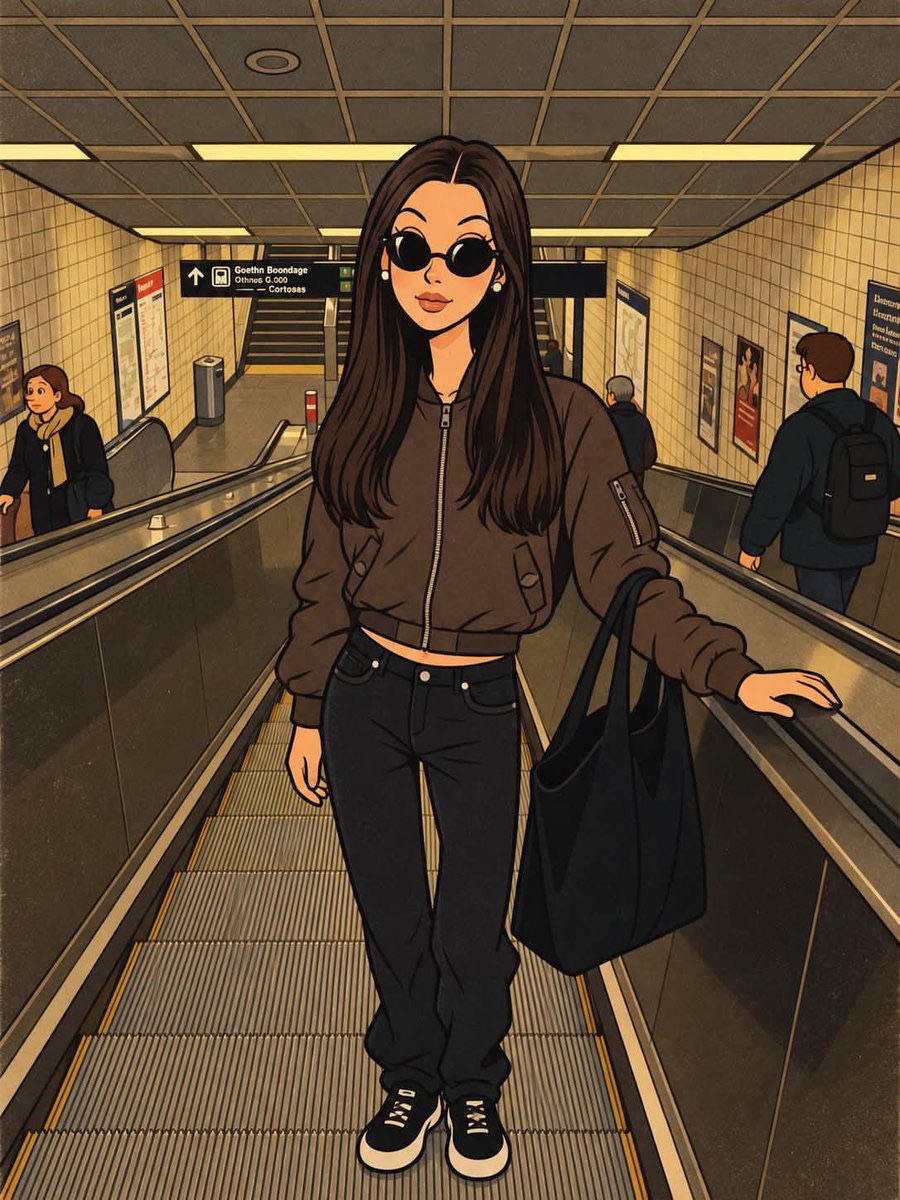
将用户上传的照片保留在海报上半部,并在下半部制作同场景的水彩、彩铅与墨线插画,形成精致的旅行生活方式海报。
 Sairah@Sairah_0
Prompt
将上传的图片作为主要参考。准确保留原有的场景、构图、主体、姿势、比例、色彩和重要细节。不要替换或重新排列主要元素。

创作一幅竖版3:4编辑风海报,呈现精致的照片到手绘插画的转变。

上半部分——原始照片
•保持上传的照片基本不变。
•保留精确的环境、人物/动物、物品、建筑、光线、色彩和构图。
•让它看起来自然、清晰、具有摄影质感。
•照片应占据海报上部约50%。

下半部分——插画版本
•将照片中的同一场景重绘为精致的手绘插画。
•保持相同的主体、位置、姿势、透视和可辨识的细节。
•采用柔和的水彩+彩色铅笔+墨线速写美学。
•细腻而富有表现力的轮廓线,淡淡的铅笔质感,轻柔的水彩晕染,略不完美的手绘边缘。
•简化背景,同时保留最具辨识度的环境元素。
•使用柔和的粉彩色调、自然的纸张色彩、细微的颗粒,以及优雅的编辑风/艺术画册感。
•插画应给人高级旅行/生活方式明信片的感觉,而不是卡通或普通的数字绘画。
•保持照片与插画之间的视觉连贯性。

布局与设计
•竖版3:4构图。
•上半部分=原始照片。
•下半部分=温暖灰白的纹理纸张/画布背景。
•在两个部分之间创建柔和无缝的过渡。
•将重绘的插画置于下半部分中央,四周留出大量留白。
•仅在自然契合场景的情况下,添加少量淡淡的手绘装饰元素,如小花瓣、叶子、爱心或速写笔触。
•在插画下方或周围加入极简优雅的字体排版。
•主标题使用精致的手写/花体字体,副标题使用小号极简的衬线/无衬线字体。
•保持排版低调而平衡。

文字
将标题和副标题替换为符合情境的措辞,或使用:
“A Brighter Day”
“A Slower Life”

对于宠物/家庭图片,使用:
“Good Friends”
“Brighter Days”
“Happier Tails ♡”

重要事项
•不要改变人物或动物的身份或外观。
•不要添加额外的人物、动物、建筑或物品。
•不要改变原始场景。
•让插画清晰地呈现为同一张照片转化而成的艺术作品。
•高级编辑风海报美学,柔和的自然色彩,精致的构图,写实细节与细腻的手工插画相结合。
•下半部分不要照片级写实重现,不要3D渲染,不要动漫,不要过于卡通的风格,不要过多文字。
Use the uploaded image as the primary reference. Preserve the original scene, composition, subjects, poses, proportions, colors, and important details accurately. Do not replace or rearrange the main elements.
Create a vertical 3:4 editorial poster with a refined photograph-to-hand-drawn-illustration transformation.
TOP SECTION — ORIGINAL PHOTO
•Keep the uploaded photograph essentially unchanged.
•Preserve the exact environment, people/animals, objects, architecture, lighting, colors, and composition.
•Make it look natural, sharp, and photographic.
•The photo should occupy approximately the upper 50% of the poster.
BOTTOM SECTION — ILLUSTRATED VERSION
•Recreate the same scene from the photograph as a delicate hand-drawn illustration.
•Keep the same subjects, positions, poses, perspective, and recognizable details.
•Use a soft watercolor + colored pencil + ink sketch aesthetic.
•Fine expressive outlines, subtle pencil texture, gentle watercolor washes, slightly imperfect hand-drawn edges.
•Simplify the background while retaining the most recognizable environmental elements.
•Use soft pastel tones, natural paper colors, subtle grain, and an elegant editorial/art-book feeling.
•The illustration should feel like a premium travel/lifestyle postcard, not a cartoon or generic digital painting.
•Maintain visual continuity between the photograph and illustration.
LAYOUT & DESIGN
•Vertical 3:4 composition.
•Upper half = original photograph.
•Lower half = warm off-white textured paper/canvas background.
•Create a soft, seamless transition between the two sections.
•Place the illustrated recreation centrally in the lower section with generous negative space around it.
•Add a few subtle hand-drawn decorative elements such as tiny petals, leaves, hearts, or sketch marks only if they naturally fit the scene.
•Minimal, elegant typography beneath or around the illustration.
•Use a sophisticated handwritten/script font for the main title and a small minimalist serif/sans-serif font for the subtitle.
•Keep typography understated and balanced.
TEXT
Replace the title and subtitle with context-appropriate wording, or use:
“A Brighter Day”
“A Slower Life”
For pet/family images, use:
“Good Friends”
“Brighter Days”
“Happier Tails ♡”
IMPORTANT
•Do not alter the identity or appearance of people or animals.
•Do not add extra people, animals, buildings, or objects.
•Do not change the original scene.
•Keep the illustration clearly recognizable as the same photograph transformed into artwork.
•Premium editorial poster aesthetic, soft natural colors, sophisticated composition, realistic details combined with delicate handmade illustration.
•No photorealistic recreation in the lower section, no 3D render, no anime, no overly cartoonish style, no excessive text.
使用建议
使用建议:上传一张主体和环境清晰的照片;根据人物、宠物或家庭场景替换标题文字,并保持3:4竖版构图与上下区域的视觉连续性。