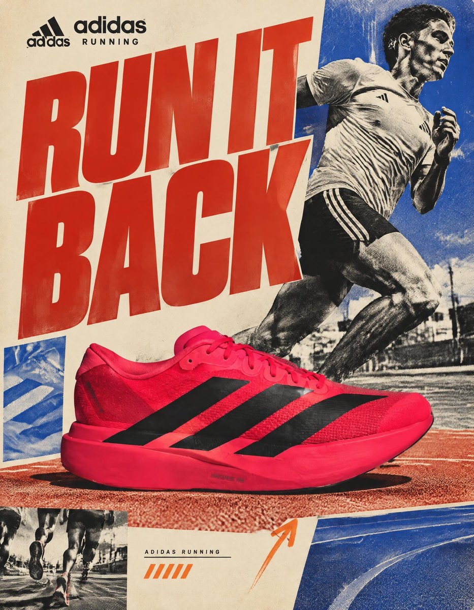
Image · GPT Image 2.5
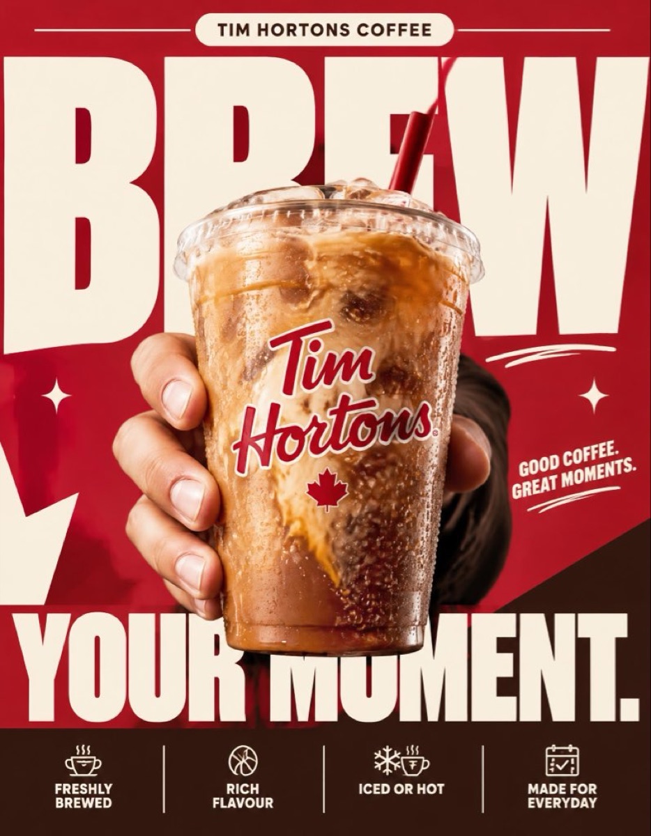
巨字冰饮广告海报
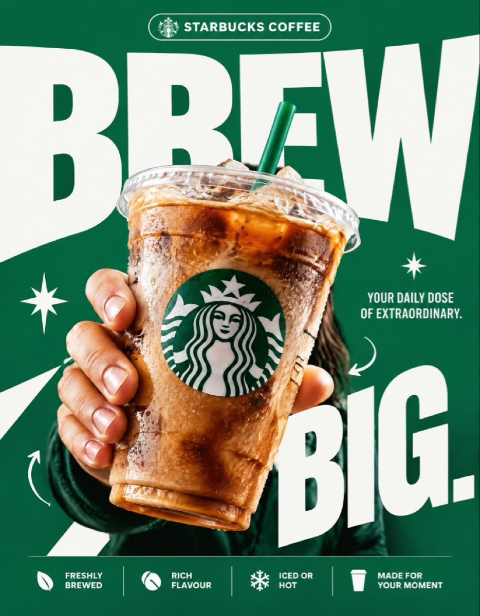
制作以超大标题、近景冰饮和品牌绿为核心的商业海报,突出强烈排版层级与产品质感。
 ᴍᴜʀᴘʜʏ@Diplomeme
Prompt
STARBUCKS — “BREW BIG.”

4:5 vertical premium poster, 8K, exaggerated bold typography × high-impact commercial art direction × photorealistic product advertising

🧠 CORE IDEA:
“BREW BIG.”

🎬 LAYOUT:

BACKGROUND BLOCK:
Solid, vivid Starbucks green background with oversized graphic shapes and strong contrast.

GIANT TYPOGRAPHY:
“BREW”
Extremely bold, oversized, tightly cropped typography dominating almost the entire composition. Letters extend beyond the canvas edges, with the Starbucks cup overlapping the text.

👤 SUBJECT:

A hand holding an iced Starbucks drink directly toward the camera, extreme forced perspective, cup dramatically enlarged in the foreground, realistic condensation, crisp ice, natural lighting.

☕ PRODUCT + VISUAL TWIST:

The Starbucks cup becomes the centerpiece of the typography. The oversized word “BREW” appears to wrap behind the cup, creating striking depth through scale, layering, and composition. Keep the cup, logo, and beverage completely photorealistic.

✨ GRAPHIC ELEMENTS:

* Oversized green and white shapes
* Sharp contrasting shadows
* Minimal starburst accents
* Small directional arrows
* Bold editorial layering

✍️ TEXT SYSTEM:

Top pill:
“STARBUCKS COFFEE”

Main headline:
“BREW BIG.”

Supporting text:
“YOUR DAILY DOSE OF EXTRAORDINARY.”

BOTTOM FEATURE STRIP:

* Freshly Brewed
* Rich Flavour
* Iced or Hot
* Made for Your Moment

ANTI-SLOP DIRECTION:
Typography is the main design feature, not a small decorative element. Extreme scale, aggressive cropping, strong visual hierarchy, deliberate overlap, premium print-ad finish. No floating coffee beans, no miniature landscapes, no random surreal objects, no excessive particles, no cluttered layouts, no generic gradients. The final poster should feel like a bold global advertising campaign with unmistakable graphic impact.
How to use
将品牌名、饮品和标语替换为自己的产品信息,生成同类广告视觉。