Image
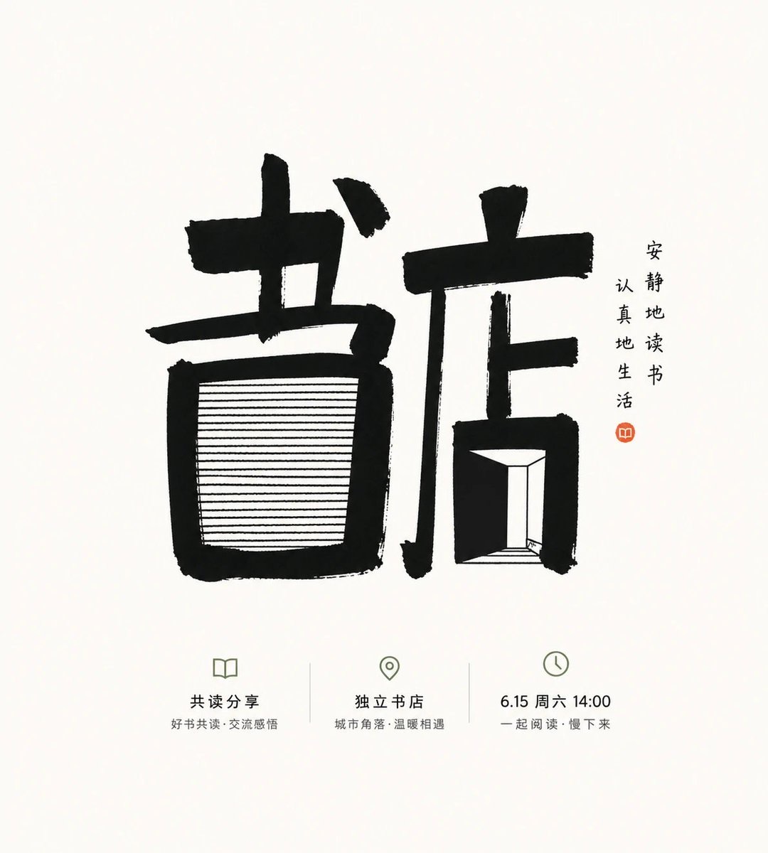
Handwritten-Glyph Key Visual for an Indie Bookstore Reading Event
Generate a vertical themed glyph poster that combines heavy black handwritten strokes, fine internal horizontal lines, bright negative space, and restrained high-contrast color to convey a quiet, approachable cultural event atmosphere.
 小小东@xiaoxiaodong
Prompt
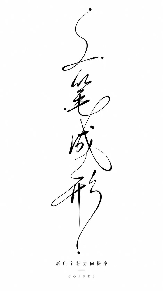
Generate a handwritten-glyph key visual around any theme subject: compress the theme name, core symbol, or key information into a few glyph units, concentrated in the central area of the image with plenty of quiet white space around. At first glance the viewer should read heavy black forms, then the fine internal lines and the hand-drawn speed of the work. The main forms use thick black strokes, with slight handwritten skew, breaks, uneven ink load, and a cut-edge feel at the edges; do not add rounded decorative finishing to the strokes. One main glyph or symbol is treated as a structure with a heavy outer frame and an interior filled with multiple horizontal fine lines pulled taut, with slightly varied line lengths, resembling compressed layered texture, creating tension between heavy blocks and fine lines, solid ink and gaps. The background is a high-brightness clean base field occupying the vast majority of the area, with a clear sense of airiness. Colors are drawn from the theme's own material, mood, and cultural meaning, but follow a role mapping of a large bright clean base color, a small amount of high-contrast structural color, and very few accent colors, keeping the image clear, quiet, high-brightness, controlled in saturation, with clear edges. Dark tones bear only the information and structural weight; do not make the image look aged, dirty, or like retro paper. Overall it should look like a quick yet deliberate hand-lettering experiment, with minimal information, concentrated force, and white space with a sense of pressure. The finished piece should have real rough edges and stroke pauses, not printed type, decorative patterns, or ordinary calligraphy.

——————
Theme: A themed glyph key visual for an indie bookstore reading event, conveying a quiet, approachable, culturally rich event atmosphere
Supplement: 3 relevant information points appear
Aspect ratio: vertical 9:10
围绕任意主题对象生成一枚手写字形主视觉:把主题名称、核心符号或关键信息压缩成少数字形单元,整体集中在画面中心区域,四周保留大量安静空白,让第一眼先读到厚重黑形,再读到内部细线的手工速度。主形体使用粗黑笔触构成,边缘保留手写时的轻微歪斜、断口、墨量不均和切割感,笔画不要圆润修饰;其中一个主要字形或符号被处理成外框厚重、内部由多条水平细线拉紧填充的结构,细线长短略有差异,像被压缩的层叠纹理,形成粗块与细线、实墨与空隙之间的张力。背景作为高明度干净底场,面积占绝大多数,通风感明确;色彩从主题自身的材质、情绪和文化语义中提取,但遵循大面积明亮洁净底色、少量高对比结构色、极少强调色的角色映射,保持清透安静、明度高、饱和度受控、边界清楚,深色只承担信息和骨架重量,不把画面做旧、做脏或变成复古纸感。整体呈现像一次快速但有判断的手绘字体实验,信息少、力度集中、空白有压迫感,完成品应有真实毛边和笔触停顿,而不是印刷字体、装饰花纹或普通书法。
——————
主题:独立书店阅读活动的主题字形主视觉,传达安静、亲近且具有文化感的活动气质
补充:出现 3 个相关信息点
画幅:竖版 9:10
How to use
Usage tip: Suitable for indie bookstore event posters, reading brand visuals, or cultural promotion images. When replacing the theme name, symbols, and 3 information points, keep the centrally focused composition, thick-thin stroke contrast, and ample white space.