Image
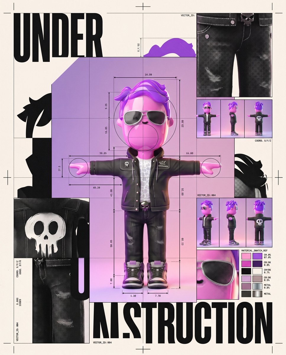
角色施工档案:实验性编辑海报
将用户上传的角色设计成兼具成品与工作文件质感的实验性编辑海报,融合不对称网格、构造线、局部放大和复古印刷效果。
 Edizkan ⭕🦇@edizkan_
Prompt
Create an experimental editorial graphic-design poster featuring the uploaded reference character as the central visual identity, surrounded by the visible construction system used to “design” the character.
Likeness Integrity

Preserve the character’s exact head-to-body proportions, eye shape, eye spacing, stylization, silhouette, outfit, accessories, materials, and original color palette. Do not humanize. Do not alter anatomy or facial structure. Do not add facial features absent from the reference. The character must remain instantly recognizable.
Core Concept

Treat the character as if it is simultaneously the finished artwork and the graphic designer’s working file.
Place one large, clean representation of the character slightly off-center. Around it, expose fragments of the visual construction process:
• oversized crop marks

• registration crosses

• measurement lines

• modular grids

• circles defining proportions

• enlarged fragments of the character’s eye, silhouette, textures, and color palette

• tiny alternate pose thumbnails

• abstract vector shapes extracted from the character’s geometry

• CMYK-style swatches derived from its original colors
Some construction lines pass behind the character, while others deliberately cross in front of cropped areas, creating layered editorial depth.
The poster should feel unfinished and finished at the same time, as if someone opened the master design file seconds before publication.
Graphic Language

Experimental Swiss editorial design mixed with contemporary art-direction systems.
Strong asymmetric grid.

Radical scale contrast.

Large areas of negative space.

Overlapping image crops.

Thin technical lines against massive geometric blocks.

Intentional misalignment and controlled visual tension.
Do not make the layout perfectly balanced or centered.
Typography

Use only one large headline:
“UNDER CONSTRUCTION”
Set it in an ultra-bold condensed grotesk sans-serif, uppercase.
Break the headline across the composition in an unconventional way. Allow part of the lettering to disappear behind the character or leave the frame.
Add only tiny abstract typographic details such as coordinates, numbers, or design-system labels. Keep them sparse and secondary.
Composition

Vertical poster.
The character occupies roughly 45–55% of the composition and sits away from the exact center.
One enlarged fragment of the character extends beyond an edge of the poster.
A giant geometric shape derived from the character’s silhouette occupies another part of the frame.
The composition should feel slightly unstable but extremely deliberate.
Depth Hierarchy

Layer 1: oversized cropped typography and geometric fragments.

Layer 2: main character, perfectly readable.

Layer 3: grids, measurements, registration marks, and smaller studies.
Keep the main character and headline crisp. Allow peripheral construction graphics to soften subtly or disappear beyond the crop.
Color System

Use the character’s original palette as the main design system.
Add only restrained black, warm off-white, and one contrasting technical accent color.
No rainbow palette.

No excessive gradients.

No color flooding.
Use subtle print misregistration, halftone texture, ink grain, and slightly imperfect offset-print edges to make the poster feel physically designed rather than digitally sterile.
Output Feel

Museum-grade contemporary graphic-design poster.

Experimental identity system.

Editorial, collectible, slightly rebellious.

It should look worthy of being screen-printed, framed, or used as the cover of an independent design magazine.
No mockup environment.

No room or wall.

No decorative 3D effects.

No generic futuristic UI.

No symmetrical layout.

No unnecessary text.

No character redesign.
ar 4:5
How to use
使用建议:上传一张希望保留造型与配色的角色参考图,再将提示词交给图像生成工具;适合制作角色视觉识别、独立杂志封面或展览海报。
Details
- Type
- Image
- Source
- Edizkan ⭕🦇
- License
- Source-author-rights
- Published
More from Edizkan ⭕🦇
-
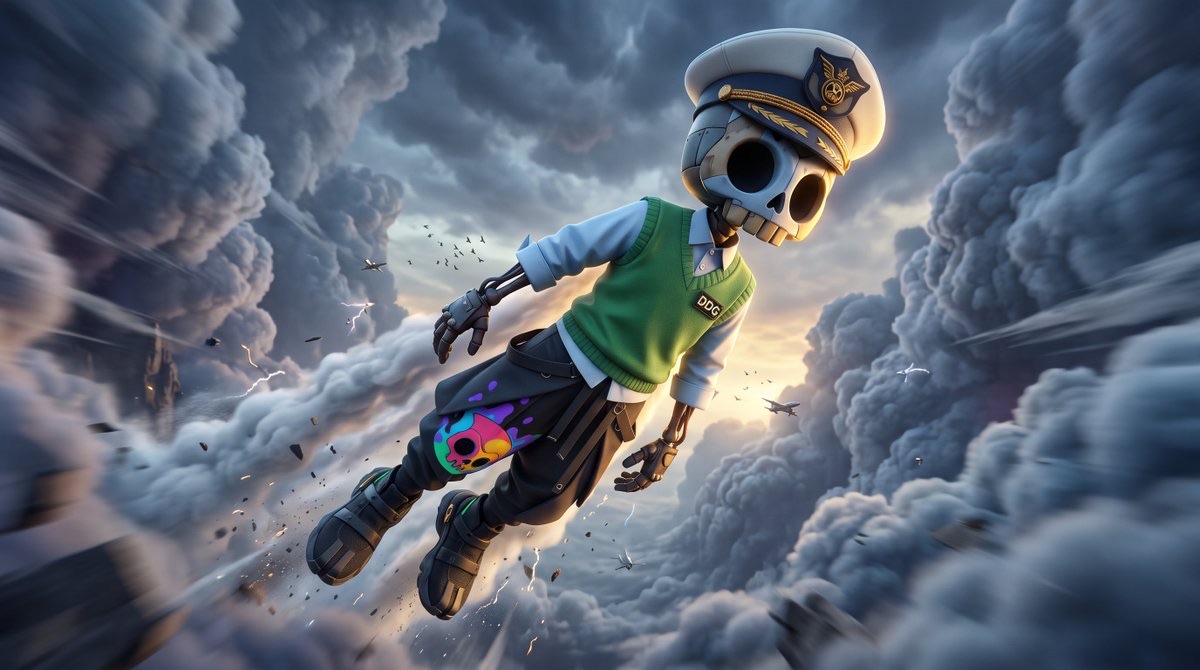
Giant Character Flying Through Storm Clouds
-
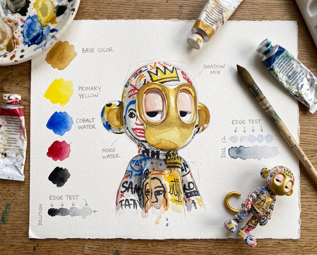
Watercolor Character Study Sheet
-
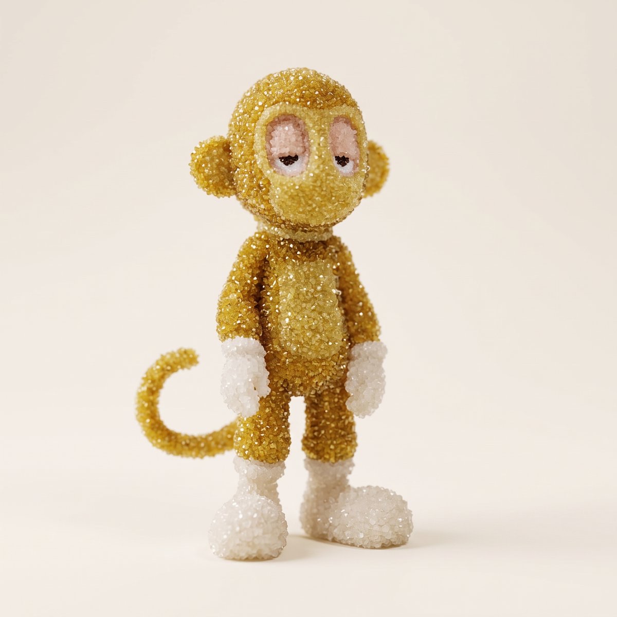
Tiny Salt-Crystal Character Sculpture
-
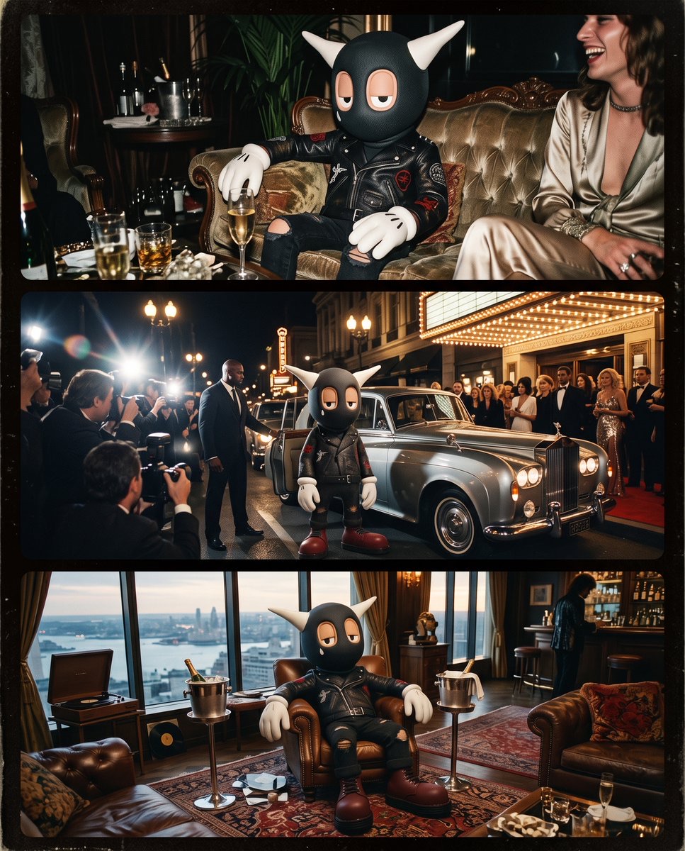
Three-Frame Portrait of a Character’s Luxury Life
-
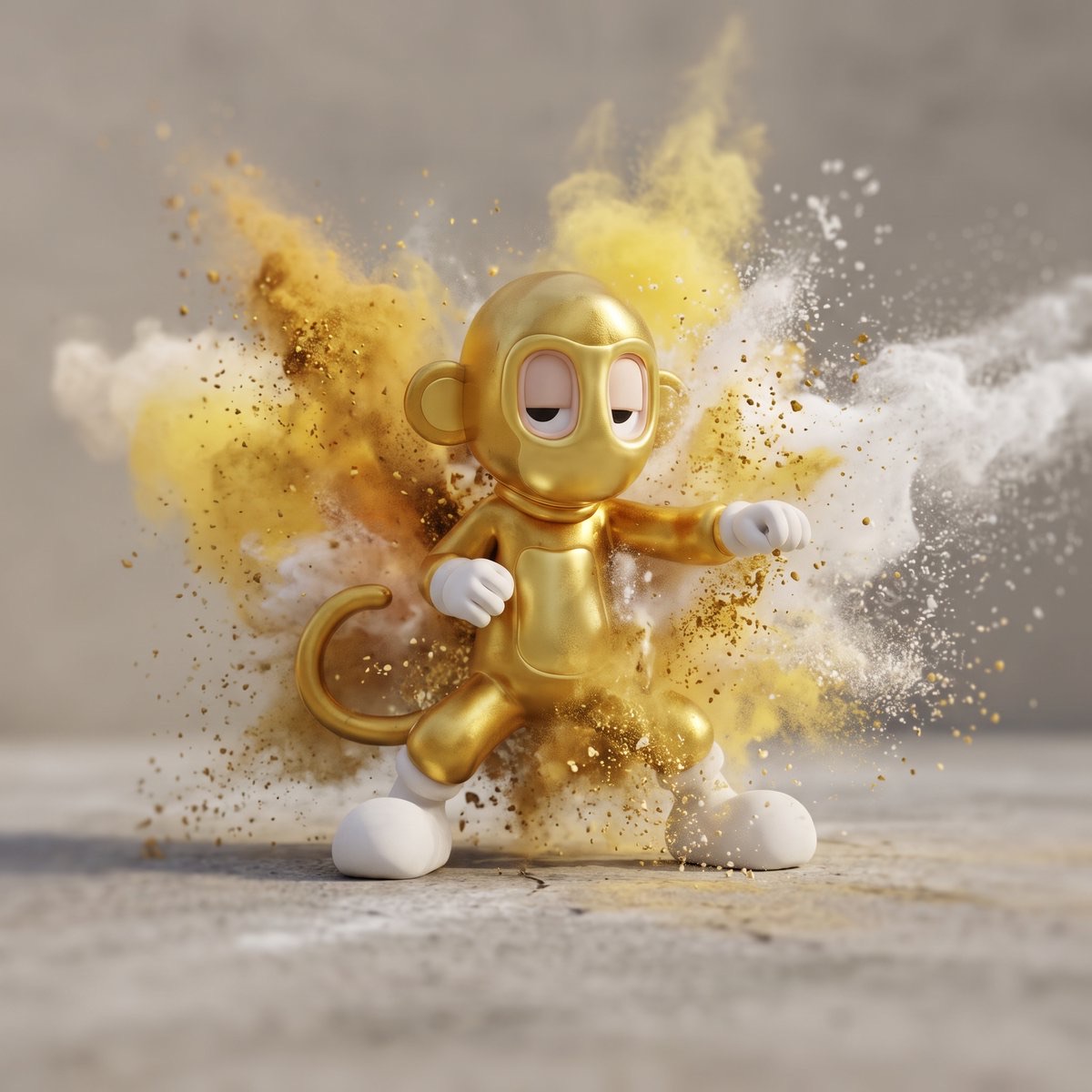
Character Amid a Burst of Powder
-
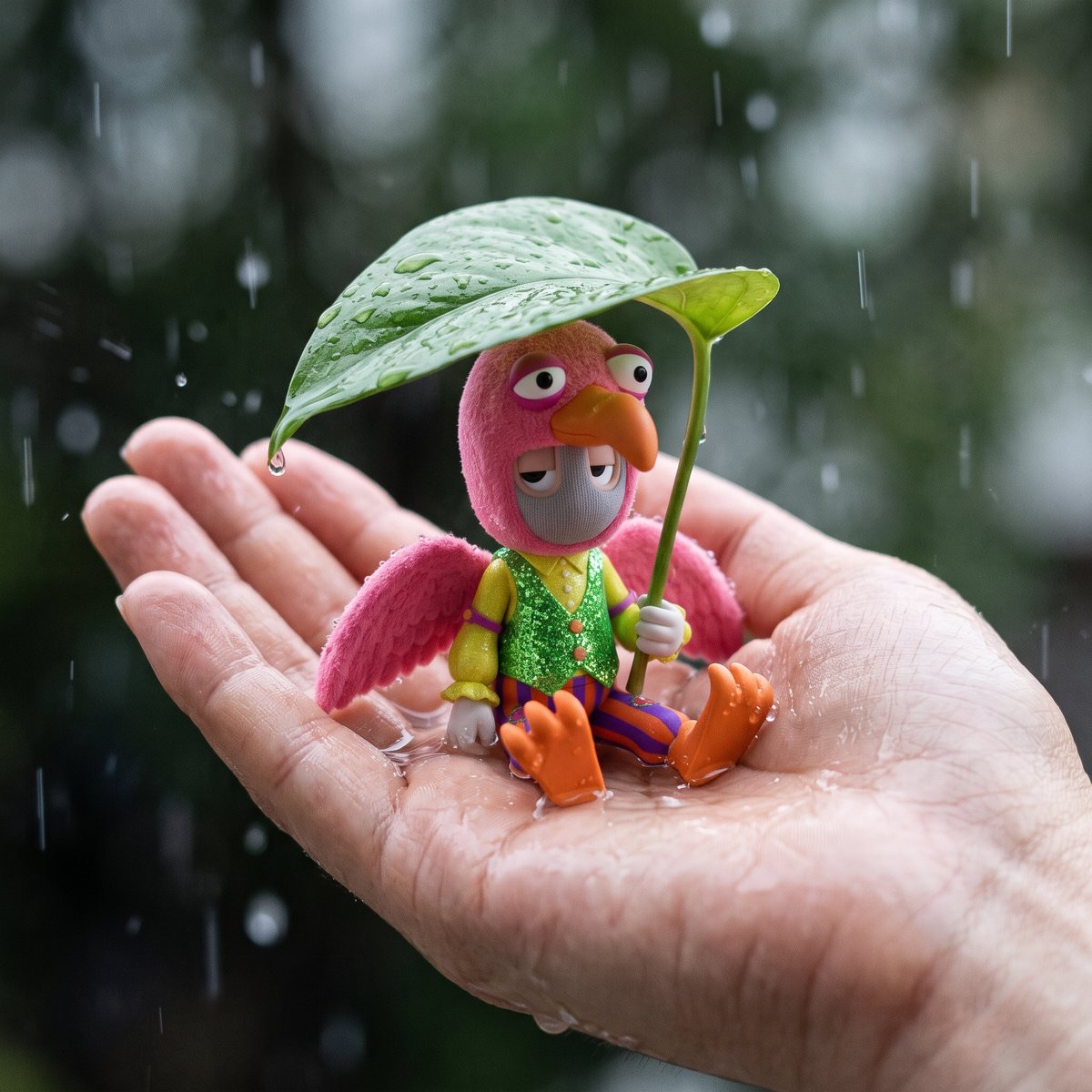
A Miniature Character Sheltered by a Leaf
-
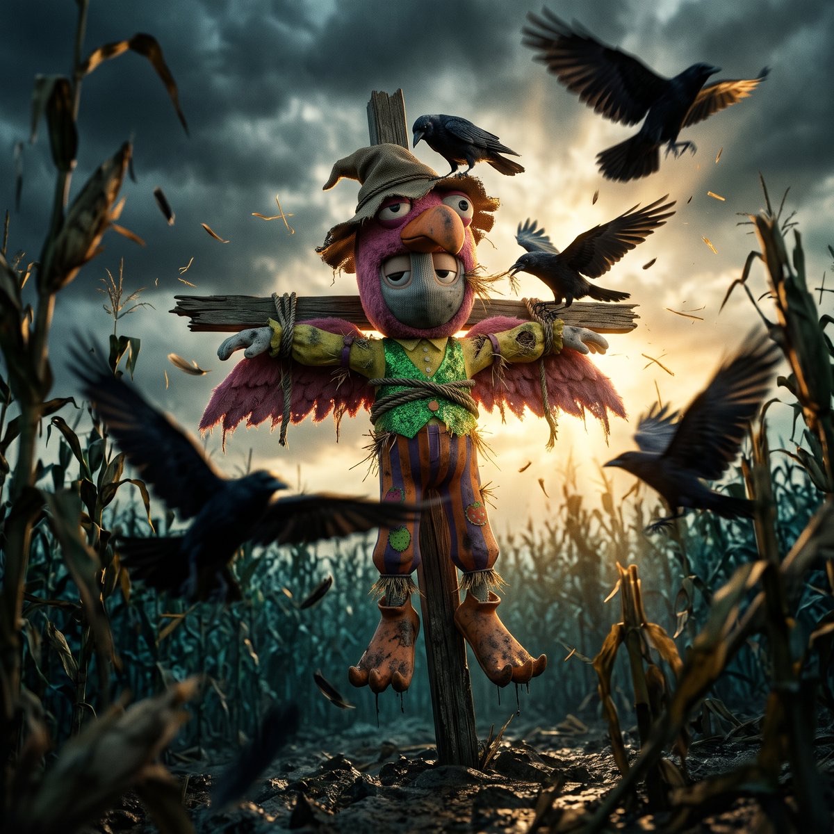
Scarecrow Under Crow Attack
-
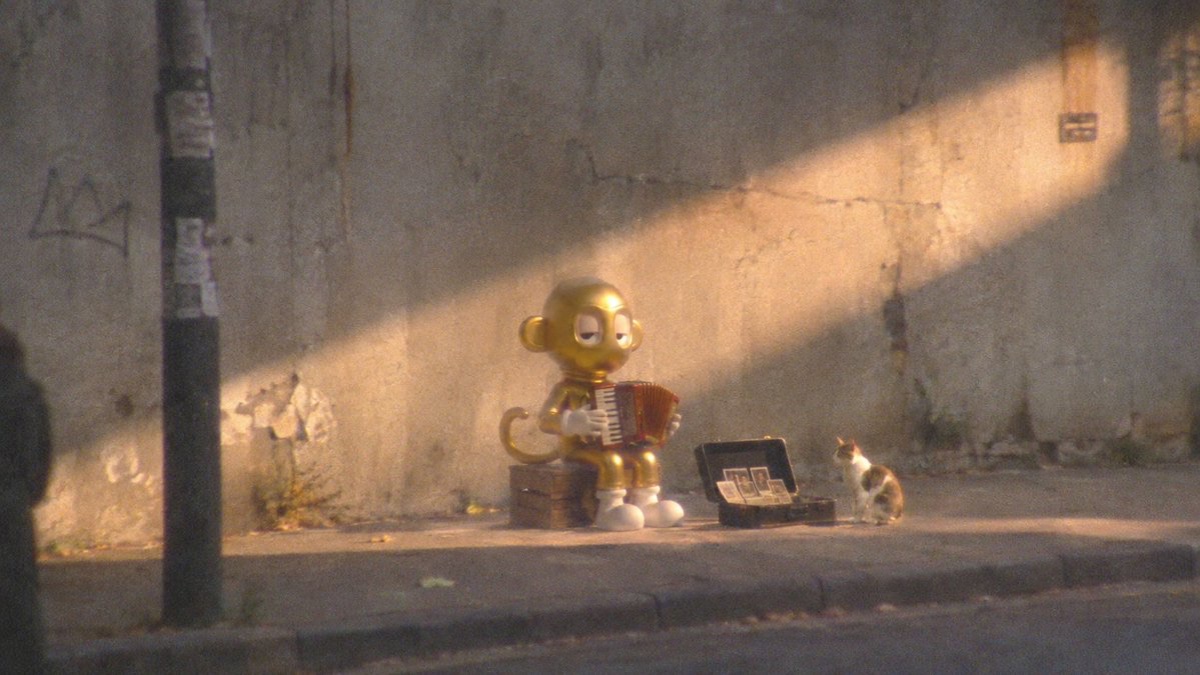
Lo-Fi Street Snapshot of a Reference Character